React Toast – Lightweight, Configurable Alert Notifications
- Small, nonblocking notification pop-up.
- Customizable notification with timeout and a progress bar.
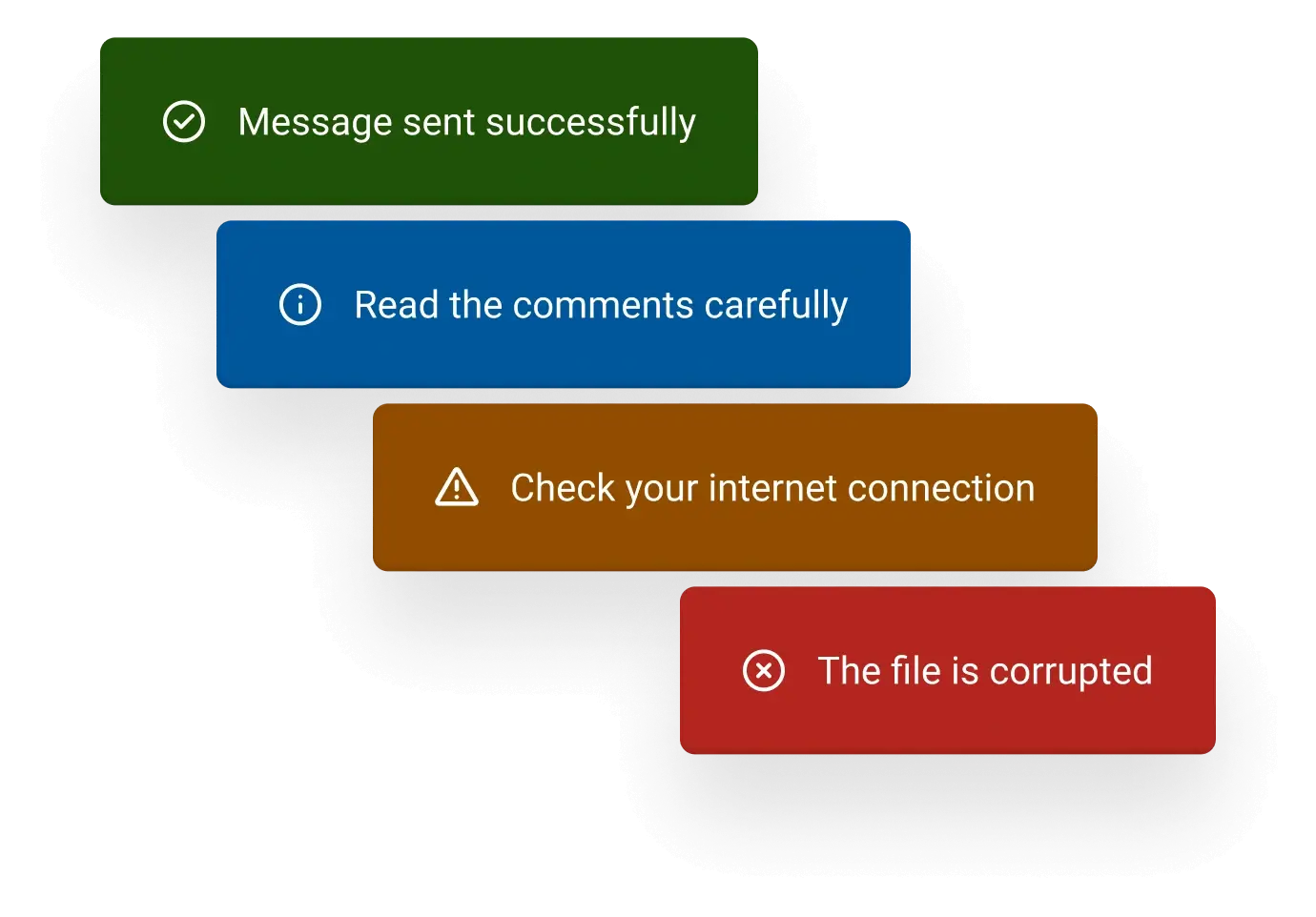
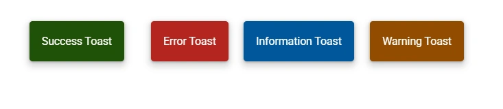
- Predefined standard notification types such as success, error, warning, and information.
- Quick, auto-dismissable alerts.
Trusted by the world’s leading companies

Overview
The React Toast is a lightweight, non-blocking notification pop-up that displays readable messages. It typically appears at the bottom of the screen or near a designated target element and automatically disappears after a few seconds with various animation effects. The component includes built-in options to customize its appearance, animation styles, display duration, and dismissal mode.
React Toast code example
Get started with the React Toast using a few simple lines of TSX code as demonstrated below. Also, explore our React Toast demo that shows how to render and configure the Toast in React.
import { Button, Color } from '@syncfusion/react-buttons';
import { Toast } from '@syncfusion/react-notifications';
import { useState } from 'react';

export default function App() {
  const [isToastVisible, setIsToastVisible] = useState(false);

  const toggleToast: () => void = () => {
    setIsToastVisible(!isToastVisible);
  };
  return (

    <div className="component-section">
      <Button toggleable={true} onClick={toggleToast} color={Color.Secondary}>
        {isToastVisible ? 'Hide' : 'Show'}
      </Button>
      <Toast
        open={isToastVisible}
        content={'Show button clicked'}
        position=
        timeout={3000}
        onClose={() => setIsToastVisible(false)}
      ></Toast>
    </div>
  );
}
Interactive toasts
Users can enhance toast messages by adding interactive elements such as input fields and buttons. These allow quick responses directly within the notification. For example, users can reply to a chat message from the toast pop-up itself.
Toast content
A toast notification can be customized to include plain text, images, icons, input fields, and buttons. Users can also load HTML content and dynamically update the toast’s content to suit different interaction needs.
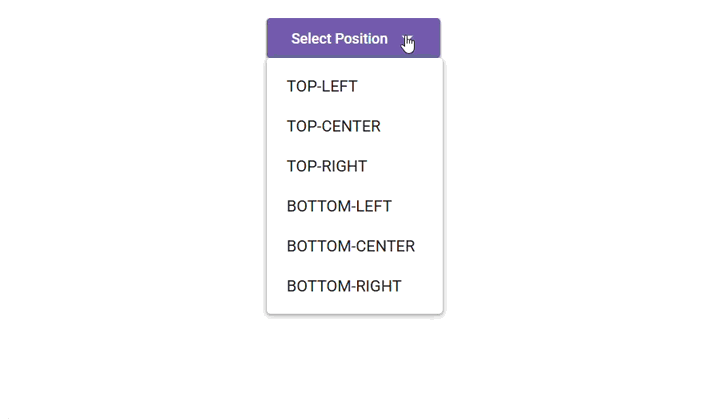
Positioning toasts
The React Toast offers built-in options to easily control its screen position. Toasts can be displayed at the top, bottom, left, right, or center based on layout preferences and design requirements.
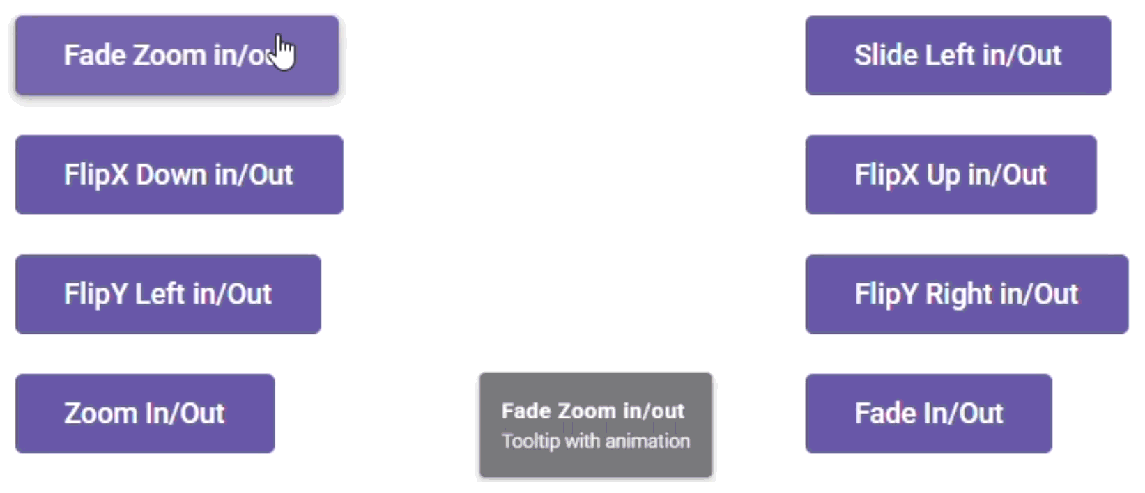
Animation
Toast animations can be configured to show or hide notifications with custom effects and durations. The animation duration can be adjusted based on the length of the notification message and estimated reading time, ensuring a smooth and user-friendly experience.
Multiple notifications
Users can display multiple toast notifications in a queued sequence within a specified duration. The order of the queue can also be customized, such as showing the newest notifications on top.
Timing (duration)
The React Toast can be configured to remain visible for a specific duration before it is hidden.
Appearance
Easily create standard React toast notifications using built-in classes like success, warning, info, and error.
Progress bar
Users can enable a progress bar within the toast to visually track the progress of an ongoing operation or to indicate the remaining time before the toast message expires.
Dismiss toasts
Users can dismiss React Toast notifications through user actions like tapping or swiping, or automatically through configured timeouts.
Accessibility
- Fully supports WAI-ARIA accessibility, making the component accessible to on-screen readers and assistive devices.
- Follows the WCG 2.0 standard in the design of the UI visual elements, such as foreground color, background color, line spacing, text, and images.
Developer-friendly API
Developers can control the appearance and behaviors of the Toast notification component, including its positioning, using a rich set of APIs.


Not sure how to create your first React Toast? Our documentation can help.
I’d love to read it nowPure React Components
Developed using React’s core principles, this library employs functional components and hooks without any external dependencies.
GRIDS
DATA VISUALIZATION
NAVIGATION
Frequently Asked Questions
Why should you choose the Syncfusion® React Toast?
The Syncfusion React Toast provides the following:
A small animated notification pop-up.
- Fully customizable alert messages with timeouts and a progress bar.
- Predefined standard notification types: success, error, warning, and information.
- One of the best React Toast components on the market.
Simple configuration and APIs.
- Support for all modern browsers.
Expansive learning demos that help you get started fast.
Where can I find the Syncfusion React Toast demo?
You can find our React Toast demo here. It shows you how to render and configure the Toast.
Can I download and utilize the Syncfusion React Toast for free?
No, this is a commercial product and requires a paid license. However, a free Community License is also available for companies and individuals whose organizations have less than $1 million USD in annual gross revenue, 5 or fewer developers, and 10 or fewer total employees.
How do I get started with Syncfusion’s React Toast component?
A good place to start would be our comprehensive getting started documentation.
See Real Success Stories
Developers around the world trust Syncfusion’s Essential Studio to simplify complex projects and speed up delivery. With a vast library of UI controls, powerful SDKs, and reliable support, Essential Studio helps teams build enterprise-ready applications with confidence.
Read Our Customer StoriesIndustry
Software development
75% Cost reduction
50% Faster development
Industry
Utilities (oil and gas)
450+ hours saved
Streamlined processes and hours of development effort saved.
Advanced, flexible features
Empowered users through robust and versatile functionality.
Industry
Software and technology
1000+ of hours saved
Accelerated development with enterprise-ready UI components.
Efficient file management
Streamlined workflows with document libraries without building them from scratch.
Industry
Software and technology
2 Years of delay avoided
Two years of delays prevented with proactive planning.
On-time delivery
Projects delivered on schedule using trusted controls.
Industry
IT services and IT consulting
Improved performance
Large datasets handled with easy customization and quick debugging.
Highly customizable
Plug-and-play controls with quick template integration.
Industry
Professional services
Instant access
Quick availability of features and resources.
Reduced dependencies
Fewer dependencies for faster development.
Rated by users across the globe
Syncfusion React Toast Resources


UI Kits
 Figma Download
Figma Download
Awards
Greatness—it’s one thing to say you have it, but it means more when others recognize it. Syncfusion® is proud to hold the following industry awards.

