React Radio Button - Flexible UI for Single-Choice Selection
- The Radio Button component builds upon the standard HTML radio button, offering multiple theme options for enhanced styling.
- Label content is fully customizable using built-in APIs.
- The UI is highly flexible, allowing you to fully tailor the design and behavior.
Trusted by the world’s leading companies

Overview
The React Radio Button is a custom radio-type HTML5 input component for selecting one option from a list of predefined choices. It supports different states, sizes, labels, label positions, and UI customizations.
React Radio Button code example
Get started with the React Radio Button component using a few simple lines of TSX code as demonstrated below. Also, explore our React Radio Button example that shows how to render and configure the component.
import { RadioButton } from '@syncfusion/react-buttons';
export default function App() {
return (
<div className="component-section">
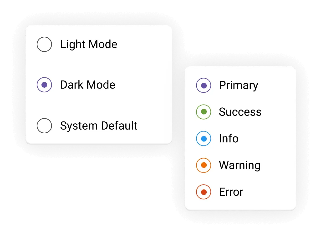
<RadioButton name='theme' value='light' defaultChecked={true} label='Light Mode' />
<RadioButton name='theme' value='dark' label='Dark Mode' />
</div>
);
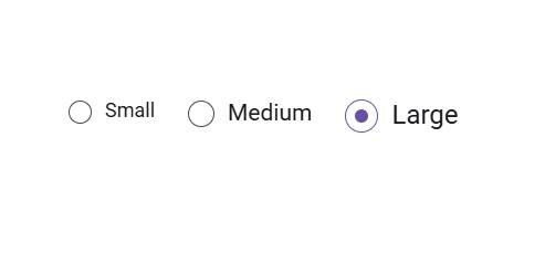
}Radio Button sizes
Supports three size options, small, medium and large, to accommodate various interface layouts and design requirements.
Radio Button label
The label defines the caption displayed next to the React Radio Button. Position the label before or after the radio button based on the application requirements.
Appearance
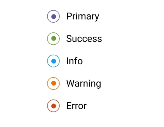
Customize the look and feel of the Radio Button by changing its fill color, background, border, and item opacity. It also supports built-in styles like primary, success, warning, info, and error to clearly visualize specific states.
Forms support
The React Radio Button component integrates seamlessly with native HTML form validation. This ensures consistent behavior across form submissions, enabling the validation of required fields and improving overall form reliability and accessibility.
Web accessibility
- Fully supports WAI-ARIA accessibility to work with screen readers and assistive devices.
- Follows WAI-ARIA best practices for implementing keyboard interaction.
- Adheres to WCAG 2.0 standards in the design of visual elements, such as foreground color, background color, line spacing, text, and images.
- Supports right-to-left (RTL) text direction for users working with RTL languages like Hebrew, Arabic, or Persian.


Pure React Components
Developed using React’s core principles, this library employs functional components and hooks without any external dependencies.
GRIDS
DATA VISUALIZATION
NAVIGATION
Frequently Asked Questions
Why should you choose the Syncfusion® React Radio Button?
Supports different sizes, labels, colors, and label positions.
- Seamlessly supports HTML forms.
Simple configuration and APIs.
- Supports all modern browsers.
- Touch-friendly and responsive UI.
- One of the best React radio buttons on the market.
Extensive demos help you learn quickly and get started fast.
Where can I find the Syncfusion React Radio Button demo?
You can find our React Radio Button demo here. It demonstrates how to render and configure the Radio Button.
Can I download and utilize the Syncfusion React Radio Button for free?
No, this is a commercial product and requires a paid license. However, a free Community License is also available for companies and individuals whose organizations have less than $1 million USD in annual gross revenue, five or fewer developers, and 10 or fewer employees.
How do I get started with the Syncfusion React Radio Button?
A good place to start would be our comprehensive getting started guide.
See Real Success Stories
Developers around the world trust Syncfusion’s Essential Studio to simplify complex projects and speed up delivery. With a vast library of UI controls, powerful SDKs, and reliable support, Essential Studio helps teams build enterprise-ready applications with confidence.
Read Our Customer StoriesIndustry
Software development
75% Cost reduction
50% Faster development
Industry
Utilities (oil and gas)
450+ hours saved
Streamlined processes and hours of development effort saved.
Advanced, flexible features
Empowered users through robust and versatile functionality.
Industry
Software and technology
1000+ of hours saved
Accelerated development with enterprise-ready UI components.
Efficient file management
Streamlined workflows with document libraries without building them from scratch.
Industry
Software and technology
2 Years of delay avoided
Two years of delays prevented with proactive planning.
On-time delivery
Projects delivered on schedule using trusted controls.
Industry
IT services and IT consulting
Improved performance
Large datasets handled with easy customization and quick debugging.
Highly customizable
Plug-and-play controls with quick template integration.
Industry
Professional services
Instant access
Quick availability of features and resources.
Reduced dependencies
Fewer dependencies for faster development.
Rated by users across the globe
Syncfusion React Radio Button resources


Awards
Greatness—it’s one thing to say you have it, but it means more when others recognize it. Syncfusion® is proud to hold the following industry awards.

