React DateTime Picker - Scheduling Input for Booking Forms
- A compact input for selecting a date and time from a pop-up calendar and time list.
- Built-in validation, range restrictions, and multiple themes.
- Accessible keyboard navigation, RTL, and localization support.
Trusted by the world’s leading companies

Overview
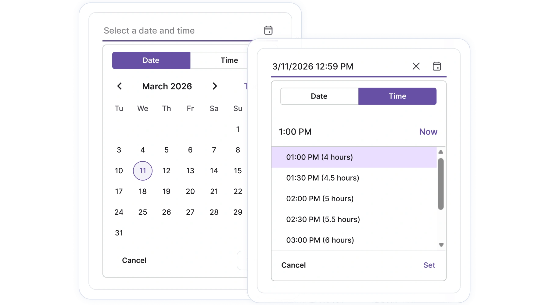
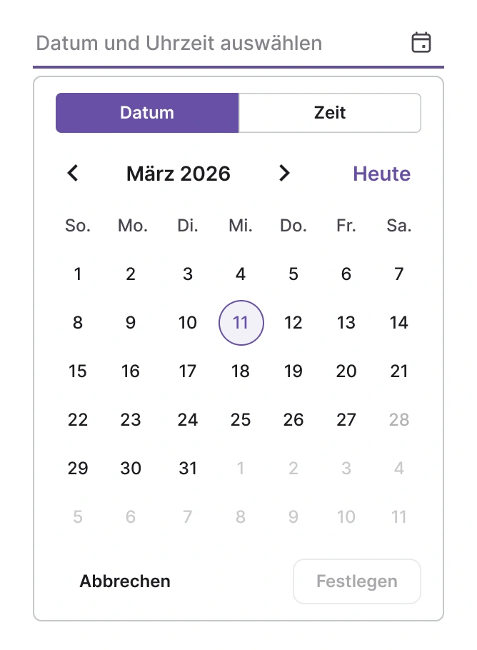
The DateTime Picker provides a compact input for entering or selecting a date and time. It includes month, year, and decade navigation; a configurable time list; and responsive pop-up modes for desktop and mobile apps.
React DateTime Picker code example
Get started quickly with a minimal TSX example that renders the default picker.
import { DateTimePicker } from '@syncfusion/react-calendars';

export default function App() {

    return (
        <div className="component-section">
            <DateTimePicker placeholder="Choose date & time" defaultValue={new Date()} />
        </div>
    );
}
Controlled mode
The DateTime Picker can be used in two ways. In controlled mode, your application holds the selected date and updates the picker so it always reflects external state. In uncontrolled mode, the picker keeps its own value after an initial default and manages state internally.
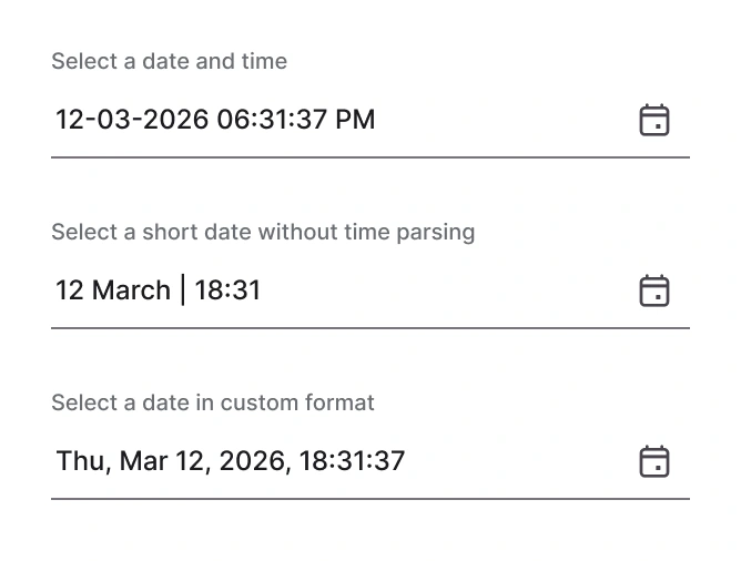
Custom formats
Choose how the selected date and time appear in the input using familiar date-time patterns (for example, MM/dd/yyyy or hh:mm). Use locale-aware patterns to match regional expectations.
Dialog mode
On constrained screens, the pop-up can present as a centered dialog to simplify selection and improve touch targets.
Displaying week numbers
Optionally show week numbers in the calendar pop-up to help users orient around calendar weeks.
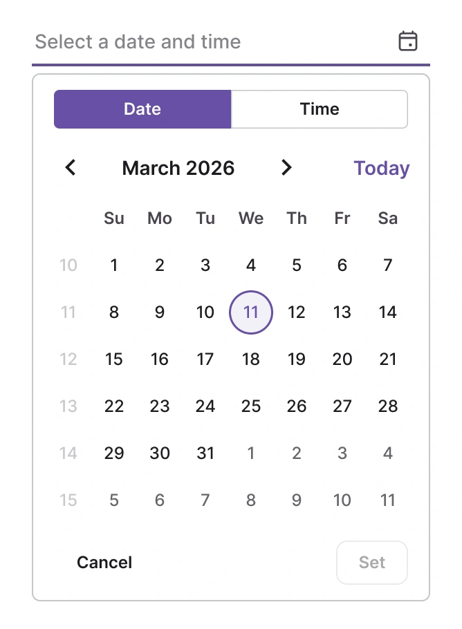
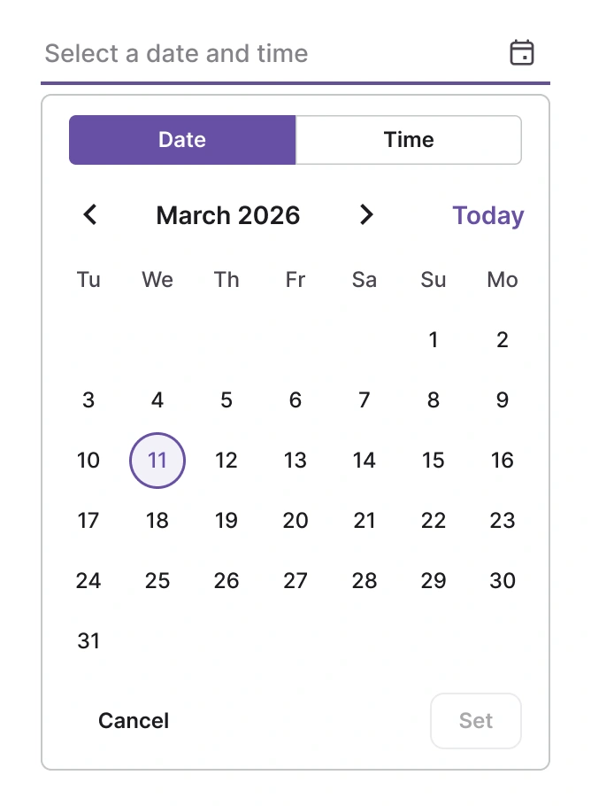
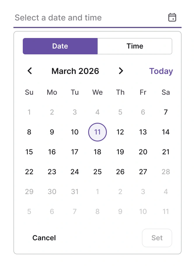
First day of week
Configure the calendar’s first day of the week to match regional expectations (for example, Monday or Sunday).
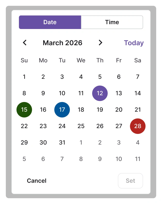
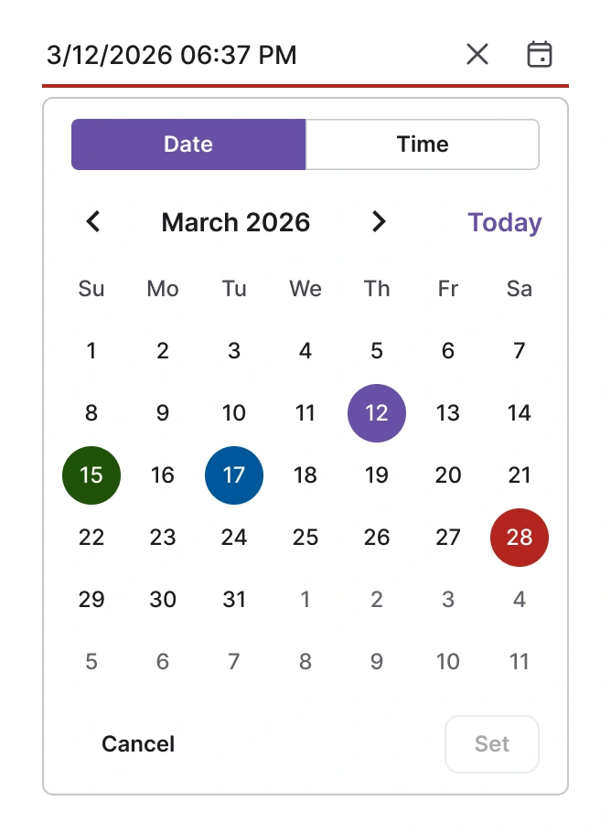
Ranges and disabled dates
Restrict selection to a date or time window or disable specific dates such as weekends and holidays.
Custom rendering of DateTime Picker
Use templates to override input appearance, day-cell markup, or time list items so the control matches your brand and UX.
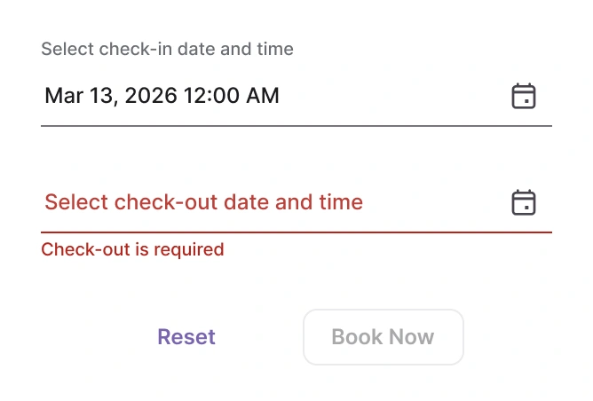
Forms
The DateTime Picker is designed for seamless integration with React forms, providing reliable data binding and validation. This ensures consistent behavior and simplified state management for selection inputs within complex form structures.
Internationalization and localization
The React DateTime Picker offers extensive internationalization capabilities, enabling adherence to various cultural date formats and the setting of the first day of the week according to regional preferences. Text elements, including month, day, and navigation controls, can be localized for use in many languages.
Accessibility
Keyboard navigation
Navigate suggestions with arrow keys, select with Enter, and close with Esc in an efficient keyboard experience.
Screen readers and accessibility
Use ARIA roles and live regions so that screen readers can announce suggestion updates and selection events.
Right-to-left (RTL) rendering
Enable RTL mode to mirror layout and pop-up alignment for right-to-left languages like Arabic or Hebrew.


Not sure how to create your first React DateTime Picker? Our documentation can help.
Read the getting started guidePure React Components
Developed using React’s core principles, this library employs functional components and hooks without any external dependencies.
GRIDS
DATA VISUALIZATION
NAVIGATION
Frequently Asked Questions
Why should you choose the Syncfusion React DateTime Picker?
The DateTime Picker delivers:
- A compact input combining typing and pop-up selection.
- Flexible range and disabled-date options for real-world scenarios.
- Localization, multiple-calendar support, and RTL readiness.
- Accessible keyboard navigation and screen-reader support.
Can the DateTime Picker be purchased separately?
No. The DateTime Picker is only sold as part of the full Essential Studio UI component suite. Contact our product specialists for licensing questions: Contact us.
Where can I find templates and examples?
Templates and examples are available in the documentation and demo pages.
Does the DateTime Picker have demos?
Yes. Explore interactive examples and runnable projects at the demo site: React DateTime Picker demo.
Is there a free option?
A free community license is available for eligible individuals and small organizations; see the Community License page for details: Community License.
See Real Success Stories
Developers around the world trust Syncfusion’s Essential Studio to simplify complex projects and speed up delivery. With a vast library of UI controls, powerful SDKs, and reliable support, Essential Studio helps teams build enterprise-ready applications with confidence.
Read Our Customer StoriesIndustry
Software development
75% Cost reduction
50% Faster development
Industry
Utilities (oil and gas)
450+ hours saved
Streamlined processes and hours of development effort saved.
Advanced, flexible features
Empowered users through robust and versatile functionality.
Industry
Software and technology
1000+ of hours saved
Accelerated development with enterprise-ready UI components.
Efficient file management
Streamlined workflows with document libraries without building them from scratch.
Industry
Software and technology
2 Years of delay avoided
Two years of delays prevented with proactive planning.
On-time delivery
Projects delivered on schedule using trusted controls.
Industry
IT services and IT consulting
Improved performance
Large datasets handled with easy customization and quick debugging.
Highly customizable
Plug-and-play controls with quick template integration.
Industry
Professional services
Instant access
Quick availability of features and resources.
Reduced dependencies
Fewer dependencies for faster development.
Rated by users across the globe
Syncfusion React DateTime Picker resources


Awards
Greatness—it’s one thing to say you have it, but it means more when others recognize it. Syncfusion® is proud to hold the following industry awards.

