Trusted by the world’s leading companies

Overview
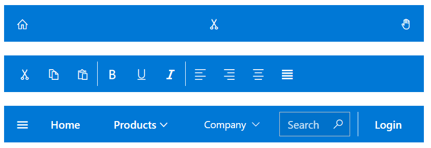
The React AppBar, also known as an action bar or nav bar, displays information and actions related to the current application screen. It is used to show branding, screen titles, navigation, and actions. The component supports height modes, color modes, positioning, and more.
Size
Display the AppBar with predefined sizes: normal, long, or short. The size of an AppBar can be changed using the regular, prominent, and dense properties.

Color
The AppBar has predefined background colors for different visual representations: light, dark, primary, and inherit.

Position
A row of content can be aligned horizontally at the top or bottom of the AppBar.

Content alignment
The React AppBar component aligns the content using a spacer and separator.

Responsive design
The AppBar layout will adjust automatically to the current screen size.

Separator
A separator is a vertical line that visually separates or groups items in an AppBar.

Developer-friendly APIs
Developers can control the appearance and behaviors of the AppBar component using a rich set of APIs.
Built-in themes
The React AppBar component supports built-in themes: Material, Bootstrap, Fabric (Office 365), Tailwind CSS, and high contrast. Users can customize these built-in themes or create new themes to achieve their desired look and feel by either simply overriding SASS variables or using our Theme Studio application.
AppBar code example
Easily get started with the React AppBar using a few simple lines of TSX code example as demonstrated below. Also explore our React AppBar example, which shows how to render and configure an AppBar in React.
import { AppBarComponent } from "@syncfusion/ej2-react-navigations";
import { ButtonComponent } from '@syncfusion/ej2-react-buttons';
import * as React from "react";
import * as ReactDOM from "react-dom";

const App = () => {
  return (
    <div className='control-container'>
      <AppBarComponent colorMode="Primary">
        <ButtonComponent cssClass='e-inherit menu' iconCss='e-icons e-menu'></ButtonComponent>
        <span className="regular">React AppBar</span>
        <div className="e-appbar-spacer"></div>
        <ButtonComponent cssClass='e-inherit login'>FREE TRIAL</ButtonComponent>
      </AppBarComponent>
    </div>
  );
}

const root = ReactDOM.createRoot(document.getElementById('element'));
root.render(<App />);Not sure how to create your first React AppBar component? Our tutorial videos and documentation can help.
I’d love to watch it now I’d love to read it nowDiscover Syncfusion’s Complete React Component Ecosystem
Explore over 145+ React UI components featuring established, production-ready controls and the latest pure React components built natively for modern web app development.
-
React Components
-
Pure React Components
-
SMART COMPONENTSGRIDSDATA VISUALIZATIONDROPDOWNSFILE VIEWERS & EDITORSBUTTONSINTERACTIVE CHATINPUTSNAVIGATIONFORMSNOTIFICATIONS
-
GRIDSDATA VISUALIZATIONNAVIGATIONINPUTS
Build Document Workflows in React
Embed PDF viewing, Word document editing, and Excel-like spreadsheet processing in your React app to streamline document workflows and help teams collaborate on files without context switching or external dependencies.
Frequently Asked Questions
Why should you choose Syncfusion React AppBar?
- A simple and highly customizable interface.
Customizable height, theme color, position, and more.
- Effortless integration with components like Button, Dropdown Menu, Menu Bar, and more.
- Standard, predefined, and contextual color variants.
- Industry-standard themes included: Material, Fabric, and Bootstrap.
- Support for all modern browsers.
- Touch-friendly and responsive UI.
Extensive demos and documentation to let you get started quickly with the React AppBar component.
Where can I find the Syncfusion React AppBar demo?
You can find our React AppBar demo, which demonstrates how to render and configure the AppBar.
Can I download and utilize the Syncfusion React AppBar for free?
No, this is a commercial product and requires a paid license. However, a free community license is also available for companies and individuals whose organizations have less than $1 million USD in annual gross revenue, 5 or fewer developers, and 10 or fewer total employees.
How do I get started with the Syncfusion React AppBar?
A good place to start would be our comprehensive getting started documentation.
Our Customers Love Us


 Documentation
Awards
Greatness—it’s one thing to say you have it, but it means more when others recognize it. Syncfusion® is proud to hold the following industry awards.


