React Dropdown List - Customizable Select UI with Advanced Filtering
- A highly configurable and lightweight dropdown selection component.
- Works with remote APIs and services, supports filtering and sorting out of the box, and gives full control over UI templates.
- Supports keyboard navigation, accessibility, and responsive layouts.
Trusted by the world’s leading companies

Overview
The React Dropdown List component is designed for selecting a value from a predefined list of items. It supports local and remote data binding, filtering, sorting, and templates to customize every part of the UI. The component also supports minimum input length for filtering, placeholder text, and floating labels to enhance usability for different scenarios.
React Dropdown List code example
Get started with the React Dropdown List using a few lines of TSX code, as shown below. Also, explore the React Dropdown List example, which shows how to render and configure the Dropdown List component in React.
import { DropDownList } from '@syncfusion/react-dropdowns';

const sports: string[] = ['Badminton', 'Cricket', 'Football', 'Golf', 'Hockey', 'Tennis'];

export default function App() {
    return (
        <div className="component-section">
            <DropDownList dataSource={sports} placeholder="Select a sport" />
        </div>
    );
}
Controlled mode
The Dropdown List component supports both controlled and uncontrolled modes. The controlled mode provides full control over updating and displaying values, typically via props such as value and onChange event, for easier integration with forms. The uncontrolled mode manages its own internal state for the selected value. It is simpler to use, requires less code, and is initialized with a defaultValue prop, making it best for basic date input.
Data binding
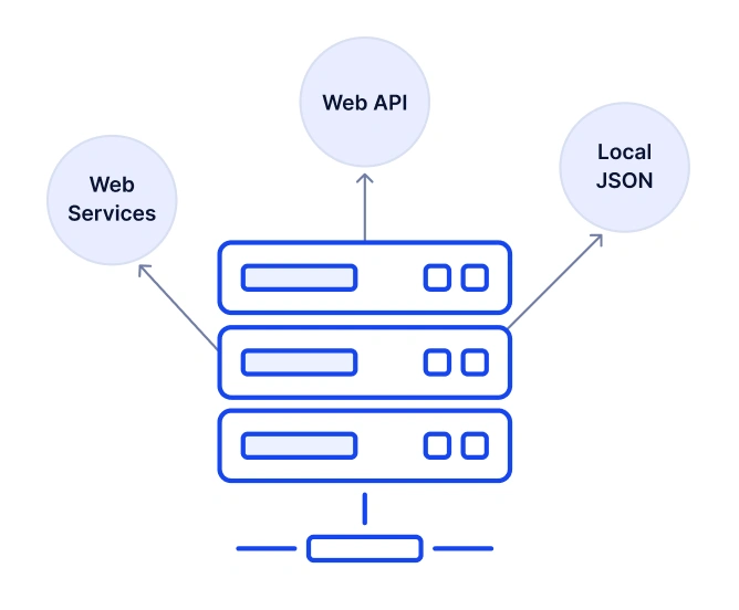
The Dropdown List component binds to local arrays or remote services with minimal configuration. Data mapping through the fields property supports text and value mapping, grouping, and custom query parameters for remote data.
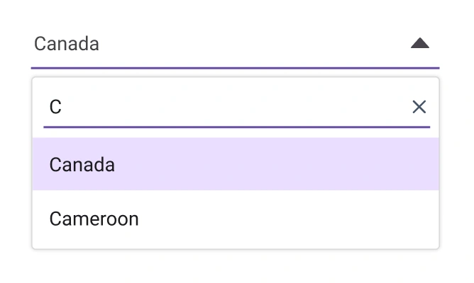
Filtering
Enable built-in filtering to find items quickly once the text is typed in the filter bar. The filter can also be configured for case sensitivity and custom predicates.
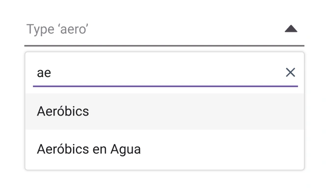
Diacritic filtering
Handle accented characters using diacritic-insensitive filtering to match input regardless of accent marks. This improves discoverability in multilingual datasets.
Sorting
Sort the list data in ascending or descending order with local or remote data using a simple configuration.
UI customization
Customize the UI’s appearance through CSS variables and theme support. Adjust pop-up width and height, item height, and the number of visible items; set placeholders, the clear button, and dropdown icon.
Header template
Add a header section inside the pop-up to introduce the list or provide context. The header supports custom HTML content and other React components.
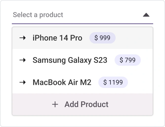
Footer template
Display helpful information or actions at the bottom of the pop-up using a footer template. Show totals, tips, or a link to add new items.
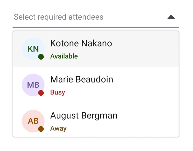
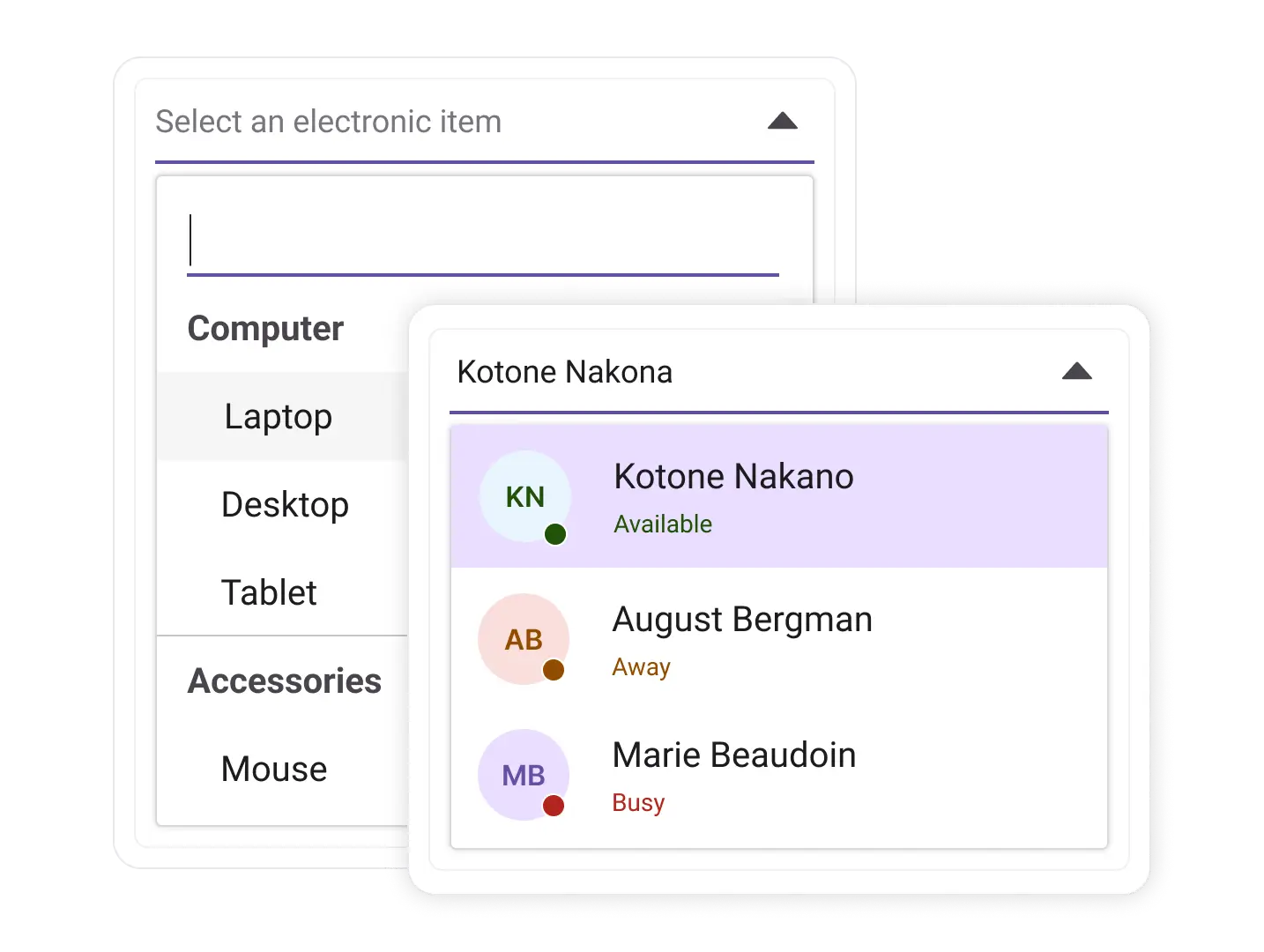
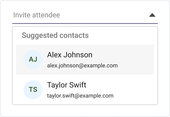
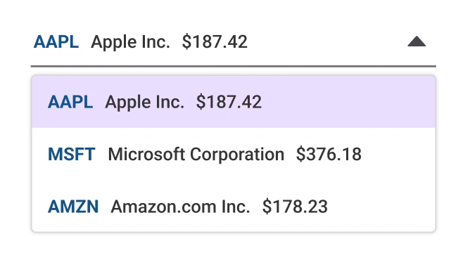
Item template
Render each list item with custom content such as images, badges, and multiline text using item templates. This is useful for visually rich lists like for products or contacts.
Value template
Customize the selected value display area with a value template. Include icons, tags, or additional context for the chosen item.
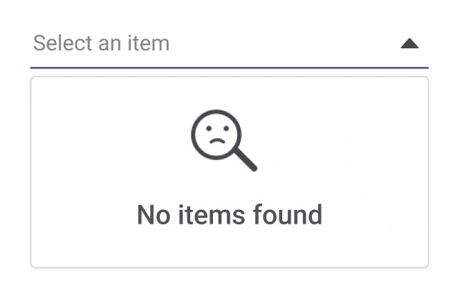
Empty record template
Show a friendly message or action when no items are found after filtering or when the data list is empty. The template accepts custom content.
Dropdown with icons
Display icons next to items to improve recognition and quick scanning. Icons can represent categories, countries, or status indicators.
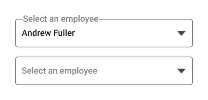
Floating label
Integrate a floating label to enhance clarity and save space. The label floats above the input when a value is selected or the control gains focus.
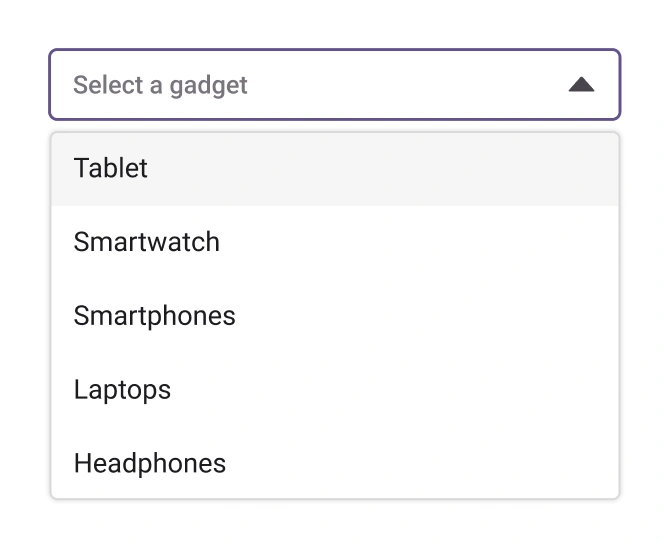
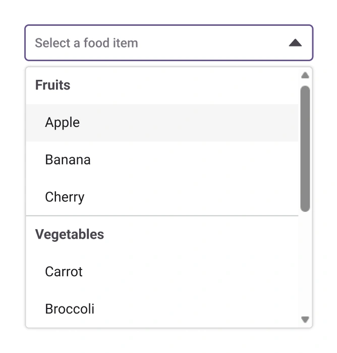
Grouping
Organize related options within a dropdown using grouping. This makes it easier for users to find what they need, especially when the list contains many items.
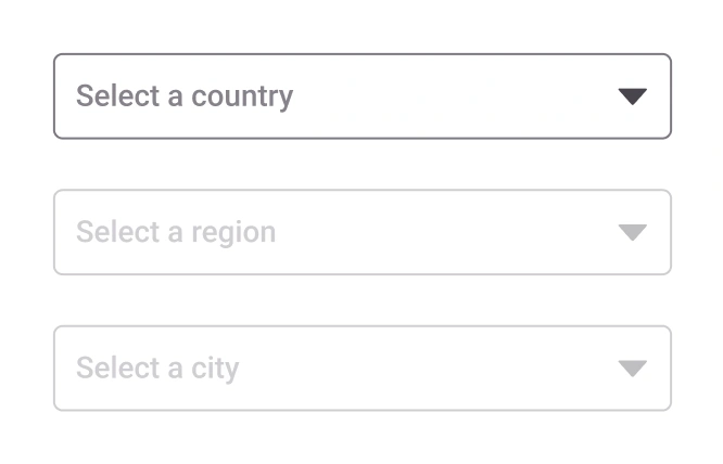
Cascading dropdown
Cascading dropdowns dynamically filter options based on the selection in a parent dropdown. They show users only relevant choices, improving accuracy and usability.
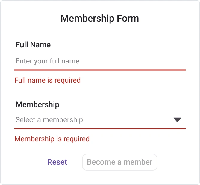
Forms
The Dropdown List is designed for seamless integration with React forms, providing reliable data binding and validation. This ensures consistent behavior and simplified state management for selection inputs within complex form structures.
Accessibility
Keyboard navigation for React Dropdown List access
The Dropdown List component is fully accessible using the keyboard. Core actions like opening the pop-up, navigating items, and making a selection can be performed using the keyboard to support inclusive applications.
Screen reader and accessibility
The Dropdown List view is compliant with WAI-ARIA accessibility standards. The UI includes high-contrast visuals for improved readability, and semantic roles and attributes provide accurate descriptions for assistive technologies.
Right-to-left (RTL) display
Right-to-left rendering mirrors the text and layout for RTL languages such as Arabic and Hebrew, improving readability and access in those locales.


Not sure how to create your first React Dropdown List? Our documentation can help.
Read the getting started guidePure React Components
Developed using React’s core principles, this library employs functional components and hooks without any external dependencies.
GRIDS
DATA VISUALIZATION
NAVIGATION
Frequently Asked Questions
Why should you choose the Syncfusion® React Dropdown List?
The Syncfusion React Dropdown List provides the following:
A lightweight component that is easily configurable.
Advanced capabilities including filtering, diacritic-insensitive searches, sorting, and complete template customization.
- Flexible data binding for local arrays and remote services.
- Simple configuration and intuitive API.
- Support for all modern browsers.
- A touch-friendly and responsive UI.
Extensive demos for quickly exploring features.
Where can I find the Syncfusion React Dropdown List demo?
You can find our React Dropdown List demo here. It demonstrates how to render and configure the component.
How do I enable filtering and sorting in the React Dropdown List?
Enable filtering using the filterable property and configure additional options such as filterType and minimum character threshold. Apply sorting via the sortOrder property to control ascending or descending order.
Can the Syncfusion React Dropdown List component be purchased separately?
No, 1,600+ components and frameworks for web, mobile, and desktop, including the React Dropdown List, are not sold individually. The pricing is positioned to be competitive relative to vendors that offer only a single dropdown component. Many customers adopt multiple components quickly, so a subscription provides access to all 1,600+ components. Additional discounts may be available depending on active promotions. Contact the product specialists to check eligibility for discounts.
Can the Syncfusion React Dropdown List be used for free?
This is a commercial product and requires a paid license. A free community license is available for companies and individuals whose organizations have less than 1 million USD in annual gross revenue, 5 or fewer developers, and 10 or fewer total employees.
How do I get started with the Syncfusion React Dropdown List?
Start with the comprehensive getting started documentation.
How do I customize the pop-up?
Use header template, footer template, and item template properties to inject custom markup. The value template customizes the selected value area, and the no records template displays content when no items are found.
See Real Success Stories
Developers around the world trust Syncfusion’s Essential Studio to simplify complex projects and speed up delivery. With a vast library of UI controls, powerful SDKs, and reliable support, Essential Studio helps teams build enterprise-ready applications with confidence.
Read Our Customer StoriesIndustry
Software development
75% Cost reduction
50% Faster development
Industry
Utilities (oil and gas)
450+ hours saved
Streamlined processes and hours of development effort saved.
Advanced, flexible features
Empowered users through robust and versatile functionality.
Industry
Software and technology
1000+ of hours saved
Accelerated development with enterprise-ready UI components.
Efficient file management
Streamlined workflows with document libraries without building them from scratch.
Industry
Software and technology
2 Years of delay avoided
Two years of delays prevented with proactive planning.
On-time delivery
Projects delivered on schedule using trusted controls.
Industry
IT services and IT consulting
Improved performance
Large datasets handled with easy customization and quick debugging.
Highly customizable
Plug-and-play controls with quick template integration.
Industry
Professional services
Instant access
Quick availability of features and resources.
Reduced dependencies
Fewer dependencies for faster development.
Rated by users across the globe
Syncfusion React Dropdown List resources


Awards
Greatness—it’s one thing to say you have it, but it means more when others recognize it. Syncfusion® is proud to hold the following industry awards.

