React Split Button – Interactive Button with Dropdown Options
- Support for primary, success, warning, info, and error button styles.
- Automatic collision detection and handling with pop-up menu flip-and-fit.
- Quick configuration for pop-up menu item customization.
- Enables execution of a primary action along with access to related tasks through an integrated dropdown menu.
Trusted by the world’s leading companies

Overview
The React Split Button is a versatile UI component that performs a default action when its main button is clicked, while offering a dropdown list of additional actions. It includes built-in support for icon integration and positioning, multiple size options, item disabling, separators, right-to-left (RTL) layouts, and extensive UI customization.
React Split Button code example
Get started with the React Split Button component using a few simple lines of TSX code, as demonstrated below. Explore this React Split Button example to see how to render and configure the Split Button component in React.
import { SplitButton } from '@syncfusion/react-splitbuttons';
export default function App() {
const items = [
{ text: 'My Profile' },
{ text: 'Friend Requests' },
{ text: 'Account Settings' },
{ text: 'Support' },
{ text: 'Log Out' }
];
return (
<div className='splitbutton-section'>
<SplitButton items={items} >Default</SplitButton>
</div>
);
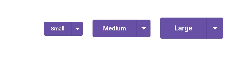
}Split Button sizes
Supports three size options, small, medium, and large, to accommodate various interface layouts and design requirements.
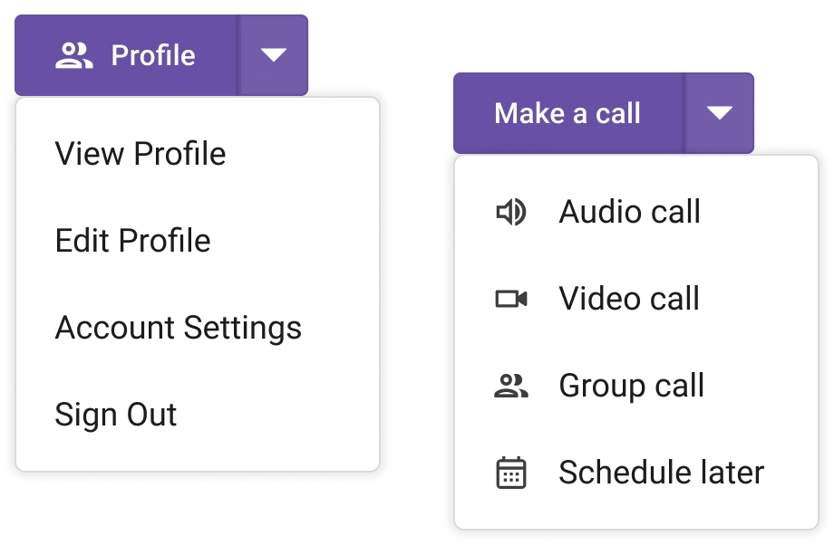
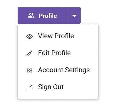
Menu items with icons
Visual elements are often more effective than text in capturing user attention. The React Split Button supports built-in options to include icons positioned to the left or above the label, or to display an icon-only button for a more compact and intuitive design.
Dropdown menu
The dropdown menu is a toggleable UI container that displays a list of action items or custom content when its button is clicked. Each item within the dropdown is fully customizable, allowing for tailored functionality and design.
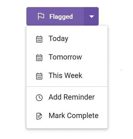
Menu divider and separator
Use a horizontal line separator to represent similar action items as a group within the list of available items.
Web accessibility
- Fully supports WAI-ARIA accessibility to work with screen readers and assistive devices.
- Follows WAI-ARIA best practices for implementing keyboard interaction.
- Follows WCAG 2.0 standards in the design of the UI visual elements, such as foreground color, background color, line spacing, text, and images.
- Supports right-to-left (RTL) text direction for users working in right-to-left languages like Hebrew, Arabic, or Persian.
Developer-friendly APIs
The Split Button offers control over all of its UI elements and their behaviors through a rich set of developer-friendly APIs, allowing you to provide the best user experience.


Not sure how to create your first React Split Button? Our documentation can help.
I’d love to read it nowPure React Components
Developed using React’s core principles, this library employs functional components and hooks without any external dependencies.
GRIDS
DATA VISUALIZATION
NAVIGATION
Frequently Asked Questions
Why should you choose the Syncfusion React Split Button?
- Built-in menu with icons, separators, and templates for fully customizable items.
- Multiple visual styles, sizes, and full theming support to match your application’s design.
- Keyboard navigation, focus management, and accessibility built to global guidelines and standards.
- Easy integration with forms and toolbars; supports a disabled state and RTL.
Simple configuration and comprehensive APIs.
- Works across all modern browsers; responsive and touch-friendly.
- One of the best React Split Buttons on the market.
Extensive demos to learn quickly and get started with the React Split Button.
Where can I find the Syncfusion React Split Button demo?
You can find our React Split Button demo here. It shows you how to render and configure the Split Button.
Can I download and utilize the Syncfusion React Split Button for free?
No, this is a commercial product and requires a paid license. However, a free Community License is also available for companies and individuals whose organizations have less than $1 million USD in annual gross revenue, 5 or fewer developers, and 10 or fewer total employees.
How do I get started with the Syncfusion React Split Button?
A good place to start would be our comprehensive getting started guide.
See Real Success Stories
Developers around the world trust Syncfusion’s Essential Studio to simplify complex projects and speed up delivery. With a vast library of UI controls, powerful SDKs, and reliable support, Essential Studio helps teams build enterprise-ready applications with confidence.
Read Our Customer StoriesIndustry
Software development
75% Cost reduction
50% Faster development
Industry
Utilities (oil and gas)
450+ hours saved
Streamlined processes and hours of development effort saved.
Advanced, flexible features
Empowered users through robust and versatile functionality.
Industry
Software and technology
1000+ of hours saved
Accelerated development with enterprise-ready UI components.
Efficient file management
Streamlined workflows with document libraries without building them from scratch.
Industry
Software and technology
2 Years of delay avoided
Two years of delays prevented with proactive planning.
On-time delivery
Projects delivered on schedule using trusted controls.
Industry
IT services and IT consulting
Improved performance
Large datasets handled with easy customization and quick debugging.
Highly customizable
Plug-and-play controls with quick template integration.
Industry
Professional services
Instant access
Quick availability of features and resources.
Reduced dependencies
Fewer dependencies for faster development.
Rated by users across the globe
Syncfusion React Split Button resources


Awards
Greatness—it’s one thing to say you have it, but it means more when others recognize it. Syncfusion® is proud to hold the following industry awards.

