Trusted by the world’s leading companies

Overview
Syncfusion® React Charts is a modern, feature-rich charting library designed for building responsive and interactive data visualizations in both web and mobile applications. It offers a collection of 20+ chart types suitable for a wide range of data visualization needs. With its optimized rendering engine, it handles large datasets efficiently, ensuring smooth performance. Built-in features like zooming, panning, tooltips, trackballs, crosshairs, highlight, and selection enhance interactivity and user engagement.
Why choose Syncfusion React Charts?
20+ chart types
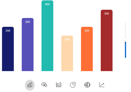
React Charts provides a comprehensive range of chart types, from common visualizations like line, area, pie, and financial charts to advanced, highly customizable options designed for complex data scenarios.
Axis types
React Charts supports a diverse set of axis types, including numeric, category, date-time, and logarithmic, enabling precise and adaptable data visualization for various scenarios.
Animation
React Charts delivers smooth, fluid animations that enhance the visual storytelling of data, providing seamless transitions during rendering and updates.
Performance
React Charts is engineered for high-performance rendering, capable of visualizing up to 100K data points in under a second for smooth, real-time data exploration even with large datasets.
Seamless data binding
Bind the chart to various local and remote data sources, such as JSON, OData, WCF, and RESTful web services, using a data manager that supports all custom APIs.
Globalization and localization
Users in different regions can format dates, numbers, and currencies to match their local preferences, ensuring a seamless experience.
Advanced, responsive, and comprehensive React charts built for your business
React Charts code example
Get started with React Charts using just a few lines of TSX code, as shown in the example below. You can also explore our interactive React Charts demo to see how to render and configure Charts in a React application.
import { Chart, ChartPrimaryXAxis, ChartSeriesCollection, ChartSeries } from '@syncfusion/react-charts';

export default function App() {
    const data = [
      { x: 'WW',    y: 38.3 },
      { x: 'EU',    y: 45.2 },
      { x: 'APAC',  y: 18.2 },
      { x: 'LATAM', y: 46.7 },
      { x: 'MEA',   y: 61.5 },
      { x: 'NA',    y: 64 }
    ];
    return (
        <Chart>
            <ChartPrimaryXAxis valueType='Category'>
            </ChartPrimaryXAxis>
            <ChartSeriesCollection>
              <ChartSeries dataSource={data} xField="x" yField="y" type="Line" />
            </ChartSeriesCollection>
        </Chart>
    )
}
Mobile-first approach
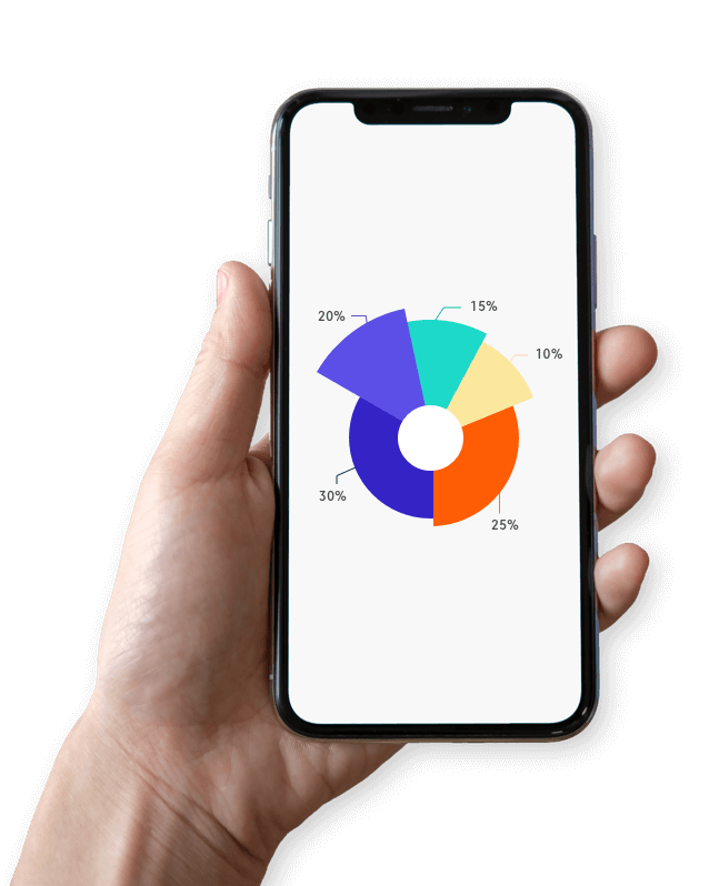
Build React charts using a single code base with a thoughtfully designed architecture that automatically adapts to web, mobile, and tablet environments. Deliver responsive, interactive, and animated charts that look great and perform smoothly on any device.
Accessibility

Keyboard navigation
All chart elements are fully accessible using a keyboard. Key features such as tooltips, legend toggling, zooming, and panning can be controlled entirely through keyboard interactions, eliminating the need for a mouse. This makes it easy to build inclusive and accessible applications with React Charts.

Screen readers
React Charts is designed in full alignment with WAI-ARIA guidelines, ensuring an inclusive experience for all users. The user interface features high contrast visuals that enhance readability for individuals with low vision. Clear and descriptive content is easily available to assistive technologies like screen readers, making the charts accessible and user-friendly.

Right to left (RTL)
React Charts can display text and layout elements from right to left, aligning with the reading direction of RTL languages. This enhances usability and accessibility for users who use languages such as Arabic, Hebrew, and Persian, delivering a more natural and intuitive experience.
Not sure how to create your first React charts? Our documentation can help.
I’d love to read it nowFrequently Asked Questions
Why should you choose Syncfusion’s React Charts?
20+ chart types and elegant animation.
Blazing-fast load times and rich UI interaction in React apps.
Flexible data binding with support to use local and remote data sources such as JSON, RESTful services, OData services, and WCF services.
- One of the best React Charts libraries on the market.
Simple configuration and APIs.
- Support for all modern browsers.
- Touch-friendly and responsive.
Expansive learning resources such as demos and documentation help you get started fast with the control.
Where can I find the Syncfusion React Charts demo?
You can find our React Charts demo here. It demonstrates how to render and configure the Charts library.
What are the features of the React Charts component?
React Charts offers features like interactive tooltips, zooming and panning, data labels, legends, markers, and highlight and selection. It also includes multiple chart types, such as line, area, pie, candlestick, range area and scatter charts.
What is React Charts?
React Charts is a powerful data visualization component that enables developers to create responsive and interactive charts for web and mobile applications. It supports multiple chart types and advanced customization options.
Can I download and utilize Syncfusion React Charts for free?
No, this is a commercial product and requires a paid license. However, a free community license is also available for companies and individuals whose organizations have less than $1 million USD in annual gross revenue and five or fewer developers, 5 or fewer developers, and 10 or fewer total employees.
How do I get started with Syncfusion React Charts?
A good place to start would be our comprehensive getting started documentation.
Is real-time data visualization possible in React Charts?
Yes, React Charts can display real-time data updates using WebSocket or similar technologies. Charts refresh dynamically to reflect changes in the data source without requiring a full reload.
How do you enable tooltips in React Charts?
To enable tooltips in Syncfusion React Charts, set the enable property to true in the ChartTooltip component. This will display detailed information when hovering over data points.
Awards
Greatness—it’s one thing to say you have it, but it means more when others recognize it. Syncfusion® is proud to hold the following industry awards.


