React DateRangePicker — A Highly Configurable Component
- Start and end dates can be set with presets, separators, and range limits.
- Built-in accessibility, customizable templates, and responsive pop-ups.
Trusted by the world’s leading companies

Overview
The DateRangePicker is a compact control for selecting a start and end date together. It includes presets for common ranges, optional separators, range restrictions, and responsive dialog behavior for small screens.
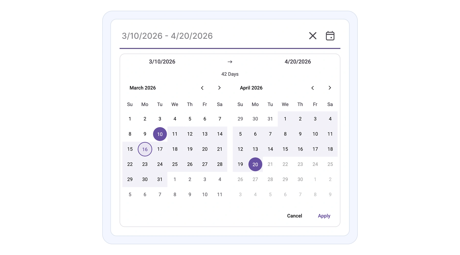
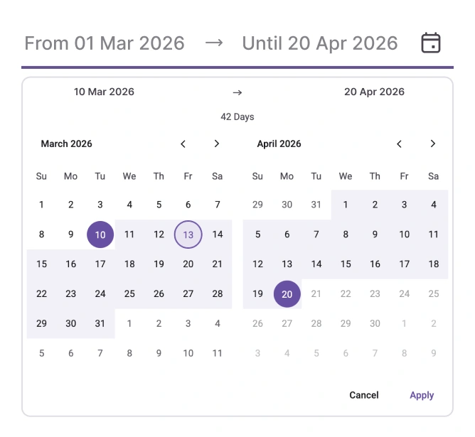
React DateRangePicker code example
Get started with a minimal TSX example that renders the default range picker.
import { DateTimePicker } from '@syncfusion/react-calendars';

export default function App() {

    return (
        <div className="component-section">
            <DateRangePicker defaultValue={[new Date(2026, 2, 10), new Date(2026, 3, 20)]} />
        </div>
    );
}
Controlled mode
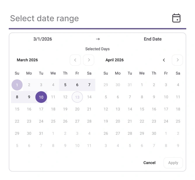
The component supports two modes. In controlled mode, the application keeps the selected range and updates the control so it always matches external state. In uncontrolled mode, the control manages its own value after an initial default.
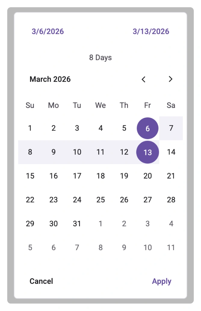
Range restrictions
Limit selection with business rules such as a maximum span, blocked days, or allowed windows to prevent invalid bookings.
Dialog mode
On small screens, the picker can open as a centered dialog to improve touch targets and reduce scrolling.
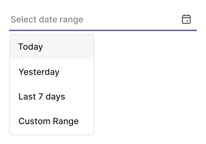
Presets
Provide one-click ranges like “Last 7 days” or “This month” so users select common ranges quickly.
Separator
Customize the visual separator between the start and end dates to match the product style and locale preferences.
Date constraints
Enforce minimum and maximum dates, working-day rules, or blackout periods so selections follow business policies.
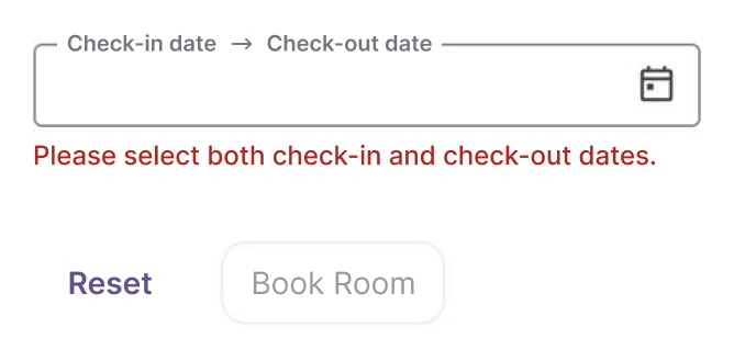
Forms
The DateRangePicker is designed for seamless integration with React forms, providing reliable data binding and validation. This ensures consistent behavior and simplified state management for selection inputs within complex form structures.
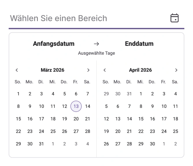
Internationalization and localization
The React DateRangePicker offers extensive internationalization capabilities, enabling adherence to various cultural date formats and the setting of the first day of the week according to regional preferences. Text elements, including month, day, and navigation controls, can be localized for use in many languages.
Accessibility
Keyboard navigation
Arrow, Enter, and Esc keys allow efficient selection without a mouse.
Screen reader support
Screen readers announce range changes and validation messages.
RTL support
Layout and pop-up alignment adapt for right-to-left languages.


Not sure how to create your first React DateRangePicker? Our documentation can help.
Read the getting started guidePure React Components
Developed using React’s core principles, this library employs functional components and hooks without any external dependencies.
GRIDS
DATA VISUALIZATION
NAVIGATION
Frequently Asked Questions
Why choose the Syncfusion React DateRangePicker?
The DateRangePicker provides:
- Presets for quick selection (for example, the last 7 days or this month).
- Range restrictions and blackout dates to enforce business rules.
- A responsive dialog mode for better mobile selection.
- Seamless form integration with inline feedback.
- Accessibility features and keyboard navigation.
Can the DateRangePicker be purchased separately?
The DateRangePicker is sold only as part of the full Essential Studio UI component suite. Contact our product specialists for licensing options: Contact us.
How do I get started with the DateRangePicker?
Begin with the getting started guide and review the demos for patterns and templates: Getting started documentation.
Does the DateRangePicker have demos?
Yes. Interactive examples and runnable projects are available at the demo site: React DateRangePicker demo.
Is there a free option?
A community license is available for qualifying developers and small organizations. See details: Community License.
See Real Success Stories
Developers around the world trust Syncfusion’s Essential Studio to simplify complex projects and speed up delivery. With a vast library of UI controls, powerful SDKs, and reliable support, Essential Studio helps teams build enterprise-ready applications with confidence.
Read Our Customer StoriesIndustry
Software development
75% Cost reduction
50% Faster development
Industry
Utilities (oil and gas)
450+ hours saved
Streamlined processes and hours of development effort saved.
Advanced, flexible features
Empowered users through robust and versatile functionality.
Industry
Software and technology
1000+ of hours saved
Accelerated development with enterprise-ready UI components.
Efficient file management
Streamlined workflows with document libraries without building them from scratch.
Industry
Software and technology
2 Years of delay avoided
Two years of delays prevented with proactive planning.
On-time delivery
Projects delivered on schedule using trusted controls.
Industry
IT services and IT consulting
Improved performance
Large datasets handled with easy customization and quick debugging.
Highly customizable
Plug-and-play controls with quick template integration.
Industry
Professional services
Instant access
Quick availability of features and resources.
Reduced dependencies
Fewer dependencies for faster development.
Rated by users across the globe
Syncfusion React DateRangePicker resources


Awards
Greatness—it’s one thing to say you have it, but it means more when others recognize it. Syncfusion® is proud to hold the following industry awards.

