React MultiSelect Dropdown for Forms: Search and Select with Tags
- Replace the HTML multi-select with a searchable, tag-based control.
- Built-in checkbox mode, filtering, grouping, and template customization.
Trusted by the world’s leading companies

Overview
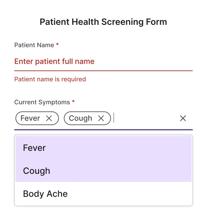
The MultiSelect Dropdown lets users type to filter and select multiple values, displaying choices as removable tags or with checkboxes. It supports simple arrays and remote endpoints, templates for items and values, grouping, and accessibility features.
React MultiSelect code example
Starter TSX showing a MultiSelect Dropdown bound to a small array.
import { MultiSelect } from '@syncfusion/react-dropdowns';

export const permissions: string[] = ['Read','Write','Delete','Update','Create','Download','Upload','Execute','Share','Archive','Restore','Approve','Reject','View','Manage Users','Configure Settings','Audit','Export','Import','Publish'];

export default function App() {
  return (
    <div className="component-section">
      <MultiSelect dataSource={permissions} placeholder="Grant permissions (e.g. Read)" />
    </div>
  );
}
Controlled mode
The MultiSelect Dropdown supports controlled and uncontrolled usage. Controlled mode gives external control of selected values (for example via value and change handlers) for form integration. Uncontrolled mode manages selection internally and is simpler for basic scenarios.
High performance
When virtualization is enabled, the control renders only visible items and uses on-demand loading to fetch additional items as users type or scroll, keeping performance smooth with very large datasets.
Flexible data binding
Bind the MultiSelect Dropdown to simple arrays, JSON collections, or remote endpoints. Server-side filtering and pagination keep payloads small while returning matching results for fast suggestion updates.
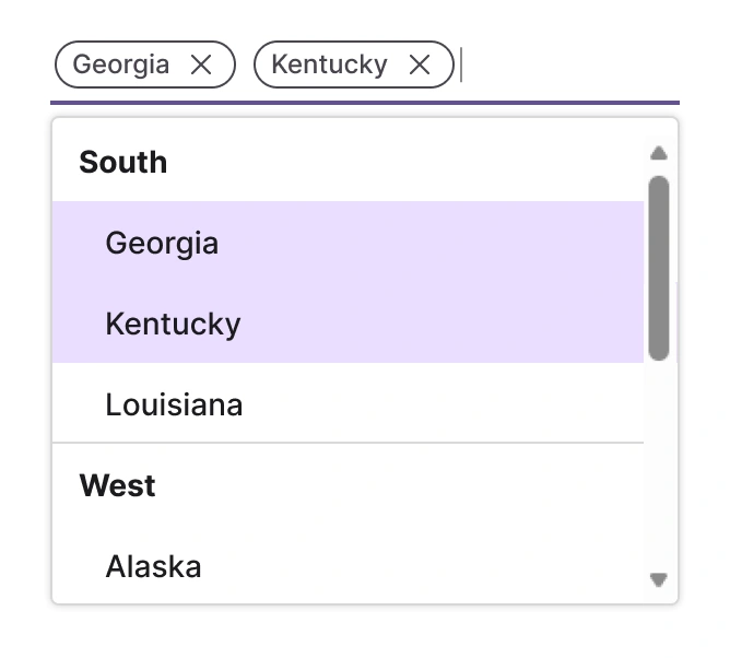
Render modes
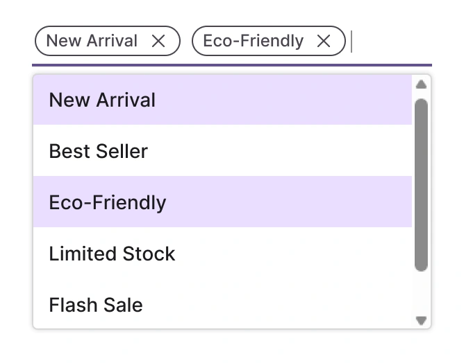
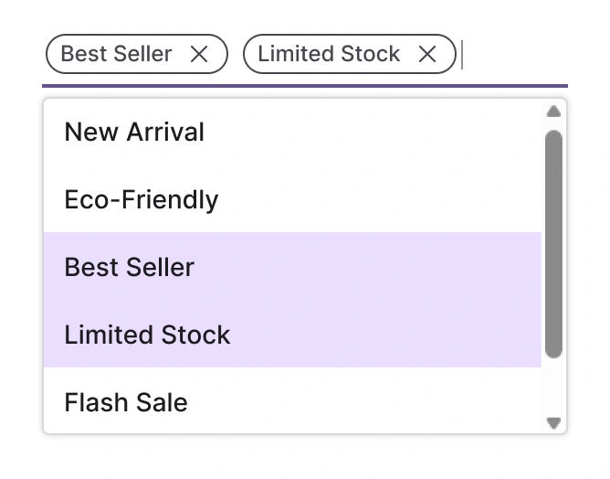
Chip mode (box mode)
Selected items are displayed as a chip (box) type in the MultiSelect Dropdown input box.
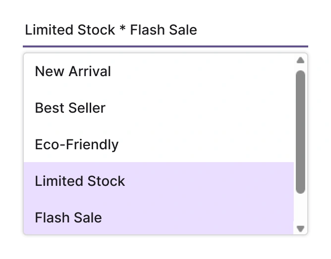
Delimiter mode
The selected items are displayed with a delimiter character in the MultiSelect Dropdown input box.
Hybrid mode (default mode)
By default, the selected items are displayed as chip type when the component is in focus. Otherwise, they’re displayed with a delimiter character.
Filtering
Built-in filtering helps users find items quickly. Filter settings include case sensitivity and minimum characters.
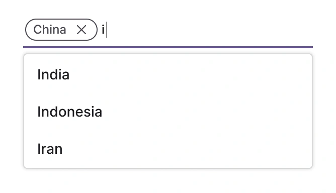
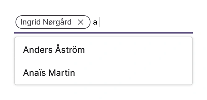
Diacritic-sensitive search
The MultiSelect Dropdown supports diacritic-sensitive searching so accented characters can be matched or ignored according to your needs; this behavior can be turned on or off.
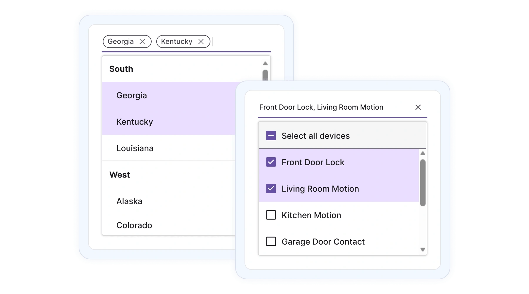
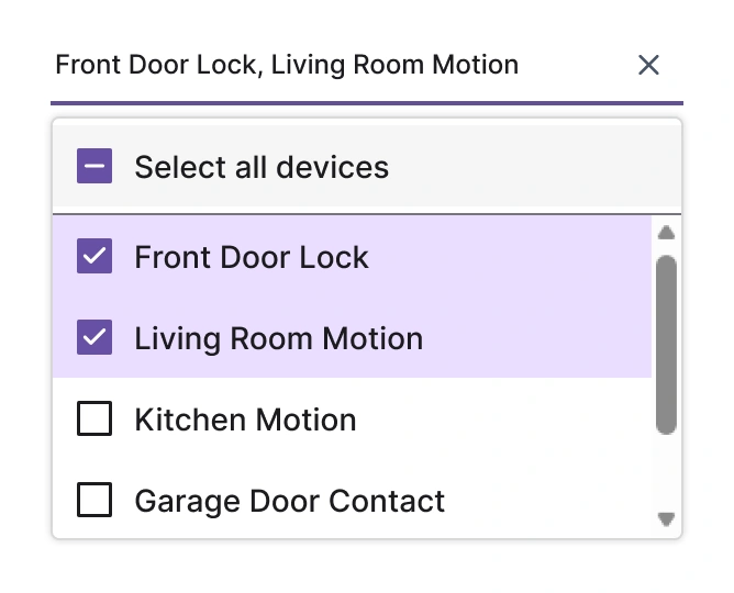
Checkbox selection
An optional checkbox mode provides easy multi-selection with a Select All option for long lists.
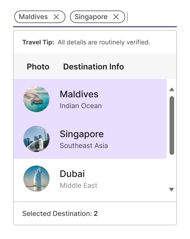
UI customization
Completely customize the MultiSelect Dropdown header, list items, and selected-value templates using template options. This helps users arrange their content in flexible formats like image view, multiline item views, and mixed-mode layouts.
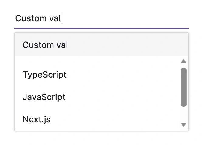
Tagging custom values
Allow users to enter values not present in the list and display them as tags.
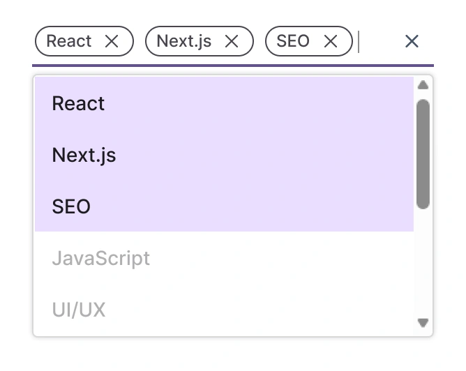
Maximum selection length
Limit how many items a user can select to prevent excessive tags and control data integrity. This is useful when selections map to business constraints.
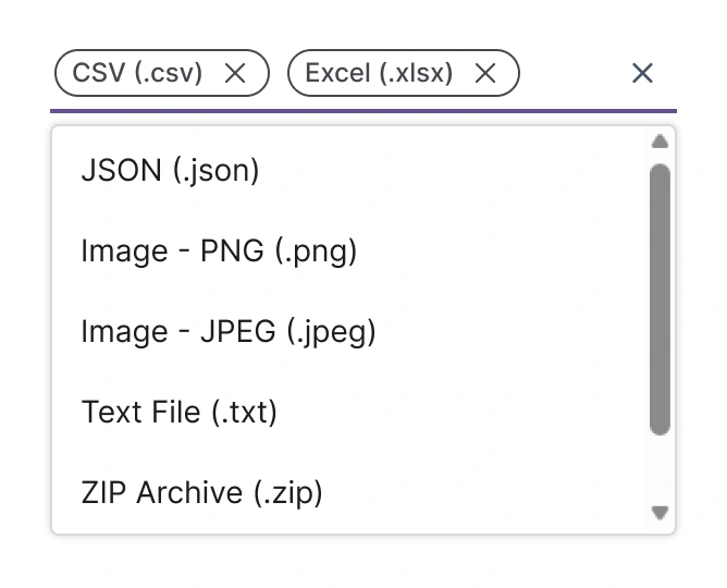
Hide selected items
Optionally hide already-selected items from the pop-up list to reduce clutter and avoid duplicate selection choices.
Forms
The MultiSelect Dropdown is designed for seamless integration with React forms, providing reliable data binding and validation. This ensures consistent behavior and simplified state management for selection inputs within complex form structures.
Accessibility
Keyboard navigation for React MultiSelect Dropdown
Navigate the input and pop-up with arrow keys, select with Enter or Space, and close with Esc for efficient keyboard-first workflows.
Screen reader and accessibility
Use ARIA roles, labeled regions, and live announcements so assistive technologies report selection changes and focus moves.
Right-to-left (RTL) rendering
Support mirrored layouts and input alignment for right-to-left languages to preserve readability and interaction patterns.


Not sure how to create your first React MultiSelect Dropdown? Start here:
Read the getting started guidePure React Components
Developed using React’s core principles, this library employs functional components and hooks without any external dependencies.
GRIDS
DATA VISUALIZATION
NAVIGATION
Frequently Asked Questions
Why choose the Syncfusion React MultiSelect Dropdown?
The React MultiSelect Dropdown delivers:
- High-performance rendering with virtualization and load-on-demand.
- Flexible templating for items, headers, and groups to match your UI.
- Grouping, nested navigation, and selection modes (single, multiple, checkbox).
- Built-in accessibility, keyboard navigation, and RTL support.
Can the MultiSelect Dropdown be purchased separately?
The MultiSelect Dropdown is part of the full Essential Studio UI component suite. Contact our product specialists for licensing and pricing: Contact us.
Is there a free option?
A free community license is available for qualifying developers and small organizations. See details: Community License.
Where do I find templates and API docs?
Templates, grouping, selection, and accessibility docs are available in the API docs and template guide.
Are there demos and examples?
Yes. Interactive examples and runnable projects are available at the demo site: React MultiSelect Dropdown demo.
How do I get started with the MultiSelect Dropdown?
Start with the getting-started guide and the template and virtualization examples in the docs: Getting started.
See Real Success Stories
Developers around the world trust Syncfusion’s Essential Studio to simplify complex projects and speed up delivery. With a vast library of UI controls, powerful SDKs, and reliable support, Essential Studio helps teams build enterprise-ready applications with confidence.
Read Our Customer StoriesIndustry
Software development
75% Cost reduction
50% Faster development
Industry
Utilities (oil and gas)
450+ hours saved
Streamlined processes and hours of development effort saved.
Advanced, flexible features
Empowered users through robust and versatile functionality.
Industry
Software and technology
1000+ of hours saved
Accelerated development with enterprise-ready UI components.
Efficient file management
Streamlined workflows with document libraries without building them from scratch.
Industry
Software and technology
2 Years of delay avoided
Two years of delays prevented with proactive planning.
On-time delivery
Projects delivered on schedule using trusted controls.
Industry
IT services and IT consulting
Improved performance
Large datasets handled with easy customization and quick debugging.
Highly customizable
Plug-and-play controls with quick template integration.
Industry
Professional services
Instant access
Quick availability of features and resources.
Reduced dependencies
Fewer dependencies for faster development.
Rated by users across the globe
Syncfusion React MultiSelect Dropdown resources


Awards
Greatness—it’s one thing to say you have it, but it means more when others recognize it. Syncfusion® is proud to hold the following industry awards.

