React Tooltip – Smart Positioning Pop-over for Contextual Information
- Adjusts the display position automatically based on the page.
- Supports custom content like icons, images, and HTML content.
- Includes built-in animations for opening and closing, making interactions more engaging.
- Offers sticky tooltip functionality to keep important information visible during scrolling.
- Allows custom opening triggers for greater flexibility and control over user interactions.
Trusted by the world’s leading companies

Overview
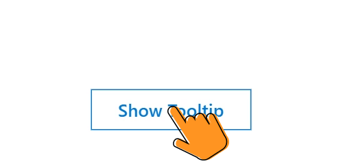
The React Tooltip is a small pop-up that shows helpful information when users hover, click, focus, or touch elements like images, buttons, or links. It can display plain text, images, links, or even custom templates, making it flexible and useful for different scenarios.
React Tooltip code example
Create a tooltip in React with a message and target element to make it fully functional. The component provides options to change the position, animation, integration modes, and appearance.
Get started with the React Tooltip by using a few simple lines of TSX code, as demonstrated below. Also, explore this React Tooltip demo, which shows how to render and configure the component.
import { Tooltip } from '@syncfusion/react-popups';
import UserIcon from './user-icon';
import { Button, Variant, Color, Size } from '@syncfusion/react-buttons';

export default function App() {

    return (<div className="component-section tooltip-section">
        <Tooltip content={<>Profile</>} >
            <Button variant={Variant.Standard} color={Color.Secondary} icon={<UserIcon />}></Button>
        </Tooltip>
    </div>);
}
Controlled and uncontrolled modes
The React Tooltip component supports both controlled and uncontrolled modes, offering flexibility in managing its state. This dual-mode capability allows integration into a wide range of application architectures, accommodating different state management strategies.
Tooltip positions
The React Tooltip component offers 12 different positioning options around the target element. A tooltip can be configured to follow the mouse cursor or remain static. For the tip pointer, four directional options are available: right, left, top, and bottom.
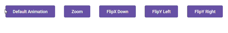
Animate tooltip
The React Tooltip supports fully customizable animations, which can be shown or hidden as needed. Animation settings include effect type, duration, and delay. Transition effects can also be controlled globally at the application level.
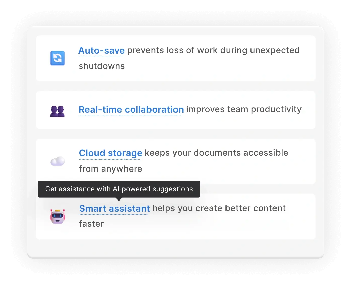
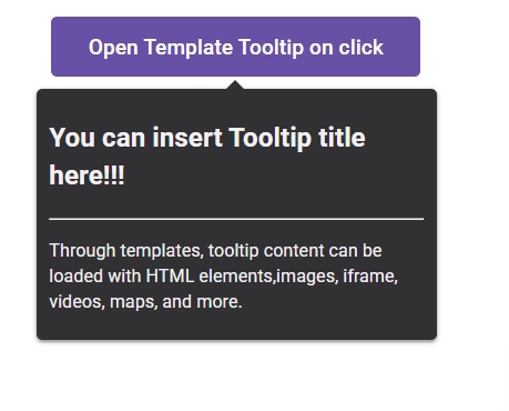
Tooltip content
The React Tooltip can display a wide range of content, including HTML elements, images, links, iframes, videos, and maps. A title can also be added to give more context to the displayed information.
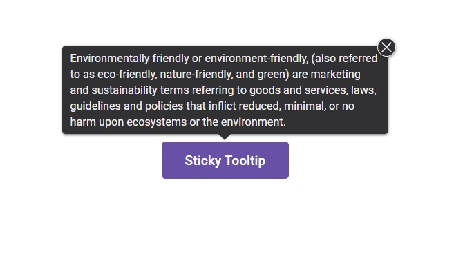
Sticky tooltip
Sticky mode prevents the tooltip from automatically hiding after a short duration, allowing it to remain visible until manually dismissed or triggered by another event.
Display behavior
The React Tooltip can be displayed or hidden based on various interaction modes, including hover, click, focus, double-click, and custom triggers.
Offset position
The offset position of the tooltip can be customized to adjust its distance from the target element.
Dimension customization
Tooltip dimensions can be configured using automatic sizing or custom pixel values for height and width. This enables flexible control over the tooltip’s layout to suit various design requirements.
Touch-friendly
The user experience is smooth on touch devices such as phones and tablets as the component recognizes touch gestures.
Accessibility
-
Fully supports WAI-ARIA, making the component accessible to screen readers and assistive devices.
-
Follows the WCAG 2.0 standard in the design of UI visual elements, such as foreground color, background color, line spacing, text, and images.
-
Follows WAI-ARIA best practices for implementing keyboard interaction.
Developer-friendly APIs
The Tooltip component provides extensive control over all UI elements and behaviors. A rich set of developer-friendly APIs ensures seamless integration and enhances the overall user experience.


Not sure how to create your first React Tooltip? Our documentation can help.
I’d love to read it nowPure React Components
Developed using React’s core principles, this library employs functional components and hooks without any external dependencies.
GRIDS
DATA VISUALIZATION
NAVIGATION
Frequently Asked Questions
Why should you choose the Syncfusion® React Tooltip component?
Automatic adjustment of display position based on view page dimensions.
Tooltip content can be customized with icons, images, and much more.
Opening and closing of the popover can be enhanced with out-of-the-box animations.
Simple configuration and APIs.
- Support for all modern browsers.
- Best react tooltip library in the market.
- Touch-friendly and responsive UI.
Expansive learning demos help you get started quickly.
How do I get started with the Syncfusion React Tooltip?
A good place to start would be our comprehensive getting started documentation.
Where can I find the Syncfusion React Tooltip demo?
Find our React Tooltip demo here. It demonstrates how to render and configure the Tooltip.
See Real Success Stories
Developers around the world trust Syncfusion’s Essential Studio to simplify complex projects and speed up delivery. With a vast library of UI controls, powerful SDKs, and reliable support, Essential Studio helps teams build enterprise-ready applications with confidence.
Read Our Customer StoriesIndustry
Software development
75% Cost reduction
50% Faster development
Industry
Utilities (oil and gas)
450+ hours saved
Streamlined processes and hours of development effort saved.
Advanced, flexible features
Empowered users through robust and versatile functionality.
Industry
Software and technology
1000+ of hours saved
Accelerated development with enterprise-ready UI components.
Efficient file management
Streamlined workflows with document libraries without building them from scratch.
Industry
Software and technology
2 Years of delay avoided
Two years of delays prevented with proactive planning.
On-time delivery
Projects delivered on schedule using trusted controls.
Industry
IT services and IT consulting
Improved performance
Large datasets handled with easy customization and quick debugging.
Highly customizable
Plug-and-play controls with quick template integration.
Industry
Professional services
Instant access
Quick availability of features and resources.
Reduced dependencies
Fewer dependencies for faster development.
Rated by users across the globe
Syncfusion React Tooltip resources


Awards
Greatness—it’s one thing to say you have it, but it means more when others recognize it. Syncfusion® is proud to hold the following industry awards.

