React Autocomplete - High-Performance Predictive Text Input
- Fast suggestion rendering with support for large data sets.
- Rich templates, diacritic-aware search, and accessible keyboard navigation.
Trusted by the world’s leading companies

Overview
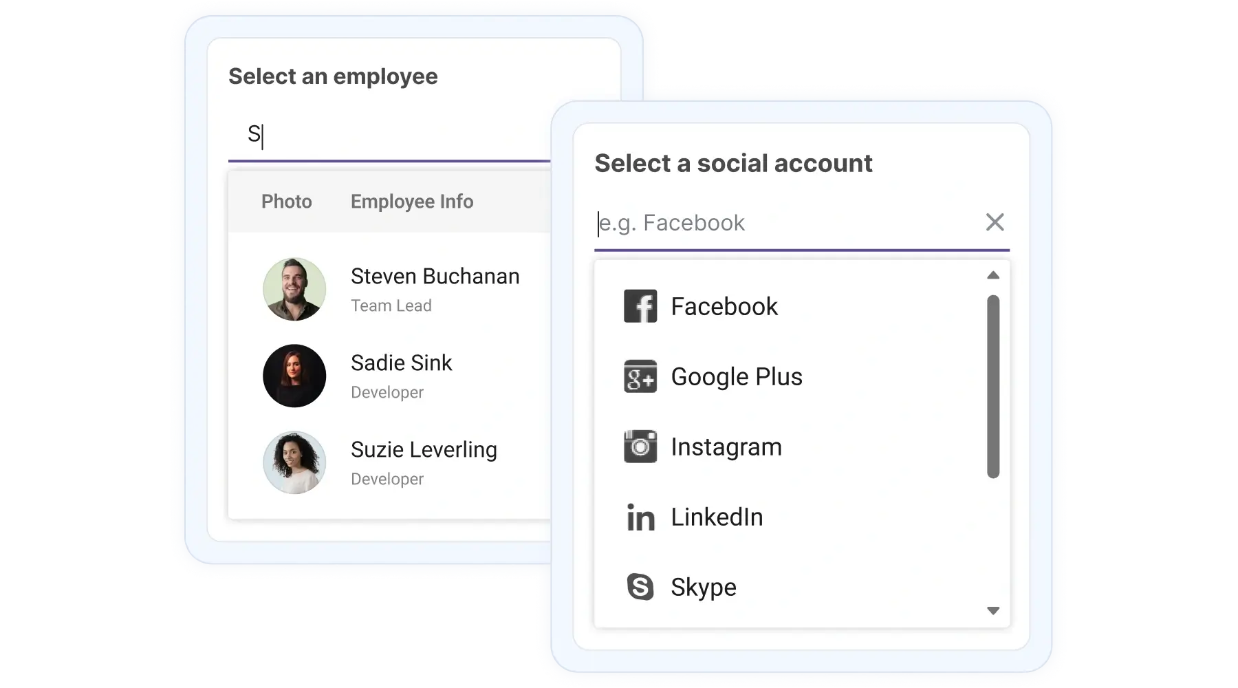
The React Autocomplete component shows matching suggestions while typing. It supports autofilling and highlighting matching text, binds to simple arrays or remote data sources, offers flexible filtering options, and provides templates for items, headers, footers, and selected values.
React Autocomplete code example
Get started quick with a minimal TSX example. This renders an Autocomplete bound to a simple array:
import { Autocomplete } from '@syncfusion/react-dropdowns';

const sports: string[] = ['Badminton', 'Cricket', 'Football', 'Golf', 'Hockey', 'Tennis'];

export default function App() {
    return (
        <div className="component-section">
            <Autocomplete dataSource={sports} placeholder="Select a sport" />
        </div>
    );
}
Controlled mode
The Autocomplete component supports both controlled and uncontrolled modes. The controlled mode provides full control over updating and displaying values, typically via the value prop and onChange event, for easier integration with forms. The uncontrolled mode manages its own internal state for the selected value. It is simpler to use, requires less code, and is initialized with a defaultValue prop, making it ideal for basic input.
High performance
With the virtualization feature, Autocomplete displays only the visible items and loads additional suggestions on demand as users type. This ensures fast, smooth performance even when working with very large datasets.
Flexible data binding
Connect the Autocomplete to remote APIs (JSON, OData) using a data manager to fetch matching suggestions on demand. Server-side queries return only relevant results, avoiding large downloads.
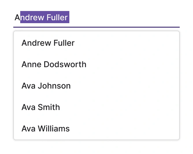
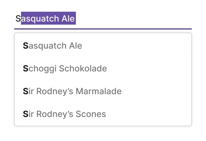
Autofill search
Enable autofill to populate the input with the first match as the user types, reducing keystrokes for predictable choices.
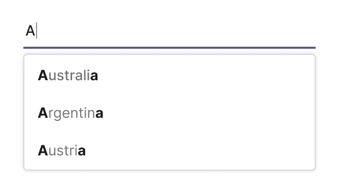
Highlighting text
Highlighting matching substrings in suggestion items helps users scan results quickly.
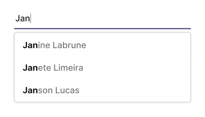
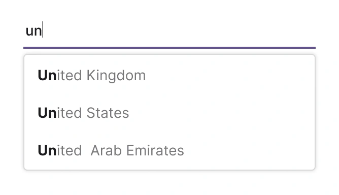
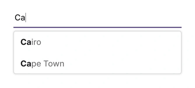
Filtering
The built-in filtering includes a rich set of options to meet different application needs. Filter data based on starts with, ends with, and contains predicates.
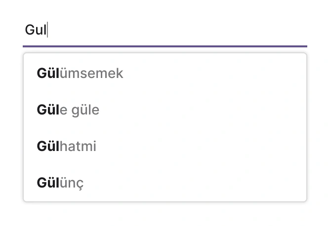
Diacritic-sensitive search
Handle accented characters properly by normalizing strings or enabling diacritic-aware comparison in the filter.
Limit suggestion items
Control the number of visible suggestions to improve performance and reduce processing load. Configure the pop-up’s maximum height or item count.
Ignore filter-text casing
Case-insensitive matching is recommended for common inputs. Normalize both source and query text for consistent behavior.
Minimum filter characters
Set how many characters must be typed before suggestions appear. This helps narrow down results for very short queries and improves performance with large datasets.
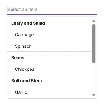
Grouping
Display suggestions in categories with headers to make long lists easier to scan.
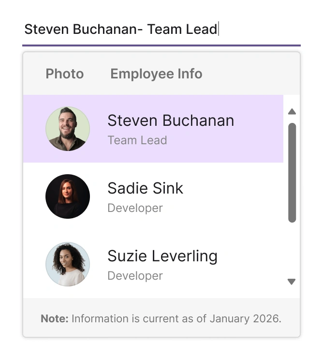
UI customization
Quickly style the pop-up and list items with templates. Use templates to render items, headers, footers, and the selected value for a consistent, compact UI.
Floating label
Integrate a floating label to enhance clarity and save space. The label floats above the input when a value is selected or the control gains focus.
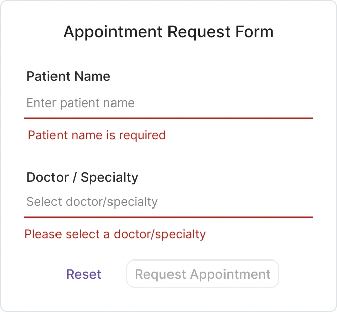
Forms
The Autocomplete is designed for seamless integration with React forms, providing reliable data binding and validation. This ensures consistent behavior and simplified state management for selection inputs within complex form structures.
Accessibility
Keyboard navigation for React Autocomplete access
Navigate suggestions with arrow keys, select with Enter, and close with Esc for an efficient keyboard experience.
Screen readers and accessibility
Use ARIA roles and live regions so that screen readers can announce suggestion updates and selection events.
Right-to-left (RTL) rendering
Enable RTL mode to mirror layout and pop-up alignment for right-to-left languages like Arabic or Hebrew.


Not sure how to create your first React Autocomplete? Our documentation can help.
Read the getting started guidePure React Components
Developed using React’s core principles, this library employs functional components and hooks without any external dependencies.
GRIDS
DATA VISUALIZATION
NAVIGATION
Frequently Asked Questions
Why should you choose the Syncfusion® React Autocomplete?
The Syncfusion React Autocomplete delivers:
- Fast suggestion rendering for large lists.
- Flexible data binding and server-side filtering support.
- Extensive templating for item, header, footer, and value content.
- Accessibility features and keyboard navigation.
- RTL and diacritic-aware search.
Can the Syncfusion React Autocomplete component be purchased separately?
No, our 1,600+ components and frameworks for web, mobile, and desktop, including the React Autocomplete, are not sold individually. The pricing is positioned to be competitive relative to vendors that offer only a single Autocomplete component. Many customers adopt multiple components quickly, so a subscription provides access to all 1,600+ components. Additional discounts may be available depending on active promotions. Contact our product specialists to check eligibility for discounts.
Can the Syncfusion React Autocomplete be used for free?
This is a commercial product and requires a paid license. However, a free community license is available for companies and individuals whose organizations have less than 1 million USD in annual gross revenue, 5 or fewer developers, and 10 or fewer total employees.
How do I get started with the Syncfusion React Autocomplete?
Start with the comprehensive getting started documentation.
Does the Autocomplete component have demos?
Yes. Explore interactive examples and runnable projects at the following demo site: React Autocomplete demo.
Where can I find the Syncfusion React Autocomplete demo?
You can find our React Autocomplete demo here. It demonstrates how to render and configure the component.
Where do I find templates and examples?
Templates and examples are available in the API docs and demo pages for item, header, footer, and value templates. You can also refer to our template guide.
See Real Success Stories
Developers around the world trust Syncfusion’s Essential Studio to simplify complex projects and speed up delivery. With a vast library of UI controls, powerful SDKs, and reliable support, Essential Studio helps teams build enterprise-ready applications with confidence.
Read Our Customer StoriesIndustry
Software development
75% Cost reduction
50% Faster development
Industry
Utilities (oil and gas)
450+ hours saved
Streamlined processes and hours of development effort saved.
Advanced, flexible features
Empowered users through robust and versatile functionality.
Industry
Software and technology
1000+ of hours saved
Accelerated development with enterprise-ready UI components.
Efficient file management
Streamlined workflows with document libraries without building them from scratch.
Industry
Software and technology
2 Years of delay avoided
Two years of delays prevented with proactive planning.
On-time delivery
Projects delivered on schedule using trusted controls.
Industry
IT services and IT consulting
Improved performance
Large datasets handled with easy customization and quick debugging.
Highly customizable
Plug-and-play controls with quick template integration.
Industry
Professional services
Instant access
Quick availability of features and resources.
Reduced dependencies
Fewer dependencies for faster development.
Rated by users across the globe
Syncfusion React Autocomplete resources


Awards
Greatness—it’s one thing to say you have it, but it means more when others recognize it. Syncfusion® is proud to hold the following industry awards.

