Trusted by the world’s leading companies

Overview
The React Sidebar, also called the side navigation menu, can be used to simplify the navigation hierarchy. Users can place primary or secondary content alongside the main content in this control. It provides a flexible container that can be expanded or collapsed based on user interactions. Any type of HTML content or component can be placed in the Sidebar for quick access and easy navigation, like quick references, menus, lists, and tree views.
React Sidebar Code Example
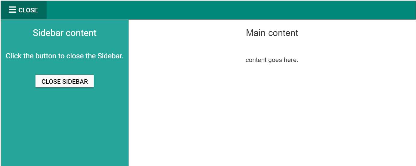
Easily get started with React Sidebar using a few simple lines of TSX code, as demonstrated below. Also explore our React Sidebar Example that shows you how to render and configure the React Sidebar Component.
import { SidebarComponent } from '@syncfusion/ej2-react-navigations';
import * as React from 'react';
function App() {
    return (
        <div className="control-section">
            <div id="wrapper">
                <SidebarComponent id="default-sidebar">
                    <div className="title"> Sidebar content</div>
                </SidebarComponent>
                <div className="content">
                    <div className="title">Main content</div>
                    <div className="sub-title"> content goes here</div>
                </div>
            </div>
        </div>
    )
}
Transition and animation
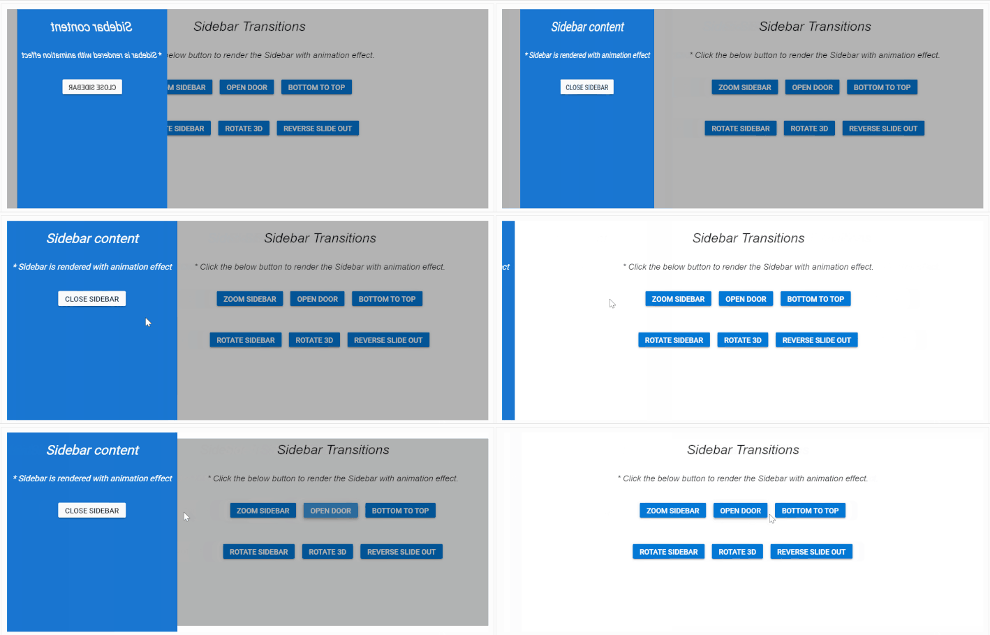
Different types of slide-out content in the Sidebar component give users the flexibility to view or hide content over or above the main content by pushing, sliding, or overlaying it.
HTML content positioning to the sides
The React Sidebar component positions its content to the left or right side of the main content area. This option allows the placement of two sidebars in a page, to the left and right, to show primary and secondary content simultaneously.
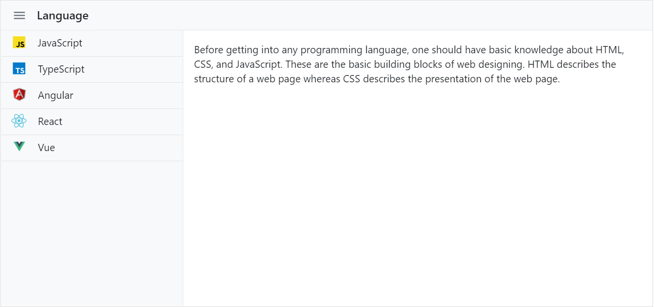
Dock the HTML side panel content
When the side content is docked to give the main content more space, the navigation text is represented as a shortened view of icons.
Toggle sidebar menu in React
Bind custom actions to an element (hamburger menu or buttons) to toggle the Sidebar.
Responsive sidebar
Auto closing the Sidebar component’s content allows the main content area to be more readable.


Animate sidebar
Show or hide the React Sidebar with CSS3 animation effects.
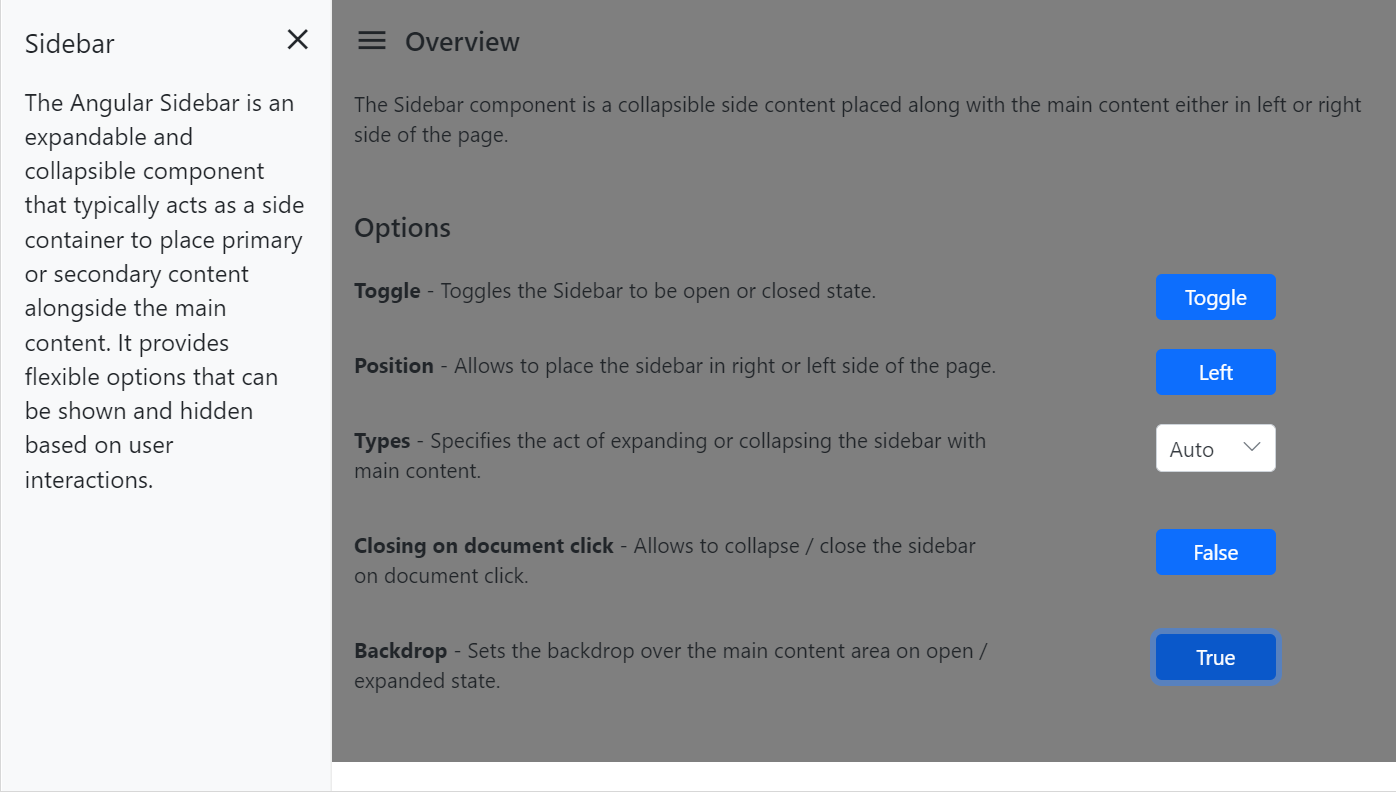
Backdrop
Apply a shadow effect to the content area until the Sidebar menu closes.


Incorporate Syncfusion controls
Easily integrate any Syncfusion React UI controls within the Sidebar.
Fit to target
React Sidebar can render within any HTML target element.


Mobile-friendly side navigation menu
The React Sidebar component’s responsive mode gives an adaptive, redesigned UI appearance for mobile devices.
Media query
Control the expand and close behavior of React Sidebar based on screen resolution.
Developer-friendly APIs
Developers have control over all the UI elements and behaviors of the components to provide the best user experience with a rich set of developer-friendly APIs.
Not sure how to create your first React Sidebar? Our tutorial videos and documentation can help.
I’d love to watch it now I’d love to read it nowDiscover Syncfusion’s Complete React Component Ecosystem
Explore over 145+ React UI components featuring established, production-ready controls and the latest pure React components built natively for modern web app development.
-
React Components
-
Pure React Components
-
SMART COMPONENTSGRIDSDATA VISUALIZATIONDROPDOWNSFILE VIEWERS & EDITORSBUTTONSINTERACTIVE CHATINPUTSNAVIGATIONFORMSNOTIFICATIONS
-
GRIDSDATA VISUALIZATIONNAVIGATIONINPUTS
Build Document Workflows in React
Embed PDF viewing, Word document editing, and Excel-like spreadsheet processing in your React app to streamline document workflows and help teams collaborate on files without context switching or external dependencies.
Frequently Asked Questions
Why should you choose Syncfusion React Sidebar?
The Syncfusion React Sidebar control supports the following features:
- A simple side navigation menu with docking options.
- A progressive layout can be built by pushing, sliding, or overlaying the Sidebar content.
- A responsive and touch-friendly design for easy interaction.
- Simple configuration and APIs
- Supports all modern browsers.
- Mobile-touch friendly and responsive.
Expansive learning resources such as demos and documentation to learn quickly and get started with React Sidebar.
Where can I find the Syncfusion React Sidebar demo?
You can find our React Sidebar demo, which demonstrates how to render and configure the Sidebar.
Can I download and utilize the Syncfusion React Sidebar for free?
No, this is a commercial product and requires a paid license. However, a free community license is also available for companies and individuals whose organizations have less than $1 million USD in annual gross revenue, 5 or fewer developers, and 10 or fewer total employees.
How do I get started with Syncfusion React Sidebar?
A good place to start would be our comprehensive getting started documentation.
Our Customers Love Us


 Documentation
Awards
Greatness—it’s one thing to say you have it, but it means more when others recognize it. Syncfusion® is proud to hold the following industry awards.


