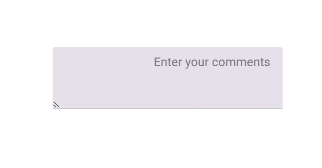
React TextArea – Accessible Multi-Line Input with Floating Labels
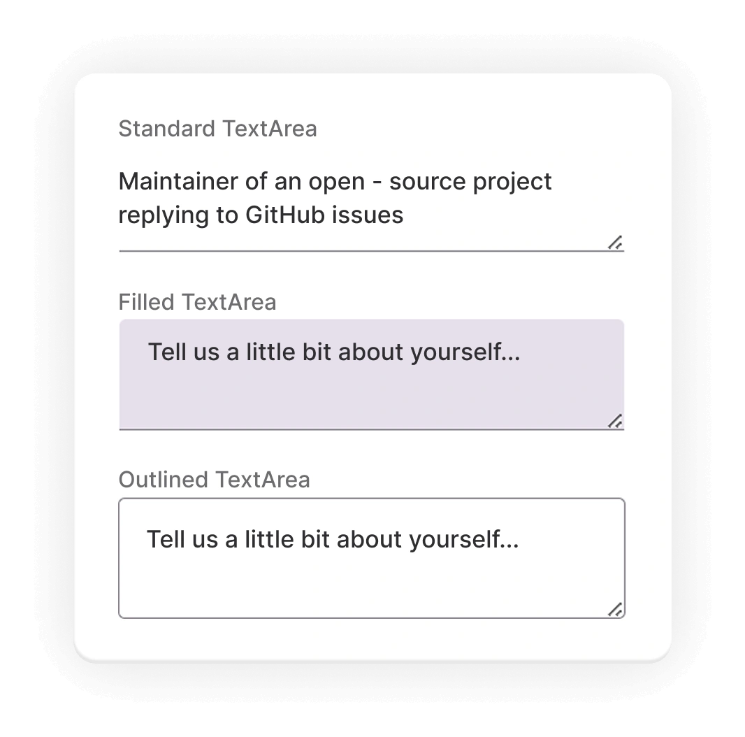
- An alternate for the regular HTML text area, styled with Syncfusion’s UI theme.
- Easy to create with features like resize handles, clear icons, and validation messages.
- Users can enter multiple lines of text effortlessly, maintaining a clean and modern interface.
- Floating labels for a neat and user-friendly experience.
- Built-in accessibility support with ARIA attributes for better usability.
Trusted by the world’s leading companies

Overview
The React TextArea is a basic input field used to enter multiple lines of text, like comments or messages. It is an improved version of the regular HTML text area by offering features like clear icons to reset input easily, floating labels for a clean, modern look, size options to fit different layout needs, and validation messages to guide users.
React TextArea code example
Get started with the React TextArea using a few simple lines of TSX code as demonstrated below. Also, explore the React TextArea demo that shows how to render and configure the TextArea in React.
import { TextArea } from '@syncfusion/react-inputs';
export default function App() {
return (
<div className="component-section">
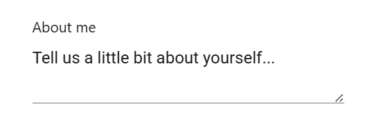
<div>About me</div>
<TextArea defaultValue={'Tell about yourself...'} width={300} />
</div>
);
};Controlled mode
The React TextArea component supports both controlled and uncontrolled modes, offering flexibility in managing its state. This dual-mode capability allows integration into a wide range of application architectures, accommodating different state management strategies.
Floating label
The floating label feature improves the user experience by smoothly moving the label above the text area when the user starts typing. This makes the input field look clean and helps users understand what the field is for.

Resizing
The React TextArea can be resized based on user preferences. With built-in resizing modes, users can easily adjust the height and width of the text area, making it more comfortable and easier to use.
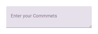
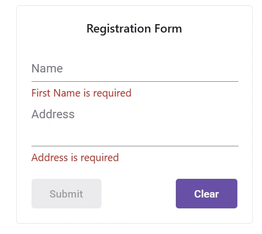
Form support
The React TextArea component integrates smoothly into HTML forms, allowing easy data entry and submission. It supports native form validation, helping maintain data accuracy and providing clear feedback to users.
Right-to-left (RTL) rendering
The React TextArea component supports right-to-left (RTL) rendering. This enhances user experience and accessibility for users of RTL languages.
Maximum length
The React TextArea supports a maximum character limit to control how much text can be entered. This helps prevent too much input, keeps data clean, and saves storage space.
Rows and columns count
The React TextArea allows easy adjustment of its size by setting the number of rows and columns to fit neatly into any layout or design.
Developer-friendly APIs
Developers can control the appearance and behaviors of the TextArea in React, including its floating label, using a rich set of APIs.


Not sure how to create your first React TextArea? Our documentation can help.
I’d love to read it nowPure React Components
Developed using React’s core principles, this library employs functional components and hooks without any external dependencies.
GRIDS
DATA VISUALIZATION
NAVIGATION
Frequently Asked Questions
Why should you choose Syncfusion React TextArea?
- An enhanced multiline input area with a modern UI and floating labels.
- Auto-resize to fit content, with min/max row constraints and a character counter.
- Size variants to match your layout needs.
Simple configuration and rich APIs.
- Globalization, accessibility, and right-to-left (RTL) support.
- Support for all modern browsers.
- Touch-friendly and responsive design.
- One of the best React TextAreas on the market that offers a feature-rich UI to capture longer user input.
Extensive demos to help you learn quickly and get started with React TextArea.
Where can I find the Syncfusion React TextArea demo?
You can find our React TextArea demo here, which demonstrates how to render and configure the TextArea.
Can I download and utilize the Syncfusion React TextArea for free?
No, this is a commercial product and requires a paid license. However, a free Community License is also available for companies and individuals whose organizations have less than $1 million USD in annual gross revenue, 5 or fewer developers, and 10 or fewer total employees.
How do I get started with the Syncfusion React TextArea?
A good place to start would be our comprehensive getting started guide.
See Real Success Stories
Developers around the world trust Syncfusion’s Essential Studio to simplify complex projects and speed up delivery. With a vast library of UI controls, powerful SDKs, and reliable support, Essential Studio helps teams build enterprise-ready applications with confidence.
Read Our Customer StoriesIndustry
Software development
75% Cost reduction
50% Faster development
Industry
Utilities (oil and gas)
450+ hours saved
Streamlined processes and hours of development effort saved.
Advanced, flexible features
Empowered users through robust and versatile functionality.
Industry
Software and technology
1000+ of hours saved
Accelerated development with enterprise-ready UI components.
Efficient file management
Streamlined workflows with document libraries without building them from scratch.
Industry
Software and technology
2 Years of delay avoided
Two years of delays prevented with proactive planning.
On-time delivery
Projects delivered on schedule using trusted controls.
Industry
IT services and IT consulting
Improved performance
Large datasets handled with easy customization and quick debugging.
Highly customizable
Plug-and-play controls with quick template integration.
Industry
Professional services
Instant access
Quick availability of features and resources.
Reduced dependencies
Fewer dependencies for faster development.
Rated by users across the globe
Syncfusion React TextArea resources


Awards
Greatness—it’s one thing to say you have it, but it means more when others recognize it. Syncfusion® is proud to hold the following industry awards.

