React ChipList – Flexible and Interactive Chip Collections UI
- Simple content represented in a compact element.
- Single and multiple selection are supported.
- Built-in support to disable, remove, and customize chip lists.
Trusted by the world’s leading companies

Overview
The React ChipList component is a collection of chips that provides small blocks of text information. A ChipList can also contain avatars, images, letters, and close icons. It can be used as tags when filtering contacts and email inboxes, selecting choices from available options, and providing input to an application.

React ChipList code example
Get started with the React ChipList using a few lines of TSX code, as demonstrated below. Also, explore this React ChipList demo, which shows how to render and configure a ChipList in React.
import { ChipList, ChipItemProps } from '@syncfusion/react-buttons';
import UserIcon from './user-icon';

export default function App() {
    const users: ChipItemProps[] = [
        { text: 'Margaret', value: '1', leadingIconUrl: 'https://react.syncfusion.com/react-ui/images/common/margaret.png' },
        { text: 'Michael', value: '2', leadingIcon: <UserIcon /> }
    ];

    return (
        <div className="component-section">
            <ChipList chips={users} aria-label='User display list'>
            </ChipList>
        </div>
    );
}
Filter chips
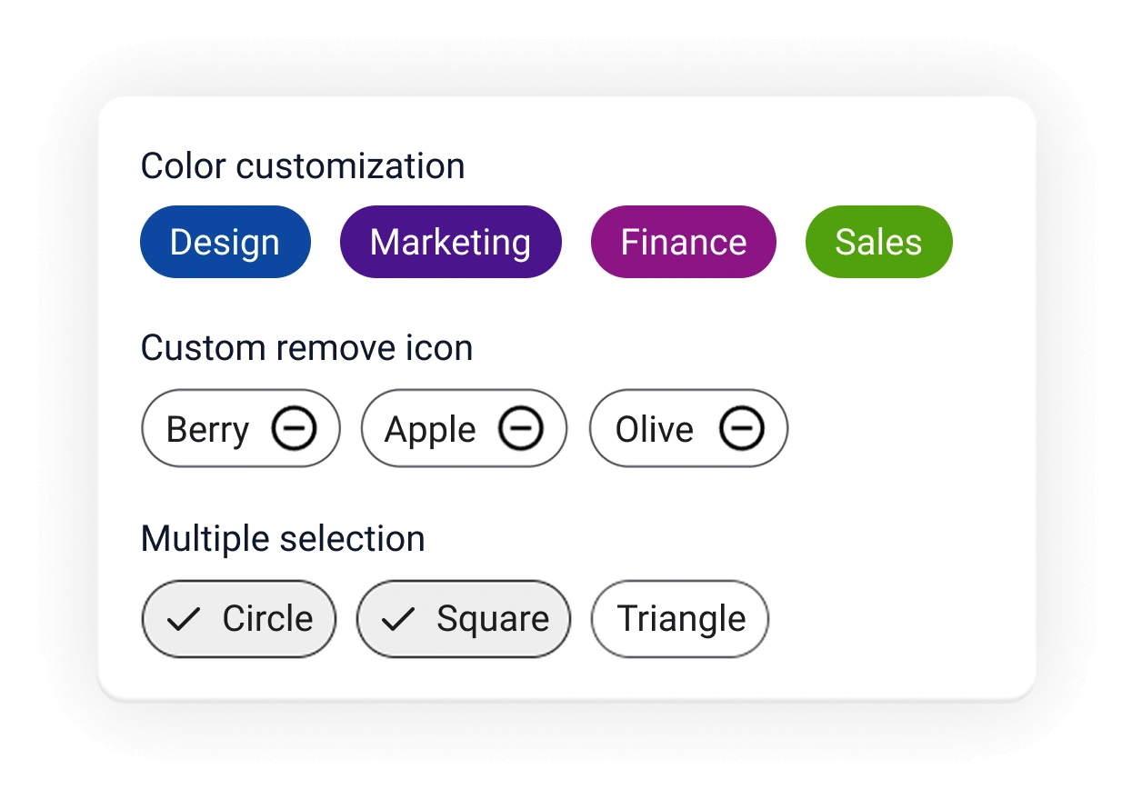
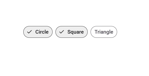
The React ChipList supports both single and multiple selection modes, allowing users to choose one or more chips from a group based on the interaction requirements. The select icon is customizable.
Dynamic chips
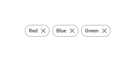
An individual chip can be removed from a group using the delete icon. This interaction allows dynamic management of chip collections. The remove icon is customizable as needed.
ChipList UI customization
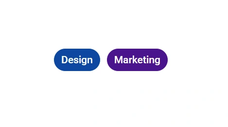
Enhance the appearance of the ChipList component with color customization options to better match your application’s design.
Controlled mode
Controlled mode in the ChipList component allows users to manage the component’s state explicitly through React state hooks instead of relying on the component’s internal state. This gives users more control over the component’s behavior and enables integration with other parts of the application.


Not sure how to create your first React ChipList? Our documentation can help.
I’d love to read it nowPure React Components
Developed using React’s core principles, this library employs functional components and hooks without any external dependencies.
GRIDS
DATA VISUALIZATION
NAVIGATION
Frequently Asked Questions
Why should you choose the Syncfusion® React ChipList?
The Syncfusion React ChipList provides the following features:
- Representation of simple content in a compact element.
Single and multiple selection types, plus a built-in remove icon.
Extensive customization options.
Simple configuration and APIs.
- Support for all modern browsers.
Expansive learning demos to help you learn quickly and get started with React ChipList.
Where can I find the Syncfusion React ChipList demo?
Find our React ChipList demo here. It demonstrates how to render and configure the ChipList.
Can I download and utilize the Syncfusion React ChipList for free?
No, this is a commercial product and requires a paid license. However, a free Community License is also available for companies and individuals whose organizations have less than $1 million USD in annual gross revenue, 5 or fewer developers, and 10 or fewer total employees.
How do I get started with the Syncfusion React ChipList?
A good place to start would be our comprehensive getting started documentation.
See Real Success Stories
Developers around the world trust Syncfusion’s Essential Studio to simplify complex projects and speed up delivery. With a vast library of UI controls, powerful SDKs, and reliable support, Essential Studio helps teams build enterprise-ready applications with confidence.
Read Our Customer StoriesIndustry
Software development
75% Cost reduction
50% Faster development
Industry
Utilities (oil and gas)
450+ hours saved
Streamlined processes and hours of development effort saved.
Advanced, flexible features
Empowered users through robust and versatile functionality.
Industry
Software and technology
1000+ of hours saved
Accelerated development with enterprise-ready UI components.
Efficient file management
Streamlined workflows with document libraries without building them from scratch.
Industry
Software and technology
2 Years of delay avoided
Two years of delays prevented with proactive planning.
On-time delivery
Projects delivered on schedule using trusted controls.
Industry
IT services and IT consulting
Improved performance
Large datasets handled with easy customization and quick debugging.
Highly customizable
Plug-and-play controls with quick template integration.
Industry
Professional services
Instant access
Quick availability of features and resources.
Reduced dependencies
Fewer dependencies for faster development.
Rated by users across the globe
Syncfusion React ChipList resources


Awards
Greatness—it’s one thing to say you have it, but it means more when others recognize it. Syncfusion® is proud to hold the following industry awards.

