React Date Range Picker - A Highly Configurable Component
- An advanced daterangepicker component with highly customizable options.
- A first Material-designed daterangepicker for all devices.
- A rich feature set including spans of days, range restriction, predefined dates (like last 30 days), validation, and automatic formatting takes this component to the next level of usage.

Quick Overview Video
Trusted by the world’s leading companies

Overview
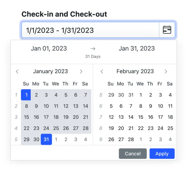
The React Date Range Picker is a lightweight and mobile-friendly component that allows end users to select start and end date values as a range from a calendar pop-up or by entering values directly in the HTML input text box.
Why choose Syncfusion React DateRangePicker?
Customizable date formats
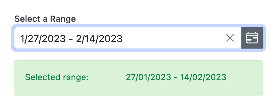
The React DateRangePicker component’s input value can be customized in addition to the default culture-specific date format.
Preset range
Define preset ranges (like last 30 days or last week) to set date ranges frequently used by the end users.
Adapts to any resolution
The React Date Range Picker has a highly responsive layout and an optimized design for desktops, touch screens, and smart phones. It works well on all mobile phones that use iOS, Android, or Windows OS.
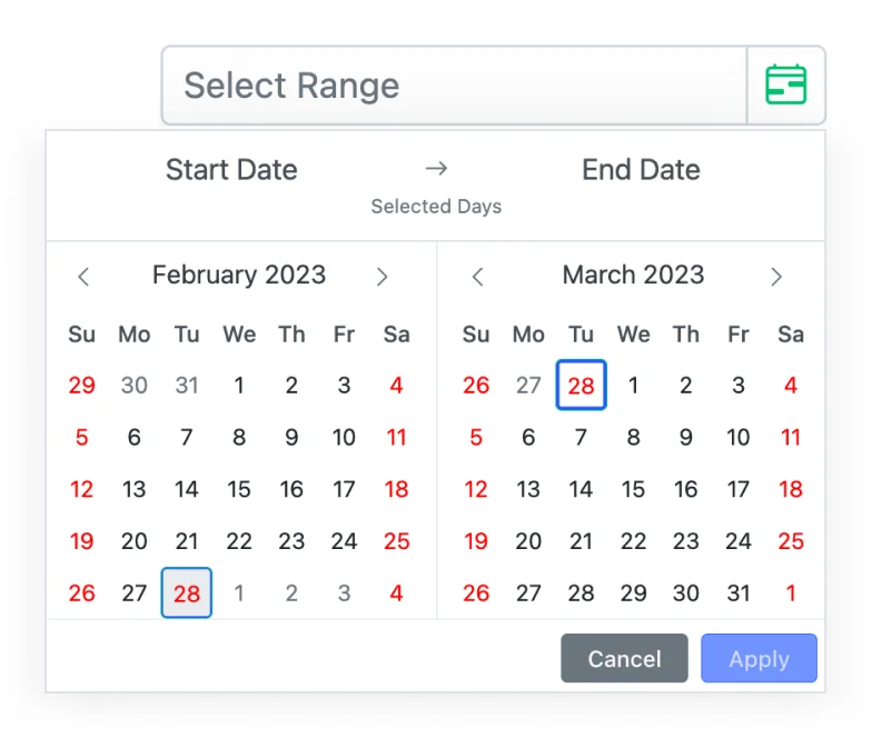
Specific date restrictions
Restricts dates outside the min and max date ranges, allowing only valid dates to be entered. Users cannot enter or choose restricted dates.
Attractive customizable themes
Cutting edge design with 5+ built-in themes such as Fluent, Tailwind CSS, Bootstrap, Material, Fabric, and more. Utilize the online Theme Studio tool to customize themes of Date Range Picker easily.
Globalization and localization
Enables users from different locales to use the DateRangePicker by formatting dates, currency, and numbering to suit preferences.
React Date Range Picker Code Example
Easily get started with the React DateRangePicker using a few simple lines of TSX code example as demonstrated below. Also explore our React Date Range Picker Example that shows you how to render and configure a Date Range Picker in React.
import * as ReactDOM from 'react-dom';
import * as React from 'react';
import { DateRangePickerComponent } from '@syncfusion/ej2-react-calendars';
import { SampleBase } from '../common/sample-base';
import './default-style.css';
export class Default extends SampleBase<{}, {}> {
render() {
return (
<div className='control-pane'>
<div className='control-section'>
<div className='daterangepicker-control-section'>
<DateRangePickerComponent></DateRangePickerComponent>
</div>
</div>
</div>
)
}
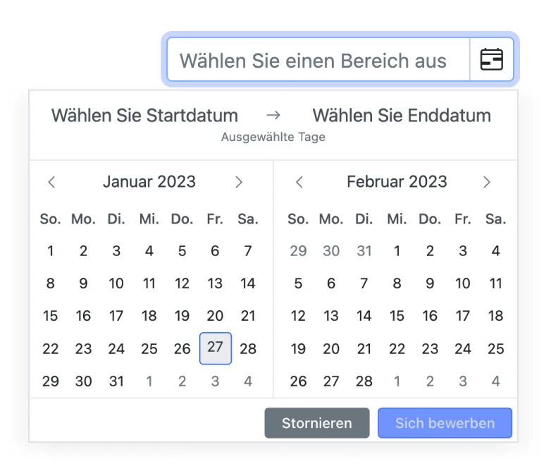
}Multi-language Date Range Picker
A multi-language React Date Range Picker allows changing the names of months, days, and the today button text to any supported language (globalization). The date format and first day of the week are set to a specific culture.
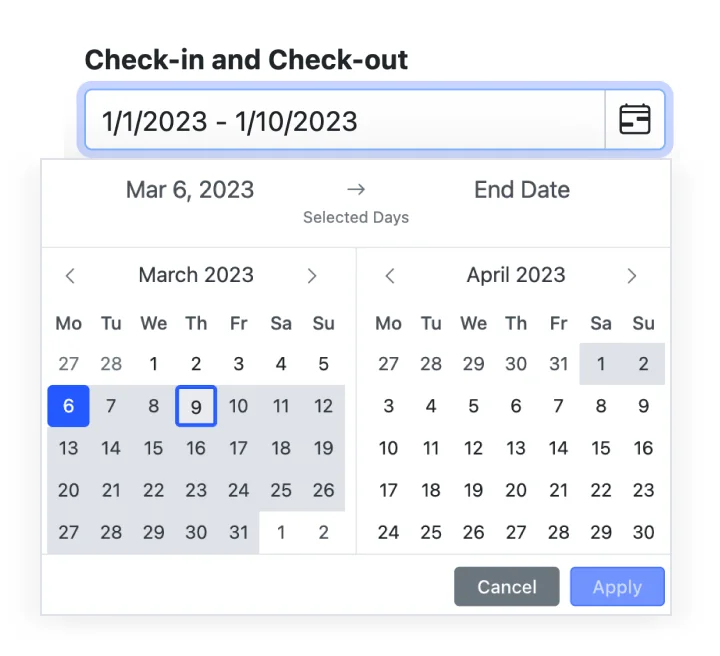
Date selection within a range
Enter or select a date within a specific range of dates by defining the min and max properties.
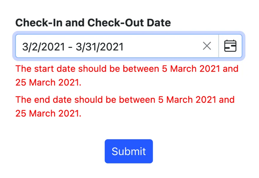
Date-range validation
The React DateRangePicker allows only valid dates to be entered by restricting dates out-of-min and out-of-max date ranges. This prevents users from entering or selecting restricted dates from a date range.
Customize DateRangePicker
Control the appearance of the component. Customize the style based on your application’s look and feel. Also change the format of the day that to be displayed in header.
Week numbers
Show the week numbers in the pop-up calendar.
First day of week
Change the first day of the week in every month of a year.
Accessibility

Keyboard navigation
The React DateRangePicker component ensures that every cell is accessible using the keyboard. Major features like sort, select, and edit can be performed using keyboard commands alone; no mouse interaction is required. This helps in creating highly accessible applications using this component.

Screen reader
The React DateRangePicker view has complete WAI-ARIA accessibility support. The DateRangePicker UI includes high-contrast visual elements that help visually impaired people to have the best viewing experience. Also, valid UI descriptions are easily accessible through assistive technologies such as screen readers.

Right to left (RTL)
Right-to-left rendering allows displaying the text and layout of the React DateRangePicker from right to left. This improves the user experience and accessibility for RTL languages.


Not sure how to create your first React Date Range Picker? Our tutorial videos and documentation can help.
I’d love to watch it now I’d love to read it nowDiscover Syncfusion’s Complete React Component Ecosystem
Explore over 140+ React UI components featuring established, production-ready controls and the latest pure React components built natively for modern web app development.
-
React Components
-
Pure React Components
-
SMART COMPONENTSGRIDSDATA VISUALIZATIONDROPDOWNSFILE VIEWERS & EDITORSBUTTONSINTERACTIVE CHATINPUTSNAVIGATIONFORMSNOTIFICATIONS
-
GRIDSDATA VISUALIZATIONNAVIGATION
Standalone UI SDKs
Integrate the DataGrid, Chart, Scheduler, Gantt, Rich Text Editor, File Manager, and Diagram UI components into applications to enable rich interaction and visualization, delivering a seamless user experience.
Document Solutions
Integrate the PDF Viewer, DOCX Editor, Spreadsheet Editor, and document-processing libraries into the React applications to enable a smooth user experience.
Frequently Asked Questions
Why should you choose Syncfusion React Date Range Picker?
The Syncfusion React Range Picker provides the following features:
An advanced DateRangePicker component with highly customizable options.
Provides month range picker option.
A rich feature set including spans of days, range restriction, predefined dates (like last 30 days), validation, and automatic formatting takes this component to the next level of usage.
- One of the best React DateRangePicker in the market that offers feature-rich UI to interact with the software.
Simple configuration and API.
- Supports all modern browsers.
- Mobile-touch friendly and responsive.
Expansive learning resources such as demos and documentation to learn quickly and get started with React Date Range Picker.
Where can I find the Syncfusion React Date Range Picker demo?
You can find our React Date Range Picker demo, which demonstrates how to render and configure the Date Range Picker.
Can I download and utilize the Syncfusion React Date Range Picker for free?
No, this is a commercial product and requires a paid license. However, a free community license is also available for companies and individuals whose organizations have less than $1 million USD in annual gross revenue, 5 or fewer developers, and 10 or fewer total employees.
How do I get started with Syncfusion React Date Range Picker?
A good place to start would be our comprehensive getting started documentation.
Our Customers Love Us
Having an excellent set of tools and a great support team, Syncfusion® reduces customers’ development time.Here are some of their experiences.

Aweseome, enough said. really
Easy usability, solving real life problems. easy to implement. most of the cases has the operators and settings possibilities you right away need. never fails to impress

Oliver O,

Geschäftsführung Kreation/Artdirektion, Small-Business
A giant framework with great pricing options
I have loved the components and options that Syncfusion has, besides, its documentation, demos, and Support are excellent.

Alejandro Javier V,
CEO, Small-Business
See Real Success Stories
Developers around the world trust Syncfusion’s Essential Studio to simplify complex projects and speed up delivery. With a vast library of UI controls, powerful SDKs, and reliable support, Essential Studio helps teams build enterprise-ready applications with confidence.
Read Our Customer StoriesIndustry
Software development
75% Cost reduction
50% Faster development
Industry
Utilities (oil and gas)
450+ hours saved
Streamlined processes and hours of development effort saved.
Advanced, flexible features
Empowered users through robust and versatile functionality.
Industry
Software and technology
1000+ of hours saved
Accelerated development with enterprise-ready UI components.
Efficient file management
Streamlined workflows with document libraries without building them from scratch.
Industry
Software and technology
2 Years of delay avoided
Two years of delays prevented with proactive planning.
On-time delivery
Projects delivered on schedule using trusted controls.
Industry
IT services and IT consulting
Improved performance
Large datasets handled with easy customization and quick debugging.
Highly customizable
Plug-and-play controls with quick template integration.
Industry
Professional services
Instant access
Quick availability of features and resources.
Reduced dependencies
Fewer dependencies for faster development.
Rated by users across the globe
Syncfusion React Date Range Picker Resources


UI Kits
 Figma Download
Figma Download
Awards
Greatness—it’s one thing to say you have it, but it means more when others recognize it. Syncfusion® is proud to hold the following industry awards.

