React Calendar - Customizable, Accessible Date Selection UI
- A highly configurable and lightweight date selection component.
- Incorporates advanced functionalities such as view modes, date range management, and week number display.
- Offers flexible and interactive selection of multiple dates in a calendar.
- Easy to customize and integrate with any React application.
Trusted by the world’s leading companies

Overview
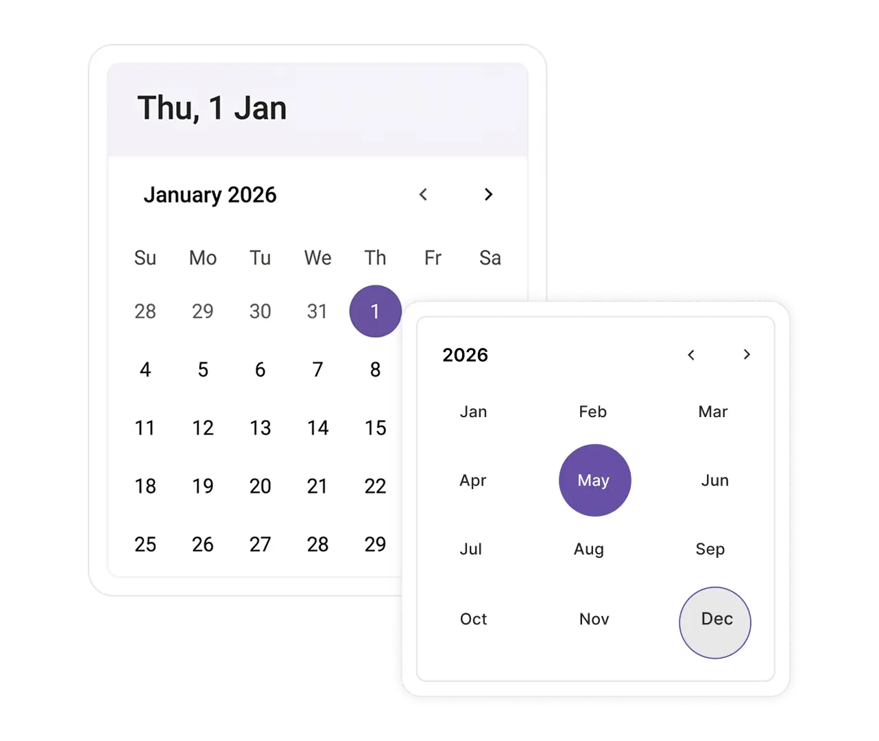
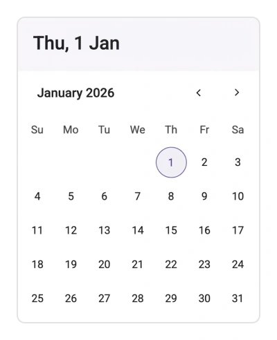
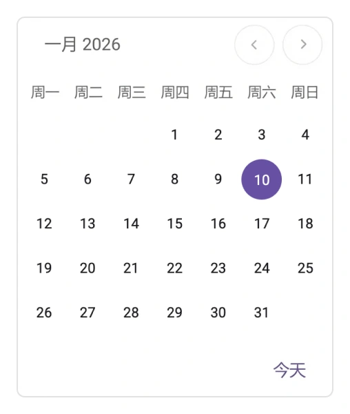
The React Calendar component is used for displaying dates and interacting with them. It features month, year, and decade navigation options for fast date selection. The component includes support for minimum and maximum date restrictions, as well as the ability to disable specific dates, enhancing its adaptability for various application needs.
React Calendar code example
Get started with the React Calendar using a few simple lines of TSX code, as demonstrated below. Also, explore our React Calendar example, which shows you how to render and configure the Calendar component in React.
import { Calendar } from '@syncfusion/react-calendars';

export default function App() {
    return (
        <div className="component-section">
            <Calendar/>
        </div>
    );
}
Controlled mode
The Calendar component supports both controlled and uncontrolled modes. The controlled mode provides full control over updating and displaying values, typically via props such as value and onChange, for easier integration with forms. The uncontrolled mode manages its own internal state for the selected date. It is simpler to use, requires less code, and is initialized with a defaultValue prop, making it best for basic date input.
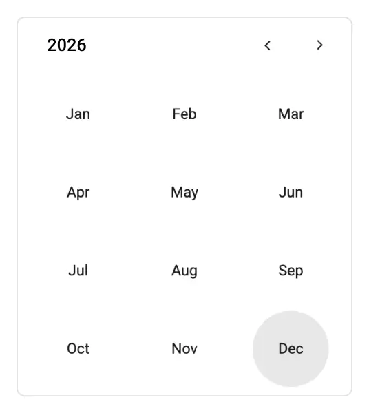
Efficient month and year selection
The React Calendar allows users to choose only a month or a year for when a precise date isn’t required. This functionality streamlines input, allowing the component to act as a month or year picker.
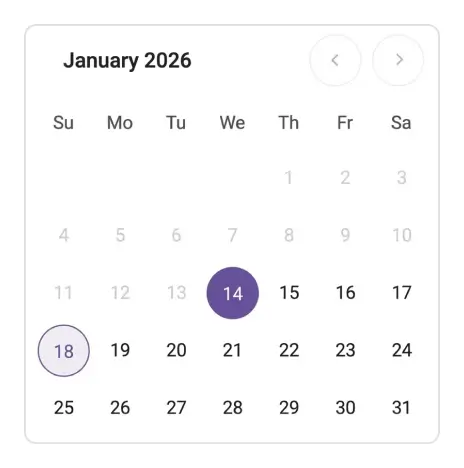
Constraining date selection
When you set minimum and maximum date values, the component ensures that only values within this specific interval are valid.
Calendar toolbar
Configure buttons for navigation, viewing changes, or custom actions in the toolbar. The toolbar supports both horizontal and vertical orientations.
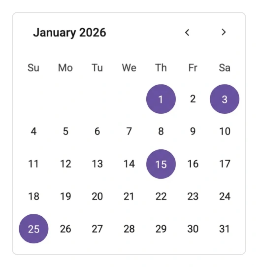
Multiple date selection
The React Calendar can be configured to enable the selection of multiple dates, which is helpful in scheduling and event management applications that require more than a single date input.
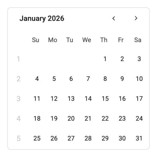
Displaying week numbers
Show week numbers alongside the date display to identify the week of the year for any selected date.
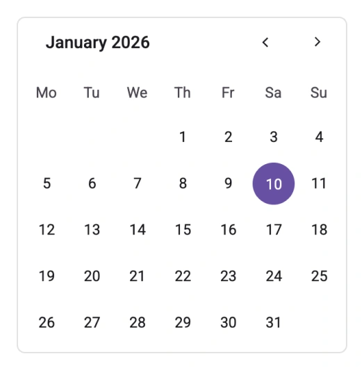
First day of week
Control which day is displayed as the start of the week in the calendar UI. This is useful for adapting the calendar to different regional or organizational preferences.
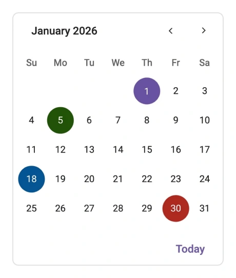
Custom rendering of calendar cells
Achieve unique visual presentations by customizing individual date cells within the React Calendar. This feature allows custom styles, content, or interactivity based on specific date properties, such as holidays and events.
Internationalization and localization
The React Calendar offers extensive internationalization capabilities, enabling adherence to various cultural date formats and the setting of the first day of the week according to regional preferences. Text elements, including month, day, and navigation controls, can be localized for use in many languages.
Accessibility
Keyboard navigation
The Calendar component ensures that every cell is accessible using the keyboard. Core features, such as selection and navigation, can be performed solely with keyboard commands, eliminating the need for mouse interaction. This promotes the creation of highly accessible applications.
Screen readers and accessibility
The React Calendar view is compliant with WAI-ARIA accessibility standards. Its UI incorporates high-contrast visual elements, optimizing the viewing experience for users with low vision. Furthermore, accurate UI descriptions are readily available for assistive technologies like screen readers.
Right-to-left (RTL) display
Right-to-left rendering allows the Calendar’s text and layout to be displayed from right to left. This enhances the user experience and accessibility for individuals working with RTL languages, such as Hebrew and Arabic.


Not sure how to create your first React Calendar? Our documentation can help.
I’d love to read it nowPure React Components
Developed using React’s core principles, this library employs functional components and hooks without any external dependencies.
GRIDS
DATA VISUALIZATION
NAVIGATION
Frequently Asked Questions
Why should you choose the Syncfusion® Essential Studio® React Calendar?
The Syncfusion React Calendar provides the following:
A lightweight and easily configurable calendar component.
Multiple-date selection, date range restriction, week numbers, and a configurable first day of the week.
Basic views like month, year, and decade.
Simple configuration and API.
- Support for all modern browsers.
- Touch-friendly and responsive UI.
Extensive demos to help you get started quickly with the component.
Where can I find the Syncfusion React Calendar demo?
You can find our React Calendar demo here. It demonstrates how to render and configure the Calendar.
Can I customize Calendar views and navigation in React?
How do I disable specific dates like weekends or holidays in the React Calendar?
Use the cellTemplate event to customize individual date cells. In this event, you can disable dates conditionally (e.g., weekends), preventing users from selecting those dates.
Can I download and utilize the Syncfusion React Calendar for free?
No, this is a commercial product and requires a paid license. However, a free community license is also available for companies and individuals whose organizations have less than $1 million USD in annual gross revenue, 5 or fewer developers, and 10 or fewer total employees.
How do I get started with Syncfusion React Calendar?
A good place to start would be our comprehensive getting started documentation.
How do I set a default selected date or restrict selection to a date range in the React Calendar?
How do I handle date selection events in the React Calendar?
Use the change event to capture when a user selects a date. The event provides the selected date value, which you can use to update your application state or trigger other actions.
See Real Success Stories
Developers around the world trust Syncfusion’s Essential Studio to simplify complex projects and speed up delivery. With a vast library of UI controls, powerful SDKs, and reliable support, Essential Studio helps teams build enterprise-ready applications with confidence.
Read Our Customer StoriesIndustry
Software development
75% Cost reduction
50% Faster development
Industry
Utilities (oil and gas)
450+ hours saved
Streamlined processes and hours of development effort saved.
Advanced, flexible features
Empowered users through robust and versatile functionality.
Industry
Software and technology
1000+ of hours saved
Accelerated development with enterprise-ready UI components.
Efficient file management
Streamlined workflows with document libraries without building them from scratch.
Industry
Software and technology
2 Years of delay avoided
Two years of delays prevented with proactive planning.
On-time delivery
Projects delivered on schedule using trusted controls.
Industry
IT services and IT consulting
Improved performance
Large datasets handled with easy customization and quick debugging.
Highly customizable
Plug-and-play controls with quick template integration.
Industry
Professional services
Instant access
Quick availability of features and resources.
Reduced dependencies
Fewer dependencies for faster development.
Rated by users across the globe
Syncfusion React Calendar resources


Awards
Greatness—it’s one thing to say you have it, but it means more when others recognize it. Syncfusion® is proud to hold the following industry awards.

