Trusted by the world’s leading companies

Overview
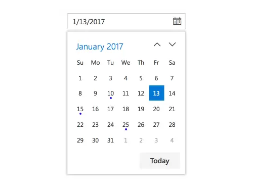
The React DatePicker is a lightweight and mobile-friendly component that allows end users to enter or select a date value. It has month, year, and decade view options to quickly navigate to the desired date. It supports minimum dates, maximum dates, disabled dates to restrict date selection and industry-standard themes such as Material, Fabric, and Bootstrap.
React DatePicker Code Example
Easily get started with the React DatePicker using a few simple lines of TSX code example as demonstrated below. Also explore our React DatePicker Example that shows you how to render and configure a DatePicker in React.
import * as ReactDOM from 'react-dom';
import * as React from 'react';
import { DatePickerComponent } from '@syncfusion/ej2-react-calendars';
import { SampleBase } from '../common/sample-base';
import './default-style.css';

export class Default extends SampleBase<{}, {}> {
    private dateValue: Date = new Date();
    render() {
        return (
            <div className='control-pane'>
                <div className='control-section'>
                    <div className='datepicker-control-section'>
                        <DatePickerComponent value={this.dateValue}></DatePickerComponent>
                    </div>
                </div>
            </div>
        )
    }
}
Mask Date Input
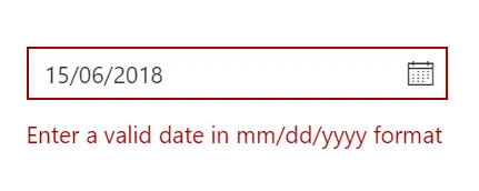
Enter valid dates in the correct format and avoid data input errors during data entry.
Month or year picker
Select only a month or a year as a value (Month Picker or Year Picker) from a pop-up calendar.
Custom date format
Change the default culture’s specific date format in the text box to improve readability or to enter the date properly.
Date selection within a date range
Restrict the users from selecting a date within the particular range of dates by using the min and max properties.
Disabled dates
Disable any date in the DatePicker to show it as an inactive date. Easily prevent weekends and holidays from being selected by disabling them in the pop-up calendar.
Form support and date validation
Date values are validated within a minimum and maximum range to enforce entering only a valid date value. In a form component, integrate the form validation plugin to perform custom validation in the date text box.

Multi-language DatePicker
Update the culture-specific date format and first day of the week, and translate the names of months, days, and today button text to any supported language with the globalization features.
Custom DatePicker
Apart from the standard, built-in themes, the appearance of the component can be customized to suit your application style.

Customization
The React DatePicker component allows for full customization of the input element and the calendar. This lets you match it to the design of your application and create a seamless user experience.
Highlight weekends
Highlight any date in a year or every weekend in a month as special days using custom styling.
Change first day of week
Auto-update the first day of the week based on the specified culture or change it based on your application.
Week number
Show the week number of the selected day in the pop-up calendar by enabling the week number option.
Islamic DatePicker
In addition to the Gregorian DatePicker, the DatePicker component supports displaying the Islamic DatePicker (Hijri DatePicker).
Web accessibility
- Fully supports WAI-ARIA accessibility that helps the DatePicker be accessed by on screen readers and assistive devices.
- Follows WAI-ARIA best practices for implementing keyboard interaction.
- Uses WCAG 2.0-based design for UI visual elements such as foreground color, background color, line spacing, text and images.
- Supports right-to-left direction for users working with RTL languages like Hebrew and Arabic.
Mobile-friendly responsive DatePicker UI
The React DatePicker provides a responsive mode that gives an adaptive, redesigned UI appearance for mobile devices.
Developer-friendly API’s
You have control over all the UI elements and behaviors of the components with a rich set of developer-friendly APIs to provide the best experience to your end users.
Built-in themes
The React DatePicker supports several built-in themes such as Material, Bootstrap, Fabric (Office 365), Tailwind CSS, and high contrast. Users can customize any one of these built-in themes or create new themes to achieve their own desired look and feel either by simply overriding SASS variables or using our Theme Studio application.
Not sure how to create your first React DatePicker? Our tutorial videos and documentation can help.
I’d love to watch it now I’d love to read it nowDiscover Syncfusion’s Complete React Component Ecosystem
Explore over 145+ React UI components featuring established, production-ready controls and the latest pure React components built natively for modern web app development.
-
React Components
-
Pure React Components
-
SMART COMPONENTSGRIDSDATA VISUALIZATIONDROPDOWNSFILE VIEWERS & EDITORSBUTTONSINTERACTIVE CHATINPUTSNAVIGATIONFORMSNOTIFICATIONS
-
GRIDSDATA VISUALIZATIONNAVIGATIONINPUTS
Build Document Workflows in React
Embed PDF viewing, Word document editing, and Excel-like spreadsheet processing in your React app to streamline document workflows and help teams collaborate on files without context switching or external dependencies.
Frequently Asked Questions
Why should you choose Syncfusion React DatePicker?
Syncfusion React DatePicker provides the following features:
- A lightweight, feature-rich, and easily configurable text-input datepicker component.
Built-in features such as validation, custom date formats, range restriction, and disable dates to improve user experience.
- Flexibility to use a month or year only DatePicker.
- One of the best React DatePicker in the market that offers feature-rich UI to interact with the software.
- Simple configuration and API.
- Supports all modern browsers.
Expansive learning resources such as demos, documentation and videos to let you get started quickly with the React DatePicker component.
Where can I find the Syncfusion React DatePicker demo?
You can find our React DatePicker demo, which demonstrates how to render and configure the DatePicker.
How do I install and set up a Syncfusion React DatePicker?
You can install the Syncfusion DatePicker by adding the @syncfusion/ej2-react-calendars package to your project. After installation, include the required CSS theme files. Syncfusion components also require a valid license for production use, which you can obtain through a free trial, purchased license, or community license.
How do I set a default date in the React DatePicker?
You can easily set a default date by using the value property in the DatePicker component. This ensures the DatePicker displays a pre-selected date when the page loads.
How can I integrate the DatePicker with form validation libraries like React Hook Form?
You can bind a form validation library’s value to your form state and apply validation rules to ensure correct date input.
Can I download and utilize the Syncfusion React DatePicker for free?
No, this is a commercial product and requires a paid license. However, a free community license is also available for companies and individuals whose organizations have less than $1 million USD in annual gross revenue, 5 or fewer developers, and 10 or fewer total employees.
How do I get started with Syncfusion React DatePicker?
A good place to start would be our comprehensive getting started documentation.
How do I set minimum and maximum selectable dates in the Syncfusion React DatePicker?
Set the min and max properties to restrict selection to the date range. For example, you can set the min date to today and the max date to the end of the year to prevent selection of dates after this year.
How do I customize the DatePicker format (e.g., DD/MM/YYYY)?
The DatePicker supports custom date formats through the format property. You can specify any valid format string to match your regional or business requirements.
Our Customers Love Us


 Documentation
Awards
Greatness—it’s one thing to say you have it, but it means more when others recognize it. Syncfusion® is proud to hold the following industry awards.


