Trusted by the world’s leading companies

Overview
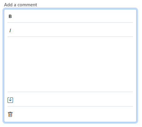
The React TextArea component is a fundamental input element in web development that allows users to input multiple lines of text within a designated area, such as comments, messages, or other lengthy content. This component is an extended version of the HTML text area element, featuring clear icons, a floating label, various sizing options, validation states, and more.
React TextArea code example
Easily get started with the React TextArea using a few simple lines of TSX code, as demonstrated below. Also explore the React TextArea example, which shows how to render and configure the TextArea in React.
import { TextAreaComponent } from '@syncfusion/ej2-react-inputs';
import * as React from "react";
import * as ReactDOM from "react-dom";

export default class App extends React.Component<{}, {}> {
public render() {
    return (
         <div className="App">
            <TextAreaComponent placeholder="Enter your comments" floatLabelType="Auto" />
        </div>
    )
}
};
ReactDOM.render(<App />, document.getElementById('input-container'));Floating label
Improve the user experience with our floating label feature. The label transitions elegantly above the text area when users start typing.


Resizing
Resize the text area dynamically using resizing handles. Users can effortlessly adjust the height and width of the text area, enhancing comfort and usability.
Form support
Seamlessly integrate our TextArea component into HTML forms for easy data submission and processing. Allow user input within forms and access native form validation mechanisms for enhanced data integrity and user feedback.


Adornments
The TextArea control supports custom adornments using the prependTemplate and appendTemplate properties, which allow users to render custom elements like icons, buttons, or dropdowns to enhance user interaction with prefix and suffix elements. Also, users can control the layout orientation dynamically with the adornmentFlow and adornmentOrientation properties to switch between horizontal and vertical arrangements.
Right-to-left (RTL) rendering
The React TextArea component supports right-to-left (RTL) rendering. Users can change the text direction and layout to be from right to left. This improvement enhances user experience and accessibility for users of RTL languages.

Maximum length
Enforce input restrictions using the maximum length feature. By setting a character limit, you can prevent users from entering excessive text, ensuring data integrity and optimizing database storage.
Number of rows and columns
Easily customize the dimensions of your text area by specifying the desired number of rows and columns so that it fits into any application layout.
Built-in themes
The React TextArea component has several built-in themes: Material, Bootstrap, Fabric (Office 365), Tailwind CSS, and high contrast. Users can customize any of these built-in themes or create new themes by overriding Sass variables or using our Theme Studio application.
Developer-friendly APIs
Developers can control the appearance and behaviors of the TextArea in React, including its floating label, using a rich set of APIs.
Other supported frameworks
The TextArea component is also available for the JavaScript, Angular, and Vue frameworks. Check out the different, platform-specific features through the following links:
Discover Syncfusion’s Complete React Component Ecosystem
Explore over 145+ React UI components featuring established, production-ready controls and the latest pure React components built natively for modern web app development.
-
React Components
-
Pure React Components
-
SMART COMPONENTSGRIDSDATA VISUALIZATIONDROPDOWNSFILE VIEWERS & EDITORSBUTTONSINTERACTIVE CHATINPUTSNAVIGATIONFORMSNOTIFICATIONS
-
GRIDSDATA VISUALIZATIONNAVIGATIONINPUTS
Build Document Workflows in React
Embed PDF viewing, Word document editing, and Excel-like spreadsheet processing in your React app to streamline document workflows and help teams collaborate on files without context switching or external dependencies.
Our Customers Love Us


 Documentation
Awards
Greatness—it’s one thing to say you have it, but it means more when others recognize it. Syncfusion® is proud to hold the following industry awards.


