Overview
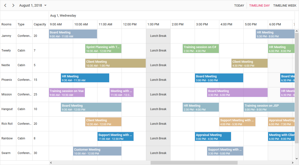
Timeline scheduling plays a major role in the React Scheduler, as it displays the timeline scheduler views for multiple resources. Its feature-rich calendar options, compact resource scheduling, and clear event representation allows you to employ it in various real-time applications. The events of timeline views support an intuitive drag-and-drop feature and a resize action.

Multiple timeline views
Five built-in timeline views are available: timeline day, timeline week, timeline work week, timeline month, and timeline year. All these views carry a common horizontal time axis and inherit almost all the calendar-specific features.
Timeline day, week, and work week views
Display appointments accurately across a common horizontal time axis for a single day or multiple days.
Timeline month view
Display appointments across multiple days of a month on a horizontal axis where each column represents a single day.
Timeline year view
Display multiple months on both horizontal and vertical axes, where each cell represents a single day.
Extensible custom views
- Display multiple days, weeks, and months across a timeline scheduler by extending each view’s interval count.
- For example, you can display a complete year, say from January 2018 to December 2018, in timeline month view by setting its interval value to 12. This allows the timeline scheduler to load 12 months from the current date (the current date being in January in this example) in timeline month view.
Header rows
- A timeline scheduler usually displays additional header rows on timeline views alone.
- You can display the year, month, and week number text labels on each individual row with out-of-the-box templates.
Event handling options
There is built-in support for better event handling, such as easier appointment creation and editing using the default event editor or through intuitive drag-and-resize actions. In addition, you can add custom data fields to both the events and resource data source.
Resource grouping
Display the resources as individual rows. Arrange the appointments of a resource horizontally in its appropriate row against the horizontal time axis.
Grouping with multiple levels
- Display resources in rows in a hierarchical tree-like structure with expand and collapse options.
- More importantly, the parent-level resources, too, will display appointments in their individual rows.
Virtual scrolling
The React Timeline Scheduler provides better performance by instantly loading large sets of resources and appointments virtually on every scroll action.

Shared events
Multiple resources can share the same appointment, thus allowing the action made on it to reflect on all other shared instances simultaneously.
Customizing resource columns
Enhance the look and feel of the resource header cells by adding text, images, or CSS styles. You can display customized tooltips with resource information while hovering over the resource header cells.
Add and remove resources
Built-in scheduler methods are available for adding or removing resources dynamically on a scheduler. You can specify the index position, where the add or remove actions are to take place.
Discover Syncfusion’s Complete React Component Ecosystem
Explore over 145+ React UI components featuring established, production-ready controls and the latest pure React components built natively for modern web app development.
-
React Components
-
Pure React Components
-
SMART COMPONENTSGRIDSDATA VISUALIZATIONDROPDOWNSFILE VIEWERS & EDITORSBUTTONSINTERACTIVE CHATINPUTSNAVIGATIONFORMSNOTIFICATIONS
-
GRIDSDATA VISUALIZATIONNAVIGATIONINPUTS
