.NET MAUI OTP Input Control
- Allows users to enter one-time passwords (OTP) for two-factor authentication.
- Automatically shifts focus to the next input field for seamless navigation.
- Adapts to any device due to its responsive design.
Trusted by the world’s leading companies

Overview
The .NET MAUI OTP Input is a versatile form component designed for entering one-time passwords (OTP) during multifactor authentication. It accepts one character per input field, providing a focused and intuitive user experience. Its built-in customization options include input types, input lengths, styling modes, placeholders, separators, and input states.
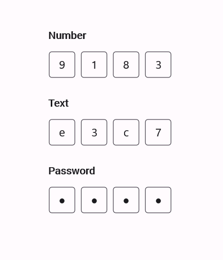
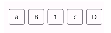
Input types
The .NET MAUI OTP Input component supports three input types:
-
Number: Allows digit entries only. This is the default input type. -
Text: Allows text and digit input. -
Password: Accepts the same input as theTexttype, but masks input characters for privacy.
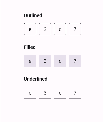
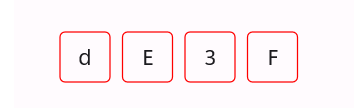
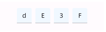
Styling modes
The built-in styling modes are:
-
Outlined: Displays a border around each input field. This is the default styling mode. -
Filled: Fills the input fields with a background color and underlines each input. -
Underlined: Highlights each input field with an underline for a sleek look.
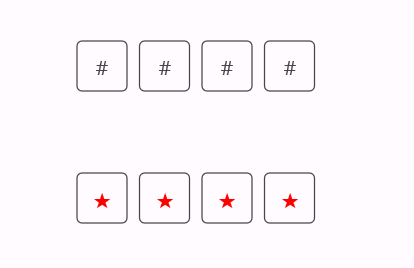
Placeholder
Display a placeholder character in each input field. If defined as a single character, that character will be shown in all fields. Otherwise, each field will display a character of the specified placeholder string based on its length.
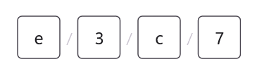
Separator
Specify a character to be placed between input fields, enhancing their visual separation.
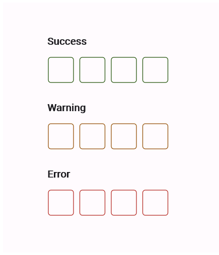
Input states
The .NET MAUI OTP Input component allows you to set the validation state to display success, warning, or error states based on the input validation.
Customization
Customize the length of the OTP Input, the styling for each field, and more.
Input length
Adjust the length of the OTP Input to fit your app requirements. The component is set to four fields by default.
Stroke
Enhance the visual clarity of the OTP Input by customizing its field stroke color. The stroke remains visible when the field is filled, ensuring a consistent UI experience.
Input background
Customize the background color of the OTP Input fields in their filled state to align with your preferred theme. The background color remains consistent as values are entered or cleared.
 95+ UI controls
200+ interactive .NET MAUI demos
3.2M+ downloads
95+ UI controls
200+ interactive .NET MAUI demos
3.2M+ downloads
.NET MAUI DataViz & UI Controls
Standalone UI SDKs
Integrate the DataGrid, Chart, Scheduler, and Rich Text Editor UI components into applications to enable rich interaction and visualization, delivering a seamless user experience.
Document Solutions
Integrate the PDF Viewer, DOCX Editor, Spreadsheet Editor, and document-processing libraries into the .NET MAUI applications to enable a smooth user experience.
Our Customers Love Us


See Real Success Stories
Developers around the world trust Syncfusion’s Essential Studio to simplify complex projects and speed up delivery. With a vast library of UI controls, powerful SDKs, and reliable support, Essential Studio helps teams build enterprise-ready applications with confidence.
Read Our Customer StoriesIndustry
Software development
75% Cost reduction
50% Faster development
Industry
Utilities (oil and gas)
450+ hours saved
Streamlined processes and hours of development effort saved.
Advanced, flexible features
Empowered users through robust and versatile functionality.
Industry
Software and technology
1000+ of hours saved
Accelerated development with enterprise-ready UI components.
Efficient file management
Streamlined workflows with document libraries without building them from scratch.
Industry
Software and technology
2 Years of delay avoided
Two years of delays prevented with proactive planning.
On-time delivery
Projects delivered on schedule using trusted controls.
Industry
IT services and IT consulting
Improved performance
Large datasets handled with easy customization and quick debugging.
Highly customizable
Plug-and-play controls with quick template integration.
Industry
Professional services
Instant access
Quick availability of features and resources.
Reduced dependencies
Fewer dependencies for faster development.
Rated by users across the globe


Awards
Greatness—it’s one thing to say you have it, but it means more when others recognize it. Syncfusion® is proud to hold the following industry awards.

