.NET MAUI Step Progress Bar: Visualizing Multi-Step Progress
- Displays the progress of a multi-step process for tracking.
- Supports horizontal and vertical step progress bars.
- Allows easy customization of appearance.

Trusted by the world’s leading companies

Overview
The .NET MAUI Step Progress Bar is a control that displays progress through multiple steps in a process, such as order tracking or a user registration form. It’s customizable, with options for the shape and content of the steps, the progress bar color, and more.
.NET MAUI Step Progress Bar code example
Easily get started with the .NET MAUI Step Progress Bar using a few simple lines of XAML code, as demonstrated below. Also, explore our .NET MAUI Step Progress Bar Example that shows you how to render and configure a Step Progress Bar in .NET MAUI.
<ContentPage
    xmlns:Step Progress Bar="clr-namespace:Syncfusion.Maui.ProgressBar;assembly=Syncfusion.Maui.ProgressBar"
    <Step Progress Bar:SfStep Progress Bar />
</ContentPage>
using Syncfusion.Maui.ProgressBar;
public partial class MainPage : ContentPage
{
public MainPage()
{
InitializeComponent();
SfStep Progress Bar Step Progress Bar = new SfStep Progress Bar();
this.Content = Step Progress Bar;
}
}Status
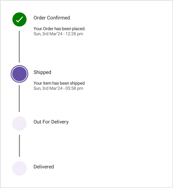
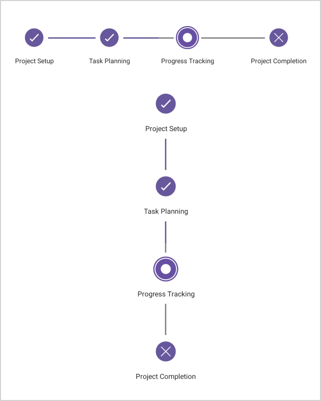
A step can have three statuses: not started, in progress, or completed. The step status is updated based on the active step index, and the progress value is updated based on the active progress value:
- Not started: Step not yet initiated.
- In progress: Step being worked on currently.
- Completed: Step successfully finished.
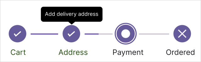
Descriptions
A step can include descriptions on either side or both sides. The primary description will appear on the right in a vertical progress bar or on the bottom in a horizontal progress bar. The secondary description will be on the left or top. These descriptions can be customized.
Label positions
A label can be positioned in four ways, in either horizontal and vertical orientation: start, end, top, and bottom.
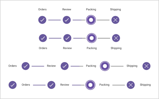
Step shape
The shape of a step can be either a circle or a square in the Step Progress Bar.
Orientation
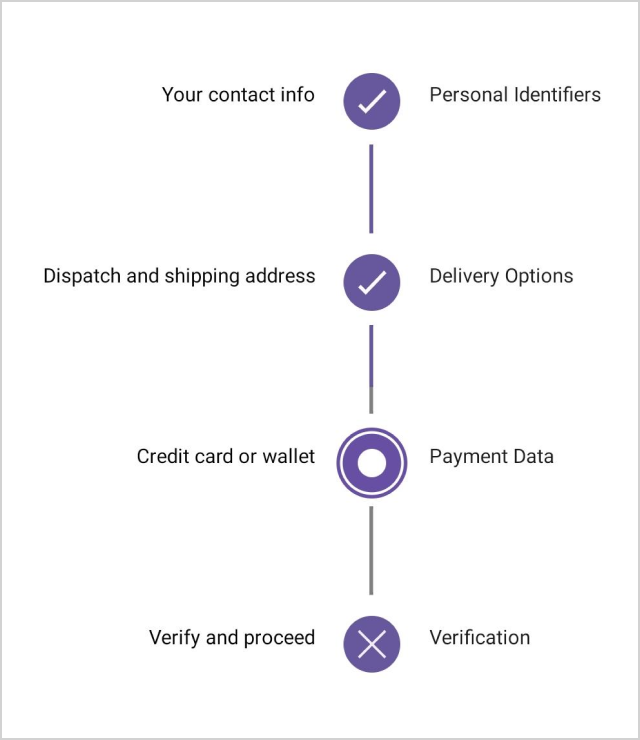
Visualize the progression of a multi-step process horizontally or vertically:
- Horizontal orientation: Displays steps or elements arranged from left to right, side-by-side. Each step or element is positioned next to the others, displayed in a linear fashion.
- Vertical orientation: Displays steps or elements stacked on top of each other, typically from top to bottom. Each step or element appears below the previous one, displayed in a vertical fashion.
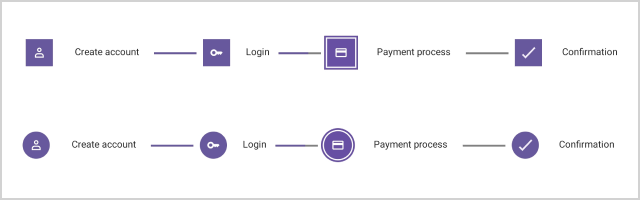
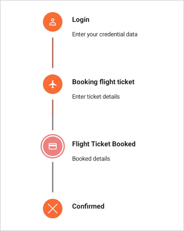
Step content type
Customize the step content with numbers, ticks, crosses, dots, or images.

Tooltips
The .NET MAUI Step Progress Bar supports tooltips to display additional information when the user hovers over or interacts with a specific step.
Appearance customization
The Step Progress Bar’s appearance can be customized using the step settings or data templates.
Step settings
Customize the step color, shape, content color and type, stroke color and width, size, content size, background, and font.

Templates
Customize the Step Progress Bar with step, primary text, and secondary text templates.
 95+ UI controls
200+ interactive .NET MAUI demos
3.2M+ downloads
95+ UI controls
200+ interactive .NET MAUI demos
3.2M+ downloads
Not sure how to create your first .NET MAUI Step Progress Bar? Our documentation can help.
I’d love to read it now.NET MAUI DataViz & UI Controls
Standalone UI SDKs
Integrate the DataGrid, Chart, Scheduler, and Rich Text Editor UI components into applications to enable rich interaction and visualization, delivering a seamless user experience.
Document Solutions
Integrate the PDF Viewer, DOCX Editor, Spreadsheet Editor, and document-processing libraries into the .NET MAUI applications to enable a smooth user experience.
Frequently Asked Questions
Why should I choose the Syncfusion .NET MAUI Step Progress Bar?
The Syncfusion .NET MAUI Step Progress Bar allows you to:
- Display and track the progress of a multi-step process.
- Implement horizontal and vertical Step Progress Bars.
- Easily customize its appearance.
Take advantage of extensive demos and documentation to get started quickly with the .NET MAUI Step Progress Bar.
Where can I find the Syncfusion .NET MAUI Step Progress Bar demo?
Take a look at our .NET MAUI Step Progress Bar demo, which demonstrates how to render and configure the Step Progress Bar.
Can I download and utilize the Syncfusion .NET MAUI Step Progress Bar for free?
No, this is a commercial product and requires a paid license. However, Syncfusion offers a free Community License, available for companies and individuals whose organizations have less than $1 million USD in annual gross revenue, 5 or fewer developers, and 10 or fewer total employees.
How do I get started with Syncfusion .NET MAUI Step Progress Bar?
A good place to start would be our comprehensive getting started documentation.
Our Customers Love Us


See Real Success Stories
Developers around the world trust Syncfusion’s Essential Studio to simplify complex projects and speed up delivery. With a vast library of UI controls, powerful SDKs, and reliable support, Essential Studio helps teams build enterprise-ready applications with confidence.
Read Our Customer StoriesIndustry
Software development
75% Cost reduction
50% Faster development
Industry
Utilities (oil and gas)
450+ hours saved
Streamlined processes and hours of development effort saved.
Advanced, flexible features
Empowered users through robust and versatile functionality.
Industry
Software and technology
1000+ of hours saved
Accelerated development with enterprise-ready UI components.
Efficient file management
Streamlined workflows with document libraries without building them from scratch.
Industry
Software and technology
2 Years of delay avoided
Two years of delays prevented with proactive planning.
On-time delivery
Projects delivered on schedule using trusted controls.
Industry
IT services and IT consulting
Improved performance
Large datasets handled with easy customization and quick debugging.
Highly customizable
Plug-and-play controls with quick template integration.
Industry
Professional services
Instant access
Quick availability of features and resources.
Reduced dependencies
Fewer dependencies for faster development.
Rated by users across the globe


 .NET MAUI UI Kit
Awards
Greatness—it’s one thing to say you have it, but it means more when others recognize it. Syncfusion® is proud to hold the following industry awards.

