.NET MAUI CheckBox - User-Friendly Selection Control
- It supports checked, unchecked, indeterminate, and disabled states.
- Parent-child relationships enable quick selection with sub-items.
- Users can customize the appearance to match their style.
Trusted by the world’s leading companies

Overview
The .NET MAUI CheckBox is a selection control with UI customization. It allows you to choose one or more options from a set and customize the appearance of different visual states using the visual state manager.
.NET MAUI CheckBox Code Example
Easily get started with the .NET MAUI CheckBox using a few simple lines of XAML and C# code examples as demonstrated below. Also, explore our .NET MAUI CheckBox Example which shows you how to render and configure the CheckBox for .NET MAUI.
<syncfusion:SfCheckBox Text="CheckBox" IsChecked="True" CornerRadius="5.0"/>SfCheckBox checkBox = new SfCheckBox();
checkBox.Text = "CheckBox";
checkBox.IsChecked = true;checkBox.CornerRadius = 5.0f;States
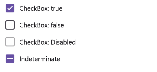
A CheckBox has three selection states: selected, unselected, and indeterminate. Use the indeterminate state when a collection of sub-choices has both unselected and selected states. To prevent the toggling of check box values, the disable option can be used.


Customize CheckBox shape
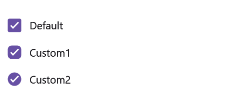
Users can customize the .NET MAUI CheckBox shape by adjusting the corner radius of the default shape.
Customize checkBox color
The CheckBox states color can be customized.


Label formatting
Users can define the CheckBox caption text and format its font name, style, size, and color.
Parent and child checkboxes
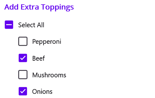
CheckBoxes can have parent-child relationships with other CheckBoxes:
- When the parent check box is checked, all the child checkboxes are checked.
- If a parent check box is unchecked, all the child checkboxes are unchecked.
- If only some child checkboxes are checked, the parent check box becomes an indeterminate check box.

Not sure how to create your first .NET MAUI CheckBox? Our tutorial videos and documentation can help.
I’d love to watch it now I’d love to read it nowFrequently Asked Questions
Why should you choose Syncfusion .NET MAUI CheckBox?
The Syncfusion .NET MAUI CheckBox:
- Provides customization capabilities for the list of options presented to users, such as text styles and button colors.
- Serves as a visual indication tool for users to make selections among predefined options, enhancing user interaction and experience.
It has simple configuration and APIs.
- It is mobile-touch friendly.
- It is one of the best .NET MAUI CheckBoxes in the market that offers feature-rich UI to interact with the software.
Has extensive demos, documentation, and videos to learn quickly and get started with .NET MAUI CheckBox.
Where can I find the Syncfusion .NET MAUI CheckBox demo?
You can find our .NET MAUI CheckBox demo, which demonstrates how to render and configure the CheckBox.
Can I download and utilize the Syncfusion .NET MAUI CheckBox for free?
No, this is a commercial product and requires a paid license. However, a free community license is also available for companies and individuals whose organizations have less than $1 million USD in annual gross revenue, 5 or fewer developers, and 10 or fewer total employees.
How do I get started with Syncfusion .NET MAUI CheckBox?
A good place to start would be our comprehensive getting started documentation.
.NET MAUI DataViz & UI Controls
Build Document Workflows in .NET MAUI
Integrate a powerful PDF Viewer and robust document processing libraries into your .NET MAUI applications, to create smooth document experiences. Empower users to interact with documents seamlessly while developers automate document creation, processing, and management behind the scenes.
Our Customers Love Us


Awards
Greatness—it’s one thing to say you have it, but it means more when others recognize it. Syncfusion® is proud to hold the following industry awards.


