Play Slide Shows Using the .NET MAUI Rotator Control
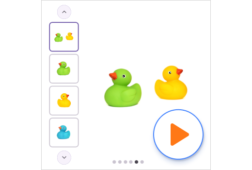
- The thumbnails display mode helps users preview all items.
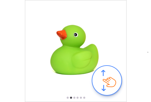
- Simple swipe navigation moves the view in vertical and horizontal directions.
- Looping options can create a continuous slide show.
Trusted by the world’s leading companies

Overview
The .NET MAUI Rotator control is a UI component that provides an interactive way to rotate images and navigate through a collection of views. It supports various navigation options like swiping, auto-play, and tapping.
.NET MAUI Rotator code example
Easily get started with the .NET MAUI Rotator using a few simple lines of C# code, as demonstrated. Also, explore our .NET MAUI Rotator example, which shows you how to render and configure the Rotator for .NET MAUI.
using Syncfusion.Maui.Core.Rotator;

namespace Rotator
{
    public partial class Rotator : ContentPage
    {
        SfRotator rotator = new SfRotator();
        StackLayout stackLayout = new StackLayout();
        public Rotator()
        {
            InitializeComponent ();
            stackLayout.HeightRequest = 300;
            List<SfRotatorItem> collectionOfItems = new List<SfRotatorItem>();
            collectionOfItems.Add(new SfRotatorItem() { Image = "image1.png" });
            collectionOfItems.Add(new SfRotatorItem() { Image = "image2.png" });
            collectionOfItems.Add(new SfRotatorItem() { Image = "image3.png" });
            collectionOfItems.Add(new SfRotatorItem() { Image = "image4.png" });
            collectionOfItems.Add(new SfRotatorItem() { Image = "image5.png" });
            rotator.ItemsSource = collectionOfItems;
            stackLayout.Children.Add(rotator);
            this.Content = stackLayout;
        }
    }
}
Display modes
The .NET MAUI Rotator control supports dot and thumbnail modes for navigating easily to a desired item.

Thumbnail
Thumbnail representation of the items provides a simple preview so that users can directly navigate to the required items by tapping.

Dot
Simple dot representation allows selected items to occupy the full space. The highlighted dot represents both count and selected index.
Swipe gesture
Users can navigate to the previous item or the next item by simply swiping from left to right or right to left, respectively.

Navigation direction
Perform navigation using vertical or horizontal sliding animation. Here, the horizontal option is a left-to-right arrangement of items, whereas the vertical option is a top-to-bottom arrangement of items.
Horizontal swiping

Vertical swiping

Navigation placement
Display dot and thumbnail representations at any one of the four sides: left, right, top, or bottom.

Looping
The looping option helps users navigate back to the first item when they reach the last item. This provides a better review experience when the control is loaded with many items.
Autoplay
Use the .NET MAUI Rotator control as a slide show when you want to display a set of items in a defined interval of time with no interactions.


Navigation interval
Customize the interval duration for auto-play.
Placing custom views
A user can perform a command with the selected item by placing a button (or any view) on it, because the Rotator control is not limited to loading only image data, but also a collection of custom views.


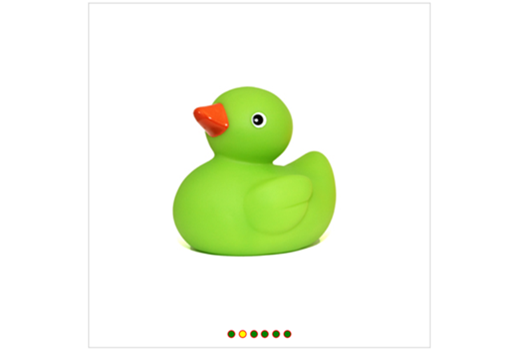
Dot color customization
Customize the dots’ colors and placement.
Not sure how to create your first .NET MAUI Rotator? Our tutorial videos and documentation can help.
I’d love to watch it now I’d love to read it nowFrequently Asked Questions
Why should you choose the Syncfusion® .NET MAUI Rotator?
The Syncfusion® .NET MAUI Rotator offers the following features:
- It provides a set of smooth and customizable transition effects like slide for a seamless user experience.
- It offers both dot and thumbnail navigation modes.
- It allows easy data binding with items.
- It supports auto-play and the looping of all items.
It has simple configuration and APIs.
- It is mobile-friendly.
It has extensive demos, documentation, and videos to let you get started quickly with the .NET MAUI Rotator.
Where can I find the Syncfusion® .NET MAUI Rotator demo?
You can find our .NET MAUI Rotator demo here. It demonstrates how to render and configure the Rotator.
Can I download and utilize the Syncfusion® .NET MAUI Rotator for free?
No, this is a commercial product and requires a paid license. However, a free community license is also available for companies and individuals whose organizations have less than $1 million USD in annual gross revenue, 5 or fewer developers, and 10 or fewer total employees.
How do I get started with Syncfusion® .NET MAUI Rotator?
A good place to start would be our comprehensive getting started documentation.
.NET MAUI DataViz & UI Controls
Our Customers Love Us


Awards
Greatness—it’s one thing to say you have it, but it means more when others recognize it. Syncfusion® is proud to hold the following industry awards.


