.NET MAUI Rating Control - Star-Based Rating Component
- Set a precision level for ratings.
- Customize the rating items’ style, size, and more.
- Restrict user selection and only allow viewing of the rating value.
Trusted by the world’s leading companies

Overview
The .NET MAUI Rating control allows users to select a rating value from a group of visual symbols like stars, hearts, or custom shapes.
.NET MAUI Rating code example
Easily get started with the .NET MAUI Rating using a few simple lines of XAML code, as demonstrated below. Also, explore our .NET MAUI Rating example, which shows you how to render and configure the Rating for .NET MAUI.
<?xml version = "1.0" encoding = "UTF-8" ?>
<Application xmlns="http://schemas.microsoft.com/dotnet/2021/maui"
             xmlns:x="http://schemas.microsoft.com/winfx/2009/xaml"
             xmlns:local="clr-namespace:SampleBrowser.Maui.Inputs"
			 xmlns:base="clr-namespace:SampleBrowser.Maui.Base;assembly=SampleBrowser.Maui.Base"
              xmlns:syncTheme="clr-namespace:Syncfusion.Maui.Themes;assembly=Syncfusion.Maui.Core"
             x:Class="SampleBrowser.Maui.Inputs.App">
    <Application.Resources>
        <ResourceDictionary>
            <ResourceDictionary.MergedDictionaries>
                <base:SampleBrowserStyles/>
                <syncTheme:SyncfusionThemeResourceDictionary/>
            </ResourceDictionary.MergedDictionaries>
        </ResourceDictionary>
    </Application.Resources>
</Application>
Precision
The .NET MAUI Rating control supports precise ratings to handle full, half, or exact values.

Standard
The provided rating is rounded to the nearest value.

Half values
The provided rating is rounded to the nearest half-value.

Exact values
Users can select an exact value for ratings.
Rating shapes
The Rating control in .NET MAUI allows the use of both predefined shapes and custom shapes.
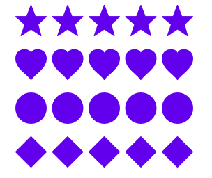
Predefined rating shapes
Use predefined rating shapes, such as stars, hearts, circles, and diamonds.
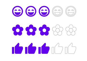
Custom rating shape
Use a custom rating shape as needed.
Set as read-only
The .NET MAUI Rating control can also be used in a read-only state. In this mode, users cannot interact with the control.

Customization
The .NET MAUI Rating control lets users customize the item color, item border color, spacing, selection color, and more, enabling the items to fit the application theme.

Item size
Make the control more accessible and enhance its accuracy by customizing the item size.

Item count
The item count can be specified to whatever value you desire (e.g., 5 stars, 6 stars).

Spacing
Specify the space between items in the Rating control.
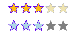
Rated and unrated fill colors
Customize the fill color for the rated and unrated states of an item.
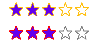
Borders
Giving items a border can make their appearance more attractive. Use borders to highlight rated and unrated items.
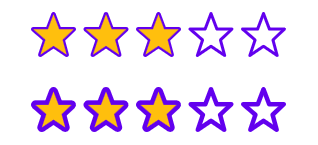
Stroke thickness
You can customize the stroke thickness of the item borders.
Not sure how to create your first .NET MAUI Rating? Our tutorial videos and documentation can help.
I’d love to watch it now I’d love to read it nowFrequently Asked Questions
Why should you choose the Syncfusion® .NET MAUI Rating control?
The Syncfusion® .NET MAUI Rating offers the following features:
- Options for deciding the accuracy level of a rating.
- A read-only rating view to show an overall rating.
- Support for determining the number of rating items to be displayed and the ability to control their size.
- Built-in tooltips to show rating values to users.
- A reaction or mood interface similar to those in social network apps such as Facebook.
A simple configuration and APIs.
- A mobile-friendly UI.
Extensive demos, documentation, and videos let you get started quickly with the .NET MAUI Rating control.
Where can I find the Syncfusion® .NET MAUI Rating demo?
You can find our .NET MAUI Rating demo here. It demonstrates how to render and configure the Rating control.
Can I download and utilize the Syncfusion® .NET MAUI Rating for free?
No, this is a commercial product and requires a paid license. However, a free community license is also available for companies and individuals whose organizations have less than $1 million USD in annual gross revenue, 5 or fewer developers, and 10 or fewer total employees.
How do I get started with Syncfusion® .NET MAUI Rating?
A good place to start would be our comprehensive getting started documentation.
.NET MAUI DataViz & UI Controls
Our Customers Love Us


 .NET MAUI UI Kit
Awards
Greatness—it’s one thing to say you have it, but it means more when others recognize it. Syncfusion® is proud to hold the following industry awards.


