.NET MAUI Tab View - A Simple and Intuitive Tab Control
- Nested tabs support with different header placements.
- Fixed and scrollable tab headers.
- Image and text support for tab headers.
Trusted by the world’s leading companies

Overview
The advanced .NET Multi-platform App UI Tab View (.NET MAUI Tabs) is a simple, intuitive interface for tab navigation in mobile and desktop applications that lets users switch between different tabs.
.NET MAUI Tab View Code Example
Easily get started with the .NET MAUI Tab View using a few simple lines of XAML code example as demonstrated below. Also, explore our .NET MAUI Tab View Example that shows you how to render and configure the .NET MAUI Tab View.
<?xml version="1.0" encoding="utf-8" ?>
<ContentPage xmlns="http://schemas.microsoft.com/dotnet/2021/maui"
            xmlns:x="http://schemas.microsoft.com/winfx/2009/xaml"
            x:Class="TabViewMauiSample.MainPage"
            xmlns:tabView="clr-namespace:Syncfusion.Maui.TabView;assembly=Syncfusion.Maui.TabView"
            BackgroundColor="{DynamicResource PageBackgroundColor}">
    <ContentPage.Content>
        <tabView:SfTabView />
    </ContentPage.Content>
</ContentPage>
Tab width mode
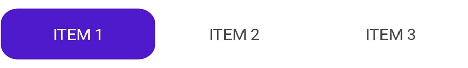
The .NET MAUI Tab View provides two options that determine how the width of the tabs is calculated on the tab bar when it is populated. The options are default and size to content.

Default
The width of all the tabs will be equally divided based on the actual width of the tab bar. This enables a fixed tab bar that does not allow tab scrolling.

Size to content
Set the width of a tab to fit the text or image it contains. This enables tab scrolling when the arrangement of the tabs and their widths exceed the width of the tab bar.
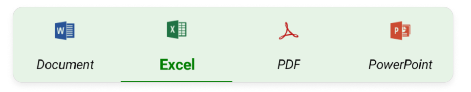
Tab image position
The .NET MAUI Tab View control provides four options that determine how the image of the tab aligns relative to the text. The options are top, bottom, left, and right.


Right
The image will be placed on the right side of the text for all the tabs.
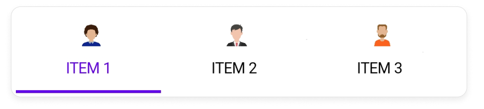
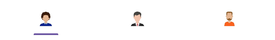
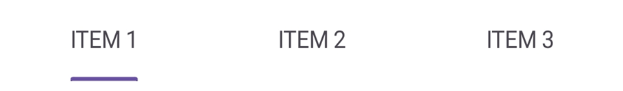
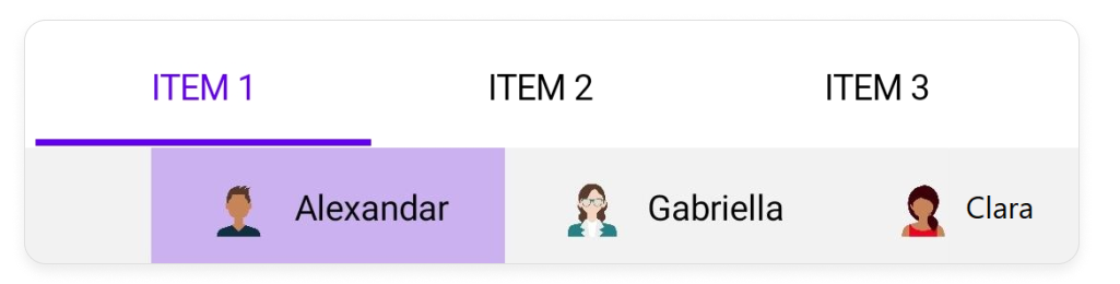
Selection indicator placement
The .NET MAUI Tab View control provides three options that determine how the selection indicator aligns relative to the tab header item. The options are top, bottom, and fill.
Top
The selection indicator will be placed at the top of the selected tab.

Fill
The selection indicator will fill the selected tab.

Bottom
The selection indicator will be placed at the bottom of the selected tab.
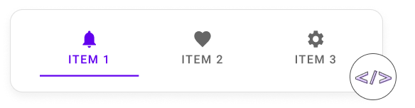
Header Display Mode
The .NET MAUI Tabs control offers three options for displaying the header of each tab item: Default, Image, and Text.

Default
Displays both the text and image on each tab item.
Image
Displays only the image on each tab item.
Text
Displays only the text on each tab item.
Tab bar placement
The .NET MAUI Tab View control provides two options that determine how the tab bar aligns relative to the tab content. The options are top and bottom.

Top
Tabs will be placed above the content region of the .NET MAUI Tab View control.

Bottom
Tabs will be placed below the content region of the .NET MAUI Tab View control.
Swipe gesture
The .NET MAUI Tab View control provides the swiping feature to navigate between the tab contents.
Selection indicator corner radius
The .NET MAUI Tab View control allows customization of the corner radius of the selection indicator.
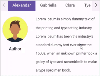
Nested tabs
A tab view can be configured in another tab view using the items property.
Color and font customization
All fonts can be customized with simple APIs. Change the text color, size, font family, and font style, including adding bold or italics.
Visual state manager
Use the visual state manager to make changes to .NET MAUI tab item properties based on the visual states. The applicable visual states are selected, normal, disable, and more.

Scroll mode
Scroll buttons in the tab view header facilitate navigation using items, and indicate the presence of tabs beyond the currently visible area.
 95+ UI controls
200+ interactive .NET MAUI demos
3.2M+ downloads
95+ UI controls
200+ interactive .NET MAUI demos
3.2M+ downloads
Not sure how to create your first .NET MAUI Tab View? Our tutorial videos and documentation can help.
I’d love to watch it now I’d love to read it now.NET MAUI DataViz & UI Controls
Standalone UI SDKs
Integrate the DataGrid, Chart, Scheduler, and Rich Text Editor UI components into applications to enable rich interaction and visualization, delivering a seamless user experience.
Document Solutions
Integrate the PDF Viewer, DOCX Editor, Spreadsheet Editor, and document-processing libraries into the .NET MAUI applications to enable a smooth user experience.
Frequently Asked Questions
Why should you choose the Syncfusion .NET MAUI Tab View?
The Syncfusion .NET MAUI Tab View control supports the following features:
- Tab View offers a simple and intuitive interface for tab navigation in mobile and desktop applications, allowing users to easily explore and switch between different tabs.
- It offers nested tabs with various header placements.
- It provides tab customization options, including different fonts and sizes.
- One of the best .NET MAUI Tab Views in the market, offering a feature-rich UI to interact with the software.
Simple configuration and APIs.
- Mobile-touch friendly.
Extensive demos, documentation, and videos to let you get started quickly with the .NET MAUI Tab View.
Where can I find the Syncfusion .NET MAUI Tab View demo?
You can find our .NET MAUI Tab View demo, which demonstrates how to render and configure the Tab View.
Can I download and utilize the Syncfusion .NET MAUI Tab View for free?
No, this is a commercial product and requires a paid license. However, a free community license is also available for companies and individuals whose organizations have less than US $1 million in annual gross revenue, 5 or fewer developers, and 10 or fewer total employees.
How do I get started with Syncfusion .NET MAUI Tab View?
A good place to start would be our comprehensive getting started documentation.
Our Customers Love Us


See Real Success Stories
Developers around the world trust Syncfusion’s Essential Studio to simplify complex projects and speed up delivery. With a vast library of UI controls, powerful SDKs, and reliable support, Essential Studio helps teams build enterprise-ready applications with confidence.
Read Our Customer StoriesIndustry
Software development
75% Cost reduction
50% Faster development
Industry
Utilities (oil and gas)
450+ hours saved
Streamlined processes and hours of development effort saved.
Advanced, flexible features
Empowered users through robust and versatile functionality.
Industry
Software and technology
1000+ of hours saved
Accelerated development with enterprise-ready UI components.
Efficient file management
Streamlined workflows with document libraries without building them from scratch.
Industry
Software and technology
2 Years of delay avoided
Two years of delays prevented with proactive planning.
On-time delivery
Projects delivered on schedule using trusted controls.
Industry
IT services and IT consulting
Improved performance
Large datasets handled with easy customization and quick debugging.
Highly customizable
Plug-and-play controls with quick template integration.
Industry
Professional services
Instant access
Quick availability of features and resources.
Reduced dependencies
Fewer dependencies for faster development.
Rated by users across the globe


Awards
Greatness—it’s one thing to say you have it, but it means more when others recognize it. Syncfusion® is proud to hold the following industry awards.

