We use cookies to give you the best experience on our website. If you continue to browse, then you agree to our privacy policy and cookie policy.

The WPF Charts control is used to visualize large amounts of data using lines, areas, pies, doughnut, etc. It includes functionalities for plotting more than 45 chart types. Each chart type in WPF is easily configured with built-in support for creating stunning visual effects.
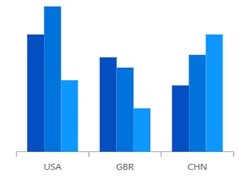
The WPF Column Chart uses vertical bars (called columns) to display different values of one or more items. Compare values across categories using vertical bars.

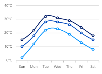
The WPF Bar Chart is ideal for showing variations in the value of an item over time. It is arranged vertically, and data values are plotted horizontally to show the variations.
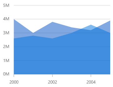
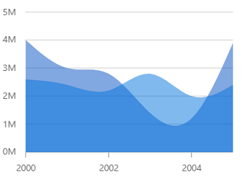
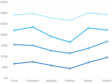
The WPF Area Charts are popular for showing volume changes over a period of time. This chart looks like the line chart that contains space between the line and the X-axis, filled with color.
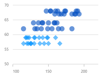
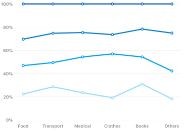
The WPF Scatter Chart, or WPF Scatter Graph is used to plot data with two numeric parameters. It supports rotation and selection.
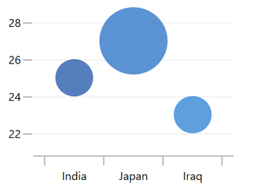
Visualizes data with three numeric parameters. The size of the bubbles depends on the third parameter.

The WPF Pie Chart is a circular graph ideal for displaying proportional values in different categories. It supports rotation and selection..
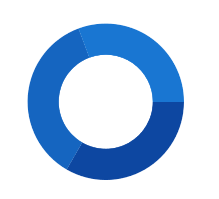
The Doughnut chart is like the pie chart, but has an open space at the center. It is used for comparing the contribution of each data point to the whole.
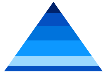
The WPF Pyramid chart represent hierarchies visually in a pyramid-like structure that shows proportions of the total.

A Funnel Chart displays values as progressively decreasing proportions, Plots streamlined data to show various stages in a process.
Like the area chart, but with data points connected with splines rather than straight lines.
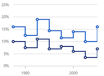
Data points are connected using vertical and horizontal lines to show step-like progress.
Like the step line chart, but with the areas connected by lines shaded.
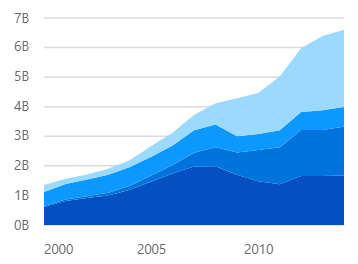
Like the area chart, but with the data points stacked on top of one another.
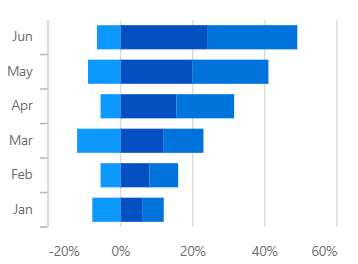
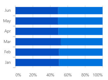
The stacked bar chart plots data points on top of one another using horizontal bars.
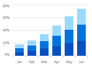
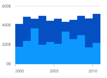
The WPF Stacked Column Chart plots data points on top of one another using vertical bars.
A stacked line chart is a line chart in which lines do not overlap because they are cumulative at each point.

Shows the relative percentage of multiple data series in stacked areas. The cumulative proportion of each stacked area always totals 100%.
Shows the relative percentage of multiple data series in stacked bars. The cumulative proportion of each stacked bar always totals 100%.
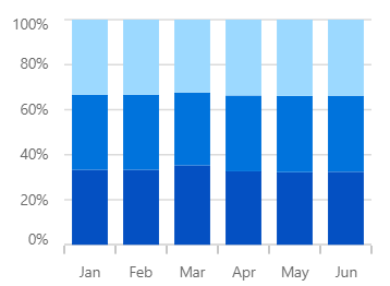
Shows the relative percentage of multiple data series in stacked columns. The cumulative proportion of each stacked column always totals 100%.
Shows the relative percentage of multiple data series in stacked lines. The cumulative proportion of each stacked line always totals 100%.

Shows variations in data values for a given time. The area between the high and low range is filled.

Shows variations in data values for a given time. The area between the high and low range is filled.
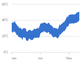
Shows variations in data values for a given time. The area between the high and low range is filled.

The HiLo chart shows the price range (the highest and lowest prices) over one unit of time.

The WPF OHLC Chart is like a candle chart. The horizontal lines at the left and right are used to show opening and closing values of the stock, and the height of the vertical line represents high and low values. They are easily customizable and support interactive features such as trackball, tooltip, selection, and zooming to track information of the data.

The WPF candlestick chart is a type of financial chart that displays high, low, open, and close values of a stock in the stock market with a vertical column and a vertical line.
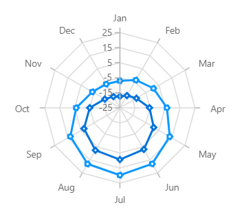
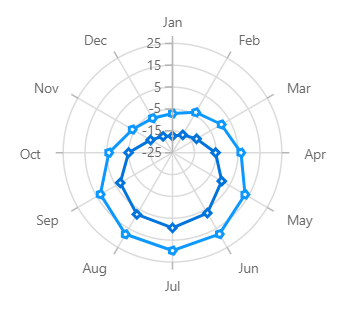
A radar chart displays multivariate data two-dimensionally with three or more quantitative variables represented on axes starting from the same point.
Shows the data points on a 360-degree circle, grouped by categories and displayed on the radial axis. It is used to compare multivariate data sets.

The WPF Histogram Chart plots the distribution of numerical data, It visualizes the frequency distribution of data over a certain time period.
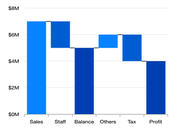
The WPF Waterfall Chart shows gradual changes in the quantitative value of an entity that is subject to change by increments or decrements. Use the waterfall chart to quickly illustrate the changes in revenues.

This chart plots a combination of rectangle and lines to show the distribution of the dataset.Displays groups of data into quartiles.

The error bar chart indicates the errors or uncertainty in reported values. Displays tables of means (or medians) and variability.
 You are using an outdated version of Internet Explorer that may not display all features of this and other websites. Upgrade to Internet Explorer 8 or newer for a better experience.