WPF Range Slider control
- A single slider can be used either as a vertical or horizontal slider.
- A single value or a range can be selected by providing a single thumb or two thumbs, respectively.
- Customizing ticks, thumbs, and tracking can easily adapt the control to your app’s design.
.NET 10 support now available
Trusted by the world’s leading companies

Overview
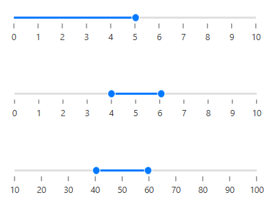
The Range Slider control allows you select a range of values within a specified minimum and maximum limit. The range can be selected by moving the thumb control along a track. The control is intended to provide a UI to filter collection items within a range.
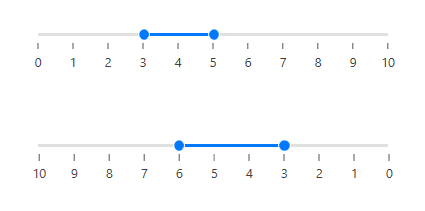
Range value
Choose a single or a range of values (start and end) between minimum and maximum.
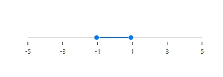
Custom values
The range slider control supports number, float, and negative values.

Tick frequency
Split the range of values into equal intervals to help users choose the required values easily.

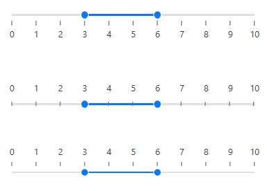
Snapping
While sliding, snap to visualize tick frequency or programmatic snap frequency.
Custom labels
The Range Slider is not restricted to numeric values, so you can visualize values as text, like: Low, Medium, High; or Bad, Good, Excellent.
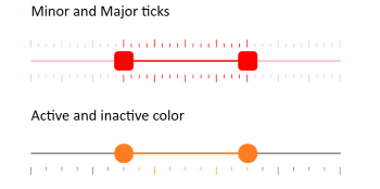
Major and minor ticks
Supports major and minor ticks representation and can be easily customized as active and inactive ticks based on the range.
Tick and label placement
Place or align ticks and labels in a different direction or orientation.
Vertical slider
You can control the orientation of a slider to render it in a vertical direction.

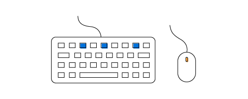
Keyboard interaction
Use arrow keys to adjust the value of a slider.
Tooltip
The value of the pointer or range is shown in a tooltip. You can control the placement of tooltips.

Orientation
The WPF Range Slider’s orientation can be set to horizontal or vertical. The default option is horizontal.

Reverse direction
Reverse the direction of a slider as needed.
Customization
Customize each element of the Range Slider in easy ways like thumb, active and inactive tracks, ticks and tooltips.

WPF Range Slider Code Example
Easily get started with the WPF Range Slider using a few simple lines of XAML or C# code example as demonstrated below. Also explore our WPF Range Slider Example that shows you how to render and configure the WPF Range Slider in WPF.
<Grid>
        <syncfusion:SfRangeSlider Minimum="100" Maximum="500"  ShowValueLabels="True" TickFrequency="50" Width="400"/>
</Grid>
public MainWindow()
{
InitializeComponent();
Grid grid = new Grid();
SfRangeSlider sfRangeSlider = new SfRangeSlider();
sfRangeSlider.Minimum = 100;
sfRangeSlider.Maximum = 500;
sfRangeSlider.ShowValueLabels = true;
sfRangeSlider.TickFrequency = 50;
sfRangeSlider.Width = 400;
grid.Children.Add(sfRangeSlider);
this.Content = grid;
}Not sure how to create your first WPF Range Slider? Our documentation can help.
I’d love to read it now140+ WPF CONTROLS
ALL CONTROLS
SMART COMPONENTS
DATA VISUALIZATION
MODERN THEMES
LAYOUT
NAVIGATION
INPUT CONTROLS
BUTTON
BUSINESS INTELLIGENCE
MISCELLANEOUS
LISTS & DROPDOWNS
FILE VIEWERS & EDITORS
CONVERSATIONAL UI
Standalone UI SDKs
Integrate the DataGrid, Chart, Scheduler, Gantt, and Diagram UI components into applications to enable rich interaction and visualization, delivering a seamless user experience.
Document Solutions
Integrate the PDF Viewer, DOCX Editor, Spreadsheet Editor, and document-processing libraries into the WPF applications to enable a smooth user experience.
Frequently Asked Questions
Why should you choose Syncfusion WPF Range Slider?
Syncfusion WPF Range Slider provides the following:
- Can be used as either a Slider or a Range Slider.
Has rich UI interaction and keyboard navigation to interact with the software.
- Is packed with a bunch of features with customization options suitable for building complex, large-scale applications.
- Has a simple configuration and APIs.
- Is touch-friendly and responsive.
Learn quickly and get started with WPF Range Slider using its extensive demos and documentation.
Can I download and utilize the Syncfusion WPF Range Slider for free?
No, this is a commercial product and requires a paid license. However, a free community license is also available for companies and individuals whose organizations have less than $1 million USD in annual gross revenue, 5 or fewer developers, and 10 or fewer total employees.
How do I get started with Syncfusion WPF Range Slider?
A good place to start would be our comprehensive getting started documentation.
Our Customers Love Us
Having an excellent set of tools and a great support team, Syncfusion® reduces customers’ development time.Here are some of their experiences.

Excellent experience with Syncfusion!
Syncfusion is a product that makes life easier! I use it to create Blazor applications (server side and webassembly) and the controls speed up development a lot. Furthermore, if needed, it is possible to ask for direct support that is never long in coming!

Andrea Scarpante,

Sydea srl
The complete component set
It is the most complete component set available. Also very handy is the fact that there is a community edition, this gives me the opportunity to test thing at home without buying a separate license.

Johan Visser,

H and T Pawnbrokers
See Real Success Stories
Developers around the world trust Syncfusion’s Essential Studio to simplify complex projects and speed up delivery. With a vast library of UI controls, powerful SDKs, and reliable support, Essential Studio helps teams build enterprise-ready applications with confidence.
Read Our Customer StoriesIndustry
Software development
75% Cost reduction
50% Faster development
Industry
Utilities (oil and gas)
450+ hours saved
Streamlined processes and hours of development effort saved.
Advanced, flexible features
Empowered users through robust and versatile functionality.
Industry
Software and technology
1000+ of hours saved
Accelerated development with enterprise-ready UI components.
Efficient file management
Streamlined workflows with document libraries without building them from scratch.
Industry
Software and technology
2 Years of delay avoided
Two years of delays prevented with proactive planning.
On-time delivery
Projects delivered on schedule using trusted controls.
Industry
IT services and IT consulting
Improved performance
Large datasets handled with easy customization and quick debugging.
Highly customizable
Plug-and-play controls with quick template integration.
Industry
Professional services
Instant access
Quick availability of features and resources.
Reduced dependencies
Fewer dependencies for faster development.
Rated by users across the globe
Syncfusion WPF Resources
Learning
 Documentation
 Documentation


Awards
Greatness—it’s one thing to say you have it, but it means more when others recognize it. Syncfusion® is proud to hold the following industry awards.

