WPF Percent TextBox - Allows Percent values Only
- A simple and easy way to input Percent values from users.
- Minimum and maximum value validation helps get accurate value from users.
- Watermark support, culture format, keyboard support, and built-in themes make the control more flexible.
.NET 10 support now available
Trusted by the world’s leading companies

Overview
The WPF Percent TextBox control provides a simple and intuitive interface to display and edit culture-specific Percent values. It supports culture-based formatting, number formatting, minimum and maximum value validation, watermark support, built-in themes, a range adorner, right-to-left support, positive and negative colors, and more.
Number formats
The numeric textbox can be formatted based on the number formats listed on MSDN. Through formatting, the number of percent decimal digits, the percent decimal separator, and the group separator can be provided.

Validation
Minimum and maximum value validation can be done within the given range. Users can choose when the validation needs to be carried out, either while entering the value or when the control loses its focus. The Percent TextBox control also allows users to do custom validation on their own.

Internationalization
The WPF Percent TextBox control comes with internationalization support to adapt to any culture through simple settings.

Watermark
Watermarks provide additional hints to users about the value they need to enter in the textbox.

Style and Customization

Built-in themes
The WPF Percent TextBox provides built-in themes like Office2016, Office2013, Metro, and Blend.

Fore color customization
Set different fore colors based on positive, negative, and zero color.

Range adorner
Increase or decrease a value just by scrolling the mouse or through extended scrolling. Display the entered value with progress notation.
Right-to-left (RTL)
The control supports right-to-left (RTL) direction for users working in right-to-left languages like Hebrew, Arabic, or Persian.

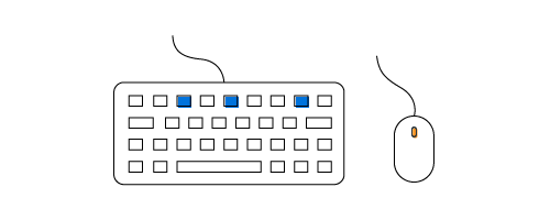
Complete keyboard and mouse support
Increment or decrement values through keyboard down and up operations. Change the values through mouse wheel operations.
WPF Percent TextBox Code Example
Easily get started with the WPF Percent TextBox using a few simple lines of XAML, and C# code example as demonstrated below. Also explore our WPF Percent TextBox Example that shows you how to render and configure the PercentTextBox in WPF.
<syncfusion:PercentTextBox x:Name="percentTextBox" Width="100" Height="25" VerticalAlignment="Center" HorizontalAlignment="Center"/>using Syncfusion.Windows.Shared;
public partial class MainWindow : Window
{
public MainWindow()
{
InitializeComponent();
//Creating an instance of PercentTextBox control
PercentTextBox percentTextBox = new PercentTextBox();
// Setting height and width to PercentTextBox
percentTextBox.Height = 25;
percentTextBox.Width = 100;
//Adding PercentTextBox as window content
this.Content = percentTextBox;
}
}Not sure how to create your first WPF Percent TextBox? Our documentation can help.
I’d love to read it now140+ WPF CONTROLS
ALL CONTROLS
SMART COMPONENTS
DATA VISUALIZATION
MODERN THEMES
LAYOUT
NAVIGATION
INPUT CONTROLS
BUTTON
BUSINESS INTELLIGENCE
MISCELLANEOUS
LISTS & DROPDOWNS
FILE VIEWERS & EDITORS
CONVERSATIONAL UI
Standalone UI SDKs
Integrate the DataGrid, Chart, Scheduler, Gantt, Rich Text Editor, File Manager, and Diagram UI components into applications to enable rich interaction and visualization, delivering a seamless user experience.
Document Solutions
Integrate the PDF Viewer, DOCX Editor, Spreadsheet Editor, and document-processing libraries into the WPF applications to enable a smooth user experience.
Frequently Asked Questions
Why should you choose Syncfusion WPF Percent TextBox?
- Null support and value validation customization.
Support for different cultures and custom formatting.
- Simple configuration and APIs.
- Support for localization and globalization.
- Rich UI interaction and keyboard navigation.
- MVVM support.
- One of the best WPF Percent Textbox in the market that offers feature-rich UI to interact with the software.
- Touch-friendly and responsive UI.
Extensive demos and documentation for getting started quickly with the WPF Percent TextBox control.
Can I download and utilize the Syncfusion WPF Percent TextBox for free?
No, this is a commercial product and requires a paid license. However, a free community license is also available for companies and individuals whose organizations have less than $1 million USD in annual gross revenue, 5 or fewer developers, and 10 or fewer total employees.
How do I get started with Syncfusion WPF Percent TextBox?
A good place to start would be our comprehensive getting started documentation.
Our Customers Love Us
Having an excellent set of tools and a great support team, Syncfusion® reduces customers’ development time.Here are some of their experiences.

Excellent experience with Syncfusion!
Syncfusion is a product that makes life easier! I use it to create Blazor applications (server side and webassembly) and the controls speed up development a lot. Furthermore, if needed, it is possible to ask for direct support that is never long in coming!

Andrea Scarpante,

Sydea srl
The complete component set
It is the most complete component set available. Also very handy is the fact that there is a community edition, this gives me the opportunity to test thing at home without buying a separate license.

Johan Visser,

H and T Pawnbrokers
See Real Success Stories
Developers around the world trust Syncfusion’s Essential Studio to simplify complex projects and speed up delivery. With a vast library of UI controls, powerful SDKs, and reliable support, Essential Studio helps teams build enterprise-ready applications with confidence.
Read Our Customer StoriesIndustry
Software development
75% Cost reduction
50% Faster development
Industry
Utilities (oil and gas)
450+ hours saved
Streamlined processes and hours of development effort saved.
Advanced, flexible features
Empowered users through robust and versatile functionality.
Industry
Software and technology
1000+ of hours saved
Accelerated development with enterprise-ready UI components.
Efficient file management
Streamlined workflows with document libraries without building them from scratch.
Industry
Software and technology
2 Years of delay avoided
Two years of delays prevented with proactive planning.
On-time delivery
Projects delivered on schedule using trusted controls.
Industry
IT services and IT consulting
Improved performance
Large datasets handled with easy customization and quick debugging.
Highly customizable
Plug-and-play controls with quick template integration.
Industry
Professional services
Instant access
Quick availability of features and resources.
Reduced dependencies
Fewer dependencies for faster development.
Rated by users across the globe
Syncfusion WPF Resources
Learning
 Documentation
 Documentation


Awards
Greatness—it’s one thing to say you have it, but it means more when others recognize it. Syncfusion® is proud to hold the following industry awards.

