WPF Calendar — Advanced and Effective Control
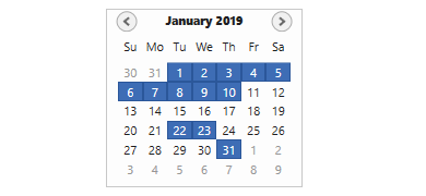
- Select a single date, multiple dates, or a range of dates.
- Customize special dates with your own icons and descriptions.
- Use many features: custom tooltips for dates, date selection range, displaying today’s date, week numbers, and complete customization.
.NET 10 support now available
Trusted by the world’s leading companies

Overview
The WPF Calendar control (month calendar) can be utilized to navigate to any day of any year. The fully touch-enabled control allows you to navigate to the next or previous month of the calendar with an intuitive swipe. It provides multiselect date support, custom tooltips for dates, date selection ranges, the ability to display today’s date at the bottom, a week numbers display, and complete customization of date, day name, and special dates cells.
Date selection
WPF Calendar control supports selecting a single, multiple, and range of dates. It also supports programmatic selection.
Date restriction
Prevent navigation beyond the specified minimum and maximum dates to prevent users from selecting certain dates.
Blackout dates
Disable interactions and selections for certain dates. This is useful when you want to block user interaction during holidays or another special event.


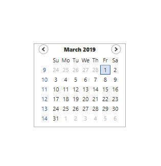
Month and year views
Display and navigate dates with an intuitive user interface using built-in month and year views. Month view displays the dates of a month with horizontal and vertical navigation and the year view displays the months of a year with horizontal navigation.

Appearance

Built-in themes
The WPF Calendar control provides various built-in themes like Office2016, Office2013, Metro, Blend, etc., which help adapt the control to the application UI.

Abbreviation for days and months
Month and day names in a calendar can be displayed with abbreviations or with full names.
Right To Left
WPF Month calendar supports right to left (RTL) direction for users working in right-to-left languages like Hebrew, Arabic, or Persian.

Globalization
Displays the days and months in different cultures. Thus, it meets the needs of different regions.

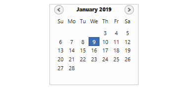
Tooltip for Particular Days
You can set the tooltip for specific days in the WPF Calendar.
WPF Calendar Code Example
Easily get started with the WPF Calendar using a few simple lines of XAML and C# code example as demonstrated below. Also explore our WPF Calendar Example that shows you how to render and configure the Calendar in WPF.
<syncfusion:CalendarEdit x:Name = "calendarEdit" Height = "200" Width = "200" />using Syncfusion.Windows.Shared;
namespace WpfApp1
{
public partial class MainWindow : Window
{
public MainWindow()
{
InitializeComponent();
// Creating an instance of the CalendarEdit
CalendarEdit calendarEdit = new CalendarEdit();
// Setting height and width to CalendarEdit
calendarEdit.Height = 200;
calendarEdit.Width = 200;
this.Content = calendarEdit;
}
}
}Not sure how to create your first WPF Calendar? Our documentation can help.
I’d love to read it now140+ WPF CONTROLS
ALL CONTROLS
SMART COMPONENTS
DATA VISUALIZATION
MODERN THEMES
LAYOUT
NAVIGATION
INPUT CONTROLS
BUTTON
BUSINESS INTELLIGENCE
MISCELLANEOUS
LISTS & DROPDOWNS
FILE VIEWERS & EDITORS
CONVERSATIONAL UI
Standalone UI SDKs
Integrate the DataGrid, Chart, Scheduler, Gantt, and Diagram UI components into applications to enable rich interaction and visualization, delivering a seamless user experience.
Document Solutions
Integrate the PDF Viewer, DOCX Editor, Spreadsheet Editor, and document-processing libraries into the WPF applications to enable a smooth user experience.
Our Customers Love Us
Having an excellent set of tools and a great support team, Syncfusion® reduces customers’ development time.Here are some of their experiences.

Nice suite of components
A very complete set of components, that has an edge on other major vendors which offer components. A lot less code required to use and code samples for more complete components. Integrates well with other 3rd party components.

John A,

C# Developer
Complete, robust, fully functional web UI
The Syncfusion Grid component is as good or better than any other on the market. It has every feature you could want: paging, sorting, filtering, sizing and reordering columns, exporting to PDF, CSV, or Excel. And they have just about every other rich web component you think of: Calendar, sortable list, embedded rich text/HTML editor, charts, maps, you name it.

Ray W,
Founder/CTO
See Real Success Stories
Developers around the world trust Syncfusion’s Essential Studio to simplify complex projects and speed up delivery. With a vast library of UI controls, powerful SDKs, and reliable support, Essential Studio helps teams build enterprise-ready applications with confidence.
Read Our Customer StoriesIndustry
Software development
75% Cost reduction
50% Faster development
Industry
Utilities (oil and gas)
450+ hours saved
Streamlined processes and hours of development effort saved.
Advanced, flexible features
Empowered users through robust and versatile functionality.
Industry
Software and technology
1000+ of hours saved
Accelerated development with enterprise-ready UI components.
Efficient file management
Streamlined workflows with document libraries without building them from scratch.
Industry
Software and technology
2 Years of delay avoided
Two years of delays prevented with proactive planning.
On-time delivery
Projects delivered on schedule using trusted controls.
Industry
IT services and IT consulting
Improved performance
Large datasets handled with easy customization and quick debugging.
Highly customizable
Plug-and-play controls with quick template integration.
Industry
Professional services
Instant access
Quick availability of features and resources.
Reduced dependencies
Fewer dependencies for faster development.
Rated by users across the globe
Syncfusion WPF Resources
Learning
 Documentation
 Documentation


Awards
Greatness—it’s one thing to say you have it, but it means more when others recognize it. Syncfusion® is proud to hold the following industry awards.

