WPF Circular and Linear ProgressBar - A Simple and Flexible Control
- Linear or Circular progress bar represents the progression of a task elegantly.
- Secondary progress can be shown like YouTube buffering.
- Indeterminate state options allow you to show interruption of progress.
.NET 10 support now available
Trusted by the world’s leading companies

Overview
The WPF ProgressBar control indicates the progress of a task with customizable visuals. It includes features to visualize progress in rectangular and circular shapes, determinate and indeterminate states, segments, and customized ranges in different colors.
Types
Visualizes progress of a task in different shapes (rectangle and circle) to give a unique appearance to your design.

Determinate
Use the determinate mode progress bar when progress can be estimated.

Indeterminate
Use the indeterminate mode progress bar when progress cannot be estimated or calculated.

Buffer
Uses a secondary progress indicator when the primary task depends on the secondary task. This will allow users to visualize both primary and secondary tasks’ progress simultaneously.
Segments
Avoid writing several lines of code to create and position multiple progress bars: just divide a progress bar into multiple segments using a single API to visualize the progress of multiple sequential tasks. WPF ProgressBar Segments documentation

Angle
Customize the start and sweep angles of a WPF circular progressbar to give a unique style to the control.

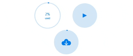
Custom content
Add any view to the center of a WPF circular progress bar to: Indicate the completion of a task; and start, pause, or cancel buttons to control the progress interactively; add an image that indicates the actual task in progress; and add custom text that conveys the progress of a task.
Visualize multiple ranges
Along with visualizing the progress of a task, users can also visualize multiple ranges with gradient colors or solid colors that are mapped to each range to enhance readability.

Appearance
The appearance of a progress bar is highly customizable. WPF ProgressBar Appearance documentation

Thickness
Tweak the thickness of the track and progress indicator to render the WPF Progress Bar with different appearances.

Colors
Apply appealing colors to the track and progress indicator to match your application theme.

Corner radius
The corner radius of the WPF linear progress can be customized.
WPF ProgressBar Code Example
Easily get started with the WPF ProgressBar using a few simple lines of XAML code example as demonstrated below. Also explore our WPF ProgressBar Example that shows you how to render and configure the ProgressBar in WPF.
<!--circularprogressbar.xaml -->
<Window
       xmlns="http://schemas.microsoft.com/winfx/2006/xaml/presentation"
       xmlns:x="http://schemas.microsoft.com/winfx/2006/xaml"
       xmlns:d="http://schemas.microsoft.com/expression/blend/2008"
       xmlns:mc="http://schemas.openxmlformats.org/markup-compatibility/2006"
       xmlns:local="clr-namespace:WpfApp4"
       xmlns:Syncfusion="http://schemas.syncfusion.com/wpf"
       x:Class="WpfApp4.MainWindow" mc:Ignorable="d" Title="MainWindow" Height="450" Width="800">
      <Grid x:Name="grid">
      <Syncfusion:SfCircularProgressBar Progress="50" Width="347"/>
      </Syncfusion:SfCircularProgressBar>
      </Grid>
</Window>

<!--linearprogressbar.xaml -->
<Window
       xmlns="http://schemas.microsoft.com/winfx/2006/xaml/presentation"
       xmlns:x="http://schemas.microsoft.com/winfx/2006/xaml"
       xmlns:d="http://schemas.microsoft.com/expression/blend/2008"
       xmlns:mc="http://schemas.openxmlformats.org/markup-compatibility/2006"
       xmlns:local="clr-namespace:WpfApp4"
       xmlns:Syncfusion="http://schemas.syncfusion.com/wpf"
       x:Class="WpfApp4.MainWindow" mc:Ignorable="d" Title="MainWindow" Height="450" Width="800">
      <Grid x:Name="grid">
      <TextBlock Text="Linear"/>
      <Syncfusion:SfLinearProgressBar Progress="70" "/>
      </Grid>
</Window>
Not sure how to create your first WPF ProgressBar? Our documentation can help.
I’d love to read it now140+ WPF CONTROLS
ALL CONTROLS
SMART COMPONENTS
DATA VISUALIZATION
MODERN THEMES
LAYOUT
NAVIGATION
INPUT CONTROLS
BUTTON
BUSINESS INTELLIGENCE
MISCELLANEOUS
LISTS & DROPDOWNS
FILE VIEWERS & EDITORS
CONVERSATIONAL UI
Standalone UI SDKs
Integrate the DataGrid, Chart, Scheduler, Gantt, Rich Text Editor, File Manager, and Diagram UI components into applications to enable rich interaction and visualization, delivering a seamless user experience.
Document Solutions
Integrate the PDF Viewer, DOCX Editor, Spreadsheet Editor, and document-processing libraries into the WPF applications to enable a smooth user experience.
Frequently Asked Questions
Why should you choose Syncfusion WPF ProgressBar?
The Syncfusion WPF ProgressBar provides the following:
- Circular and linear ProgressBars that indicate the progress of a task with customizable visuals.
Features to visualize progress in rectangular and circular shapes, determinate and indeterminate states, segments, and customized ranges in different colors.
- One of the best WPF ProgressBar in the market that offers feature-rich UI to interact with the software.
- Touch-friendly and responsive UI.
- Simple configuration and API.
Extensive demos, documentation to learn quickly and get started with WPF ProgressBar.
Can I download and utilize the Syncfusion WPF ProgressBar for free?
No, this is a commercial product and requires a paid license. However, a free community license is also available for companies and individuals whose organizations have less than $1 million USD in annual gross revenue, 5 or fewer developers, and 10 or fewer total employees.
How do I get started with Syncfusion WPF ProgressBar?
A good place to start would be our comprehensive getting started documentation.
Our Customers Love Us
Having an excellent set of tools and a great support team, Syncfusion® reduces customers’ development time.Here are some of their experiences.

Excellent experience with Syncfusion!
Syncfusion is a product that makes life easier! I use it to create Blazor applications (server side and webassembly) and the controls speed up development a lot. Furthermore, if needed, it is possible to ask for direct support that is never long in coming!

Andrea Scarpante,

Sydea srl
The complete component set
It is the most complete component set available. Also very handy is the fact that there is a community edition, this gives me the opportunity to test thing at home without buying a separate license.

Johan Visser,

H and T Pawnbrokers
See Real Success Stories
Developers around the world trust Syncfusion’s Essential Studio to simplify complex projects and speed up delivery. With a vast library of UI controls, powerful SDKs, and reliable support, Essential Studio helps teams build enterprise-ready applications with confidence.
Read Our Customer StoriesIndustry
Software development
75% Cost reduction
50% Faster development
Industry
Utilities (oil and gas)
450+ hours saved
Streamlined processes and hours of development effort saved.
Advanced, flexible features
Empowered users through robust and versatile functionality.
Industry
Software and technology
1000+ of hours saved
Accelerated development with enterprise-ready UI components.
Efficient file management
Streamlined workflows with document libraries without building them from scratch.
Industry
Software and technology
2 Years of delay avoided
Two years of delays prevented with proactive planning.
On-time delivery
Projects delivered on schedule using trusted controls.
Industry
IT services and IT consulting
Improved performance
Large datasets handled with easy customization and quick debugging.
Highly customizable
Plug-and-play controls with quick template integration.
Industry
Professional services
Instant access
Quick availability of features and resources.
Reduced dependencies
Fewer dependencies for faster development.
Rated by users across the globe
Syncfusion WPF Resources
Learning
 Documentation
 Documentation


Awards
Greatness—it’s one thing to say you have it, but it means more when others recognize it. Syncfusion® is proud to hold the following industry awards.

