WPF OLAP Gauge Control for KPI results
- Highlight key performance indicators (KPI) in the gauge.
- Render in half-circle and full-circle frame types.
- Customize pointer, pointer cap, scales, ranges, ticks, labels, indicators, etc.
.NET 10 support now available
Trusted by the world’s leading companies

Overview
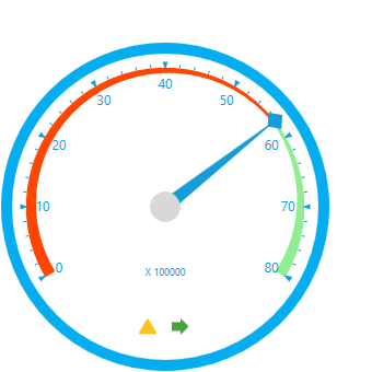
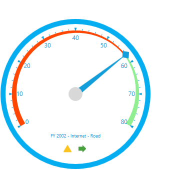
The WPF OLAP Gauge control is ideal for highlighting business-critical key performance indicator (KPI) information in an intuitive manner.


Data binding
The WPF OLAP Gauge control enables you to retrieve multidimensional data from SSAS or any XML/A provider. Following is the list of data sources our OLAP controls widely support:
- SSAS
- Mondrian
- Active pivot
- Oracle
Key performance indicators
KPIs are a collection of calculations associated with a measure group that evaluates business success. Typically, these calculations are a combination of multidimensional expressions (MDX) or calculated members. There are four different types of available KPI indicators:
- Goal
- Status
- Trend
- Value


Frame types
WPF OLAP Gauge supports full-circle, half-circle, circular-center-gradient, circular-with-dark-outer-frames, circular-with-inner-left-gradient, circular-with-inner-top-gradient, counterclockwise-half-circle, left-half-circle, and right-half-circle gauges to visualize data in a compact area by modifying the start and end angles.
Key elements

Scale
The scale of the gauge is a circular arc that supports a range of numbers bound by minimum and maximum values.

Pointer
The pointer is a needle-type element indicating the current value on the scale.

Ticks
Ticks mark the values that are present on the scale.

Ranges
Highlight a range of values. Ranges can show with different colors that help you quickly visualize where a value falls on a scale.

Indicators
Indicators let the user view status and trends, showing progress toward a goal.

Markers
Markers help to signify the current value or goal on the scale.
Flexible layout
Easily arrange multiple gauges in a structured layout by specifying row and column count. Based on the specification, gauges will be arranged in the available space.

Gauge customization

Gauge factor
Allows users to view detailed information about the measure values specified in the control.
Gauge label
The gauge figures out the category by combining the descriptions of series and category axes members.

Tooltip
Provides basic information while the mouse hovers over each individual gauge.
Direction
Users can change the scale direction to either clockwise or counterclockwise.

Custom style and themes

Built-in themes
Ships with built-in themes like Blend, Office 2010, Office 2013, Office 2016, Office 365, Visual Studio 2013, Visual Studio 2015, and Metro.

Custom styles
Customize the appearance of the control by changing the styles of the pointer, pointer cap, scales, ticks, labels, and state indicators.

Globalization and localization

Globalization
Users from different locales can use the control by applying date formats, currency formats, and number formats to suit local preferences.

Right-to-left (RTL)
The text direction and layout of the control can be displayed in the right-to-left (RTL) direction.

Developer-friendly APIs
For a great developer experience, flexible built-in APIs are available to define and customize the WPF OLAP Gauge control. Developers can optimize the data bound to the control and customize the user interface (UI) completely using code with ease.
140+ WPF CONTROLS
ALL CONTROLS
SMART COMPONENTS
DATA VISUALIZATION
MODERN THEMES
LAYOUT
NAVIGATION
INPUT CONTROLS
BUTTON
BUSINESS INTELLIGENCE
MISCELLANEOUS
LISTS & DROPDOWNS
FILE VIEWERS & EDITORS
CONVERSATIONAL UI
Standalone UI SDKs
Integrate the DataGrid, Chart, Scheduler, Gantt, Rich Text Editor, File Manager, and Diagram UI components into applications to enable rich interaction and visualization, delivering a seamless user experience.
Document Solutions
Integrate the PDF Viewer, DOCX Editor, Spreadsheet Editor, and document-processing libraries into the WPF applications to enable a smooth user experience.
Our Customers Love Us
Having an excellent set of tools and a great support team, Syncfusion® reduces customers’ development time.Here are some of their experiences.

Excellent experience with Syncfusion!
Syncfusion is a product that makes life easier! I use it to create Blazor applications (server side and webassembly) and the controls speed up development a lot. Furthermore, if needed, it is possible to ask for direct support that is never long in coming!

Andrea Scarpante,

Sydea srl
The complete component set
It is the most complete component set available. Also very handy is the fact that there is a community edition, this gives me the opportunity to test thing at home without buying a separate license.

Johan Visser,

H and T Pawnbrokers
See Real Success Stories
Developers around the world trust Syncfusion’s Essential Studio to simplify complex projects and speed up delivery. With a vast library of UI controls, powerful SDKs, and reliable support, Essential Studio helps teams build enterprise-ready applications with confidence.
Read Our Customer StoriesIndustry
Software development
75% Cost reduction
50% Faster development
Industry
Utilities (oil and gas)
450+ hours saved
Streamlined processes and hours of development effort saved.
Advanced, flexible features
Empowered users through robust and versatile functionality.
Industry
Software and technology
1000+ of hours saved
Accelerated development with enterprise-ready UI components.
Efficient file management
Streamlined workflows with document libraries without building them from scratch.
Industry
Software and technology
2 Years of delay avoided
Two years of delays prevented with proactive planning.
On-time delivery
Projects delivered on schedule using trusted controls.
Industry
IT services and IT consulting
Improved performance
Large datasets handled with easy customization and quick debugging.
Highly customizable
Plug-and-play controls with quick template integration.
Industry
Professional services
Instant access
Quick availability of features and resources.
Reduced dependencies
Fewer dependencies for faster development.
Rated by users across the globe
Syncfusion WPF Resources
Learning
 Documentation
 Documentation


Awards
Greatness—it’s one thing to say you have it, but it means more when others recognize it. Syncfusion® is proud to hold the following industry awards.

