Badge control for WPF
- Badges are commonly used to display a notification count or status information in different sizes and contextual color variants.
- The easily customizable notification badge provides widely used badge types, standard colors, and predefined symbols.
- Easily integrates with other controls such as ListBox, TabControl, and more.
.NET 10 support now available
Trusted by the world’s leading companies

Overview
The WPF Badge is a notification control that is used to notify users of new or unread messages, notifications, status, and more. They can easily be integrated with controls like ListBox, TabControl, and more.
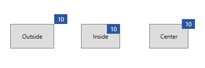
Badge position and alignment
Change and move badges to any place on the content according to the user’s needs.
Badge position
Position badges at any location of the content.
Badge alignment
Align badges to their content in start, end, and center modes.
Badge customization
Customize the WPF Badge control using its built-in badge icons, background colors, text colors, and font styles.
Predefined shapes
Provides predefined notification shapes such as oval, ellipse, and rectangle.
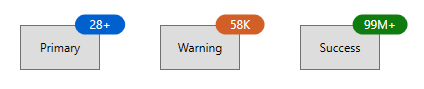
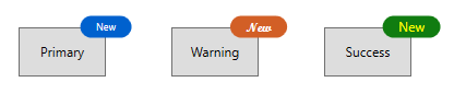
Predefined styles
Seven predefined contextual color variants are available for badges, including primary, secondary, warning, error, and more.
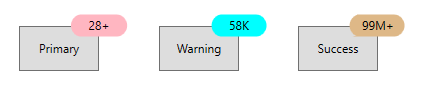
Background customization
Customize the background of badges to enhance the style.
Font customization
Customize the badge font size, family, and color to improve readability.
Animation
The WPF Badge control provides a visually appealing way to animate badges when their notification value changes.
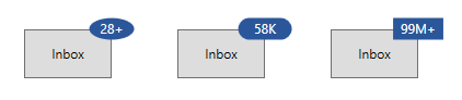
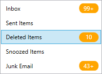
Integration with other controls
Integrate the WPF Badge with various controls to achieve different features, such as displaying the number of unread messages in an email category, the status of product support, and more.
140+ WPF CONTROLS
ALL CONTROLS
SMART COMPONENTS
DATA VISUALIZATION
MODERN THEMES
LAYOUT
NAVIGATION
INPUT CONTROLS
BUTTON
BUSINESS INTELLIGENCE
MISCELLANEOUS
LISTS & DROPDOWNS
FILE VIEWERS & EDITORS
CONVERSATIONAL UI
Standalone UI SDKs
Integrate the DataGrid, Chart, Scheduler, Gantt, Rich Text Editor, File Manager, and Diagram UI components into applications to enable rich interaction and visualization, delivering a seamless user experience.
Document Solutions
Integrate the PDF Viewer, DOCX Editor, Spreadsheet Editor, and document-processing libraries into the WPF applications to enable a smooth user experience.
Our Customers Love Us
Having an excellent set of tools and a great support team, Syncfusion® reduces customers’ development time.Here are some of their experiences.

Excellent experience with Syncfusion!
Syncfusion is a product that makes life easier! I use it to create Blazor applications (server side and webassembly) and the controls speed up development a lot. Furthermore, if needed, it is possible to ask for direct support that is never long in coming!

Andrea Scarpante,

Sydea srl
The complete component set
It is the most complete component set available. Also very handy is the fact that there is a community edition, this gives me the opportunity to test thing at home without buying a separate license.

Johan Visser,

H and T Pawnbrokers
See Real Success Stories
Developers around the world trust Syncfusion’s Essential Studio to simplify complex projects and speed up delivery. With a vast library of UI controls, powerful SDKs, and reliable support, Essential Studio helps teams build enterprise-ready applications with confidence.
Read Our Customer StoriesIndustry
Software development
75% Cost reduction
50% Faster development
Industry
Utilities (oil and gas)
450+ hours saved
Streamlined processes and hours of development effort saved.
Advanced, flexible features
Empowered users through robust and versatile functionality.
Industry
Software and technology
1000+ of hours saved
Accelerated development with enterprise-ready UI components.
Efficient file management
Streamlined workflows with document libraries without building them from scratch.
Industry
Software and technology
2 Years of delay avoided
Two years of delays prevented with proactive planning.
On-time delivery
Projects delivered on schedule using trusted controls.
Industry
IT services and IT consulting
Improved performance
Large datasets handled with easy customization and quick debugging.
Highly customizable
Plug-and-play controls with quick template integration.
Industry
Professional services
Instant access
Quick availability of features and resources.
Reduced dependencies
Fewer dependencies for faster development.
Rated by users across the globe
Syncfusion WPF Resources
Learning
 Documentation
 Documentation


Awards
Greatness—it’s one thing to say you have it, but it means more when others recognize it. Syncfusion® is proud to hold the following industry awards.

