Trusted by the world’s leading companies

Overview
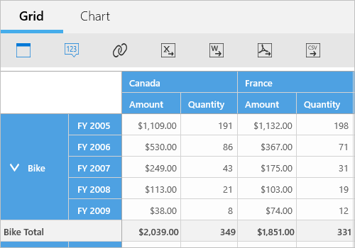
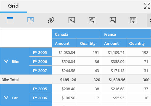
Browse multidimensional data organized into dimensions, measures, named sets, and KPIs in a cube format, as well as pivot data, with the UWP Pivot and OLAP Browser. You can visualize the results in graphical (UWP Pivot Chart) and table (UWP Pivot Grid) formats. The control can also be used to create and edit reports at runtime that can be stored for later use.
Data binding
The UWP Pivot and OLAP Browser provides extensive support to bind OLAP and pivot data sources.
- OLAP data sources: SSAS, Mondrian, ActivePivot, and Oracle.
- Pivot data sources: DataTable, DataView, and DataSet from SQL databases or collections like IEnumerable, ICollection, IList, List
, and ArrayList.
Optimized for mobile devices

Touch support
All features work smoothly on touch devices with ease. Features such as drag and drop, drill up and drill down, filtering, sorting, and report manipulation can be done on the fly.

Responsive support
View the control layout on mobile devices.
UWP Pivot Grid
End users can enable the built-in features of Pivot Grid either through UI or a simple, user-friendly API in code behind.
For more details about the built-in UWP Pivot Grid features, check here
UWP Pivot Chart
End users can enable the built-in features of UWP Pivot Chart either through UI or a simple user-friendly API in code-behind.
For more details about the built-in UWP Pivot Chart features, check here
OLAP
End users can easily slice and dice the OLAP cube elements of their choice to visualize performance, trends, outliers, and more.

Slice and dice
The slice-and-dice feature creates a new view for the end user by selecting limited dimensions and measures from the OLAP cube and filtering them.

Predefined KPIs
KPIs are a collection of calculations associated with a measure group that evaluates business success. A few KPIs are defined and listed earlier during the time of OLAP cube creation itself.

Virtual KPIs
Users can create their own KPIs at runtime and write expressions, as well. In an expression, positive numbers will be represented by a green light or up arrow, and negative numbers will be represented by a red light or down arrow, depending on the user preference.

Paging
Load and render large amounts of data through paging without any performance constraints.

Named sets
Named sets simplify MDX queries and provide useful aliases for complex, commonly used set expressions.

Calculated members and measures
You can create and display your own dimensions and measures at runtime.

Member properties
Member properties provide basic information about each member in each tuple, including member name, parent level, and number of children. These member properties are available for all members at any given level, and can be enabled in reports programmatically.
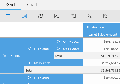
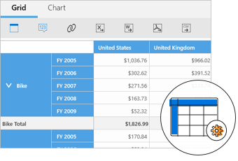
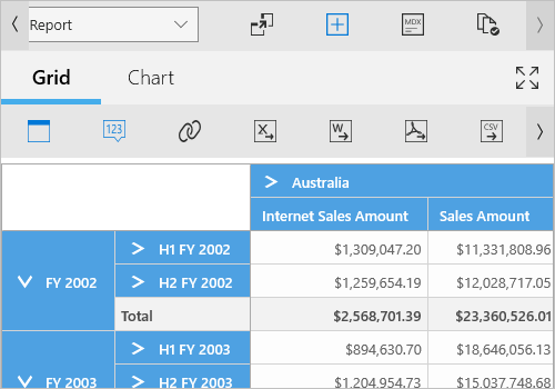
Drill down and drill up
There is built-in support to drill down (expand) and drill up (collapse) to visualize the pivot grid and pivot chart information in both abstract and detailed views.
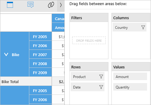
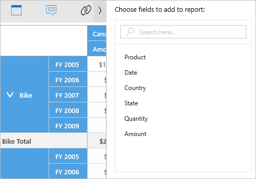
Axis element builder
The axis element builder is similar to the pivot table field list in Excel, as it allows you to create and manage the control with multidimensional (OLAP) and pivot data sources. End users can drag hierarchies or fields and filter them to create reports at runtime.
Pivot/Cube browser
- OLAP cube organizes its elements such as dimensions, hierarchies, measures, KPIs, and named sets from the selected cube in a tree-like structure.
- Fields are loaded in a list view structure for a pivot data source.
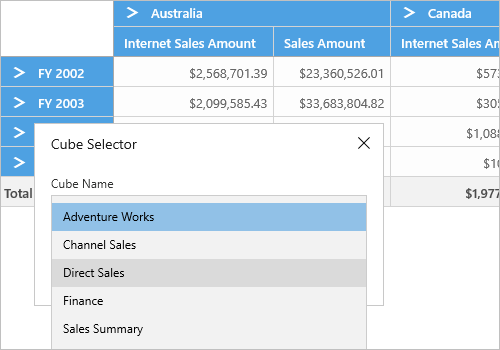
Cube selector
The cube selector allows you to select any one of the cubes available in the connected database. Based on the selected cube, the corresponding cube element gets loaded into the control. You can perform this only for OLAP data sources.
Filtering
Easily filter and view data using built-in normal and Excel-like filter UIs with advanced filtering options. It is also possible to filter programmatically.
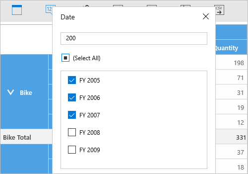
Header filtering
Display only selective values for a field either through the UI or code behind.
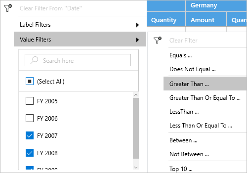
Excel-like filtering
Filter column and row headers based on either label text or grand total value.
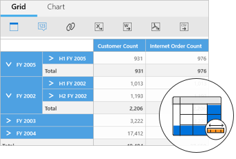
Sorting
Order rows and columns either in ascending or descending order.
Header sorting
Order the column and row header either in ascending or descending order. You can do this only for pivot data sources.
Custom sorting
Order the column and row header based on the custom comparer defined by the user. You can do this only for pivot data sources.
Measure sorting
Orders the columns and rows based on measure values. You can do this only for OLAP data sources through reports in code behind.
Summaries and calculations
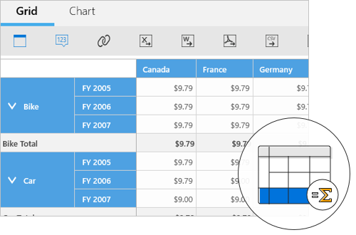
Summaries
Along with 10 built-in summary types, you can define your own custom summaries. You can do this only for pivot data sources.
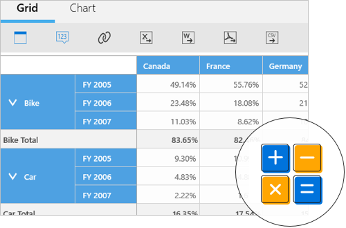
Calculations
You can insert new calculations and use 16 built-in calculation types. You can do this only for pivot data sources.
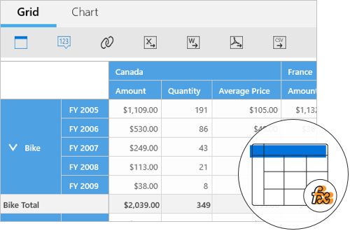
Calculated field
The calculated field, otherwise known as an unbound field, generates a unique field with your own calculated value by executing a simple user-defined formula. You can use this only with pivot data sources.
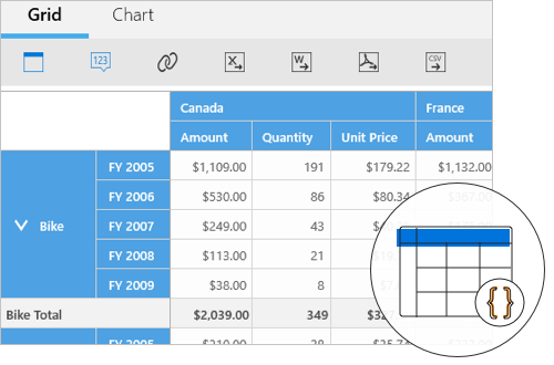
Expression field
An expression field generates data by executing a user-defined expression. The generated data is specific to a few field(s) from the underlying data source. You can apply this only for pivot data sources.
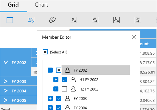
Member editor
The member editor dialog displays members of the selected field in a tree-like structure. You can filter the members and this is applicable only with OLAP data sources.
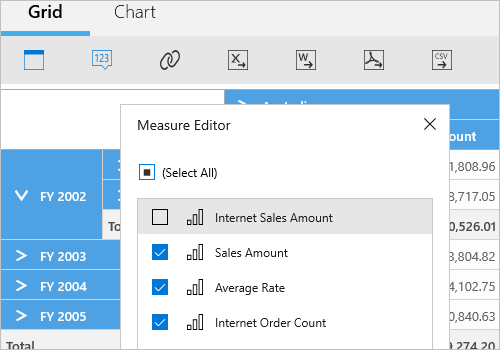
Measure editor
The measure editor dialog displays a collection of measures from the current report. You can filter the measures and this is applicable only with OLAP data sources.
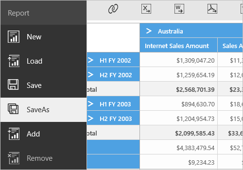
Report manipulation
- New — Create a new report collection.
- Add — Add a new report in the current report collection.
- Rename — An individual report name can be modified in the current report collection.
- Remove — An individual report can be removed from the current report collection.
- Save — Save the current report collection in XML format.
- Save as — Save the current report with more than one name in XML format.
- Load — Load back the saved report collection that is in XML format.
Toolbar
The following options are available in the toolbar to perform reporting operations:
- Toggle axis—Toggle the hierarchies in the row axis and column axis.
- Show and hide expander—Toggle the visibility of expanders used for drill operations.
- Full screen—View the pivot chart and pivot grid in the full screen of the device.
- Defer update—Users can refresh the control on-demand instead of during every user interaction.
Additional options are available only for OLAP data sources:
- Report options—Add, rename, save, load, and remove reports at runtime.
- Cube selector—Select any one of the cubes available in the connected database.
- Report list—Select any report from the report collection bound to the control.
- MDX—Show the MDX query of the current report.
- Paging—Enable or disable the paging option of the control.
- Calculated members and measures—Create a new calculated member or measure at runtime.
- Virtual KPI—Create a new virtual KPI element at runtime.
Additional options are available only for pivot data sources:
- Expression field—Create a new expression field at runtime.
- Custom summary—Create a new custom summary at runtime.
- Calculated field—Create a new calculated field at runtime.
Layout customization
Users can render the control in different layouts with the help of built-in properties:
- During initial loading, the default view can be either pivot grid or pivot chart.
- At runtime, users can display either a pivot chart or pivot grid alone.
- Users can show or hide columns, rows, slicers, and the value axis.
- Users can show or hide the search box in the cube browser and also expand or collapse its view.
- At runtime, users can show or hide the Pivot Chart and Pivot Grid toolbar.
- Users can show or hide the toggle axis, expanders, report options, report list, and MDX dialog in the main toolbar.
- Users can customize size through the control’s API.

Save and load reports
You can save reports from the current session in XML format for later use. UI support is provided for Save, Save As, and Load Report operations. You can do this only with OLAP data sources.
Custom style and themes

Built-in themes
Ships with built-in themes like Blend, Office 2010, Office 2016, Office 365, Visual Studio 2013, Visual Studio 2015, Metro, Lime, and Saffron.
Custom styling
You can customize the control’s appearance to any extent in code behind.
Developer-friendly APIs
For a great developer experience, flexible built-in APIs are available to define and customize the UWP Pivot and OLAP Browser. Developers can optimize the data bound to the control and customize the user interface (UI) completely using code with ease.
Globalization and localization

Globalization
Users from different locales can use the control by applying appropriate date formats, currency formats, and number formats.

Right to left (RTL)
The text direction and layout of the control can be displayed in the right-to-left (RTL) direction.

Localization
Users can customize the text in the user interface based on the local culture.
110+ UWP CONTROLS
ALL CONTROLS
GRIDS
DATA VISUALIZATION
INPUT CONTROLS
CALENDAR
NAVIGATION
BUSINESS INTELLIGENCE
LISTS & DROPDOWN
NOTIFICATION
MISCELLANEOUS
FILE VIEWERS & EDITORS
Standalone UI SDKs
Integrate the DataGrid, Chart, Scheduler, Gantt, Rich Text Editor, File Manager, and Diagram UI components into applications to enable rich interaction and visualization, delivering a seamless user experience.
Document Solutions
Integrate the PDF Viewer, DOCX Editor, Spreadsheet Editor, and document-processing libraries into the UWP applications to enable a smooth user experience.
Our Customers Love Us
Having an excellent set of tools and a great support team, Syncfusion® reduces customers’ development time.Here are some of their experiences.

Excellent experience with Syncfusion!
Syncfusion is a product that makes life easier! I use it to create Blazor applications (server side and webassembly) and the controls speed up development a lot. Furthermore, if needed, it is possible to ask for direct support that is never long in coming!

Andrea Scarpante,

Sydea srl
The complete component set
It is the most complete component set available. Also very handy is the fact that there is a community edition, this gives me the opportunity to test thing at home without buying a separate license.

Johan Visser,

H and T Pawnbrokers
See Real Success Stories
Developers around the world trust Syncfusion’s Essential Studio to simplify complex projects and speed up delivery. With a vast library of UI controls, powerful SDKs, and reliable support, Essential Studio helps teams build enterprise-ready applications with confidence.
Read Our Customer StoriesIndustry
Software development
75% Cost reduction
50% Faster development
Industry
Utilities (oil and gas)
450+ hours saved
Streamlined processes and hours of development effort saved.
Advanced, flexible features
Empowered users through robust and versatile functionality.
Industry
Software and technology
1000+ of hours saved
Accelerated development with enterprise-ready UI components.
Efficient file management
Streamlined workflows with document libraries without building them from scratch.
Industry
Software and technology
2 Years of delay avoided
Two years of delays prevented with proactive planning.
On-time delivery
Projects delivered on schedule using trusted controls.
Industry
IT services and IT consulting
Improved performance
Large datasets handled with easy customization and quick debugging.
Highly customizable
Plug-and-play controls with quick template integration.
Industry
Professional services
Instant access
Quick availability of features and resources.
Reduced dependencies
Fewer dependencies for faster development.
Rated by users across the globe
Syncfusion UWP Resources
Learning
 Documentation
 Documentation


Awards
Greatness—it’s one thing to say you have it, but it means more when others recognize it. Syncfusion® is proud to hold the following industry awards.

