Trusted by the world’s leading companies

Overview
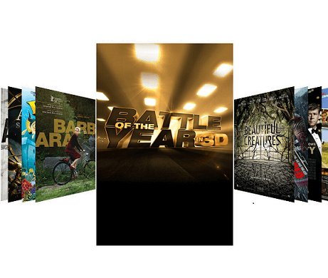
The carousel control provides an intuitive interface to navigate through a collection of views with scaling and rotation transformations. It has a linear interface to navigate through a collection of views without scaling and rotation transformations.
Default view
The carousel default view is an intuitive interface used to navigate through a collection of views with offset images, scaling, and rotation.


Rotation
The rotate option helps users set the rotation angle of non-selected items.
Scaling
The scale option helps users change the size of non-selected items.
Linear view
The carousel control allows users to populate a collection of views in a horizontal linear layout.

Custom template
The carousel control accepts templates for carousel items that help you to change the look of the item used in it.

Load more
The load more option enables users to load a subset of data in the carousel. It helps users to increase initial loading performance when populating huge items.

Virtualization
The carousel control has been designed with virtualization, so you can get the weight of the grid app when loading the huge view collection.
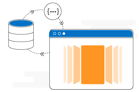
Data binding
Data binding works out of the box for the most popular data sources. The carousel control has been designed with MVVM pattern in mind for every aspect.
Set spacing between items

Displaying default space between UWP Carousel items

Displaying user defined space between UWP Carousel items
Default view
The carousel control has the option to set the space between non-selected items and selected items.

Linear view
The linear view has the option to set space between all items.
110+ UWP CONTROLS
ALL CONTROLS
GRIDS
DATA VISUALIZATION
INPUT CONTROLS
CALENDAR
NAVIGATION
BUSINESS INTELLIGENCE
LISTS & DROPDOWN
NOTIFICATION
MISCELLANEOUS
FILE VIEWERS & EDITORS
Standalone UI SDKs
Integrate the DataGrid, Chart, Scheduler, Gantt, and Diagram UI components into applications to enable rich interaction and visualization, delivering a seamless user experience.
Document Solutions
Integrate the PDF Viewer, DOCX Editor, Spreadsheet Editor, and document-processing libraries into the UWP applications to enable a smooth user experience.
Our Customers Love Us
Having an excellent set of tools and a great support team, Syncfusion® reduces customers’ development time.Here are some of their experiences.

Excellent experience with Syncfusion!
Syncfusion is a product that makes life easier! I use it to create Blazor applications (server side and webassembly) and the controls speed up development a lot. Furthermore, if needed, it is possible to ask for direct support that is never long in coming!

Andrea Scarpante,

Sydea srl
The complete component set
It is the most complete component set available. Also very handy is the fact that there is a community edition, this gives me the opportunity to test thing at home without buying a separate license.

Johan Visser,

H and T Pawnbrokers
See Real Success Stories
Developers around the world trust Syncfusion’s Essential Studio to simplify complex projects and speed up delivery. With a vast library of UI controls, powerful SDKs, and reliable support, Essential Studio helps teams build enterprise-ready applications with confidence.
Read Our Customer StoriesIndustry
Software development
75% Cost reduction
50% Faster development
Industry
Utilities (oil and gas)
450+ hours saved
Streamlined processes and hours of development effort saved.
Advanced, flexible features
Empowered users through robust and versatile functionality.
Industry
Software and technology
1000+ of hours saved
Accelerated development with enterprise-ready UI components.
Efficient file management
Streamlined workflows with document libraries without building them from scratch.
Industry
Software and technology
2 Years of delay avoided
Two years of delays prevented with proactive planning.
On-time delivery
Projects delivered on schedule using trusted controls.
Industry
IT services and IT consulting
Improved performance
Large datasets handled with easy customization and quick debugging.
Highly customizable
Plug-and-play controls with quick template integration.
Industry
Professional services
Instant access
Quick availability of features and resources.
Reduced dependencies
Fewer dependencies for faster development.
Rated by users across the globe
Syncfusion UWP Resources
Learning
 Documentation
 Documentation


Awards
Greatness—it’s one thing to say you have it, but it means more when others recognize it. Syncfusion® is proud to hold the following industry awards.

