Trusted by the world’s leading companies

Overview
The React Splitter is a layout user interface (UI) that provides resizable, expandable, collapsible, and nestable panes. It is useful for constructing different layouts in web apps such as Outlook style, Windows Explorer style, code editor UI, and more. The component can integrate other JavaScript UI controls inside its split panes.
Resizable splitter panels
The React Splitter component has built-in resizable support that helps widen or shrink the panes. Users can control the resize behavior for individual panes with min and max size validation.


Collapsible panes
Built-in support is available for expanding and collapsing the panes by interaction.
Multiple panes
Users can configure more than 2 panes to construct different layouts using React Splitter component such as Outlook-style, Windows explorer-style, Visual Studio code-style, and more.
Content as React UI component
Users can integrate other React UI component (For example: TreeView, ListView, Rich Text Editor), HTML markup, or plain text content in the React split panes.
Vertical or horizontal orientation
The orientation of the split panes can either be horizontal or vertical inside the React Splitter component.

Separator (Divider)
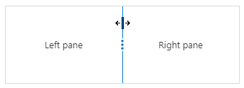
The React Splitter component has a split bar to visually split the panes that contains resize gripper.
Nested React Splitter
Splitters can be nested in various levels within the pane to create complex layout such as code editor-style layout.
Right-to-Left (RTL)
The React Splitter component supports right-to-left (RTL) rendering. Users can change the text direction and layout of the Splitter component from right to left. It improves the user experience and accessibility for users who use RTL languages.
Themes
The React Splitter component has several built-in themes such as Material, Bootstrap, Fabric (Office 365), Tailwind CSS, and High Contrast. Users can customize any one of these built-in themes or create new themes to achieve their own desired look and feel either by simply overriding SASS variables or using our Theme Studio application.
Sizing to content
Users can specify pane size either in pixels or in percentage values including min and max range values to accommodate the sizing to its child component or content.
React Splitter Code Example
Easily get started with the React Splitter Component using a few simple lines of TSX code example as demonstrated below. Also explore our React Splitter Example that shows you how to render and configure a Splitter in React.
import { PaneDirective, PanesDirective, SplitterComponent } from '@syncfusion/ej2-react-layouts';
import * as React from "react";

class App extends React.Component {
  public render() {
return (
  <div className="App">
  <SplitterComponent id="splitter" height="250px" width="600px">
      <PanesDirective>
        <PaneDirective/>
        <PaneDirective/>
        <PaneDirective/>
      </PanesDirective>
  </SplitterComponent>
  </div>
  );
  }
}
export default App;Not sure how to create your first React Splitter? Our tutorial videos and documentation can help.
I’d love to watch it now I’d love to read it nowDiscover Syncfusion’s Complete React Component Ecosystem
Explore over 145+ React UI components featuring established, production-ready controls and the latest pure React components built natively for modern web app development.
-
React Components
-
Pure React Components
-
SMART COMPONENTSGRIDSDATA VISUALIZATIONDROPDOWNSFILE VIEWERS & EDITORSBUTTONSINTERACTIVE CHATINPUTSNAVIGATIONFORMSNOTIFICATIONS
-
GRIDSDATA VISUALIZATIONNAVIGATIONINPUTS
Build Document Workflows in React
Embed PDF viewing, Word document editing, and Excel-like spreadsheet processing in your React app to streamline document workflows and help teams collaborate on files without context switching or external dependencies.
Our Customers Love Us


 Documentation
Awards
Greatness—it’s one thing to say you have it, but it means more when others recognize it. Syncfusion® is proud to hold the following industry awards.


