Trusted by the world’s leading companies

Overview
The React Multi Select Dropdown is a quick replacement for the HTML select tag for selecting multiple values. HTML MultiSelect Dropdown is a textbox component that allows the user to type or select multiple values from a list of predefined options. It has several out-of-the-box features such as data binding, filtering, grouping, tagging with custom values, and checkbox mode.
React Multi Select Dropdown Code Example
Easily get started with the React Multi Select Dropdown Component using a few simple lines of TSX code example as demonstrated below. Also explore our React Multi Select Dropdown Example that shows you how to render and configure a React Multi Select Dropdown in React.
import { MultiSelectComponent} from '@syncfusion/ej2-react-dropdowns';
import * as React from 'react';
import * as ReactDOM from "react-dom";

export default class App extends React.Component<{}, {}> {
  public render() {
    return (
       // specifies the tag for render the MultiSelect component
      <MultiSelectComponent id='mtselement'/>
    );
  }
}

ReactDOM.render(<App />, document.getElementById('sample'));
Data binding
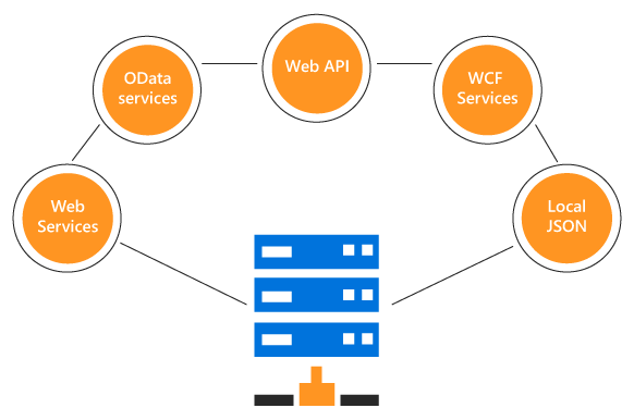
You can bind data from a variety of data sources like an array of primitive data, JSON data collections, or a remote data source using various kinds of adaptors such as OData, OData V4, URL, JSON, and Web API. This uses JavaScript data manager to manage data and has customization option for data request and processing.
Render modes
Various render modes are available to visualize selected items.

Chip mode (box mode)
Selected items are displayed as a chip (box) type in the MultiSelect input box.

Delimiter mode
The selected items are displayed with a delimiter character in the MultiSelect input box.

Hybrid mode(default mode)
By default, the selected items are displayed as chip type when the component is in focus. Otherwise, they’re displayed with a delimiter character.
Filtering and searching
The React MultiSelect Dropdown has built-in filtering support with a rich set of filtering configurations available.

Custom filtering
The React MultiSelect Dropdown filter query can be customized. You can also use your own filter libraries to filter data like Fuzzy search.

Diacritic sensitive search
The React MultiSelect Dropdown component has built-in diacritic character sensitivity support. This behavior can be turned on or off.

Filter settings
The filter search can be customized with case sensitivity, and the number of characters needed to make the filter search can be set.
UI customization with templates
Use templates to change the appearance of the selection pop-up list items, the header and footer of the selection pop-up list, and the Multiselect Dropdown input box selected values.

Header template
Design your own header for a pop-up list using a header template.

Item template
Define the custom appearance of each list item using an item template.

Footer template
Design your own custom footer for a pop-up list using footer template.

Value template
Define the custom appearance of selected values using a value template.

Empty record template
Configure the custom look of a pop-up list when no items are available to display in the filter search functionality.
MultiSelect items icons
Each list item of a pop-up list can be configured with a custom icon or image to improve readability and visualization.

MultiSelect Dropdown check box
The React MultiSelect Dropdown component has check box support. Enabling a check box on each item helps the user handle multiple selected values.
Selection limit
You can limit the number of items that can be selected in a drop-down.

Chip customization
You can customize the selected chip (value) element appearance on value selection action.
Tagging custom value
Tag the new values that are not present in the predefined list.


Grouping with category
Group the popup list items with the corresponding category which masks easy to pick the item quickly from the dropdown, also increase the visual experience of the user.
Pop-up dimension
The width and height of a pop-up option list are customizable.


HTML form support
The React MultiSelect Dropdown is a form component, seamlessly supporting HTML forms and obtaining values on form submission.
Sortable list items
You can display items in the ascending or descending order in a popup list.

Responsive MultiSelect Dropdown
A responsive mode gives an adaptive, redesigned UI appearance for mobile devices and recognizes touch gestures.
Developer-friendly APIs
Developers can customize all UI elements and control their behaviors using the component’s rich set of client-side APIs.
Built-in themes
The React MultiSelect component is shipped with several built-in themes such as Material, Bootstrap, Fabric (Office 365), Tailwind CSS, and High Contrast. Customize any one of these built-in themes or create new themes by either simply overriding SASS variables or using our Theme Studio application.
Accessibility
-
Fully supports WAI-ARIA accessibility that makes list view accessible to on-screen readers and assistive devices.
-
Follows WAI-ARIA best practices best practices for implementing keyboard interaction.
-
Follows WCAG 2.0standard in design for the UI element visuals such as foreground color, background color, line spacing, text, and images.
-
Supports right-to-left (RTL) direction for users working in right-to-left languages like Hebrew, Arabic, or Persian.


Not sure how to create your first React MultiSelect Dropdown? Our tutorial videos and documentation can help.
I’d love to watch it now I’d love to read it nowDiscover Syncfusion’s Complete React Component Ecosystem
Explore over 140+ React UI components featuring established, production-ready controls and the latest pure React components built natively for modern web app development.
-
React Components
-
Pure React Components
-
SMART COMPONENTSGRIDSDATA VISUALIZATIONDROPDOWNSFILE VIEWERS & EDITORSBUTTONSINTERACTIVE CHATINPUTSNAVIGATIONFORMSNOTIFICATIONS
-
GRIDSDATA VISUALIZATIONNAVIGATION
Standalone UI SDKs
Integrate the DataGrid, Chart, Scheduler, Gantt, Rich Text Editor, File Manager, and Diagram UI components into applications to enable rich interaction and visualization, delivering a seamless user experience.
Document Solutions
Integrate the PDF Viewer, DOCX Editor, Spreadsheet Editor, and document-processing libraries into the React applications to enable a smooth user experience.
Frequently Asked Questions
Why should you choose Syncfusion React MultiSelect Dropdown?
- A quick replacement of the HTML select element with multiple selection.
Built-in check box support with a Select All option for easy interactions.
Built-in support for filtering, hierarchical data binding, grouping, tagging, selection limits, and UI customization with templates.
- Supports standard Syncfusion themes which include Bootstrap v5 and Tailwind CSS.
- Allows multiple render modes, floating labels options, sortable list items, and customizable popup dimension.
- Highly customizable interface with web accessibility features.
Simple configuration and API.
- Supports all modern browsers.
- Mobile-touch friendly and responsive.
- One of the best React MultiSelect Dropdown in the market that offers feature-rich UI to interact with the software.
Extensive demos and documentation to learn quickly and get started with React MultiSelect DropDown.
Where can I find the Syncfusion React MultiSelect Dropdown demo?
You can find our React MultiSelect Dropdown demo here.
Can I download and utilize the Syncfusion React MultiSelect Dropdown for free?
No, this is a commercial product and requires a paid license. However, a free community license is also available for companies and individuals whose organizations have less than $1 million USD in annual gross revenue, 5 or fewer developers, and 10 or fewer total employees.
How do I get started with Syncfusion React MultiSelect Dropdown?
A good place to start would be our comprehensive getting started documentation.
Our Customers Love Us
Having an excellent set of tools and a great support team, Syncfusion® reduces customers’ development time.Here are some of their experiences.

Aweseome, enough said. really
Easy usability, solving real life problems. easy to implement. most of the cases has the operators and settings possibilities you right away need. never fails to impress

Oliver O,

Geschäftsführung Kreation/Artdirektion, Small-Business
A giant framework with great pricing options
I have loved the components and options that Syncfusion has, besides, its documentation, demos, and Support are excellent.

Alejandro Javier V,
CEO, Small-Business
See Real Success Stories
Developers around the world trust Syncfusion’s Essential Studio to simplify complex projects and speed up delivery. With a vast library of UI controls, powerful SDKs, and reliable support, Essential Studio helps teams build enterprise-ready applications with confidence.
Read Our Customer StoriesIndustry
Software development
75% Cost reduction
50% Faster development
Industry
Utilities (oil and gas)
450+ hours saved
Streamlined processes and hours of development effort saved.
Advanced, flexible features
Empowered users through robust and versatile functionality.
Industry
Software and technology
1000+ of hours saved
Accelerated development with enterprise-ready UI components.
Efficient file management
Streamlined workflows with document libraries without building them from scratch.
Industry
Software and technology
2 Years of delay avoided
Two years of delays prevented with proactive planning.
On-time delivery
Projects delivered on schedule using trusted controls.
Industry
IT services and IT consulting
Improved performance
Large datasets handled with easy customization and quick debugging.
Highly customizable
Plug-and-play controls with quick template integration.
Industry
Professional services
Instant access
Quick availability of features and resources.
Reduced dependencies
Fewer dependencies for faster development.
Rated by users across the globe
Syncfusion React Resources
Learning
 Documentation
 Documentation


Awards
Greatness—it’s one thing to say you have it, but it means more when others recognize it. Syncfusion® is proud to hold the following industry awards.

