Overview
Columns define the schema of a data source in Blazor Gantt Chart component. It supports formatting, column definitions, column chooser, column menu, column reordering, and other important features. The operations such as sorting, filtering, and searching can be performed based on column definitions
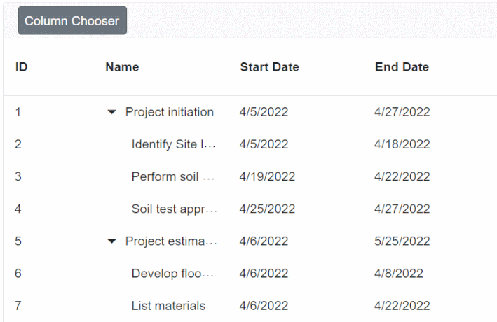
Define columns
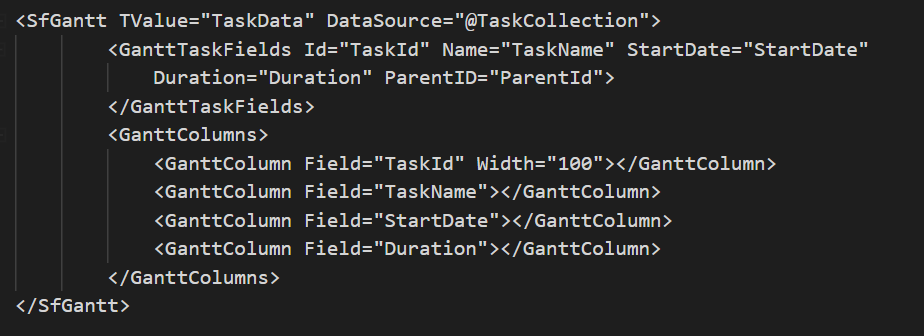
You can define columns explicitly to display the needed items in a Gantt Chart. You can also enhance the appearance of columns by setting the header text, text alignment, cell value format, and width.
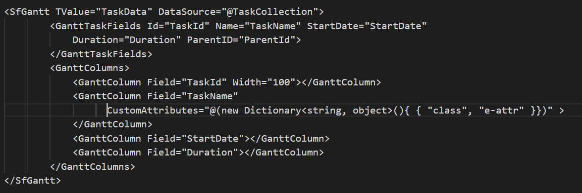
Cell Attributes
Users can decorate each cell element of a Gantt Chart with their own attributes by customizing styles, add additional class names, etc.
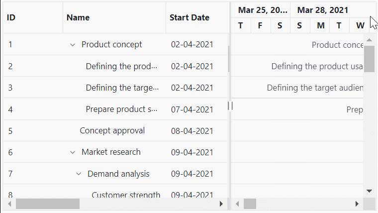
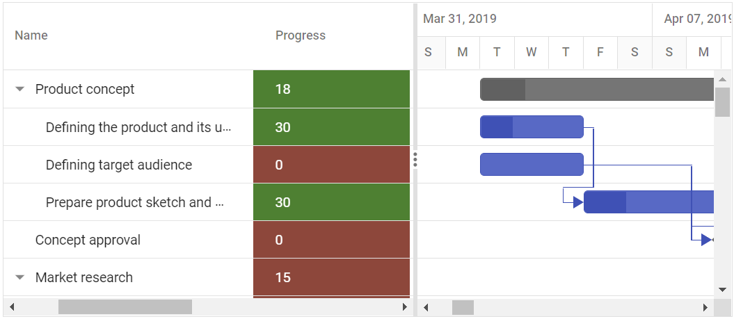
Resize
Column resize allows changing column width on the fly by simply dragging the right corner of the column header. A scroll bar appears when the Gantt Chart content width exceeds the element width.
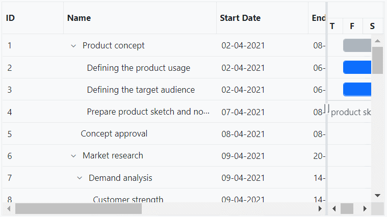
Reorder
Reorder Gantt Chart columns either through user interaction or programmatically. Simply dragging a column header into the desired column position will reorder the columns of a Gantt Chart.
Cell styling
The ASP.NET Core Gantt Chart supports customization of cell styles by using CSS or programmatically
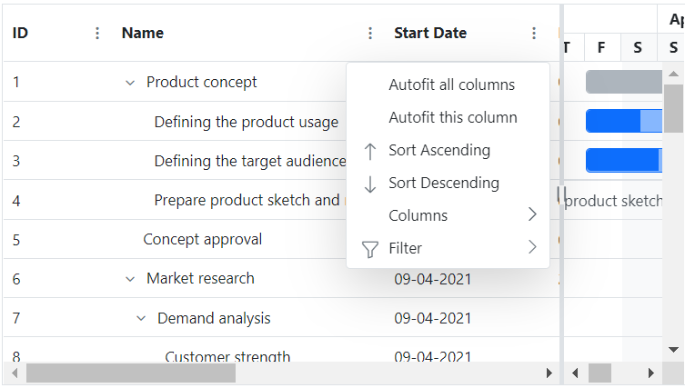
Column chooser
The column chooser provides a list of column names paired with check boxes that allows the user to toggle visibility on the fly. This helps the users to control the column visibility through an interactive UI.
Column menu
Allows performing various column-based actions with the help of Blazor Gantt Chart column menu. Menu items can also be customized to list only the preferred actions.
Our Customers Love Us


See Real Success Stories
Developers around the world trust Syncfusion’s Essential Studio to simplify complex projects and speed up delivery. With a vast library of UI controls, powerful SDKs, and reliable support, Essential Studio helps teams build enterprise-ready applications with confidence.
Read Our Customer StoriesIndustry
Software development
75% Cost reduction
50% Faster development
Industry
Utilities (oil and gas)
450+ hours saved
Streamlined processes and hours of development effort saved.
Advanced, flexible features
Empowered users through robust and versatile functionality.
Industry
Software and technology
1000+ of hours saved
Accelerated development with enterprise-ready UI components.
Efficient file management
Streamlined workflows with document libraries without building them from scratch.
Industry
Software and technology
2 Years of delay avoided
Two years of delays prevented with proactive planning.
On-time delivery
Projects delivered on schedule using trusted controls.
Industry
IT services and IT consulting
Improved performance
Large datasets handled with easy customization and quick debugging.
Highly customizable
Plug-and-play controls with quick template integration.
Industry
Professional services
Instant access
Quick availability of features and resources.
Reduced dependencies
Fewer dependencies for faster development.