Overview
The WinUI Cartesian Charts control supports plotting 20+ chart types. Each chart type is easily configurable with built-in options for stunning visual effects.
Basic charts


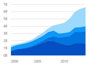
WinUI area chart
Area charts are like line charts except that the area under the lines is shaded.
Correlation charts
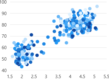
WinUI scatter chart
The scatter plot or scatter chart visualizes data with two numeric parameters.
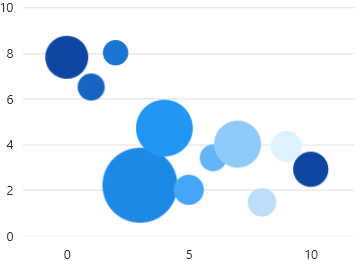
Bubble charts
Visualize data with three numeric parameters. The size of the bubbles depends on the third parameter.
Financial charts
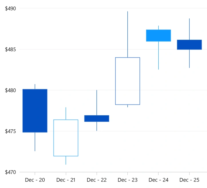
Candle chart
The candle chart displays stock data by showing the opening and closing values in a rectangular body, while the vertical wicks represent the high and low values.
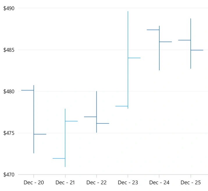
OHLC chart
The OHLC chart is similar to a candle chart. The horizontal lines on the left and right represent the opening and closing values of the stock, while the vertical line shows the high and low values.
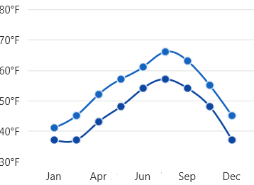
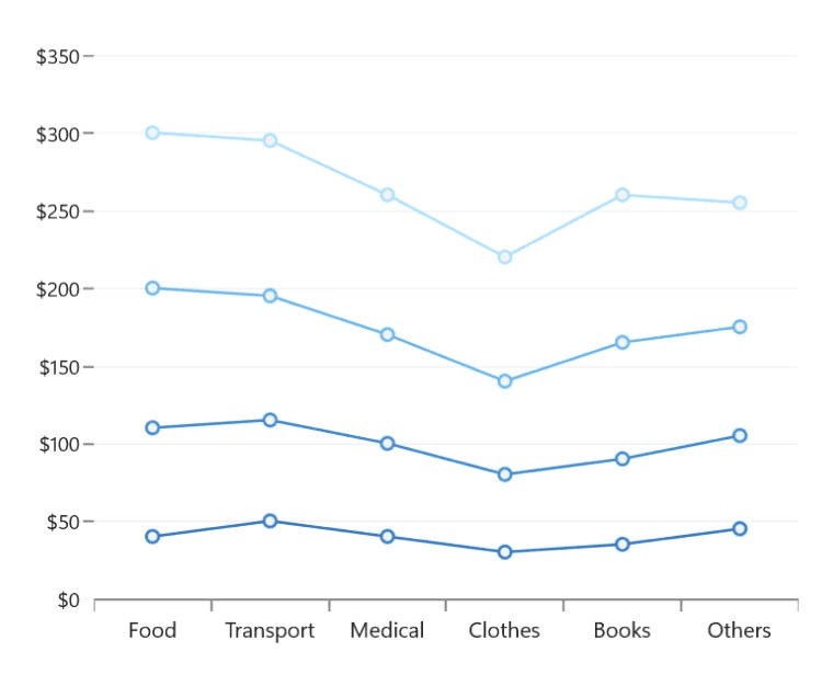
Spline charts
Spline area chart
Spline area charts are like spline charts except that the areas under the splines are shaded.
Step charts

Step line charts
Data points are connected by vertical and horizontal lines to show a step-like progress.
Step area chart
Step area charts are similar to step line charts except that the areas under the lines are shaded.
Stacked charts
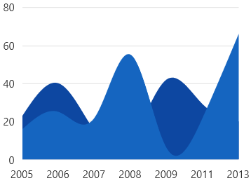
Stacked area charts
A stacked area chart is like an area chart, but the data points are stacked on top of each other.
Stacked line chart
A stacked line chart is like the line chart, but with the data points stacked on top of each other.
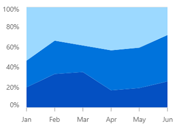
WinUI 100% stacked area charts
This chart shows the relative percentage of multiple data series in stacked areas. The cumulative proportion of each stacked area always totals 100%.
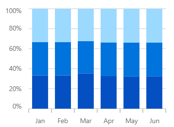
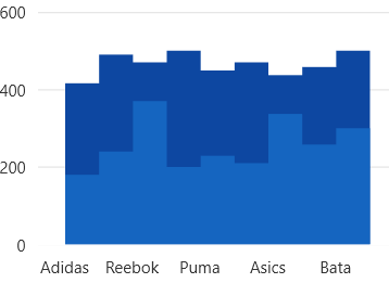
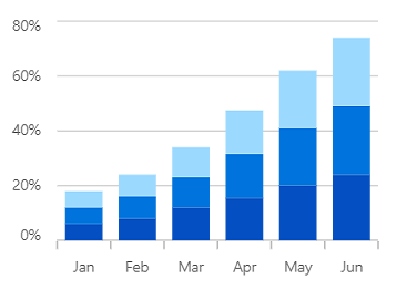
100% stacked column charts
View the relative percentage of multiple data series in stacked columns. The cumulative proportion of each stacked column always totals 100%.
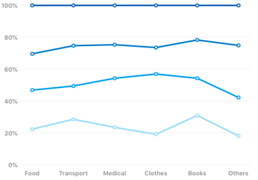
100% stacked line charts
With a 100% stacked line chart, the relative percentage of multiple data series are displayed as stacked lines. The cumulative proportion of each stacked line always totals 100%.