Overview
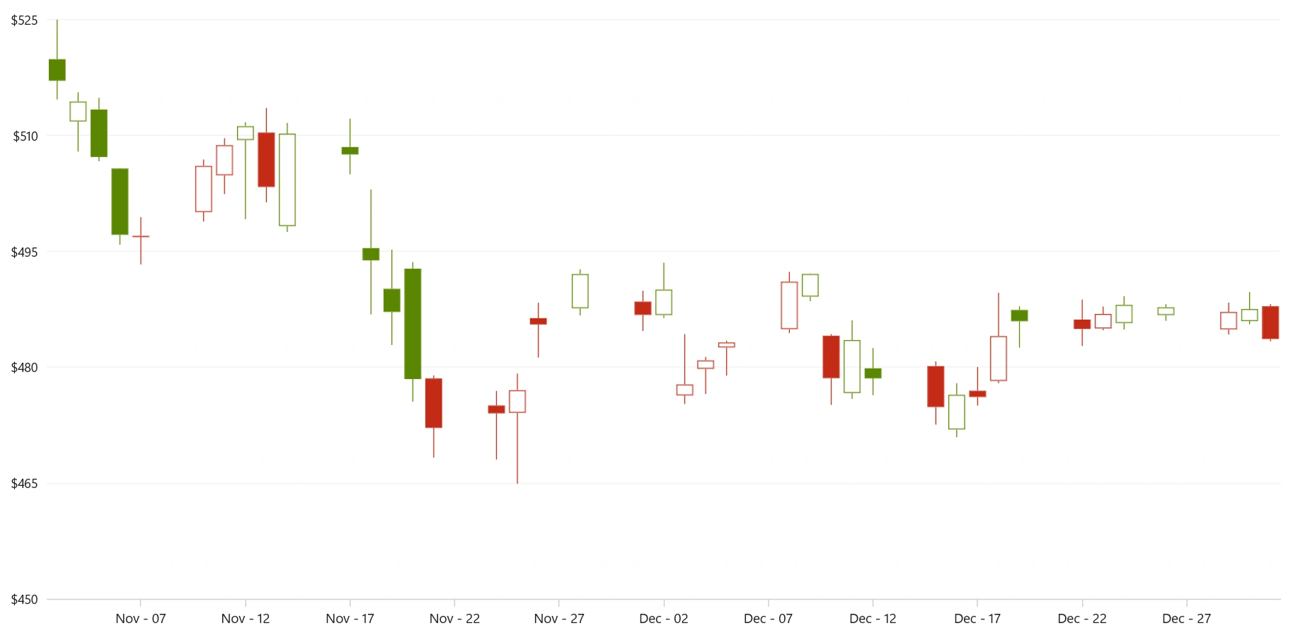
The WinUI candle chart is commonly used to represent the open, high, low, and close values of stocks in the stock market. It visualizes financial data at equal intervals, making it easier to identify trends. The high and low values are connected by a vertical straight line, while the region between the open and close values is represented by a vertical column segment. The chart supports interactive features such as zooming, panning, trackball, tooltips, and selection.
Key features
Hollow and solid
The candle chart supports both hollow and solid (filled) styles, which are commonly applied in different analytical patterns.
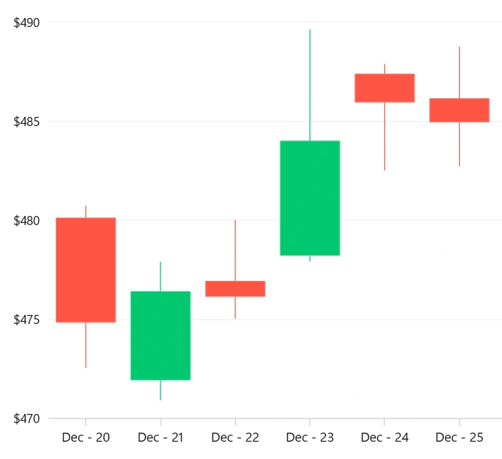
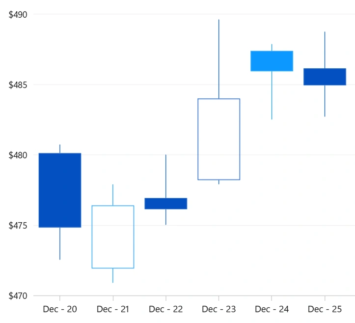
Bull and bear
Customize your candle chart by applying custom bullish and bearish brushes.
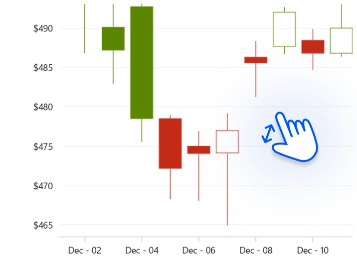
Zooming and scrolling
Zoom and pan within the candle chart to focus on particular areas of financial data.
Code guidelines
Get started with WinUI candle charts by using just a few lines of XAML and C# code, as shown in the example below.
<Window x:Class="ChartExample.MainWindow"
        xmlns="http://schemas.microsoft.com/winfx/2006/xaml/presentation"
        xmlns:x="http://schemas.microsoft.com/winfx/2006/xaml"
        xmlns:local="using:ChartExample"
        xmlns:d="http://schemas.microsoft.com/expression/blend/2008"
        xmlns:mc="http://schemas.openxmlformats.org/markup-compatibility/2006"
        xmlns:chart="using:Syncfusion.UI.Xaml.Charts"
        mc:Ignorable="d"
        Title="WinUI Candle Chart">

    <Grid>
        <chart:SfCartesianChart>
            <!--Setting DataContext-->
            <chart:SfCartesianChart.DataContext>
                <local:ViewModel/>
            </chart:SfCartesianChart.DataContext>

            <!--Initialize the horizontal axis for the WinUI chart-->
            <chart:SfCartesianChart.XAxes>
                <chart:CategoryAxis/>
            </chart:SfCartesianChart.XAxes>

            <!--Initialize the vertical axis for the WinUI chart-->
            <chart:SfCartesianChart.YAxes>
                <chart:NumericalAxis/>
            </chart:SfCartesianChart.YAxes>

            <!--Adding candle series to the WinUI chart-->
            <chart:CandleSeries ItemsSource="{Binding Data}"
                                XBindingPath="Month"
                                High="High" Low="Low"
                                Open="Open" Close="Close">
            </chart:CandleSeries>
        </chart:SfCartesianChart>
    </Grid>
</Window>
public class DataModel
{
public string Month { get; set; }
public double High { get; set; }
public double Low { get; set; }
public double Open { get; set; }
public double Close { get; set; }
public DataModel(string xValue, double high, double low, double open, double close)
{
Month = xValue;
High = high;
Low = low;
Open = open;
Close = close;
}
}
public class ViewModel
{
public ObservableCollection<DataModel> Data { get; set; }
public ViewModel()
{
Data = new ObservableCollection<DataModel>()
{
new DataModel("Jan",97.33,93.69,94.02,96.47 ),
new DataModel("Feb",106.0237,98.0237,104.91,102.31),
new DataModel("Mar",107.65,104.89,105.93,105.67),
new DataModel("Apr",112.39,108.66,108.97,109.85),
new DataModel("May",100.73,95.67,95.87,100.35),
};
}
}Learning resources


Learn more about the available options to customize WinUI candle charts.
