Trusted by the world’s leading companies

Overview
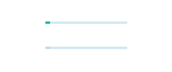
The React Progress Bar indicates the progress of a task with customizable visuals. It includes features to visualize progress in rectangular and circular shapes, determinate and indeterminate states, segments, and customized ranges in different colors. It also supports animation.
React Progress Bar Code Example
Easily get started with the React Progress Bar using a few simple lines of TSX code example as demonstrated below. Also explore our React Progress Bar Example that shows you how to render and configure a Progress Bar in React.
import { ProgressBarComponent } from '@syncfusion/ej2-react-progressbar';
import * as React from "react";
import * as ReactDOM from "react-dom";
import { SampleBase } from '../common/sample-base';
export class Default extends SampleBase<{}, {}> {
  public animation: any = {
      enable: true,
      duration: 2000,
      delay: 0
  };
  render() {
    return (
        <div>
            <ProgressBarComponent id="linear" type='Linear' height='60' value={40}
            animation={this.animation}></ProgressBarComponent>
        </div>
    )
  }
}
Types
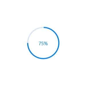
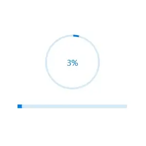
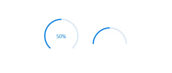
Visualize progress in different shapes (rectangle, circle, and semi-circle) to give a unique appearance to your app design.


States
Visualize progress in different modes.
Determinate
Use the determinate mode progress bar when progress can be estimated.

Indeterminate
Use the indeterminate mode progress bar when progress cannot be estimated or calculated. It can be combined with determinate mode to let users know that the app is estimating the progress before the actual progress starts.

Buffer
Use a secondary progress indicator when the primary task depends on the secondary task. This will allow users to visualize both primary and secondary tasks’ progress simultaneously.
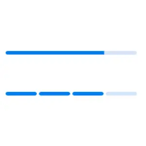
Segments
Avoid writing several lines of code to create and position multiple progress bars: just divide a progress bar into multiple segments using a single API to visualize the progress of multiple sequential tasks.

Angle
Customize the start and sweep angles of circular progress to give a unique style to the circular progress bar.
Tooltip
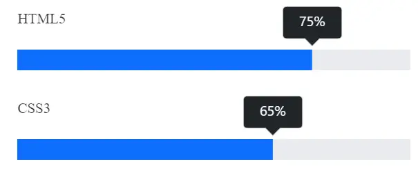
Display tooltips during initial load of progress bars and mouse hover with numeric or text values of the progress.

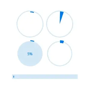
Custom content
Add any view to the center of a circular progress bar to: indicate the completion of the progress; add start, pause, or cancel buttons to control the progress interactively; add an image that indicates the actual task in progress; add custom text that conveys the progress.
Visualize multiple ranges
Along with visualizing the progress of a task, users can also visualize multiple ranges with gradient colors or solid colors that are mapped to each range to enhance the readability.
Appearance
The appearance of a progress bar is highly customizable.
Thickness
Tweak the thickness of the track and progress indicator to render the progress bar with different appearances.
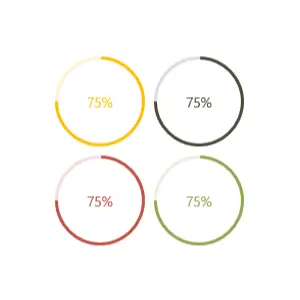
Colors
Apply appealing colors to the track and progress indicator to match your app theme.


Not sure how to create your first React Progress Bar? Our tutorial videos and documentation can help.
I’d love to watch it now I’d love to read it nowDiscover Syncfusion’s Complete React Component Ecosystem
Explore over 140+ React UI components featuring established, production-ready controls and the latest pure React components built natively for modern web app development.
-
React Components
-
Pure React Components
-
SMART COMPONENTSGRIDSDATA VISUALIZATIONDROPDOWNSFILE VIEWERS & EDITORSBUTTONSINTERACTIVE CHATINPUTSNAVIGATIONFORMSNOTIFICATIONS
-
GRIDSDATA VISUALIZATIONNAVIGATION
Standalone UI SDKs
Integrate the DataGrid, Chart, Scheduler, Gantt, Rich Text Editor, File Manager, and Diagram UI components into applications to enable rich interaction and visualization, delivering a seamless user experience.
Document Solutions
Integrate the PDF Viewer, DOCX Editor, Spreadsheet Editor, and document-processing libraries into the React applications to enable a smooth user experience.
Frequently Asked Questions
Why should you choose Syncfusion React Progress Bar?
- Linear or circular progress bars represent progression of an operation elegantly.
- Secondary progress can be shown like YouTube buffering.
Indeterminate state shows a cyclic animation when progress is not detectable.
The appearance of a progress bar is highly customizable.
- One of the best React Progress Bar in the market that offers a feature-rich UI to interact with the software.
- Simple configuration and APIs.
Expansive learning resources such as demos, documentation to learn quickly and get started with React Progress Bar.
Where can I find the Syncfusion React Progress Bar demo?
You can find our React Progress Bar demo here, which demonstrates how to render and configure the Progress Bar.
How do you install the React Circular Progress Bar?
You can install Syncfusion React Progress Bar using NPM (syncfusion/ej2-react-progressbar). It features both linear and circular progress bars, with rich customization and accessibility support.
Can I download and utilize the Syncfusion React Progress Bar for free?
No, this is a commercial product and requires a paid license. However, a free community license is also available for companies and individuals whose organizations have less than $1 million USD in annual gross revenue, 5 or fewer developers, and 10 or fewer total employees.
How do I get started with Syncfusion React Progress Bar?
A good place to start would be our comprehensive getting started documentation.
What is the progress Bar in React and Tailwind?
A progress bar visually indicates the status of task completion. With Syncfusion React ProgressBar, you get built-in styling and customization, eliminating the need for manual integration with Tailwind.
Our Customers Love Us
Having an excellent set of tools and a great support team, Syncfusion® reduces customers’ development time.Here are some of their experiences.

Aweseome, enough said. really
Easy usability, solving real life problems. easy to implement. most of the cases has the operators and settings possibilities you right away need. never fails to impress

Oliver O,

Geschäftsführung Kreation/Artdirektion, Small-Business
A giant framework with great pricing options
I have loved the components and options that Syncfusion has, besides, its documentation, demos, and Support are excellent.

Alejandro Javier V,
CEO, Small-Business
See Real Success Stories
Developers around the world trust Syncfusion’s Essential Studio to simplify complex projects and speed up delivery. With a vast library of UI controls, powerful SDKs, and reliable support, Essential Studio helps teams build enterprise-ready applications with confidence.
Read Our Customer StoriesIndustry
Software development
75% Cost reduction
50% Faster development
Industry
Utilities (oil and gas)
450+ hours saved
Streamlined processes and hours of development effort saved.
Advanced, flexible features
Empowered users through robust and versatile functionality.
Industry
Software and technology
1000+ of hours saved
Accelerated development with enterprise-ready UI components.
Efficient file management
Streamlined workflows with document libraries without building them from scratch.
Industry
Software and technology
2 Years of delay avoided
Two years of delays prevented with proactive planning.
On-time delivery
Projects delivered on schedule using trusted controls.
Industry
IT services and IT consulting
Improved performance
Large datasets handled with easy customization and quick debugging.
Highly customizable
Plug-and-play controls with quick template integration.
Industry
Professional services
Instant access
Quick availability of features and resources.
Reduced dependencies
Fewer dependencies for faster development.
Rated by users across the globe
Syncfusion React Progress Bar Resources


UI Kits
 Figma Download
Figma Download
Awards
Greatness—it’s one thing to say you have it, but it means more when others recognize it. Syncfusion® is proud to hold the following industry awards.

