Trusted by the world’s leading companies

Overview
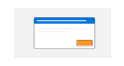
The React Dialog is a useful user interface (UI) component for informing users about critical information, errors, warnings, and questions, as well as confirming decisions and collecting input from users. The component has a rich set of built-in features such as action buttons, positioning, animations, dragging, resizing, templating, and more with mobile dialog support. The Dialog includes modal dialogs and non-modal dialogs (modeless) based on interactions.
React Dialog Code Example
Easily get started with the React Dialog using a few simple lines of TSX code example as demonstrated below. Also explore our React Dialog Example that shows you how to render and configure a Dialog in React.
import { DialogComponent } from '@syncfusion/ej2-react-popups';
import * as React from "react";
class App extends React.Component {
    constructor(props) {
        super(props);
        this.dialogClose = () => {
            this.setState({ hideDialog: false });
        };
        this.state = {
            hideDialog: false
        };
    }
    handleClick() {
        this.setState({ hideDialog: true });
    }
    render() {
        return (<div className="App" id='dialog-target'>
      <button className='e-control e-btn' id='targetButton1' role='button' onClick={this.handleClick = this.handleClick.bind(this)}>Open</button>
      <DialogComponent width='250px' content='This is a Dialog with content' target='.App' visible={this.state.hideDialog} close={this.dialogClose}/>
  </div>);
    }
}
export default App;Modal dialogs (modal window)
The React Dialog component comes with two different types of dialogs, modal and non-modal (modeless):
- Modal dialogs force users to interact with them before continuing. They are used to show important interaction information and non-continuous process information (for example, a sign-up or login form).
- Non-modal dialogs allow users to interact outside the dialog box even if it is in an active state, which is suitable for frequent and nonblocking dialogs (for example, find and replace dialogs).
Dialog UI elements
The React Dialog component provides headers (titles), body (content), and action area/footer for better customization.
Action buttons
The React Dialog component provides built-in support to perform actions through buttons, which define necessary callback functions to handle user input.
Positioning
Users can position a dialog wherever they want in a page. It is easy to configure this through built-in positions or any custom axis value (for example: top left, bottom right, top right, bottom left, 100 75).
Draggable
A modal Dialog box in React can be moved anywhere in a page by dragging its header, which performs using the Draggable library.
Templates
In Dialog the template support is provided to the header, content and footer sections. So any text or HTML content can be appending in these sections.


Localization
Localization library allows to localize the default text content of Dialog. In Dialog, the close button’s tooltip text alone will be localize based on culture.
Appearance
The following content provides the exact CSS structure that can be used to modify the control’s appearance based on the user preference.

Overlays
Modal dialogs create overlays on open modal windows that provide options for a user to control the closing behavior of a dialog while interacting with it.
Additional dialogs
Users can launch multiple dialogs simultaneously or one above the other based on their z-index (z-depth) to make additional dialogs (nested modal dialogs).
Animation
A variety of smooth, built-in animations are available to configure for the opening and closing of modal dialogs. They perform based on CSS3 animation from the Animation library.
Resizable
The modal dialog can resize from any of the edges or borders of the dialog within the target container by using its handle (grip) or hovering on it.
Close options
A modal dialog can be closed by clicking on a close icon, with an overlay click, or by pressing the ESC key. Users can restrict the closing behavior of a dialog based on its callback function parameters, also.
Remote content via AJAX
Users can directly load content from a remote source (like an external webpage) into a dialog using the AJAX library.
Alert and confirmation dialogs
Create React alerts and confirmation dialogs using built-in functions.
Right-to-left (RTL)
The React Dialog component supports right-to-left (RTL) rendering. Users can change the text direction and layout of the Dialog component to RTL. This improves the user experience and accessibility for those who use RTL languages.

Accessibility
-
Fully supports WAI-ARIA accessibility, which helps dialogs be accessed by on-screen readers and assistive devices.
-
Follows WAI-ARIA Best Practices for implementing keyboard interaction.
-
Follows the WCAG 2.0 standard in the design of UI element visuals such as foreground color, background color, line spacing, text, and images.

Responsiveness
The React Dialog component is highly configurable to give mobile dialogs better user experiences across phone, tablet, and desktop form factors.
Themes
The React Dialog component has several built-in themes such as Material, Bootstrap, Fabric (Office 365), Tailwind CSS, and High Contrast. Users can customize any one of these built-in themes or create new themes to achieve their own desired look and feel either by simply overriding SASS variables or using our Theme Studio application.
Developer-friendly APIs
Developers can control the appearance and behaviors of a dialog, including its positioning, content, and animation, using a rich set of APIs.


Not sure how to create your first React Modal Dialog? Our documentation can help.
I’d love to read it nowDiscover Syncfusion’s Complete React Component Ecosystem
Explore over 145+ React UI components featuring established, production-ready controls and the latest pure React components built natively for modern web app development.
-
React Components
-
Pure React Components
-
SMART COMPONENTSGRIDSDATA VISUALIZATIONDROPDOWNSFILE VIEWERS & EDITORSBUTTONSINTERACTIVE CHATINPUTSNAVIGATIONFORMSNOTIFICATIONS
-
GRIDSDATA VISUALIZATIONNAVIGATIONINPUTSCALENDARSDROPDOWNS
Frequently Asked Questions
Why should you choose Syncfusion React Dialog?
Syncfusion React Dialog provides the following features:
Highly customizable and configurable user interface (UI) dialog box.
- Simple way to display critical information, errors, warnings, confirmations, alerts, questions, and message boxes.
Built-in features such as action buttons, drag and drop, positioning, animations, and themes.
- Simple configuration and API.
- Support for all modern browsers.
- Mobile friendly and responsive UI.
Expansive learning resources such as demos and documentation to let you get started quickly with the React Dialog component.
Where can I find the Syncfusion React Dialog demo?
You can find our React Dialog demo, which demonstrates how to render and configure the Modal Dialog.
Can I download and utilize the Syncfusion React Dialog for free?
No, this is a commercial product and requires a paid license. However, a free community license is also available for companies and individuals whose organizations have less than $1 million USD in annual gross revenue, 5 or fewer developers, and 10 or fewer total employees.
How do I get started with Syncfusion React Dialog?
A good place to start would be our comprehensive getting started documentation.
Our Customers Love Us
Having an excellent set of tools and a great support team, Syncfusion® reduces customers’ development time.Here are some of their experiences.

Aweseome, enough said. really
Easy usability, solving real life problems. easy to implement. most of the cases has the operators and settings possibilities you right away need. never fails to impress

Oliver O,

Geschäftsführung Kreation/Artdirektion, Small-Business
A giant framework with great pricing options
I have loved the components and options that Syncfusion has, besides, its documentation, demos, and Support are excellent.

Alejandro Javier V,
CEO, Small-Business
See Real Success Stories
Developers around the world trust Syncfusion’s Essential Studio to simplify complex projects and speed up delivery. With a vast library of UI controls, powerful SDKs, and reliable support, Essential Studio helps teams build enterprise-ready applications with confidence.
Read Our Customer StoriesIndustry
Software development
75% Cost reduction
50% Faster development
Industry
Utilities (oil and gas)
450+ hours saved
Streamlined processes and hours of development effort saved.
Advanced, flexible features
Empowered users through robust and versatile functionality.
Industry
Software and technology
1000+ of hours saved
Accelerated development with enterprise-ready UI components.
Efficient file management
Streamlined workflows with document libraries without building them from scratch.
Industry
Software and technology
2 Years of delay avoided
Two years of delays prevented with proactive planning.
On-time delivery
Projects delivered on schedule using trusted controls.
Industry
IT services and IT consulting
Improved performance
Large datasets handled with easy customization and quick debugging.
Highly customizable
Plug-and-play controls with quick template integration.
Industry
Professional services
Instant access
Quick availability of features and resources.
Reduced dependencies
Fewer dependencies for faster development.
Rated by users across the globe
Syncfusion React Resources
Learning
 Documentation
 Documentation


Awards
Greatness—it’s one thing to say you have it, but it means more when others recognize it. Syncfusion® is proud to hold the following industry awards.

