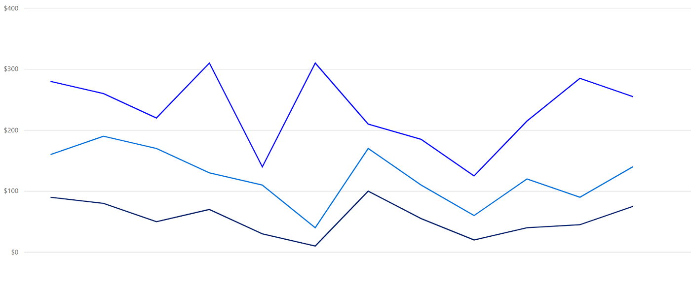
Overview
React Stacked line chart is a chart with Y values stacked over one another in the series order. Shows the relation between individual values to the total sum of the points.
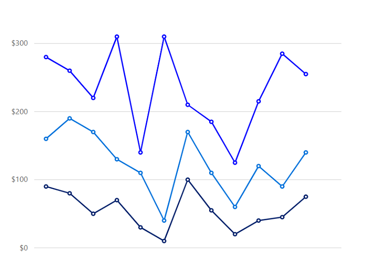
Marker
Marks data points with built-in shapes such as circles, rectangles, ellipses, vertical lines, horizontal lines, diamonds, triangles, pentagons, crosses, and pluses. In addition to these shapes, use images to make the point more attractive.
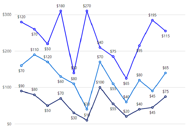
Data label
Data labels display information about data points. Add a template to display data labels with HTML elements such as images, DIV, and spans for more informative data labels. You can rotate a data label by its given angle.
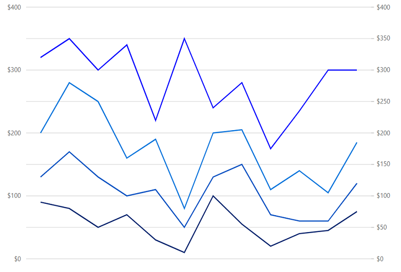
Multiple axes
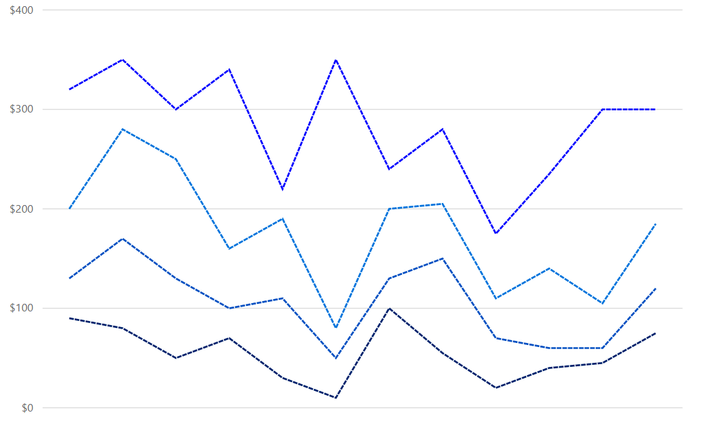
Use multiple axes to plot different data sets that widely vary from one other.
Customization
Customize the look and feel of the stacked line chart using built-in APIs.
Code snippet
Easily get started with the React stacked line chart using a few simple lines of HTML and JS code, as demonstrated below. Also explore our React stacked line chart example that shows you how to render and configure the charts.
import { ChartComponent, SeriesCollectionDirective, SeriesDirective, Inject, Category, StackingLineSeries } from '@syncfusion/ej2-react-charts';
import * as React from "react";
class App extends React.Component<{}, {}> {
    public primaryXAxis: AxisModel = { valueType: 'Category'};
    public chartData: any[] = [
      { x: 'Food', y: 90, y1: 40, y2: 70, y3: 120 },
      { x: 'Transport', y: 80, y1: 90, y2: 110, y3: 70 },
      { x: 'Medical', y: 50, y1: 80, y2: 120, y3: 50 },
      { x: 'Clothes', y: 70, y1: 30, y2: 60, y3: 180 },
      { x: 'Personal Care', y: 30, y1: 80, y2: 80, y3: 30 },
      { x: 'Books', y: 10, y1: 40, y2: 30, y3: 270 },
      { x: 'Fitness', y: 100, y1: 30, y2: 70, y3: 40 },
      { x: 'Electricity', y: 55, y1: 95, y2: 55, y3: 75 },
      { x: 'Tax', y: 20, y1: 50, y2: 40, y3: 65 },
      { x: 'Pet Care', y: 40, y1: 20, y2: 80, y3: 95 },
      { x: 'Education', y: 45, y1: 15, y2: 45, y3: 195 },
      { x: 'Entertainment', y: 75, y1: 45, y2: 65, y3: 115 }
  ];
  public marker : any = {visible: true} ;
public render() {
    return <ChartComponent id='charts' primaryXAxis={this.primaryXAxis}>
      <Inject services={[StackingLineSeries, Category]} />
       <SeriesCollectionDirective>
                             <SeriesDirective dataSource={chartData} xName='x' yName='y' name='John' width='2' type='StackingLine' marker= {marker}} dashArray='5,1'>
                            </SeriesDirective>
                            <SeriesDirective dataSource={chartData} xName='x' yName='y1' name='Peter' width='2' type='StackingLine' marker= {marker} dashArray='5,1'>
                            </SeriesDirective>
                            <SeriesDirective dataSource={chartData} xName='x' yName='y2' name='Steve' width='2' type='StackingLine' marker= {marker} dashArray='5,1'>
                            </SeriesDirective>
                            <SeriesDirective dataSource={chartData} xName='x' yName='y3' name='Charle' width='2' type='StackingLine' marker= {marker} dashArray='5,1'>
                            </SeriesDirective>
    </SeriesCollectionDirective>
    </ChartComponent>
  }
};
ReactDOM.render(
  <App />,
  document.getElementById('charts') as HTMLElement
);
<!DOCTYPE html>
<html>
<body>
<div id="charts"></div>
</body>
</html>Learning Resources


Discover Syncfusion’s Complete React Component Ecosystem
Explore over 145+ React UI components featuring established, production-ready controls and the latest pure React components built natively for modern web app development.
-
React Components
-
Pure React Components
-
SMART COMPONENTSGRIDSDATA VISUALIZATIONDROPDOWNSFILE VIEWERS & EDITORSBUTTONSINTERACTIVE CHATINPUTSNAVIGATIONFORMSNOTIFICATIONS
-
GRIDSDATA VISUALIZATIONNAVIGATIONINPUTS