Trusted by the world’s leading companies

Overview
The ASP.NET Core Tooltip control is a pop-up that shows information or a message when users hover, click, focus on or touch an image, button, anchor tag, etc. The information displayed in the Tooltip can include simple text, images, hyperlinks, or custom templates.
Position and mouse trails
The ASP.NET Core tooltip has twelve different options to position it around the target. You can configure the Tooltip to follow the mouse or not. To position the tip pointer, there are four options: Right, left, top, and bottom.
Smart positioning/auto positioning
The tooltip intelligently auto positions its content and arrows. It also fits in the best location of the view port or container.
Dynamic content through AJAX
Load content dynamically to Tooltip on demand using the AJAX callback.
Animate Tooltip
Show or hide completely customizable animations in the ASP.NET Core Tooltip . You can include animation effect, duration, and delay. You can also control transition effects at the application level.
Templated tooltip
The tooltip content can be loaded with HTML elements, images, hyperlinks, iframe, videos, maps, etc. Users can also add a title to the content.
Display behavior
Show or hide an ASP.NET Core Tooltip using hover, click, double-click, focus, and custom modes. Use the custom mode to show or hide a tooltip.
Offset position
Customize the offset position of a tooltip from a target element.
Sticky Tooltip
Prevent the tooltip from hiding after a short duration using the sticky mode.
Trigger actions
Show the ASP.NET Core Tooltip on hover, click, touch, and focus on any element.
Fancy tooltip
The ASP.NET Core Tooltip can be fully customized using CSS styles.
Dimension customization
Both automatic and custom pixel values can be used to set tooltip’s height and width.


Scroll mode
When the tooltip’s size exceeds the container space, the scroll mode displays an HTML scroll bar.
Built-in Themes
ASP.NET Core Tooltip is shipped with several built-in themes: material, bootstrap, fabric (office 365), and high contrast. Users can customize any one of these built-in themes or create new themes to achieve their own desired look and feel. It is achieved either by simply overriding SASS variables or using our Theme Studio application with ease.

Easy integration
Users just need a message and target element to make the Tooltip fully functional. It will work out of the box. However, it provides many options to change the position, animation, and appearance.
Touch-Friendly
Best user experience on touch devices such as phones and tablets by recognizing touch gestures.
HTML5 SVG and canvas
ASP.NET Core supports both SVG and canvas elements. Users can directly attach tooltips to HTML5 <svg> or <canvas> elements to show data visualization elements.
Other supported frameworks
Tooltip is also available for our Blazor, Angular, React, Vue, and JavaScript frameworks. Check out the different Tooltip platforms from these links:
Accessibility
-
Fully supports WAI-ARIA accessibility to make the control accessible to screen readers and assistive devices.
-
Follows the WCAG 2.0 standard, in the design of UI element visuals such as foreground color, background color, line spacing, text, and images.
-
Follows WAI-ARIA best practices best practices for implementing keyboard interaction.
Developer-friendly APIs
In ASP.NET Core Tooltip, you have control over all the UI elements and its behaviors. It provides the best user experience through a rich set of developer-friendly APIs.
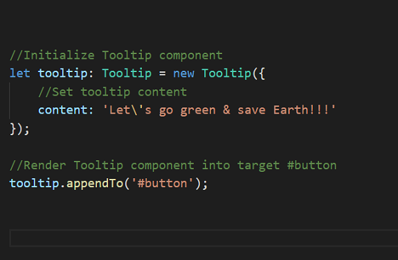
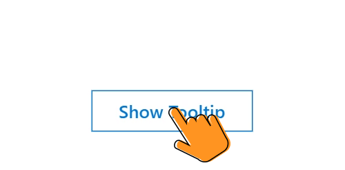
ASP.NET Core Tooltip Code Example
Easily get started with the ASP.NET Core Tooltip using a few simple lines of HTML code example as demonstrated below. Also explore our ASP.NET Core Tooltip Example that shows you how to render and configure a Tooltip in ASP.NET Core.
<ejs-tooltip id="Tooltip" content="Lets go green & Save Earth !!!">
    <!-- Target element -->
    <e-content-template>
      <span id='target'>Show Tooltip</span>
    </e-content-template>
</ejs-tooltip>

<style>
    #Tooltip {
        position: absolute;
        left: calc( 50% - 60px);
        top: 38%;
    }
</style>
Not sure how to create your first ASP.NET Core Tooltip? Our documentation can help.
I’d love to read it now140+ ASP.NET CORE UI CONTROLS
ALL CONTROLS
SMART COMPONENTS
GRIDS
DATA VISUALIZATION
FILE VIEWERS & EDITORS
DROPDOWNS
NAVIGATION
INPUTS
BUTTONS
NOTIFICATION
INTERACTIVE CHAT
Standalone UI SDKs
Integrate the DataGrid, Chart, Scheduler, Gantt, Rich Text Editor, File Manager, and Diagram UI components into applications to enable rich interaction and visualization, delivering a seamless user experience.
Document Solutions
Integrate the PDF Viewer, DOCX Editor, Spreadsheet Editor, and document-processing libraries into the ASP.NET Core applications to enable a smooth user experience.
Frequently Asked Questions
Why should you choose Syncfusion ASP.NET Core Tooltip?
Syncfusion ASP.NET Core ToolTip provides the following features:
Automatically adjust display position based on the view page without inconsistencies.
Customize the content with icons, images, a dynamic AJAX template, and more.
- Enhance the opening and closing of a pop-over with out-of-the-box animations.
- Simple configuration and API.
- Support for all modern browsers.
Expansive learning resources such as demos and documentation to let you get started quickly with the ASP.NET Core Tooltip component.
Where can I find the Syncfusion ASP.NET Core Tooltip demo?
N> You can find our ASP.NET Core Tooltip demo, which demonstrates how to render and configure the Tooltip.
Can I download and utilize the Syncfusion ASP.NET Core Tooltip for free?
No, this is a commercial product and requires a paid license. However, a free community license is also available for companies and individuals whose organizations have less than $1 million USD in annual gross revenue, 5 or fewer developers, and 10 or fewer total employees.
How do I get started with Syncfusion ASP.NET Core Tooltip?
A good place to start would be our comprehensive getting started documentation.
Our Customers Love Us
Having an excellent set of tools and a great support team, Syncfusion® reduces customers’ development time.Here are some of their experiences.

Great and flexible controls to build web applications
Controls meet specifications to develop web applications (ASP.NET MVC and Core in my case) and provide a lot of features to develop world-class software. There are options for other frameworks/platforms. Support is excellent which makes me feel very confident when facing trouble, they provide answers in 24 hours. Support team will make a big effort to solve your issues and they are ready for a phone call and to remotely connect to your PC.

Jorge M,

Founder and Software Architect, Small-Business
Great tool, saves alot of time, and great support
Syncfusion really makes it simple to implement features that would take a ton of time and effort to create. When you're building your site, the UI can take a ton of time away from building the core app. With Syncfusion's tools it reduces that effort significantly so you can get back to building the core elements.

Walter T,
Founder, Small-Business
See Real Success Stories
Developers around the world trust Syncfusion’s Essential Studio to simplify complex projects and speed up delivery. With a vast library of UI controls, powerful SDKs, and reliable support, Essential Studio helps teams build enterprise-ready applications with confidence.
Read Our Customer StoriesIndustry
Software development
75% Cost reduction
50% Faster development
Industry
Utilities (oil and gas)
450+ hours saved
Streamlined processes and hours of development effort saved.
Advanced, flexible features
Empowered users through robust and versatile functionality.
Industry
Software and technology
1000+ of hours saved
Accelerated development with enterprise-ready UI components.
Efficient file management
Streamlined workflows with document libraries without building them from scratch.
Industry
Software and technology
2 Years of delay avoided
Two years of delays prevented with proactive planning.
On-time delivery
Projects delivered on schedule using trusted controls.
Industry
IT services and IT consulting
Improved performance
Large datasets handled with easy customization and quick debugging.
Highly customizable
Plug-and-play controls with quick template integration.
Industry
Professional services
Instant access
Quick availability of features and resources.
Reduced dependencies
Fewer dependencies for faster development.
Rated by users across the globe
Syncfusion ASP.NET Core Resources
Learning
 Documentation
 Documentation


Awards
Greatness—it’s one thing to say you have it, but it means more when others recognize it. Syncfusion® is proud to hold the following industry awards.

