Trusted by the world’s leading companies

Overview
The ASP.NET Core Splitter is a layout user interface (UI) that provides resizable, expandable, collapsible, and nestable panes. It is useful for constructing different layouts in web apps such as Outlook style, Windows Explorer style, code editor UI, and more. The control can integrate other JavaScript UI controls inside its split panes.
Resizable panes
The ASP.NET Core Splitter control has built-in resizable support that helps widen or shrink the panes. Users can control the resize behavior for individual panes with min and max size validation.
Collapsible panes
Built-in support is available for expanding and collapsing the panes by interaction.
Multiple panes
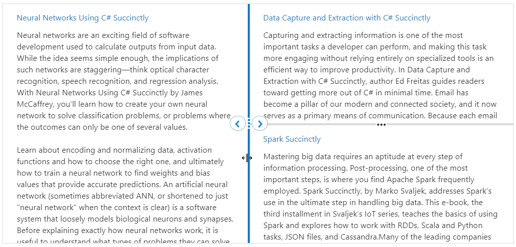
Users can configure more than 2 panes to construct different layouts using ASP.NET Core Splitter control such as Outlook-style, Windows explorer-style, Visual Studio code-style, and more.
Content as ASP.NET Core UI control
Users can integrate other ASP.NET Core UI control (For example: TreeView, ListView, Rich Text Editor), HTML markup, or plain text content in the split panes.
Vertical or horizontal orientation
The orientation of the split panes can either be horizontal or vertical inside the ASP.NET Core Splitter control.

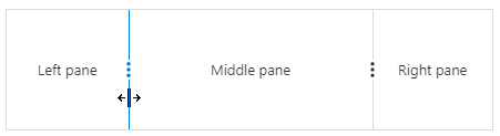
Separator (Divider)
The ASP.NET Core Splitter control has a split bar to visually split the panes that contains resize gripper.
Nested ASP.NET Core Splitter
Splitters can be nested in various levels within the pane to create complex layout such as code editor-style layout.
Right-to-Left (RTL)
The ASP.NET Core Splitter control supports right-to-left (RTL) rendering. Users can change the text direction and layout of the Splitter control from right to left. It improves the user experience and accessibility for users who use RTL languages.
Themes
The ASP.NET Core Splitter control has several built-in themes such as material, bootstrap, fabric (Office 365), and high contrast. Users can customize any one of these built-in themes or create new themes to achieve their own desired look and feel either by simply overriding SASS variables or using our Theme Studio application.
Sizing to content
Users can specify pane size either in pixels or in percentage values including min and max range values to accommodate the sizing to its child control or content.
Not sure how to create your first Splitter? Our documentation can help.
I’d love to read it now140+ ASP.NET CORE UI CONTROLS
ALL CONTROLS
SMART COMPONENTS
GRIDS
DATA VISUALIZATION
FILE VIEWERS & EDITORS
DROPDOWNS
NAVIGATION
INPUTS
BUTTONS
NOTIFICATION
INTERACTIVE CHAT
Standalone UI SDKs
Integrate the DataGrid, Chart, Scheduler, Gantt, Rich Text Editor, File Manager, and Diagram UI components into applications to enable rich interaction and visualization, delivering a seamless user experience.
Document Solutions
Integrate the PDF Viewer, DOCX Editor, Spreadsheet Editor, and document-processing libraries into the ASP.NET Core applications to enable a smooth user experience.
Our Customers Love Us
Having an excellent set of tools and a great support team, Syncfusion® reduces customers’ development time.Here are some of their experiences.

Great and flexible controls to build web applications
Controls meet specifications to develop web applications (ASP.NET MVC and Core in my case) and provide a lot of features to develop world-class software. There are options for other frameworks/platforms. Support is excellent which makes me feel very confident when facing trouble, they provide answers in 24 hours. Support team will make a big effort to solve your issues and they are ready for a phone call and to remotely connect to your PC.

Jorge M,

Founder and Software Architect, Small-Business
Great tool, saves alot of time, and great support
Syncfusion really makes it simple to implement features that would take a ton of time and effort to create. When you're building your site, the UI can take a ton of time away from building the core app. With Syncfusion's tools it reduces that effort significantly so you can get back to building the core elements.

Walter T,
Founder, Small-Business
See Real Success Stories
Developers around the world trust Syncfusion’s Essential Studio to simplify complex projects and speed up delivery. With a vast library of UI controls, powerful SDKs, and reliable support, Essential Studio helps teams build enterprise-ready applications with confidence.
Read Our Customer StoriesIndustry
Software development
75% Cost reduction
50% Faster development
Industry
Utilities (oil and gas)
450+ hours saved
Streamlined processes and hours of development effort saved.
Advanced, flexible features
Empowered users through robust and versatile functionality.
Industry
Software and technology
1000+ of hours saved
Accelerated development with enterprise-ready UI components.
Efficient file management
Streamlined workflows with document libraries without building them from scratch.
Industry
Software and technology
2 Years of delay avoided
Two years of delays prevented with proactive planning.
On-time delivery
Projects delivered on schedule using trusted controls.
Industry
IT services and IT consulting
Improved performance
Large datasets handled with easy customization and quick debugging.
Highly customizable
Plug-and-play controls with quick template integration.
Industry
Professional services
Instant access
Quick availability of features and resources.
Reduced dependencies
Fewer dependencies for faster development.
Rated by users across the globe
Syncfusion ASP.NET Core Resources
Learning
 Documentation
 Documentation


Awards
Greatness—it’s one thing to say you have it, but it means more when others recognize it. Syncfusion® is proud to hold the following industry awards.

