Trusted by the world’s leading companies

Overview
The ASP.NET Core ComboBox component is a drop-down list with editable textbox that also allows users to choose an option from a predefined pop-up list. It can be used as an alternative to the HTML select tag and has several out-of-the-box features such as data binding, filtering, grouping, cascading, templates, UI customization, pop-up list customization, and more.

Data binding
Bind data from different data sources in an array or list of primitive data, JSON data collections, or remote data sources using adapters such as OData, OData V4, URL, JSON, and Web API.
The control uses the Essential JS 2 data manager to manage data, and also has customization options for data requests and processing.
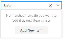
Custom value
The editable combo box allows the entry of a custom value when the option the user searched for is not available in the pop-up list. Also, you can set a value for the combo box or get the selected value from the combo box at any time through the interactive APIs.
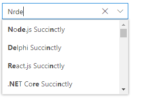
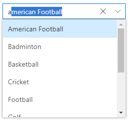
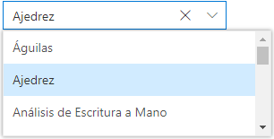
Filtering
The combo box provides a built-in filtering support with a rich set of filtering configurations to meet all the application needs.
Custom filtering
Filter queries are customizable, and users can use their own filter libraries to filter data.

Diacritic sensitivity
The ASP.NET Core ComboBox control supports diacritic-sensitive search. This behavior can be turned on and off.
Filter settings
The filter search can be customized to be case sensitive, and can be performed with the minimum query string characters.
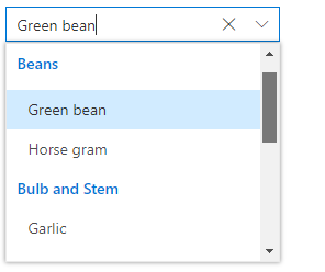
Grouping with category
Group the pop-up list items with a corresponding category that makes it easy for users to pick an item quickly from the drop-down, and also improves the visual experience for users.
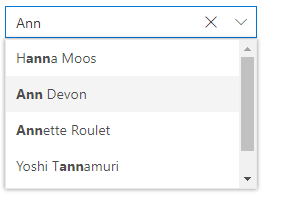
Autofill
The autofill option allows users to easily search through the options in the combo box. When a user types a query string to search, the available matching options will be filled automatically.
Cascading combo boxes
The ASP.NET Core ComboBox control provides an option to create multiple cascading combo boxes. Users can populate the data source of the second ComboBox based on the value selected from the first ComboBox.
Drop-down styles with templates
Another important combo box feature is templates, which allow you to make custom changes to the header, footer, and list items in the pop-up list to make them look unique.
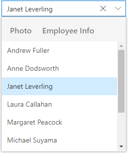
Header template
Design your own header for the pop-up list using a header template.

Item template
Define the appearance of each item in the pop-up list with item templates.
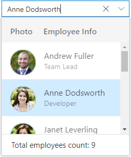
Footer template
Design your own custom and static footers for the pop-up list using footer templates.
Customizing the UI
Users can customize each part of the combo box based on their application requirements.
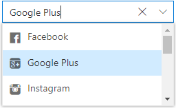
Icons in list items
Each list item can be configured to display a custom icon to improve the component’s readability and appearance.
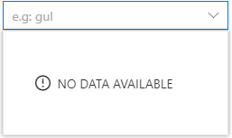
Empty record
Configure a custom look for the pop-up list when there are no items to display.
Customize dimensions
The dimensions of the pop-up list can be customized to fit the application.
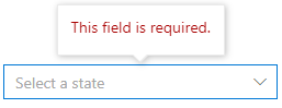
Forms support
Since the combo box is a form component, it supports HTML forms, template-driven forms (Angular), and reactive forms.
Mobile responsive UI
The ASP.NET Core ComboBox control supports a responsive mode that provides an adaptive, redesigned UI appearance for mobile devices and touch actions.
Web accessibility
-
Fully supports WAI-ARIA accessibility guidelines to work with screen readers and assistive devices.
-
Follows WAI-ARIA best practices for implementing keyboard interaction.
-
Designs the UI element visuals such as foreground color, background color, line spacing, text, and images based on WCAG 2.0 standard.
-
Supports right-to-left (RTL) direction for users working with RTL languages like Hebrew, Arabic, or Persian.
Developer friendly APIs
Developers can customize all UI elements and control their behaviors according to the end user’s requirements using its rich set of client-side APIs.
Other supported frameworks
ComboBox is also available in Blazor, Angular, React, Vue, and JavaScript frameworks. Check out the different ComboBox platforms from the links below,
ASP.NET Core ComboBox Code Example
Easily get started with the ASP.NET Core ComboBox using a few simple lines of HTML and TS code example as demonstrated below. Also explore our ASP.NET Core ComboBox Example that shows you how to render and configure a ComboBox in ASP.NET Core.
<body>
    <div id='container' style="margin:0 auto; width:300px;">
        <!--element which is going to render the ComboBox-->
        <input type="text" tabindex="1" id='comboelement' />
    </div>
</body>
import { ComboBox } from '@syncfusion/ej2-dropdowns';
// initialize ComboBox component
let comboBoxObject: ComboBox = new ComboBox();
// render initialized ComboBox
comboBoxObject.appendTo('#comboelement');Not sure how to create your first ASP.NET Core ComboBox? Our documentation can help.
I’d love to read it now140+ ASP.NET CORE UI CONTROLS
ALL CONTROLS
SMART COMPONENTS
GRIDS
DATA VISUALIZATION
FILE VIEWERS & EDITORS
DROPDOWNS
NAVIGATION
INPUTS
BUTTONS
NOTIFICATION
INTERACTIVE CHAT
Standalone UI SDKs
Integrate the DataGrid, Chart, Scheduler, Gantt, Rich Text Editor, File Manager, and Diagram UI components into applications to enable rich interaction and visualization, delivering a seamless user experience.
Document Solutions
Integrate the PDF Viewer, DOCX Editor, Spreadsheet Editor, and document-processing libraries into the ASP.NET Core applications to enable a smooth user experience.
Frequently Asked Questions
Why should you choose Syncfusion ASP.NET Core ComboBox?
- A great alternative to the HTML select tag, with a modern look and feel.
Editable combo box with advanced features, including auto suggestion, grouping, sorting, and more.
- Support for complete customization of the UI and pop-up list through different template options.
- One of the best ASP.NET Core ComboBox in the market that offers feature-rich UI to interact with the software.
- Simple configuration and API.
- Supports all modern browsers.
- Mobile-touch friendly and responsive.
Extensive demos and documentation to learn quickly and get started with ComboBox ASP.NET Core.
Where can I find the Syncfusion ASP.NET Core ComboBox demo?
You can find our ASP.NET Core ComboBox demo here.
Can I download and utilize the Syncfusion ASP.NET Core ComboBox for free?
No, this is a commercial product and requires a paid license. However, a free community license is also available for companies and individuals whose organizations have less than $1 million USD in annual gross revenue, 5 or fewer developers, and 10 or fewer total employees.
How do I get started with Syncfusion ASP.NET Core ComboBox?
A good place to start would be our comprehensive getting started documentation.
Our Customers Love Us
Having an excellent set of tools and a great support team, Syncfusion® reduces customers’ development time.Here are some of their experiences.

Great and flexible controls to build web applications
Controls meet specifications to develop web applications (ASP.NET MVC and Core in my case) and provide a lot of features to develop world-class software. There are options for other frameworks/platforms. Support is excellent which makes me feel very confident when facing trouble, they provide answers in 24 hours. Support team will make a big effort to solve your issues and they are ready for a phone call and to remotely connect to your PC.

Jorge M,

Founder and Software Architect, Small-Business
Great tool, saves alot of time, and great support
Syncfusion really makes it simple to implement features that would take a ton of time and effort to create. When you're building your site, the UI can take a ton of time away from building the core app. With Syncfusion's tools it reduces that effort significantly so you can get back to building the core elements.

Walter T,
Founder, Small-Business
See Real Success Stories
Developers around the world trust Syncfusion’s Essential Studio to simplify complex projects and speed up delivery. With a vast library of UI controls, powerful SDKs, and reliable support, Essential Studio helps teams build enterprise-ready applications with confidence.
Read Our Customer StoriesIndustry
Software development
75% Cost reduction
50% Faster development
Industry
Utilities (oil and gas)
450+ hours saved
Streamlined processes and hours of development effort saved.
Advanced, flexible features
Empowered users through robust and versatile functionality.
Industry
Software and technology
1000+ of hours saved
Accelerated development with enterprise-ready UI components.
Efficient file management
Streamlined workflows with document libraries without building them from scratch.
Industry
Software and technology
2 Years of delay avoided
Two years of delays prevented with proactive planning.
On-time delivery
Projects delivered on schedule using trusted controls.
Industry
IT services and IT consulting
Improved performance
Large datasets handled with easy customization and quick debugging.
Highly customizable
Plug-and-play controls with quick template integration.
Industry
Professional services
Instant access
Quick availability of features and resources.
Reduced dependencies
Fewer dependencies for faster development.
Rated by users across the globe
Syncfusion ASP.NET Core Resources
Learning
 Documentation
 Documentation


Awards
Greatness—it’s one thing to say you have it, but it means more when others recognize it. Syncfusion® is proud to hold the following industry awards.

