Trusted by the world’s leading companies

Overview
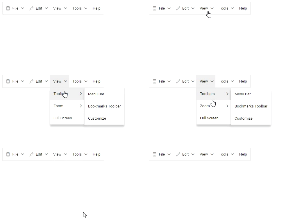
The React Menu Bar is a graphical user interface component that serves as a navigation header for your web application or site. It supports data binding, templates, icons, multilevel nesting, and horizontal and vertical menus.
Data binding
Menu can be bound to data in the form of JavaScript object array collection. It supports self-referential or hierarchical structure of data.

Menu item icons
Users tend to perceive visual information better than text. Include icons or sprite images to the menu items easily to provide a visual representation of the actions.
Menu templates
Templates is used to create custom user experience. Menu provides template for each menu item to customize the entire Menu UI.
Vertical menu
React Menu supports its alignment in either vertical or horizontal orientation.
Multi-level nesting
React Menu supports multi-level nested items. You can browse the sub-menu by hovering or clicking a parent item.

Integration with other components
React Menu can be used with other components. Adding a menu to other components only requires simple configuration.
React Menu Bar Code Example
Easily get started with the React Menu Bar using a few simple lines of TSX code example as demonstrated below. Also explore our React Menu Bar Example that shows you how to render and configure a Menu Bar in React.
import * as ReactDOM from 'react-dom';
import * as React from 'react';
import { MenuComponent, MenuItemModel } from '@syncfusion/ej2-react-navigations';
import { SampleBase } from '../common/sample-base';
import './default.css';

/**
 * Menu default sample
 */
export class Default extends SampleBase<{}, {}> {
    // Menu items definition
    public menuItems: MenuItemModel[] = [
        {
            text: 'File',
            iconCss: 'em-icons e-file',
            items: [
                { text: 'Open', iconCss: 'em-icons e-open' },
                { text: 'Save', iconCss: 'em-icons e-save' },
                { separator: true },
                { text: 'Exit' }
            ]
        },
        {
            text: 'Edit',
            iconCss: 'em-icons e-edit',
            items: [
                { text: 'Cut', iconCss: 'em-icons e-cut' },
                { text: 'Copy', iconCss: 'em-icons e-copy' },
                { text: 'Paste', iconCss: 'em-icons e-paste' }
            ]
        },
        {
            text: 'View',
            items: [
                {
                    text: 'Toolbars',
                    items: [
                        { text: 'Menu Bar' },
                        { text: 'Bookmarks Toolbar' },
                        { text: 'Customize' },
                    ]
                },
                {
                    text: 'Zoom',
                    items: [
                        { text: 'Zoom In' },
                        { text: 'Zoom Out' },
                        { text: 'Reset' },
                    ]
                },
                { text: 'Full Screen' }
            ]
        },
        {
            text: 'Tools',
            items: [
                { text: 'Spelling & Grammar' },
                { text: 'Customize' },
                { separator: true },
                { text: 'Options' }
            ]
        },
        {
            text: 'Help'
        }
    ];

    render() {
        return (
            <div className='control-pane'>
                <div className='control-section'>
                    <div className='menu-section'>
                        <div className='menu-control'>
                            <MenuComponent items={this.menuItems}></MenuComponent>
                        </div>
                    </div>
                </div>
            </div>
        )
    }
}
Built-in themes
The React Menu supports built-in themes such as Bootstrap 5, Tailwind CSS, Fluent, high contrast, and more. Users can customize these built-in themes or create new themes to achieve the desired look and feel either by simply overriding SASS variables or using the Theme Studio application.
Web Accessibility
- Fully supports WAI-ARIA for working with screen readers and assistive devices.
- Follows WAI-ARIA best practices for implementing keyboard interaction.
- Based on WCAG 2.0 standards, we designed the UI element visuals such as foreground color, background color, line spacing, text and images
- Supports right-to-left (RTL) text direction for users working in right-to-left languages like Hebrew, Arabic, or Persian.
Not sure how to create your first React Menu Bar? Our tutorial videos and documentation can help.
I’d love to watch it now I’d love to read it nowDiscover Syncfusion’s Complete React Component Ecosystem
Explore over 145+ React UI components featuring established, production-ready controls and the latest pure React components built natively for modern web app development.
-
React Components
-
Pure React Components
-
SMART COMPONENTSGRIDSDATA VISUALIZATIONDROPDOWNSFILE VIEWERS & EDITORSBUTTONSINTERACTIVE CHATINPUTSNAVIGATIONFORMSNOTIFICATIONS
-
GRIDSDATA VISUALIZATIONNAVIGATIONINPUTS
Build Document Workflows in React
Embed PDF viewing, Word document editing, and Excel-like spreadsheet processing in your React app to streamline document workflows and help teams collaborate on files without context switching or external dependencies.
Frequently Asked Questions
Why should you choose Syncfusion React Menu Bar?
- Display a multilevel menu with smooth animation docked in the header and footer.
Customize menu items that include other controls like Checkbox, Radio Button, and more.
Automatic collision detection with submenu flip, and fits the screen.
- Use horizontal and vertical menus as a navigation drawer.
- Hamburger menu, when clicked opens a navigation drawer.
- One of the best React Menu Bar components in the market that offers a feature-rich UI to interact with the software.
- Simple configuration and APIs.
- Supports all modern browsers.
- Mobile-touch friendly and responsive.
Extensive demos, documentation to learn quickly and get started with React Menu Bar.
Where can I find the Syncfusion React Menu Bar demo?
You can find our React Menu Bar demo, which demonstrates how to render and configure the Menu Bar.
Can I download and utilize the Syncfusion React Menu Bar for free?
No, this is a commercial product and requires a paid license. However, a free community license is also available for companies and individuals whose organizations have less than $1 million USD in annual gross revenue, 5 or fewer developers, and 10 or fewer total employees.
How do I get started with Syncfusion React Menu Bar?
A good place to start would be our comprehensive getting started documentation.
Our Customers Love Us


 Documentation
Awards
Greatness—it’s one thing to say you have it, but it means more when others recognize it. Syncfusion® is proud to hold the following industry awards.


