Blazor DataGrid
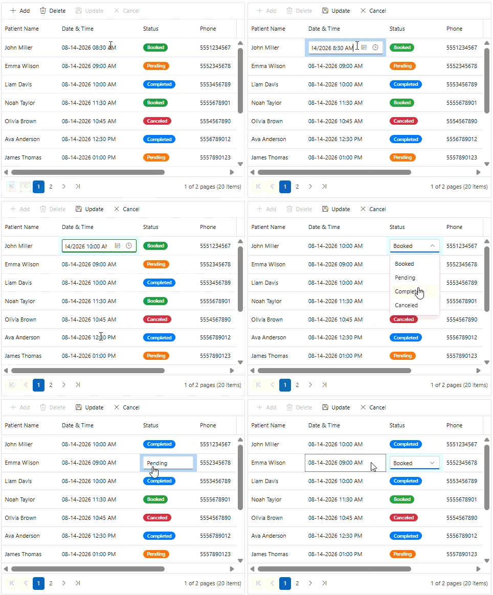
Excel-like editing
The DataGrid offers Excel-like editing, allowing users to edit cells efficiently using familiar keyboard navigation and interaction patterns. This improves productivity when working with large datasets and data-entry scenarios.

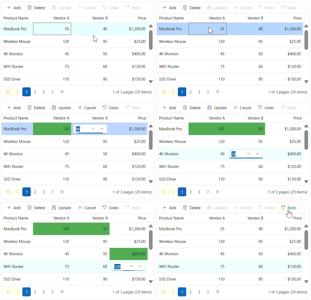
Undo and redo batch editing
The DataGrid includes undo and redo functionality for editing operations, enabling users to revert or reapply changes easily. This helps prevent accidental data modifications.
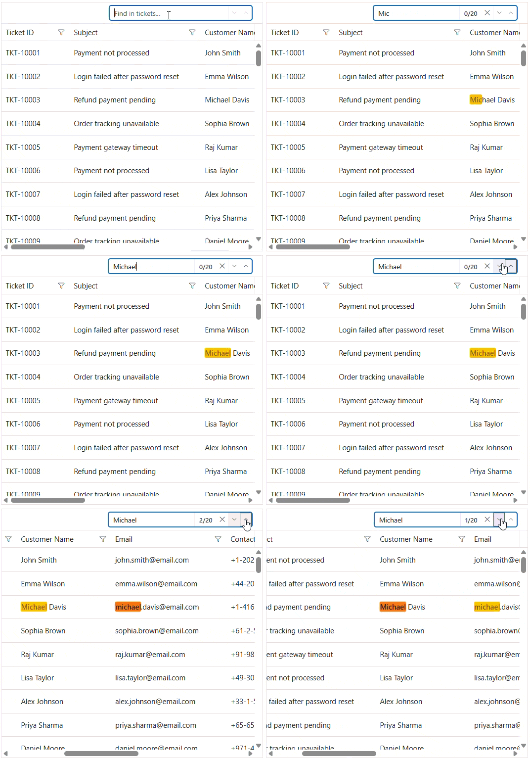
Find and highlight
The DataGrid provides built-in find and highlight functionality that helps users quickly locate matching content in grid records. Matching text is visually highlighted, making it easier to identify and navigate to relevant information.
Event-driven data binding
The DataGrid supports event-driven data binding, enabling developers to load and update data dynamically through events. This approach provides greater flexibility for integrating custom data sources, performing server-side operations, and responding to user interactions in real time.
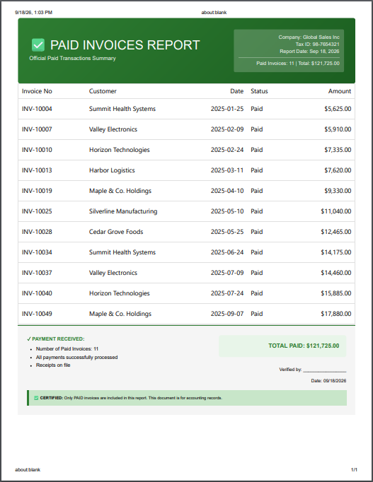
Custom printing
The DataGrid allows the customization of the print output. Developers can control the content, layout, and appearance of printed documents.
Web DataGrid


Formula cell
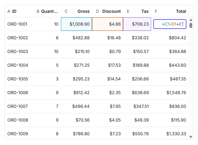
Perform spreadsheet-like calculations directly in grid cells using formulas. Formula cells automatically evaluate expressions and update results when their dependencies change, enabling dynamic data computation and analysis within the DataGrid.

Advanced filter
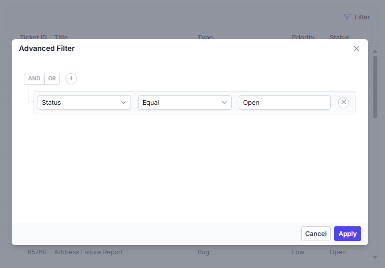
Build complex filtering conditions with an intuitive filtering interface. Advanced filtering supports multiple criteria, logical operators, and custom rules, making it easier to analyze and narrow down large datasets.
Row number
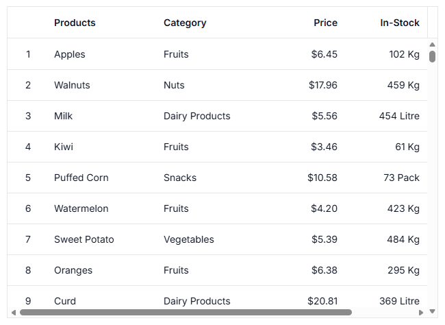
Display automatically generated row numbers to simplify record identification and navigation. Row numbers remain synchronized with sorting, filtering, and other grid operations.
WebMCP integration
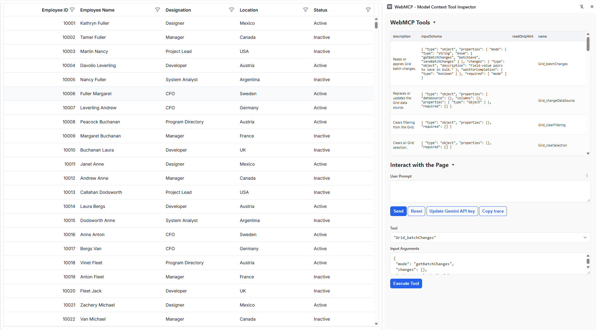
The Grid supports the Web Model Context Protocol (WebMCP), enabling AI models and agents to interact with Grid data through built-in tools. User interactions can be validated before execution, allowing requests to be reviewed, modified, or canceled while maintaining control over Grid operations.
Pure React DataGrid
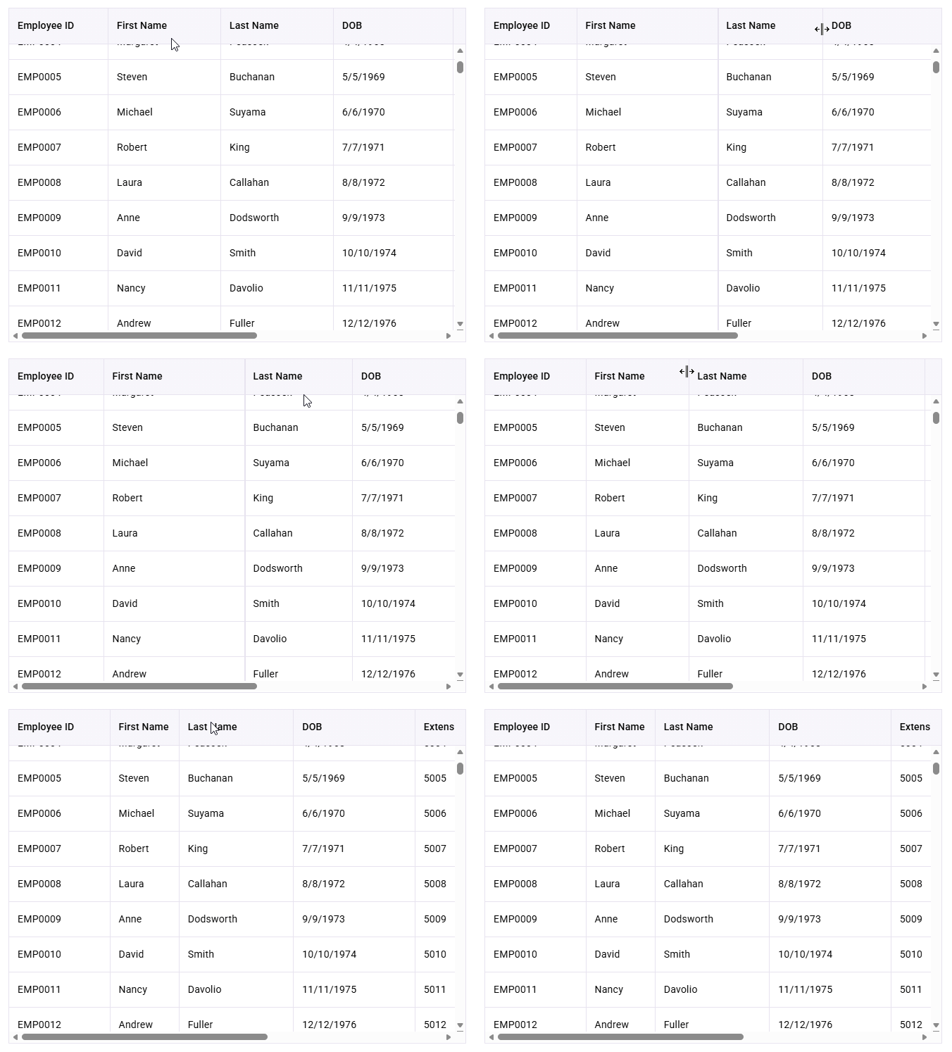
Column resize
Adjust column widths interactively to optimize data visibility and layout. Column resizing helps users tailor the grid presentation to accommodate varying content lengths and viewing preferences.
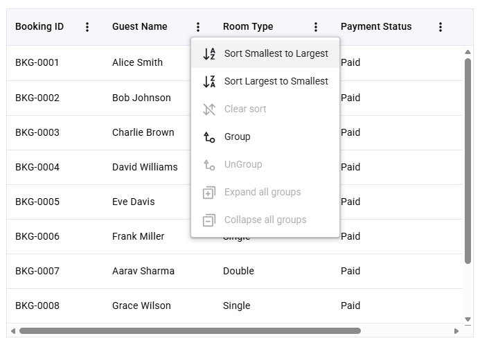
Column menu
Access common column operations through a dedicated menu in each column header. The column menu provides quick actions such as sorting, filtering, grouping, and column customization to improve productivity.
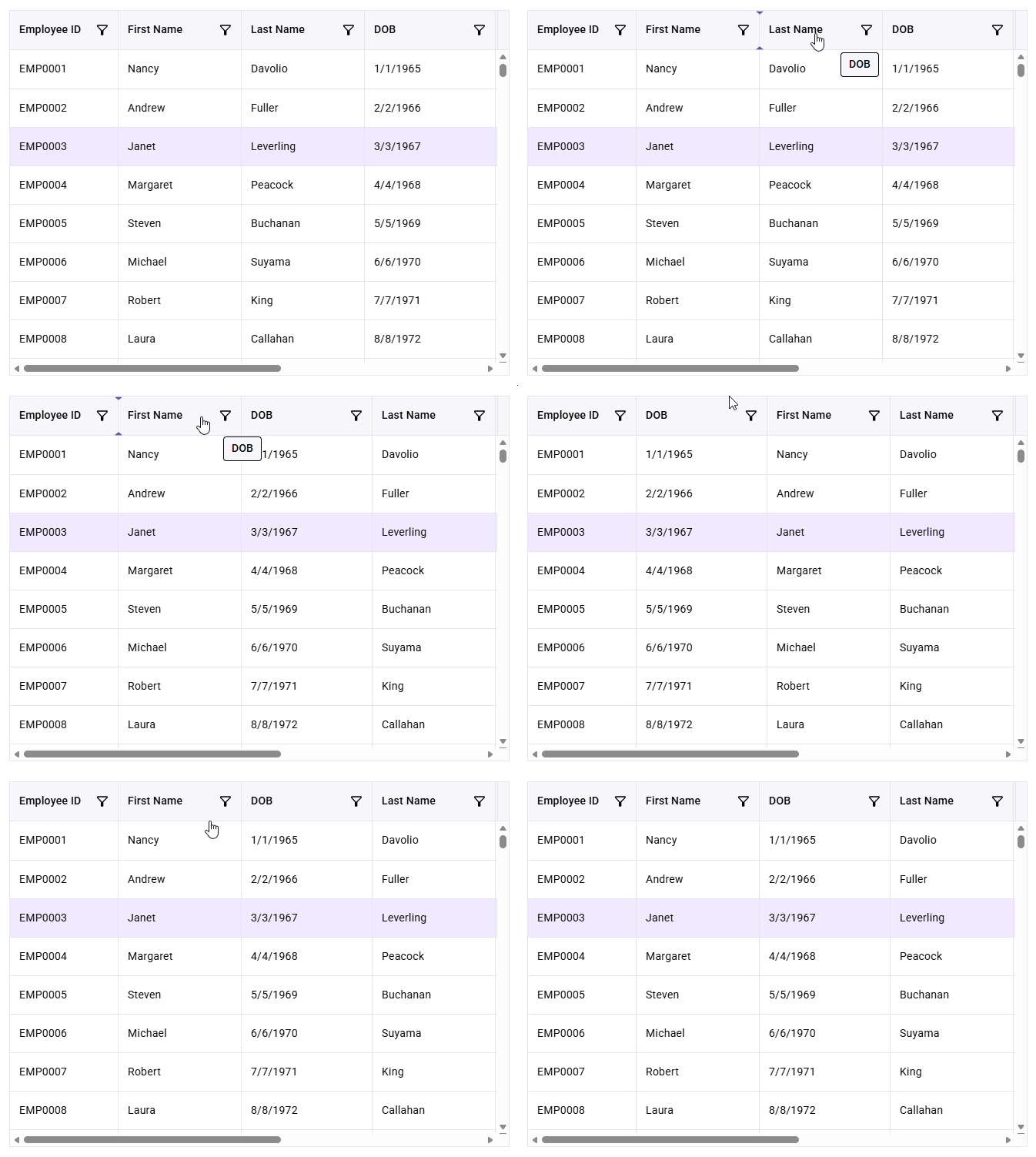
Column reorder
Rearrange columns with drag-and-drop to create customized layouts. Column reordering enables users to prioritize important information and organize data according to their workflow.
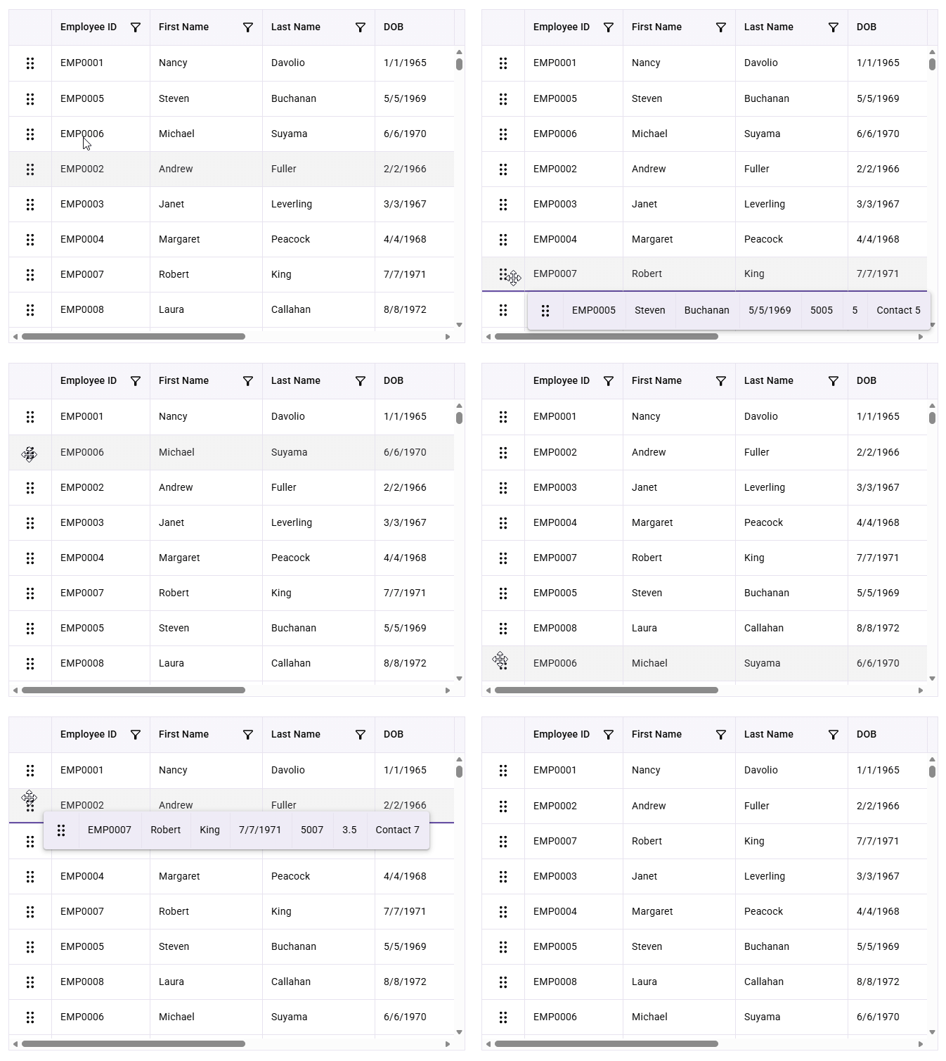
Row reorder
Reorder rows through drag-and-drop to modify record sequences visually. This feature simplifies data organization and management while providing an intuitive user experience.
Row number
Display automatically generated row numbers to simplify record identification and navigation. Row numbers remain synchronized with sorting, filtering, and other grid operations.
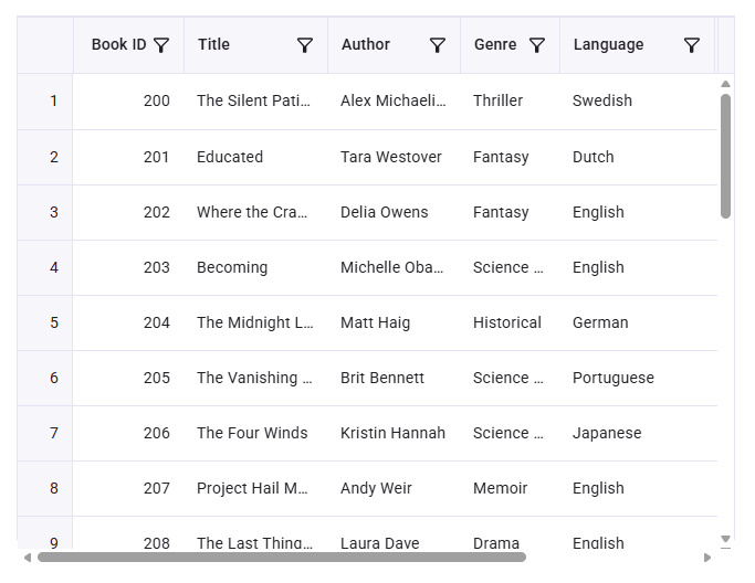
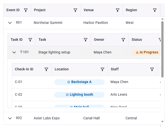
Nested grid
Display hierarchical data structures using nested grids within parent rows. Users can explore related records while keeping master-detail relationships clear and organized.
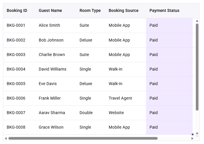
Autofill
Accelerate data entry by dragging the fill handle to automatically populate adjacent cells. Autofill supports repeating values and extending data patterns, reducing manual input effort.
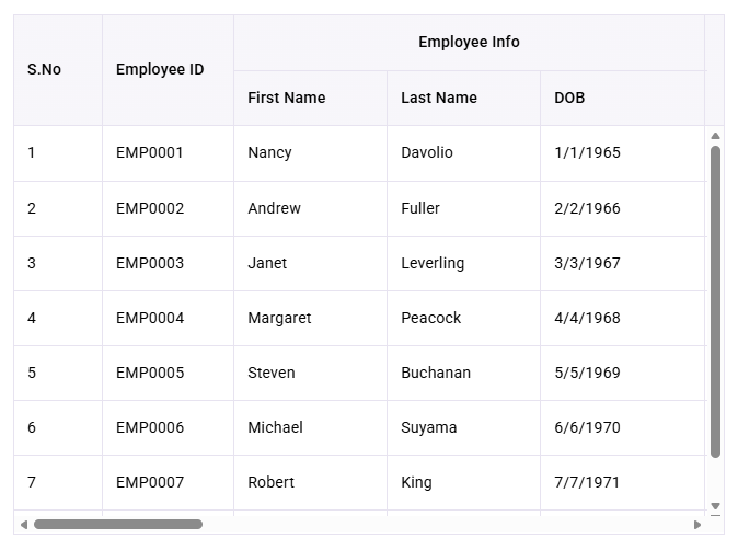
Multilevel headers
Organize related columns under grouped header sections using multilevel headers. This feature improves readability and provides a structured presentation for datasets with complex column hierarchies.
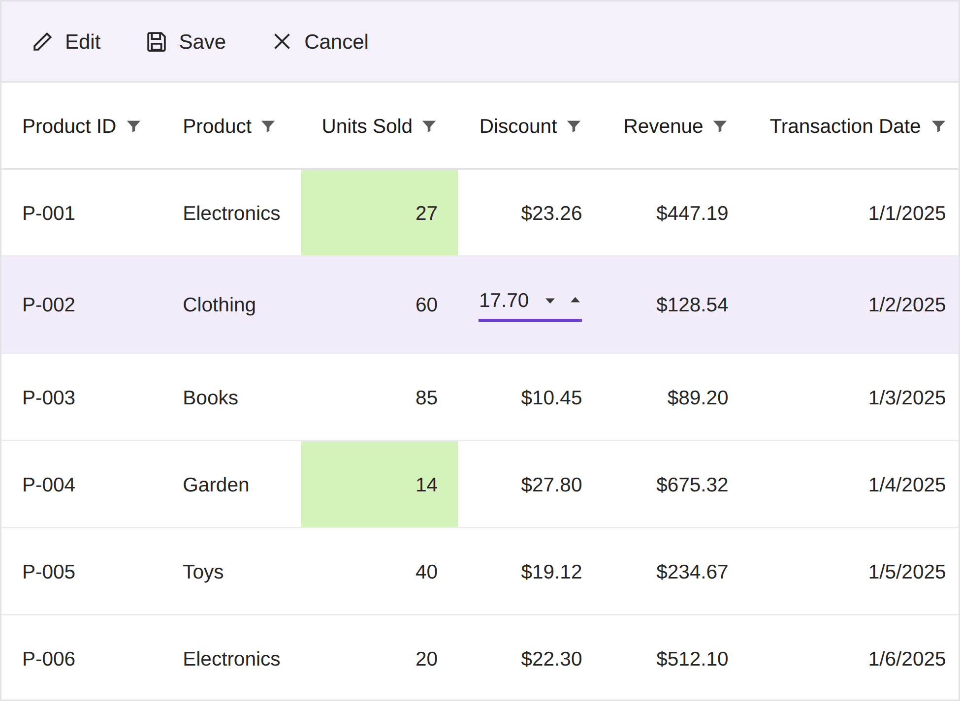
Batch edit
Perform bulk editing operations across multiple records before saving changes. Batch editing allows multiple additions, modifications, and deletions to be reviewed and committed in a single action, improving efficiency when managing large datasets.
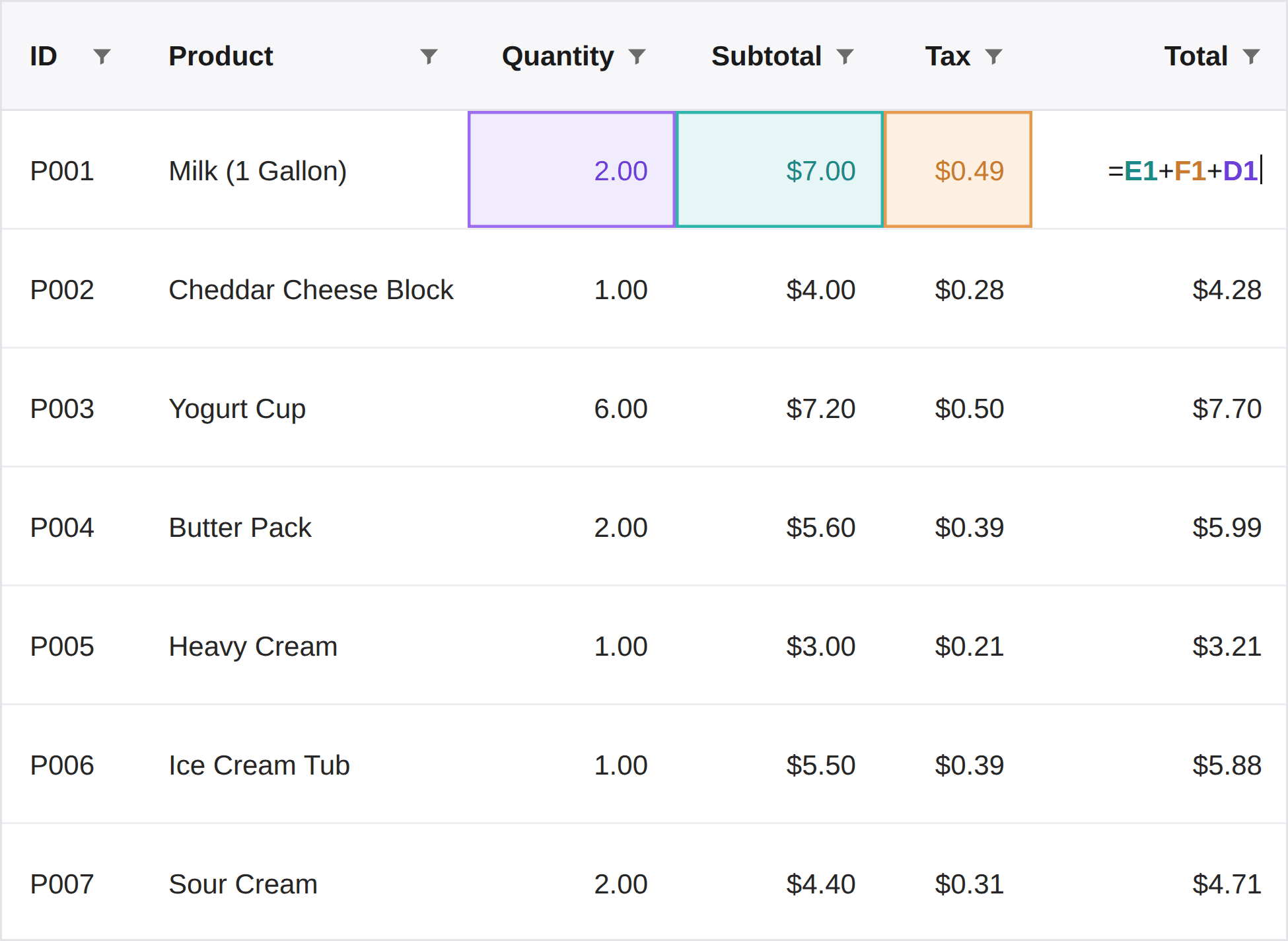
Formula cell
Perform spreadsheet-like calculations directly within grid cells using formulas. Formula cells automatically evaluate expressions and update results when dependent values change, enabling dynamic data computation and analysis within the DataGrid.
Tree data
Display hierarchical data in a tree structure while maintaining the familiar Grid experience. Tree data lets users expand and collapse parent-child relationships, making it easier to navigate and manage nested records.

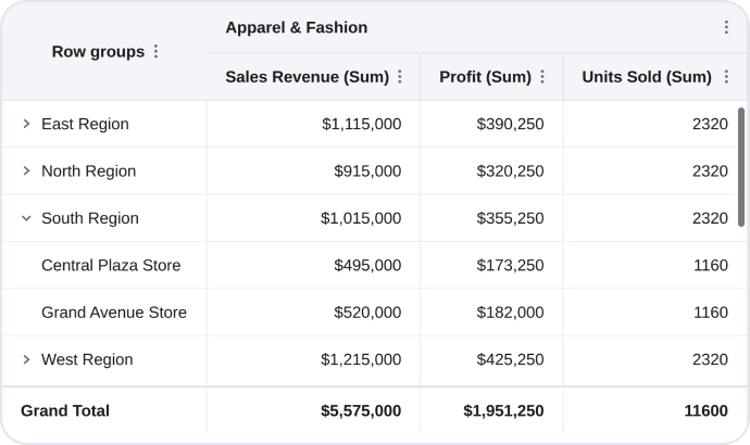
Pivot view
Analyze and summarize large datasets using an interactive pivot view. The pivot view organizes and aggregates data across rows and columns, helping users identify trends, compare values, and gain meaningful insights from complex datasets.
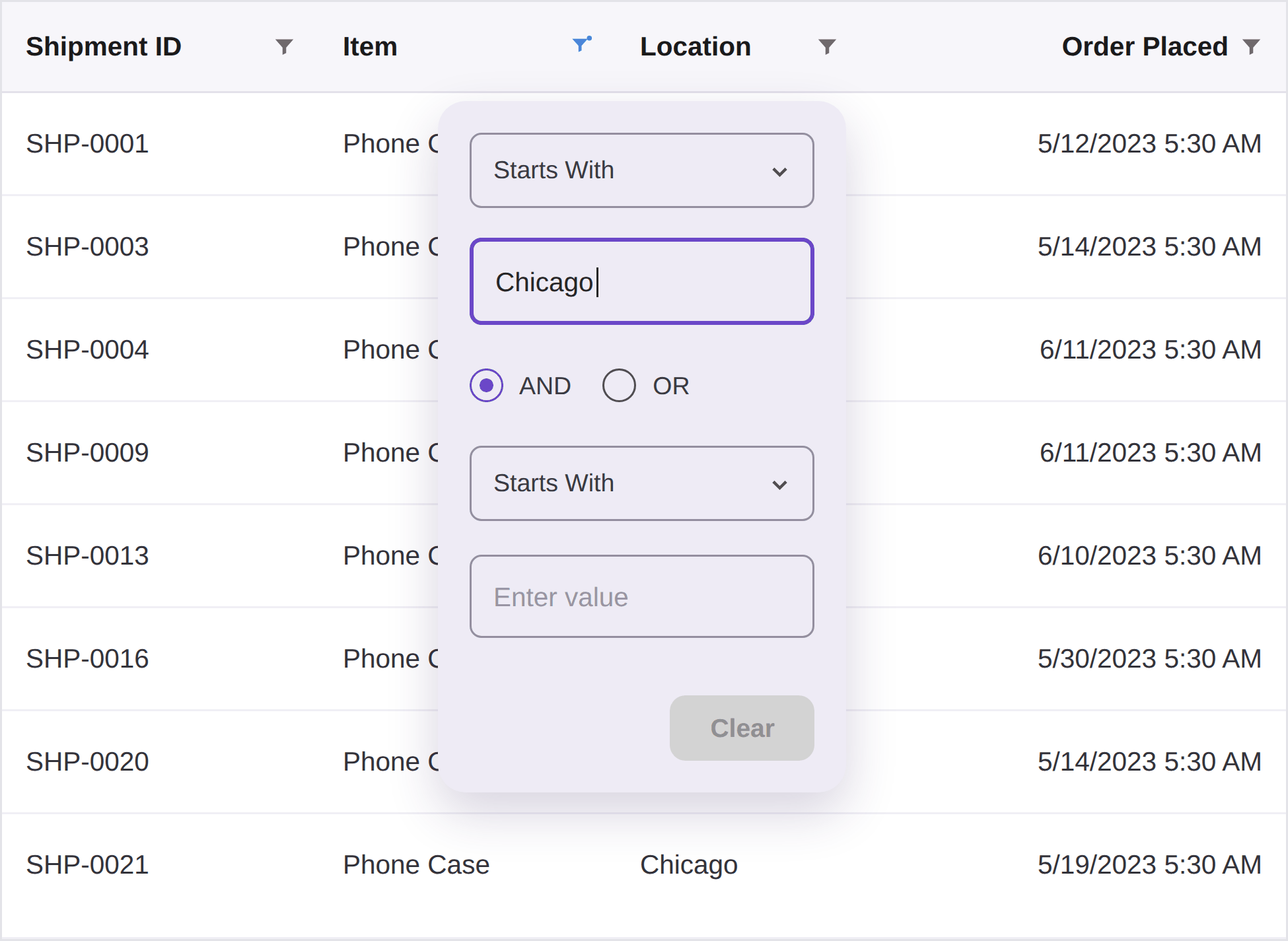
Menu filter
Access column-specific filtering options through a dedicated filter menu. Apply condition-based filters tailored to the column data type to quickly refine the displayed records and focus on relevant information.
Column and row pinning
Keep important columns and rows visible while scrolling through large datasets. Column and row pinning improves data accessibility by keeping key information fixed, making it easier to compare and review records.

Web TreeGrid
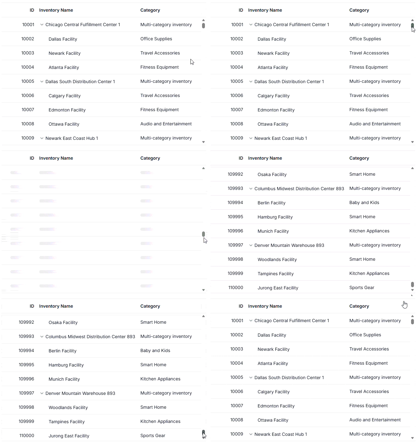
DOM virtualization
The Tree Grid efficiently handles large datasets by rendering only the visible rows using a buffer. This reduces memory usage and enables smooth scrolling.
Hierarchy checkbox
Enhanced hierarchy checkbox selection with self, hierarchy, and filtered hierarchy modes, providing greater control over parent-child record selection behaviors in Tree Grid.

.NET MAUI DataGrid
Multirow view
This feature allows a single data record to be displayed across multiple rows, improving the presentation of complex datasets. It provides a flexible layout for organizing related fields, enhancing readability and enabling efficient data visualization within the DataGrid.

.NET MAUI TreeGrid
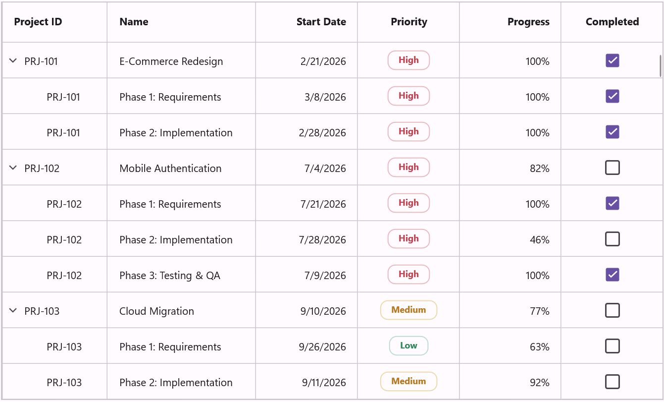
We are excited to introduce the TreeGrid for .NET MAUI, a powerful hierarchical data visualization control designed to display self-referential and nested data in a tree structure. It combines the flexibility of a tree view with the rich functionality of a data grid, enabling users to efficiently organize, navigate, and interact with hierarchical datasets.
Key features
Data binding: Easily bind hierarchical data collections to the TreeGrid, enabling seamless visualization and management of parent-child relationships.
Columns: Define and customize multiple columns to display structured information, providing a clear and organized view of hierarchical data.
Sorting: Sort hierarchical data by one or more columns to quickly identify and organize information while preserving the tree structure.
Programmatic filtering: Apply filters programmatically to display only the relevant records, enabling dynamic data exploration and customized views based on application requirements.
Freeze panes: Keep essential rows or columns visible while scrolling through large datasets, improving navigation and data readability.
Expand and collapse nodes: Allow users to expand and collapse parent nodes interactively, making it easy to navigate large data hierarchies while maintaining a clean user interface.
Expander customization: Customize the appearance and behavior of expanders to align with application requirements and enhance the overall user experience.
Styling and theming: Customize the TreeGrid’s appearance with extensive styling and theming options to create visually consistent and engaging applications.
Directionality: Use both left-to-right (LTR) and right-to-left (RTL) layouts for an optimal viewing experience across different languages and regional preferences.
WinUI DataGrid
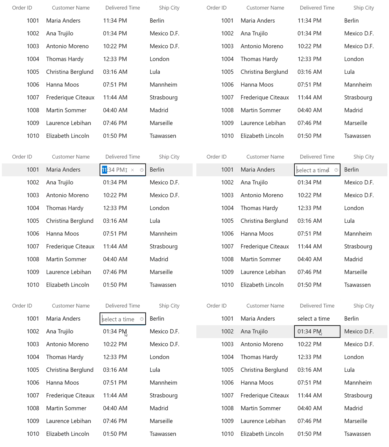
Show Clear button in editors
Display a built-in Clear button in the GridTimeColumn editor, enabling users to clear values with a single click during editing.
Default sort order
Set the default sort direction at the grid or column level to force sorting to start in either ascending or descending order.
WinUI TreeGrid
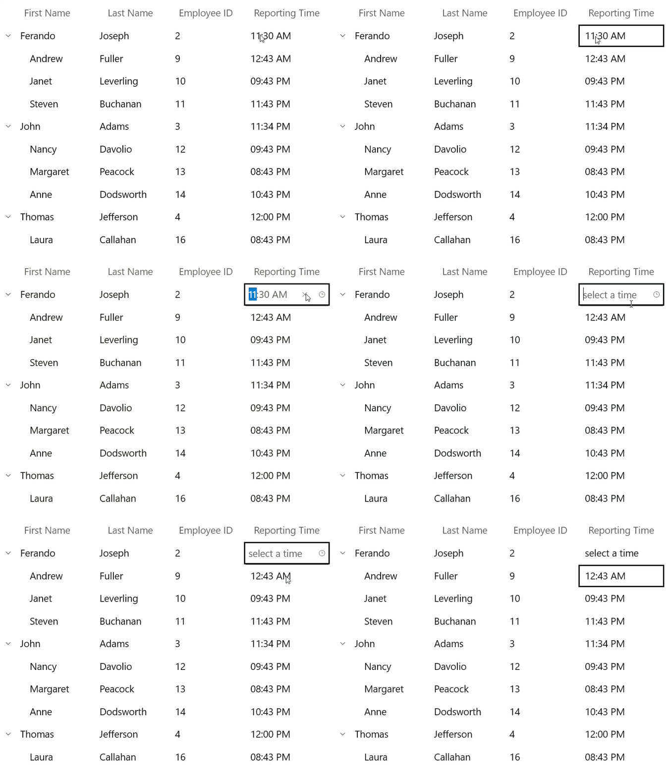
Show Clear button in editors
Display a built-in Clear button in the TreeGridTimeColumn editor, enabling users to clear values with a single click during editing.
Default sort order
Set the default sort direction at the grid or column level to force sorting to start in either ascending or descending order.
WPF DataGrid
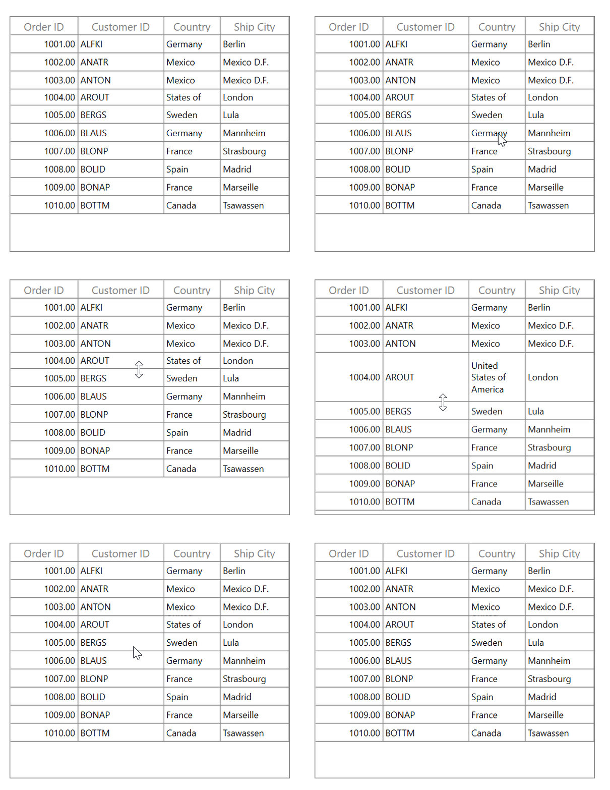
Row resizing
This feature allows users to resize rows interactively by dragging row borders to adjust row heights at runtime.
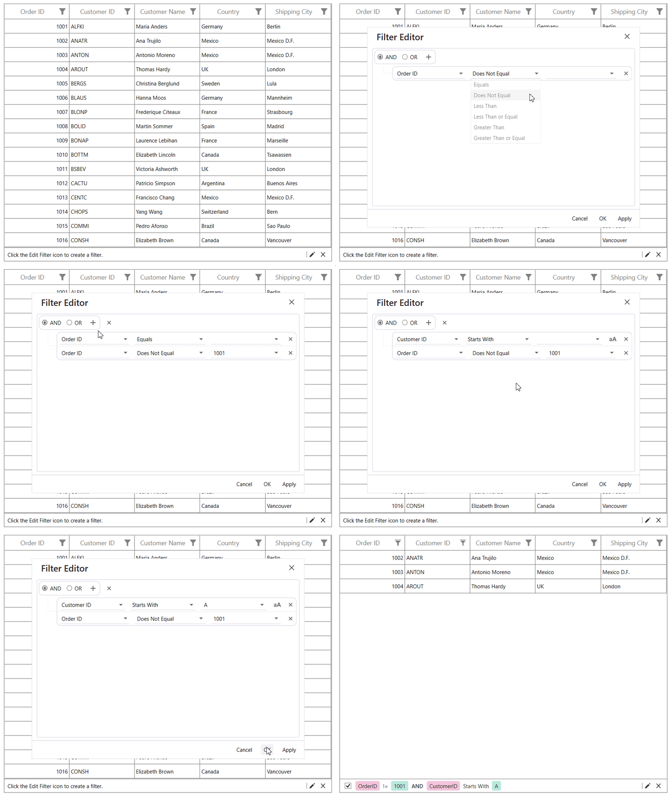
FilterEditor control
This feature allows users to create custom filtering experiences.
Character casing in editors
Automatically convert user-entered characters to uppercase or lowercase in the GridTextColumn editor.
Default sort order
Set the default sort direction at the grid or column level to force sorting to start in either ascending or descending order.
WPF Smart DataGrid
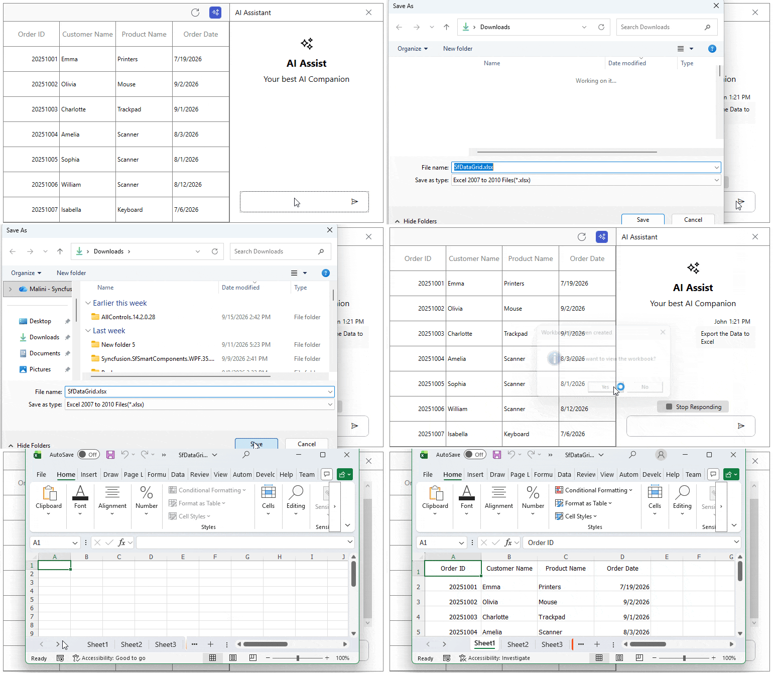
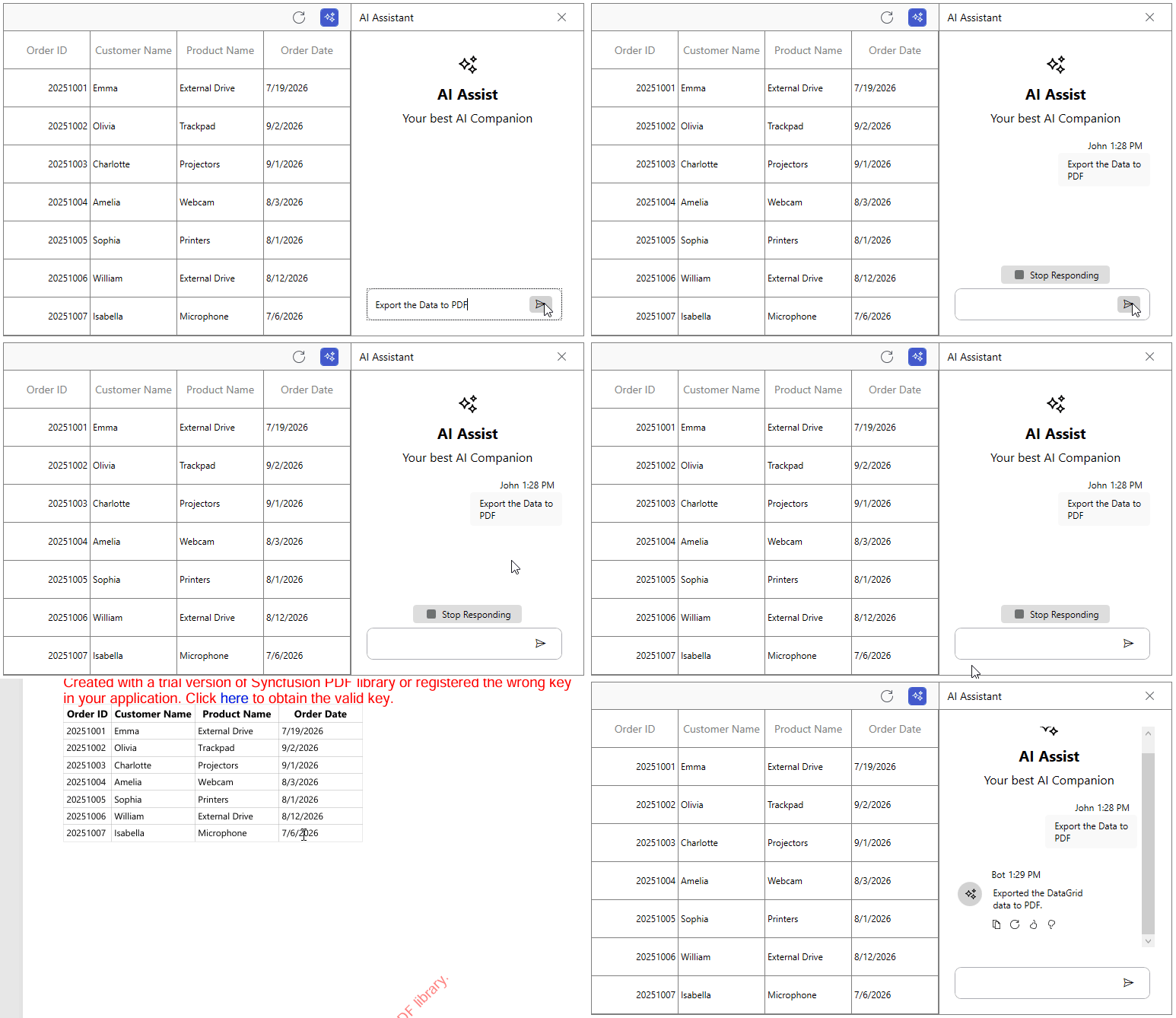
AI-powered exporting
Export data to Excel or PDF using natural language prompts. The Smart DataGrid interprets user intent and generates the requested file automatically.
WPF TreeGrid
Default sort order
Set the default sort direction at the grid or column level to force sorting to start in either ascending or descending order.

Do you have a feature request? Post the details in the feedback portal.