AI AssistView
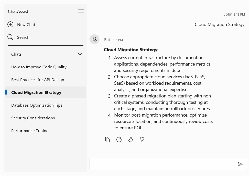
Conversation history
This feature allows users to view, access, and switch between previous conversations, ensuring seamless continuity and improved productivity.
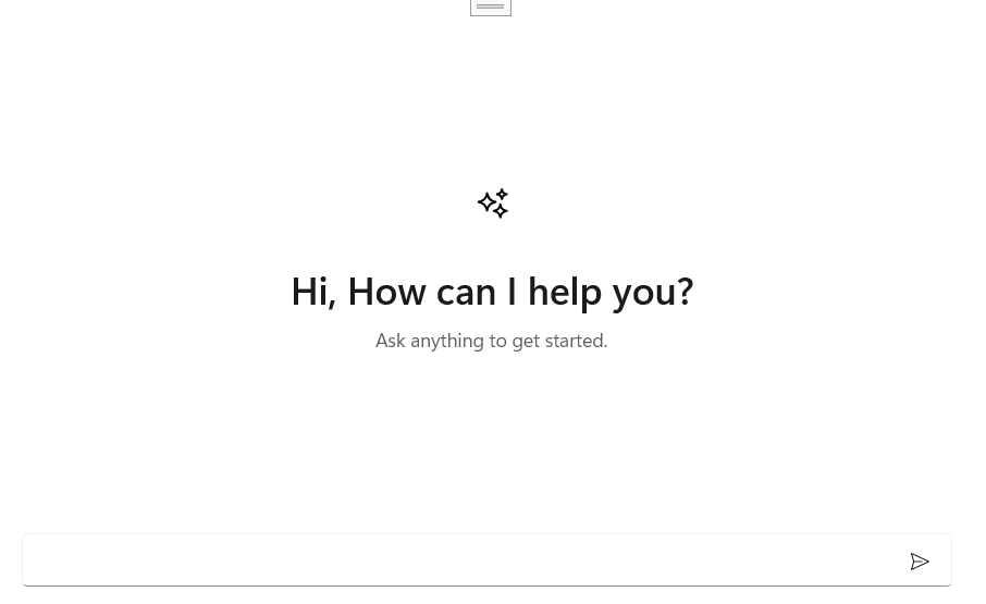
Empty view
Users can personalize the empty-state view with text, images, logos, and other UI elements when no chat conversations are present.
AutoComplete
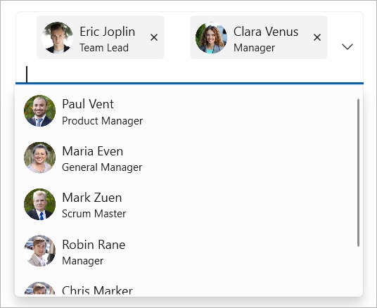
Token item template
Fully customize the appearance of tokens and dynamically apply different templates based on the underlying data.
Chart
Multilevel label rotation
Rotate multilevel labels in WPF Charts to improve readability when displaying long text or closely spaced labels on an axis.
XPS vector export support
Export the WPF Charts control as XPS (XML Paper Specification) documents. XPS exporting preserves chart content as vector graphics, ensuring sharp and high-quality output at any zoom level or print resolution.
DataGrid
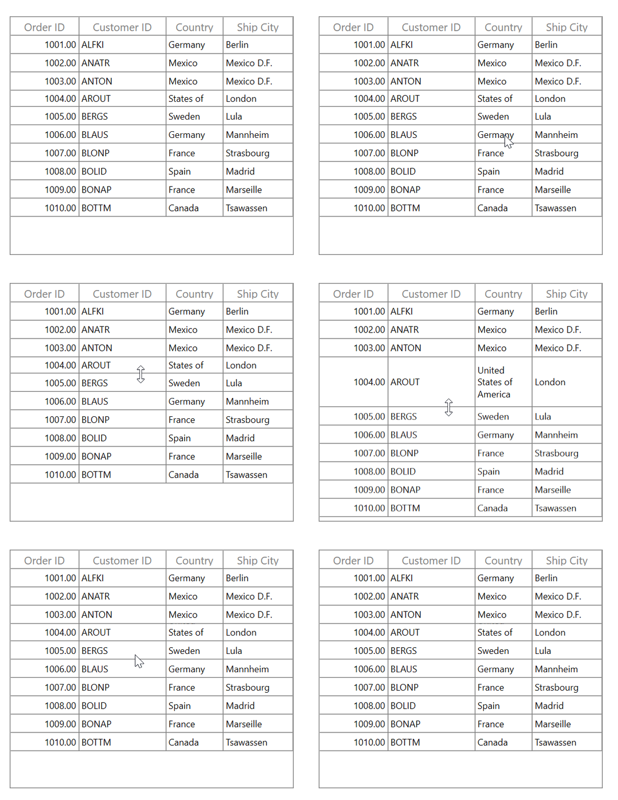
Row resizing
This feature allows users to resize rows interactively by dragging row borders to adjust row heights at runtime.
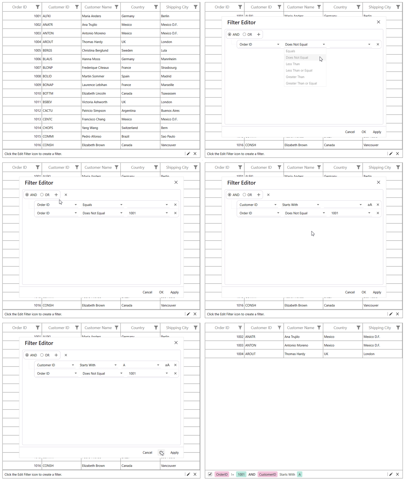
FilterEditor control
This feature allows users to create custom filtering experiences.
Character casing in editors
Automatically convert user-entered characters to uppercase or lowercase in the GridTextColumn editor while editing.
Default sort order
Set the default sort direction at the grid or column level to force sorting to start in either ascending or descending order.
Gantt Chart
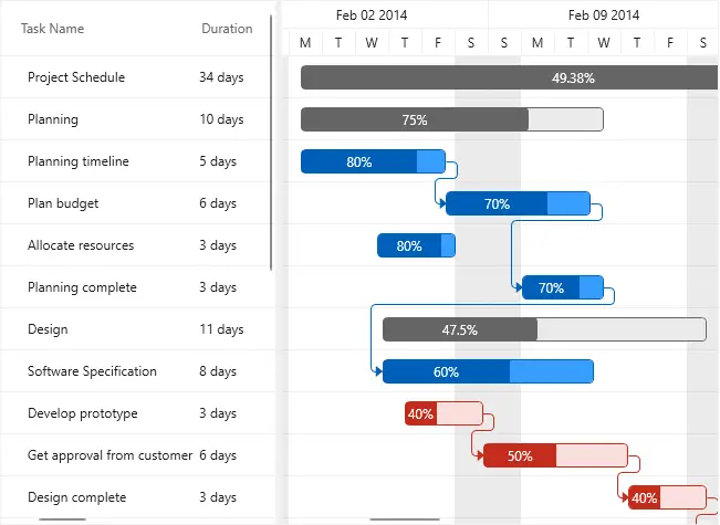
Modernized built-in themes
Modernized built-in themes enhance the appearance of taskbars, milestones, connectors, progress indicators, and scheduler elements. The refreshed styling improves readability and delivers a more polished and consistent user experience across all supported themes.
Kanban Board
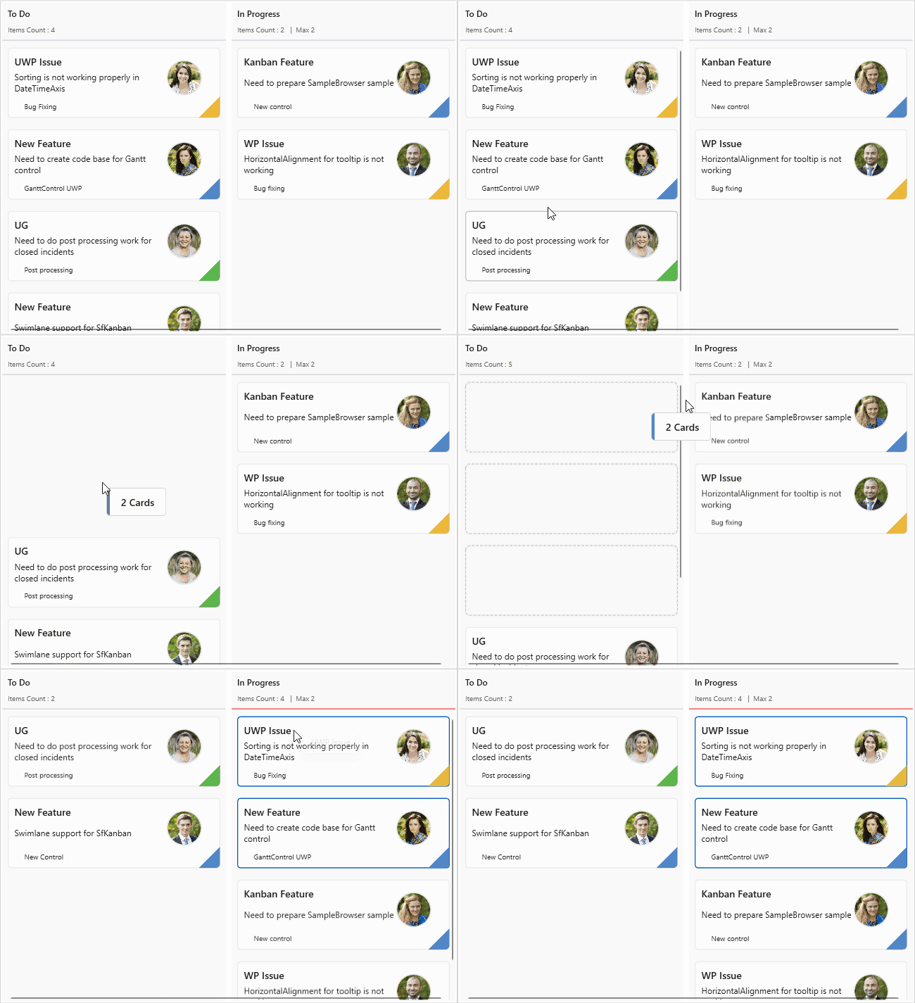
Multi-card selection and drag-and-drop
Multiple Kanban cards can be selected and dragged simultaneously, with hover and selection visual indicators that provide clear feedback during card interactions.
Smart DataGrid
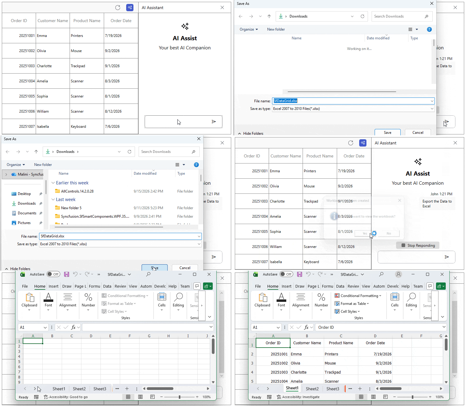
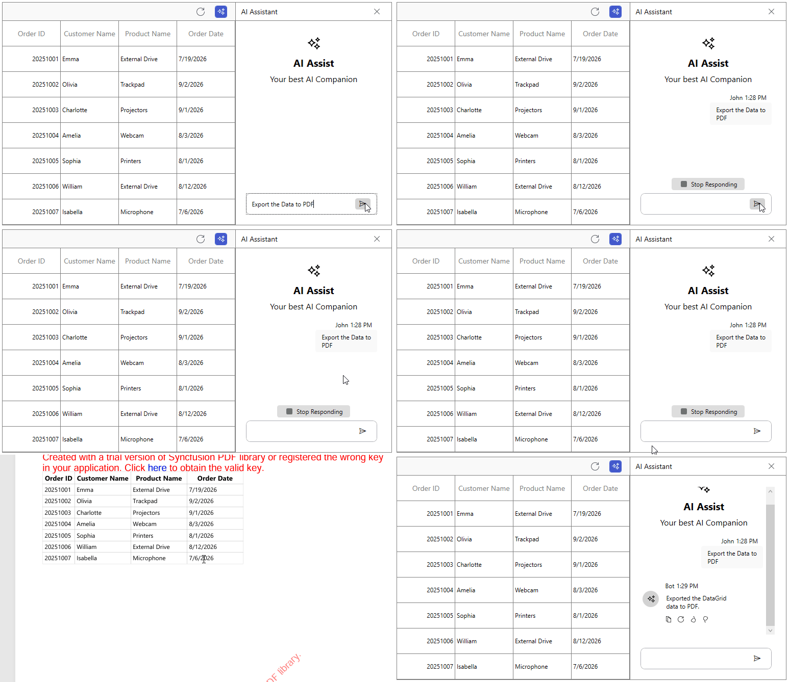
AI-powered export
Export data to Excel or PDF using natural-language prompts. Smart DataGrid interprets user intent and generates the requested file automatically.
TabControl
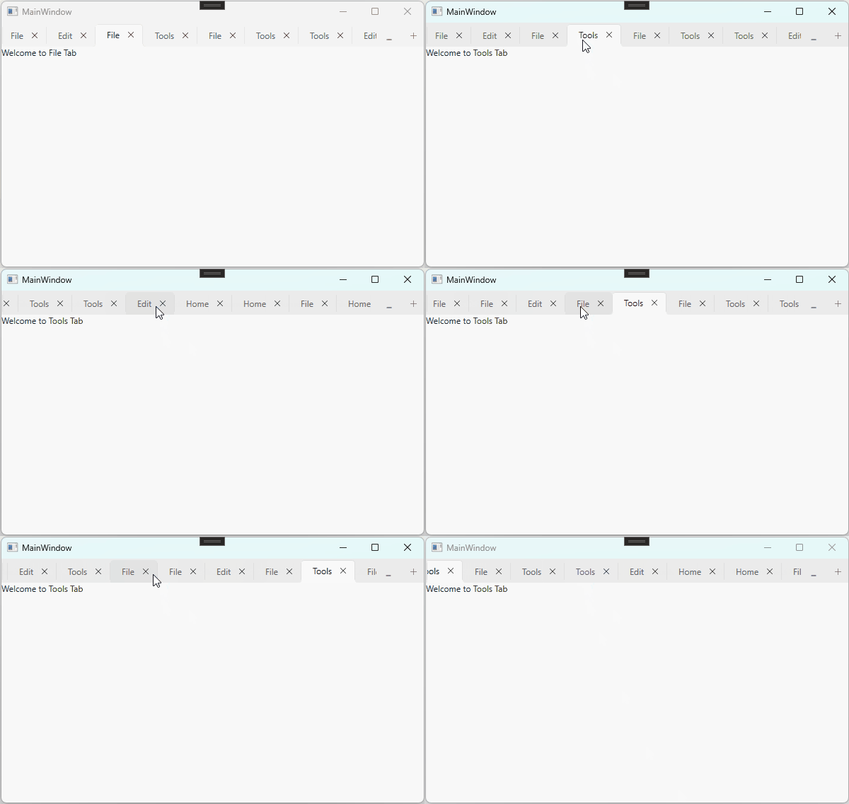
Mouse wheel support for scrolling tabs
The TabControl now supports mouse wheel scrolling for tab headers, making it easier to navigate tabs when the tab strip overflows the available space.
Text Input Layout
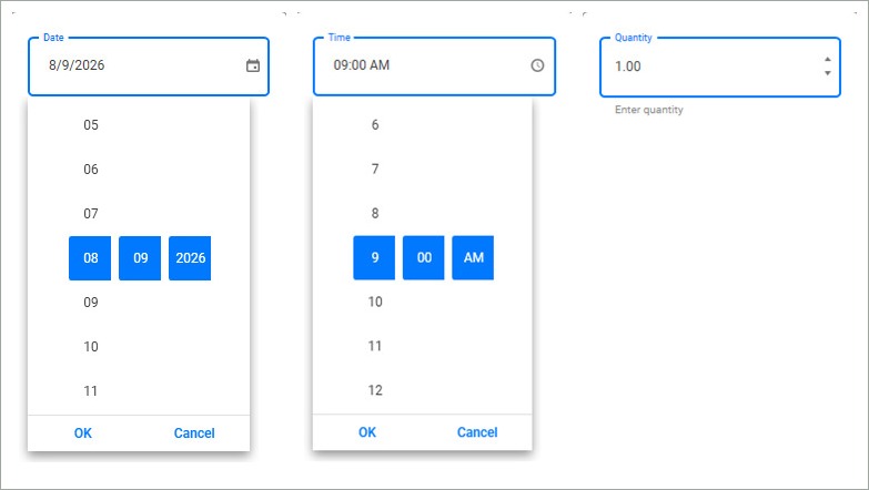
Additional input views
The Text Input Layout control now supports the DatePicker, TimePicker, and NumericUpDown controls. Users can add floating labels, hints, help text, error messages, and leading or trailing icons to them for a more intuitive input experience.
Toast Notification
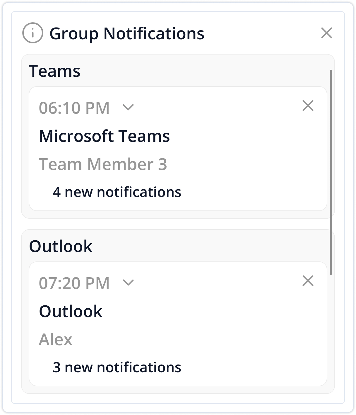
Grouping
Custom toast notifications can be grouped by group name, helping organize related notifications, reduce clutter, and improve readability.
Custom position
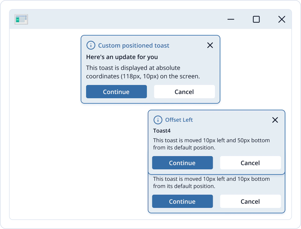
This feature allows developers to control where toast notifications appear, using built-in placements, offsets, or exact screen and window coordinates. This offers greater flexibility for arranging notifications on the screen.
Toast distance customization
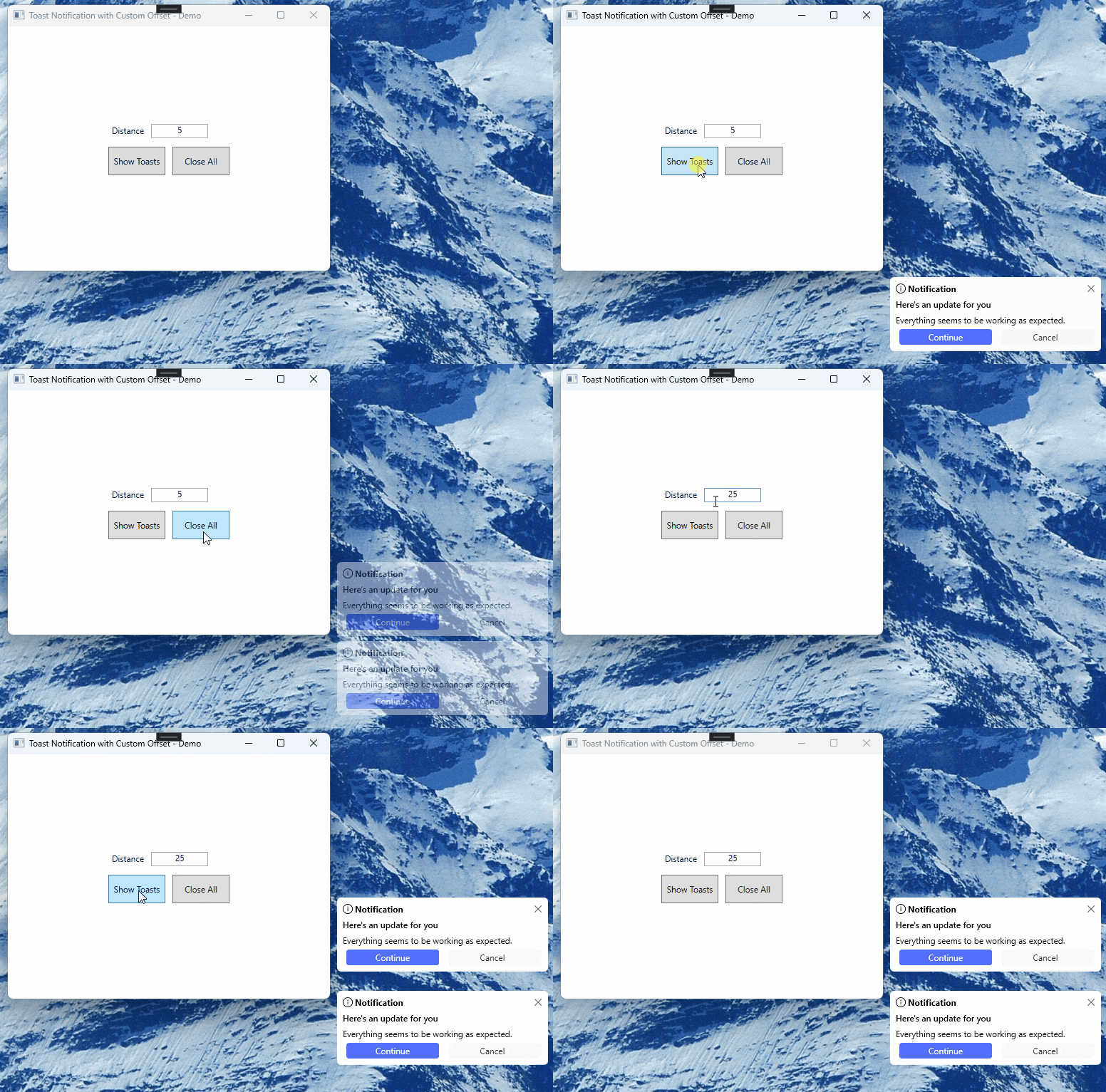
Developers can define the vertical gap between stacked toast notifications. This allows adjusting toast density to suit different UI layouts and improves visual spacing.
TreeGrid
Default sort order
Set the default sort direction at the grid or column level to force sorting to start in either ascending or descending order.

Do you have a feature request? Post the details in the feedback portal.