Common
Theme improvements
- The theming experience has been enhanced to provide a more modular and streamlined approach. Updated theme packages offer both consolidated and component-level styles, with dedicated entry points
(index.css/index.scss)that automatically resolve dependencies. - Additionally, the theming system has been upgraded to the latest Sass version
1.100.0, improving compatibility and providing a more consistent styling workflow across applications. SCSS styling is now standardized through centralized theme packages. SCSS files are no longer supported within individual component packages or the EJ2 combined package, enabling a more structured and maintainable approach to styling.
Production-ready component
The following component has been developed to meet industry standards and is now marked as production-ready for Vue:
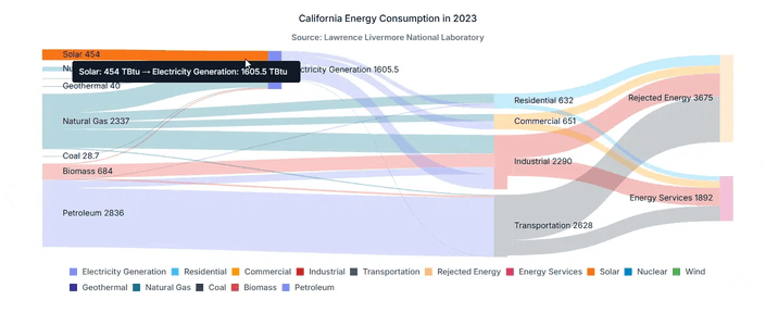
- Sankey Diagram: A powerful visualization tool for understanding flows and relationships within complex systems. It uses interconnected nodes and weighted links to clearly show how quantities move and transform across stages.
AI AssistView
Regenerate responses with navigation
The AI AssistView supports response regeneration, generating multiple alternative responses for a single prompt. Navigation arrows enable seamless browsing between generated responses without re-entering the prompt, enhancing exploration of different AI-generated solutions and reducing redundant prompt submissions.
Text-to-speech for responses
The integrated text-to-speech functionality speaks AI-generated responses hands-free, enabling developers to utilize AI-generated content while multitasking.

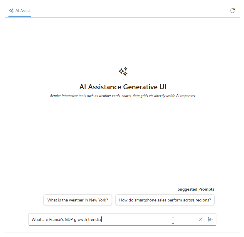
Generative UI with interactive tools
This feature enables generative UI, allowing interactive UI tools to be dynamically generated directly within AI responses. By configuring an appropriate system prompt, the AI can invoke registered tools, seamlessly integrating dynamic and interactive UI elements into responses.
AI chain-of-thoughts
The AI AssistView now displays the AI’s chain-of-thought process before generating responses. It provides transparency into the AI model’s reasoning steps, helping explain how conclusions were reached and enabling verification of the logical flow of AI-generated solutions.
Accumulation Chart
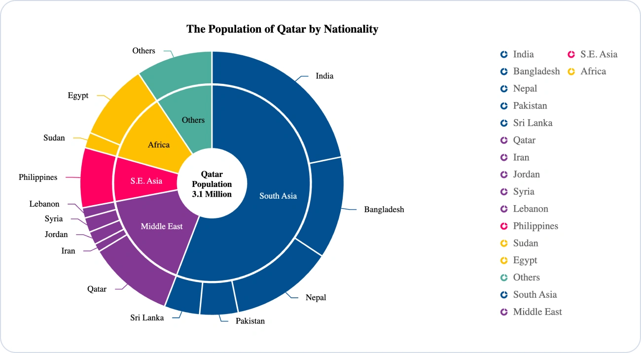
Nested donut (multi-level)
The multi-series pie chart displays multiple datasets as concentric rings within a single chart. This makes it easier to compare data and understand hierarchical relationships. Cross-series legend grouping with the mappingKey feature allows similar categories to be combined into a single legend item, enabling unified interaction across all matching slices. Each series operates independently, supporting tooltips, data labels, highlighting, and selection. Find the demo link here.
Chart
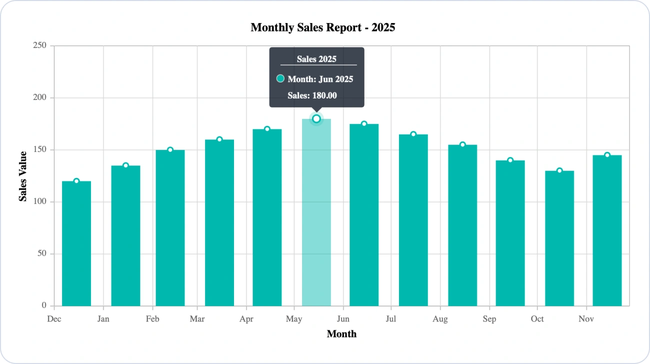
Inline DateTime and number formatting in tooltip
Inline DateTime and number formatting within tooltip format strings enables values to be displayed more clearly and readably, such as formatting dates (MMM yyyy, MM:yy) and numbers (n2, c2, n0). This handles invalid formats or values without affecting rendering or template behavior.
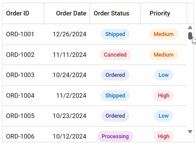
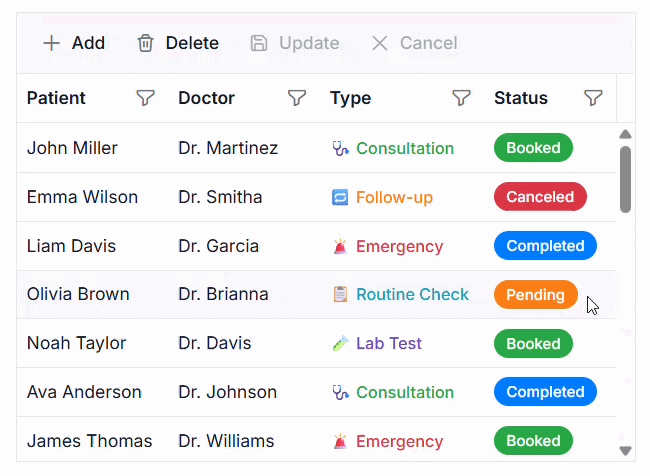
DataGrid
DOM virtualization
DOM virtualization efficiently handles large datasets by rendering only the visible rows with a buffer. This reduces memory usage and ensures smooth scrolling.
Cell edits
The DataGrid provides a seamless inline editing experience. In addition to row-level editing, users can update individual cell values directly within the grid, with support for programmatic control.
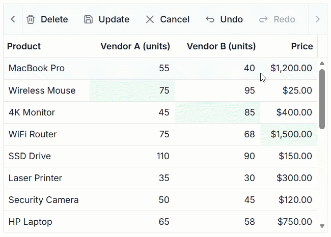
Undo and redo for batch editing
This feature allows users to undo and redo batch editing, helping them correct mistakes quickly.
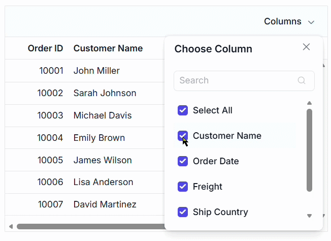
Show or hide columns with immediate mode
Columns can be shown or hidden dynamically using immediate mode, improving flexibility in data presentation.
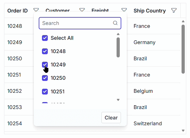
Excel and checkbox filters with immediate mode
Filtering actions are applied instantly without additional confirmation in immediate mode, making data exploration faster and more intuitive.
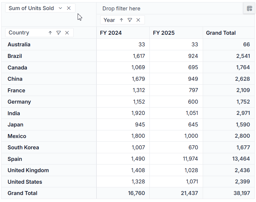
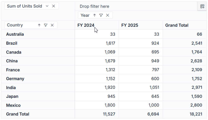
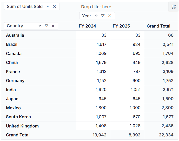
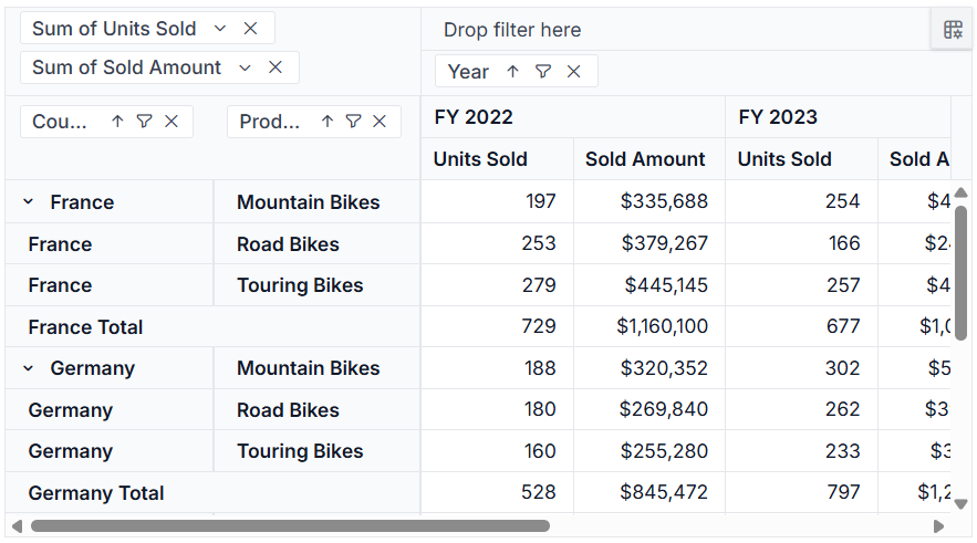
Pivot Table
Built-in CRUD operations for seamless data management
The Syncfusion Pivot Table now supports native create, read, update, and delete (CRUD) operations with configurable server-side controller endpoints. This enables efficient data editing directly within the Pivot Table, simplifies back-end integration, and eliminates the need for custom CRUD implementations. It is ideal for applications that require dynamic data updates and real-time synchronization.
Advanced top and bottom value filtering
Gain deeper insights with Top N and Bottom N filtering in pivot tables. This feature, available through both APIs and the runtime UI, allows users to filter and analyze high-performing or low-performing data points quickly. It enhances decision-making by helping users focus on the most critical values in large datasets.
Append current selection to existing filters
Improve filtering efficiency with incremental, Excel-like filtering capabilities. Users can now add the current selection to existing filters without clearing previously applied conditions. This makes multi-member filtering more intuitive and significantly enhances interactive data exploration.
Percentage of running totals aggregation type
The Pivot Table now supports percentage of running totals as an aggregation type. This allows users to view cumulative values as percentages, making it easier to analyze trends, measure contribution over time, and understand data progression.
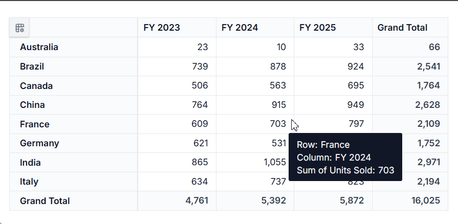
Repeat item labels in classic pivot table layout
Enhance readability and reporting clarity with repeating row item labels in a classic pivot table layout. They provide consistent formatting across the UI and exported reports, making it easier to interpret large and complex datasets in both digital and printed formats.
Range Selector
New series types
Range Navigator supports spline, spline area, and column series types, expanding the visualization options for range-based data selection. Spline displays smoother trend lines, spline area emphasizes variations over a continuous range, and column represents values as distinct vertical bars within the navigator.
This enhancement provides greater flexibility for building financial dashboards, analytical reports, and time-series applications, helping users interpret data more effectively through the most suitable visual representation.
Stock Chart
Indicator events
Indicator events in Stock Charts enable users to detect and control add and remove operations triggered through the built-in toolbar. The before indicator change event allows canceling an indicator mutation before it is applied, while the indicator changed event is triggered after a successful indicator update.
Do you have a feature request? Post the details in the feedback portal.