Common
New component
- The
Sunburst Chartcomponent has been added to Blazor.
Blazor Sunburst Chart (preview)
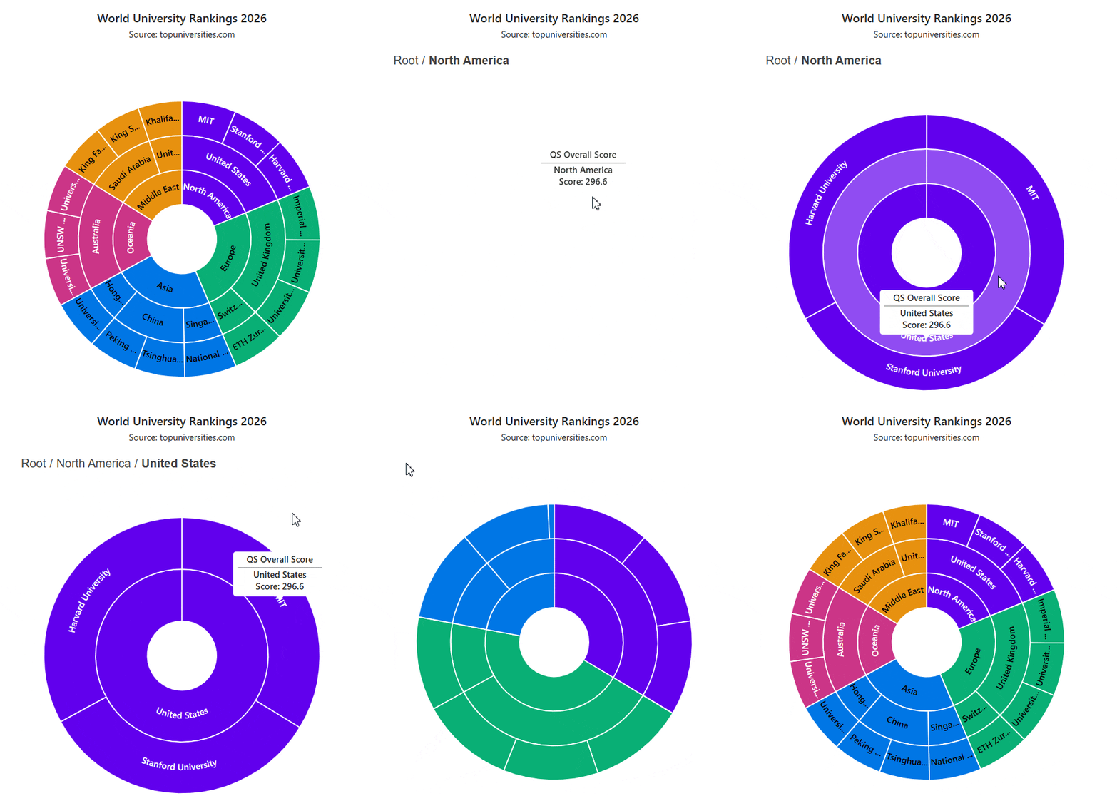
The Sunburst Chart component visualizes multilevel hierarchical data as concentric rings, where the arc length of each segment encodes its value. Users can click a slice to drill down into its underlying levels, and built-in highlight and selection interactions make individual slices easy to emphasize.
Key features
- Multilevel visualization: Hierarchical data is rendered as concentric rings, with arc length encoding each value.
- Drill down: Click a slice to drill down into its underlying levels.
- Highlight and selection: Built-in highlight and selection support.
- Theming: Data labels, multilevel tooltips, title, subtitle, legend, and borders fully support themes.
- Smart tooltip fill: The tooltip fill automatically follows the active theme, with a dark fallback when no theme is applied.

Web Charts


Stacked column with smart data label
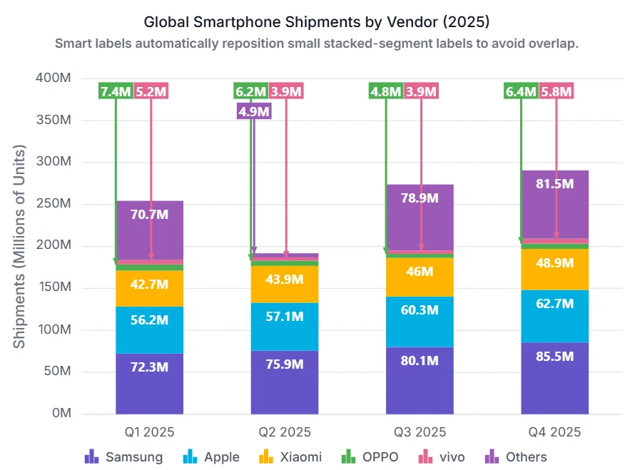
Automatic collision handling is now provided for data labels in stacked series, ensuring each label remains clearly readable. Overlapping data labels are detected and relocated to a readable area, while a visual connection from each relocated label to its original data point is maintained through a connector line.
WebMCP integration
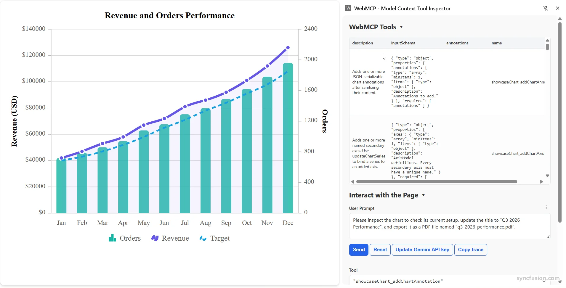
Charts supports the Web Model Context Protocol (WebMCP), enabling AI models and agents to interact with chart data and visual elements through built-in tools. Write operations require user confirmation, and the beforeWebMcpToolExecute event lets users inspect, modify, or cancel tool execution.
Pure React Charts
Linear and radial gradient
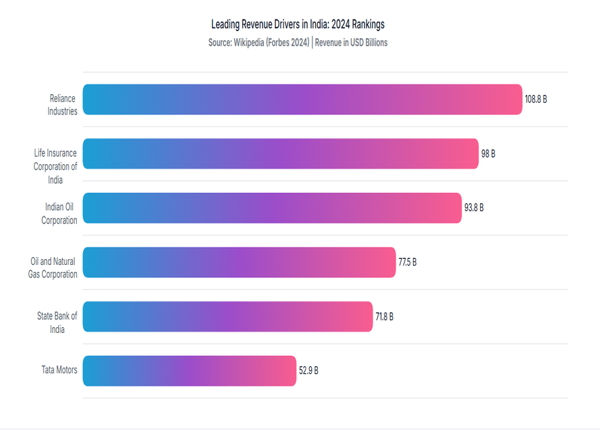
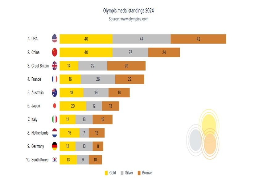
Apply linear and radial gradient fills across chart elements, including series, indicators, trendlines, markers, trackball, and tooltip markers, for a richer, more polished look that draws attention to key data points and trends.
Axis label template
Customize axis labels with templates to render rich content—icons, images, or multiline text—in place of plain text, giving full control over how axis information is presented.
Excel and CSV export
Export chart data to Excel or CSV directly from the chart with a single method call, so users can analyze the underlying data offline or share it without leaving the application.
Blazor charts
Nested doughnut support for accumulation charts
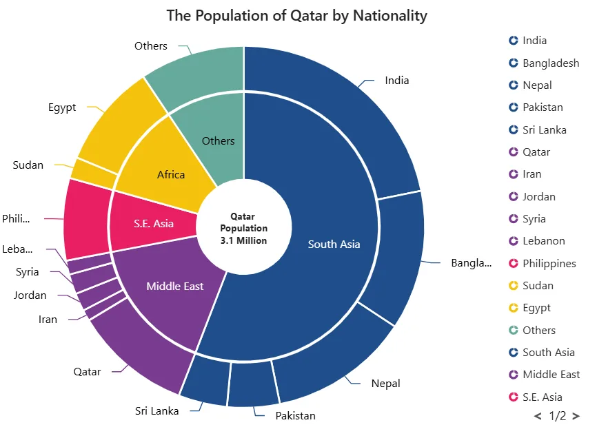
The multi-series pie chart displays multiple datasets as concentric rings within a single chart. This makes it easier to compare data and understand hierarchical relationships. Cross-series legend grouping with the MappingKey feature allows similar categories to be combined into a single legend item, enabling unified interaction across all matching slices. Each series operates independently, supporting tooltips, data labels, highlighting, and selection.
.NET MAUI Cartesian Charts
Gradients in line series
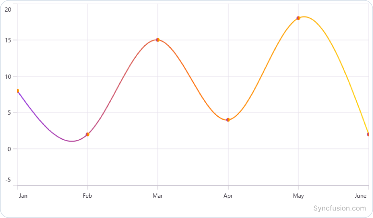
Apply smooth color transitions to line series using gradient brushes. This feature enhances visual appeal and enables more expressive data representation through customizable gradient effects.
Trackball for stacked column series
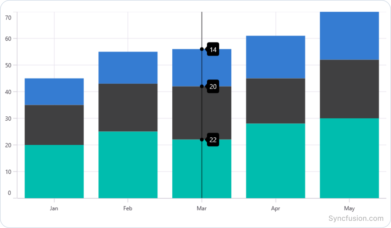
This feature allows users to view detailed values through an interactive trackball in stacked column series. Nearest-point, group-all-points, and float-all-points display modes provides flexible options for analyzing and comparing stacked data.
Annotation z-order
Control the display order of chart annotations to place them above or below chart series, enabling more flexible and visually organized chart presentations.
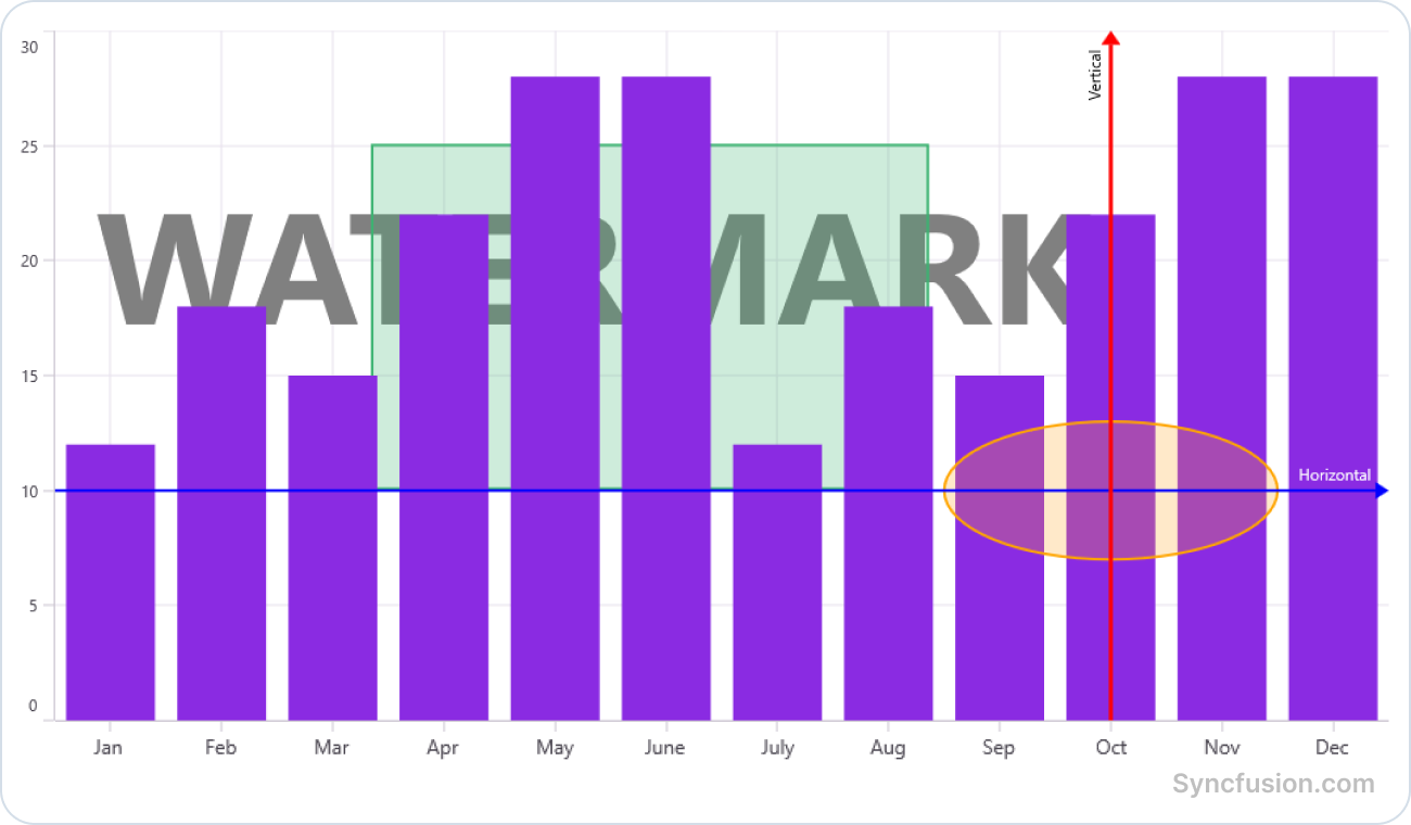
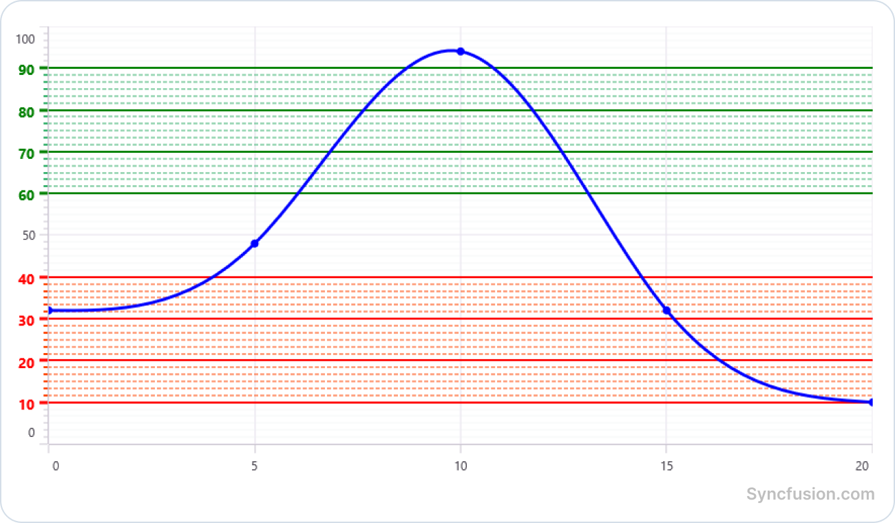
Axis range styling
Customize the appearance of axis labels, gridlines, and tick lines within specific axis ranges. This feature helps highlight important thresholds, target ranges, and critical data intervals for improved chart readability and analysis.
.NET MAUI Polar Charts
Accessibility
This enhancement improves chart usability for users of assistive technologies by providing better navigation and interaction with chart elements.
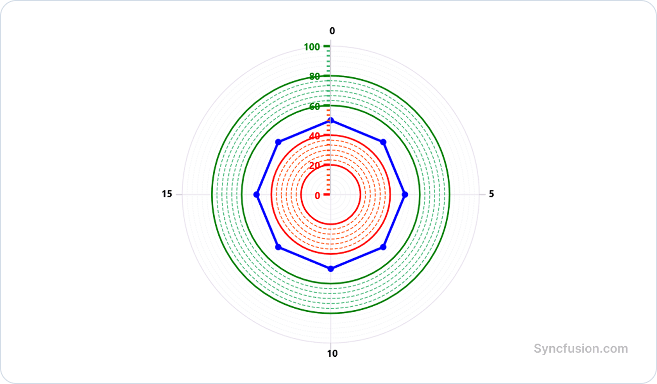
Axis range style
Customize the appearance of axis labels, gridlines, and tick lines within specific axis ranges. This feature helps highlight important thresholds, target ranges, and critical data intervals for improved chart readability and analysis.
Web 3D Charts
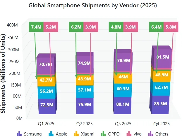
Stacked column with smart data label
Automatic collision handling is now provided for data labels in stacked series, ensuring each label remains clearly readable. Overlapping data labels are detected and relocated to a readable area, while a visual connection from each relocated label to its original data point is maintained through a connector line.
Web Stock Chart
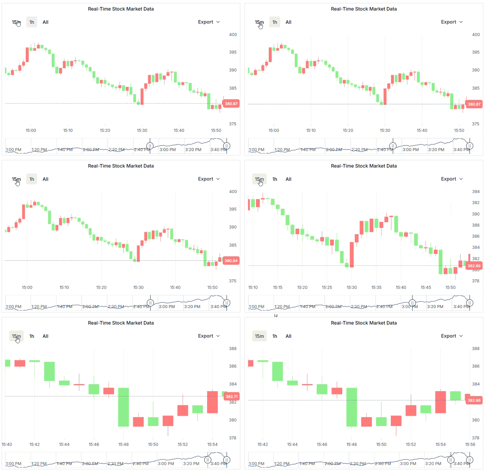
Real-time data visualization
Smooth real-time data visualization is now supported through dynamic data operations, historical data navigation, automatic navigator synchronization, axis animations, and navigator series animations. Continuous live data updates can be rendered without visual disruptions while preserving user interactions such as range selection, navigator movement, and zooming.
Improved Stock Chart rendering performance
Improved the initial rendering performance of the Stock Chart for large datasets over 500,000 data points. The initial load time has been reduced from approximately 20 seconds to 2.5–3 seconds, providing a faster and more responsive experience while rendering the complete dataset.
WPF Charts
Multilevel label rotation
Rotate multilevel labels in WPF Charts to improve readability when displaying long text or closely spaced labels on an axis.
XPS vector export support
Export the WPF Charts control as XPS (XML Paper Specification) documents. XPS exporting preserves chart content as vector graphics, ensuring sharp and high-quality output at any zoom level or print resolution.

Do you have a feature request? Post the details in the feedback portal.